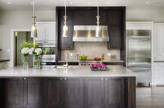
If you want your dark cabinet choice to work and have the longest style staying power, consider the following:
Let the cabinets shine
When I work with clients who want everything that they consider trendy in one space, I always discuss the wisdom of this approach. Something has to be the star in a space and you should decide in the beginning what the star will be. When you choose dark cabinets they demand centre stage, and everything else should support them and make them look their best. Using lots of white or very light colours with dark cabinets is the way to go to get that sophisticated, rich, classy look that many people are after when they choose dark cabinets.
Use in open area spaces
Dark cabinets work well in large, open area spaces where the wall colours are lighter rather than darker. The dark cabinets help to balance and ground the space. .
Have breaks in the dark flow
Leaving lots of wall space free of cabinets and/or having glass with light interior cabinets can do a lot to balance a darker cabinet colour. Having contrast with the floor is a must to create a lively space.
Mix dark and light together
Questions to consider:
Is there enough contrast with the floor?
When you choose dark cabinets your floors need to contrast with the cabinets or you are going to have the "bear cave" look that happens when your floors blend in with your cabinets. This is not an attractive look for smaller spaces. Even thought the floor above does have some contrast with the cabinets, I would have chosen something a tad lighter to open up the space. Again, no absolutes, only considerations and photos often lie. This is a lovely space.
Is there enough contrast between elements?
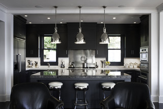
This space is unusually dark. It is the perfect kitchen for someone, but I would venture to say that it would not be a selling point for many buyers.
Can you have too much pattern?
When you have darker, busy countertops and then have patterned backsplash you are setting up pattern competition, and it can look very busy in a small space. My rule of thumb is patterned counter, plain backsplash.
Do you have enough lighting?
Sometimes it is difficult to tell from a photo exactly how much light is in a space. This space is reading dark even with the obviously adequate lighting from three (probably four with under counter) light sources and light reflection from the white counter and backsplash.
Who knew there was so much to consider when you decide to go for dark! Again, there are no absolutes only considerations and balances. Happy decision making.
Who knew there was so much to consider when you decide to go for dark! Again, there are no absolutes only considerations and balances. Happy decision making.


No comments:
Post a Comment