Showing posts with label modern. Show all posts

Monday, February 18, 2013

The dish on modern design


Modern style is a clean, streamlined furniture and architecture style that first appeared in the  1930s with roots in the German Bauhaus School of Design and Scandinavian modern design.   The modern movement was a response to what happened in design and history up to that point.  Art, architecture and  interior design broke from traditional detailing and styles and forged a new path. Modern design is still a prominent style in today's homes where homeowners seek original mid century modern furniture and accessories or resort to reproduction pieces.

  Defining characteristics of  modern interior design include:

 John Maniscalco Architecture
  •  simple, minimal, flat surfaces and unbroken lines 
  • low profile furniture with raised legs for an airy look 
  • wood floors but sometimes, cork, cement or rubber
  • minimal accessories


  • emphasis on form, geometric shapes
  • large windows that let the outside in
  • natural elements for accessories (large plants, sculptural twigs)
 

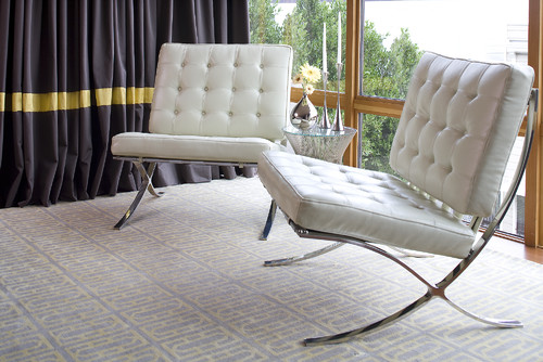
    • use of metals, leather and glass

      •  molded plywood, clear and white plastics for furniture

       
      •  simple or no hardware


      George Nijland
      •  predominately light walls, especially white
      • controlled use of pure colours in furniture/accessories ( mostly red, yellow, blue) 
      • use of texture 
      • use of art to add colour,  design elements and a focal point


        use of geometric patterning


        Many of the iconic furniture pieces of mid century design are still reproduced today and this confuses people because modern  is not that new! What some consider leading edge has been popular since the middle of the century.
         

         One of the strongest trends in home decor  today is to mix  modern pieces with contemporary decor.   The overall tone of this room is mid century  modern , but the severity of line and the more minimal approach has been softened with accessories.  Removing flowers, books, vases and pillows would create a truly modern decor.


         In my own home I like to mix mid century modern  pieces like the dresser, bed and chair with softer accents and a range of patterns and textures.



        Tuesday, December 20, 2011

        Design solutions: What do I do with the TV?


         Here I go again ranting about my favourite pet peeve in home decor- TV's! I'm always collecting ideas about this design dilemma.
         
        In a home theater the TV is king,  but in a smaller space meant for family living it needs to know its place.   If you want a TV to be the focal point in a room you certainly don't have to work at it because  it is  big and black, commanding attention through  scale and contrast.  I must not be the only one who feels this way because questions about where to put a TV continually crop up with clients.

        Family room contemporary family room

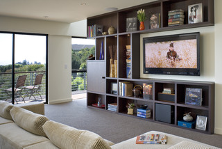
        These dark bookcases  provide a frame for the TV and it is tucked nicely into other aspects of the room. I don't know why  so many TVs have shiny black frames! Then you need an equally dark wood to balance it.

        Media Unit 002887 modern media room

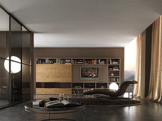
        Finally a gray/silver  frame.  This is a similar set up, but I personally prefer the overall lightness of the bookcases and TV within it. If you use a similar set up it is important to leave open space around the TV.


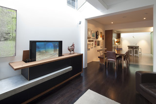
        Consider placing your TV on an entertainment console.  In this way it is visually part of the structure.   Your neck will also thank you for your efforts.  Continually jutting your chin up in the air to watch a TV hung too high on a wall is not healthy for your neck.  Then there's the practical aspect for people who wear bifocals.When you tip your head up you are looking out through the wrong part. 


        Newtown Terrace contemporary living room
         Crawford Architects

          And my most favourite of all is the magic disappearing TV!

         source

        In a minimalist decor, the TV is often treated  starkly.  The white framing which stands out from the wall makes it look like a picture.  The extra storage behind is very functional. 


        Here's another modern solution where the TV is treated like another accessory and the black banding on top and bottom connects nicely with the TV. The stacked art/photos replicate the rectangular shapes. Very pleasing overall. 

         And there you have it- installment 2 on that pesky TV.  Hope there was an idea you liked.

        Gambar Belangkas