Showing posts with label living room. Show all posts

Sunday, June 24, 2012

Not your average colour scheme

Some colour schemes are a dime a dozen and others are just daring and interesting. Today I'm looking at salmon/coral/melon and pink/rose/magenta.

Now I'm not saying I would use these colours in my own home. You can appreciate from afar without committing!  These rooms have just too much colour for my personal style.  I'm attracted to them because they are so vibrant and fresh.  Isn't it a good thing we don't all like the same colours?

 How do you feel about these rooms?  If you could transport any of them into your own home would you?

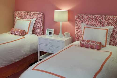
This colour scheme seems to be most popular in bedrooms. 

 Interior Designer Artistic Designs for Living, Tineke Triggs

The white bedding  and accessories work well to balance the hot colours.  White has many uses in decor and acting as a backdrop is just one of them.


You can't deny that these colours are great for a kid's room.  I'm really liking the hit of lime green as an accent.


This is the subtle version of this scheme.  Just a hint of melon with a deeper pink. Both are tempered with lots of off white.  That seems to be a common thread through most of these rooms.

More vibrant colours against light walls and furniture. The pink is leaning toward purple and there isn't that much of it. 

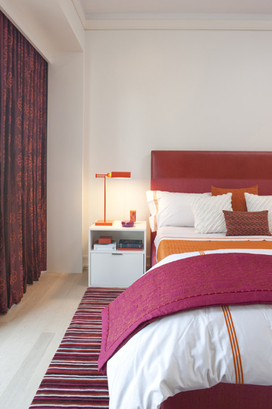
 This room turns it around and focuses on a rich magenta with smaller pops of orange. Do you think the headboard is dramatic enough or would you like to see a big piece of art over it?


Do you fancy one of these?

Living rooms


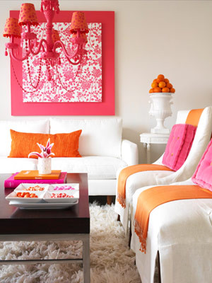
 Lots of white to play with these two vibrant colours. I'm longing for a little more pattern, perhaps a stripe with a third colour thrown in to replace the pink cushions. 

Here are some choice....


I would go for the purple one. How about you?
 
 While we're at it what let's think about the white vase... Hummm...

Choose one.  No matter what pillows you choose there's a vase that works.

  Can a room be over matched?  YES!


Deeper pink leaning toward red with just hints of orange give a totally different look.  In this room a neutral tan  in varying values serves as a backdrop to the vibrant colour. I like the fact that this room is not too over matched.  Lots of pattern in the pillows.


Simplified Bee®: Sweet, Modern Pink & Orange Nursery Room for Baby...

Wednesday, May 2, 2012

10 Tips for decorating a small living room

It's a fact that  in many of today's new home builds, either your living room or family room will be a smaller  room.  There are many things that can be done to help visually enlarge smaller spaces. There are ways to use darker colours and larger scale furniture in smaller spaces, but their successful use takes a trained eye.  If you want to decorate a small room  with confidence the following ideas are easily applied. 

1.  Choose light  furniture with simple lines

light furniture small living room
Houzz
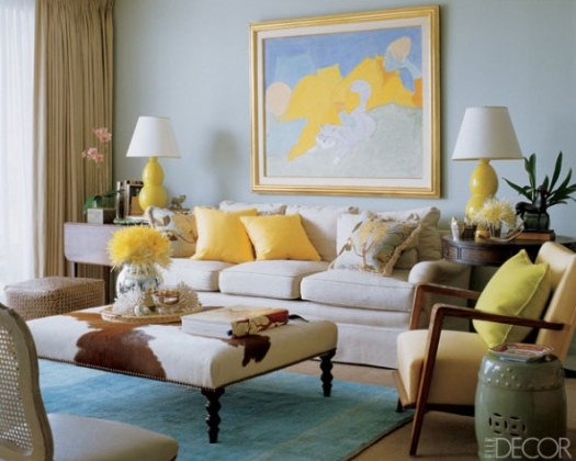
There's only one thing I would change in this room. With everything else  so light , I find the darker wood of the table somewhat harsh.  Something lighter would be more cohesive
light furniture small living room decorating advice

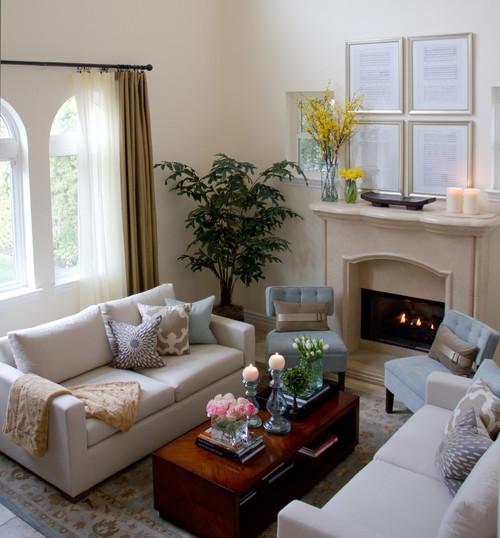
Choose furniture first and look for pieces that are light in colour and have legs. Lighter colours occupy less visual weight and legs provide an unobstructed view of the floor, allowing the space to appear more open.  Coffee and end tables in metal and glass also allow the eye to move through the pieces consuming little visual space while dark wood furniture has the opposite effect.  The cow hide ottoman above works because it is overall light and has great legs. It also serves to connect the tones of the wood pieces in the room.

2.  Choose a lighter colour scheme 

light furniture small living room decorating advice
 Maria Killam

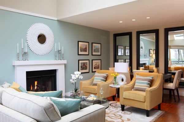
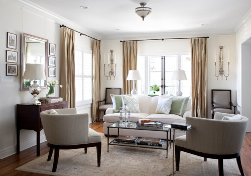
 Neutral colours mixed with  lighter shades of blue and  green  work well in a small living area.  Cooler colours recede  thus giving the impression of a larger space. . Use hints of  brighter colors in  accent rugs or pillows. The golden accents above warm up this space.  Small spaces work best with a three-color (or less) palette as in the room above.  If you love texture consider using a monochromatic scheme.   Bare  wood floors in lighter wood tones also add to a clean, flowing feeling.  Dark floors have the opposite effect.  Unfortunately the current trend for darker floors often causes many problems including closing in a space. The dark mirrors at the end of this space enlarge it.  Which leads me to ...

3.  Use mirrors effectively

mirrors small living room decorating advice
Mirrors can make a small space look larger but it's not that simple.  They function best by reflecting light. That can be the light colour of the wall or refleced  light. Be aware of what gets reflected in your mirror by standing in different positions in the room.  I have seen mirrors actually decrease visual space because they reflect the wrong things.

4.  Emphasize  vertical lines  

verticals in small spaces decorating advice

verticals in decorating a small space

We often forget that a room has a vertical axis. Add things to the space to encourage your eyes to move upward from the furniture.  Floor lamps, large vases with tall twigs, full length draperies, long  mirrors, vertical paintings or stacked paintings, mantles, tables with multi- layered  arrangements etc. are possible choices.Did you notice the large mirror on the end wall?


5. Match the furniture to the scale of the  room  

small scale light furniture decorating a small living room tips

If your room is small, choose smaller scale furniture.  Armless chairs, apartment size sofas, small sectional etc. will make the room appear  more spacious. Consider a bench rather than a conventional coffee table or a glass or lucite table as in #4 photo.  Don't get carried away with this and  end up with  clutter by using too many small items.

6.  Choose multifunctional furniture  

 small Living Room decorating tips

 One of the best ways to deal with limited space is to choose  dual-purpose furniture, e.g., a pair of ottomans can double as coffee tables, with storage inside; coffee tables with a lower shelf can hold baskets, books, covered boxes for storage; consoles with doors make tidy hiding places, bookshelves used as a sofa table when you can't walk around the sofa, etc.   

7.  Build in storage 


Give a small space  character and maximum function with a bank of custom-built cabinets in a light colour.  Built in cabinets and shelving triple storage options.  Keeping the colour of built ins light will increase the visual space. Arrange objects on open shelves in an artful way.  Leave lots of open space and vary the sizes and shapes of decorative objects. 

8. Harmonize  large pieces of furniture

harmonized furniture small space decorating

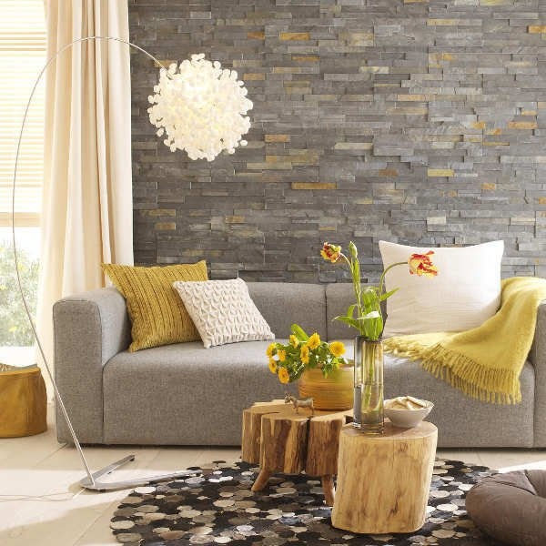
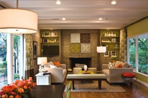
If you have a  sofa or sectional that you need to keep and it dominates the room,  paint the walls  a shade that is just a bit lighter than the upholstery . The eye will move  across the room rather than sticking on  the sofa. In the room above a stone wall harmonizes with the sofa and the warm yellow from the wall is picked up as accents.

9.  Control clutter

clutter control small spaces

Find interesting ways to store the objects that are needed in a room, e.g.,  storage cubes, baskets, covered decorative boxes, ottomans, etc. This room has a lovely wicker basket which serves as an end table.  On the shelf  is a fabric covered box and the coffee table has a lower shelf which can be used to store books, boxes, baskets etc.Sometimes the more space you have the more objects you accumulate. Keep shelving organized.

10. Layer lighting

layer lighting small spaces

Lighting is important in any room but even more so in a small room.  Keep window  treatments light and airy so that the natural light can shine through or have drapes that can be pulled back to let the light flood in. . For evenings or when there is minimal natural light use additional lighting to maximize each area of the room. A dark corner is a great place for a floor lamp or an accent table with a lamp for reading.   Wall sconces take up little space and can be used to highlight a certain areas of a room. Lights over artwork add an additional layer of brightness and highlight the artwork.  I try to have at least four  levels of light in a room- natural light, dimable ceiling lights, floor lamp or sconces, and  table lamps. Do a visual check to see if the four corners of your room have adequate light.

Many of these ideas will work in much larger rooms too.  The most important thing to remember is to select furniture that is the right scale for the space you are decorating. 


Sunday, November 27, 2011

Choosing great end tables


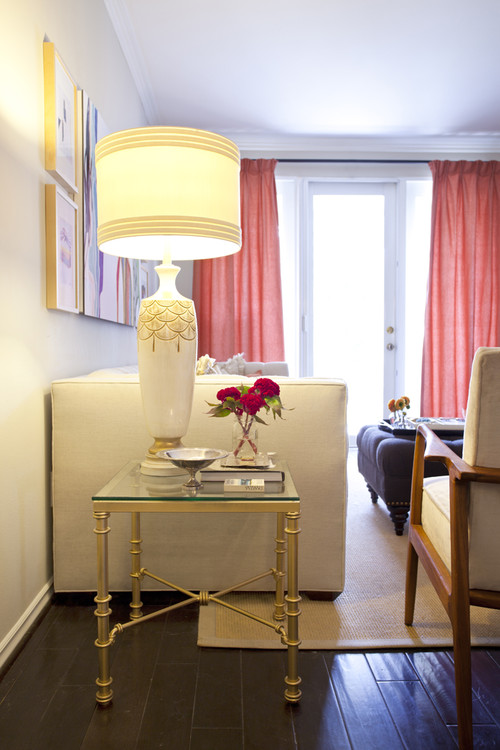
It requires a lot of patience to find the perfect end tables for a room. These tables are  part of your overall room design and you should follow some general guidelines to make sure they don't distract from your focal point or create too much conflict with everything else that is going on in the room. It's a delicate balance between your personal preferences and basic standards of design.

 Do end tables have to match the coffee table?

NO!  Having three tables in a space all matching sounds like a recipe for boredom in my opinion.  I know it's easy when you buy a set and  I know many homeowners opt for this solution, but I like a more curated look where each piece has obviously been given careful consideration and chosen for the space.  It is important that the pieces harmonize in the space or provide an impact whichever you are going for.

 Glenwood Residence contemporary living room


In this room the end tables match each other and are light and airy which is in  opposition to the coffee table which is upholstered and dark. While they don't match the whole room is harmonized.

Glenwood Residence eclectic living room

This is another living room design by Tobi Fairley which has matching end tables with a very different coffee table. I would argue that the end tables, while very interesting  in the overall design scheme, are too high.  I could see more than one elbow smacked on these! That leads to the second consideration.

  
What's the perfect height for end tables?

 By function an end table is usually placed by a chair or sofa and you have to lift your arm over the arm of the furniture to lay something on the table.  Remember function first.  They also need to be tall enough to provide a base for a lamp which should be a reasonable height to shed light.  24 - 26" is the usual  the  height of an  end table (some are as tall as 30in.), but the chosen table should work with the proportions of your other furniture.  A simpler way to say this is have your tables just  below the height of the arm of the sofa/chair. But these are guidelines. The round table in the room below is taller than the chair but doesn't look out of proportion with the other furniture.

While at CHil Design Group contemporary family room
 There are  also four different types of tables in this room and it doesn't look disjointed  because they are all in the same wood tones. When you have this many tables, a mix of shapes is imperative.  Some should be round  to play against all the rectangles.

Domicile id contemporary living room
Domicile Interior Design

 While this is a lovely room, I personally find the end table too low for the high arm on the sofa.  You would have to reach way up and then down to place a drink on the table.  The lamp is also overpowering the table.   Tables and lamps have to work together, but that's a topic for another post. 
 

 Strictly speaking this is a side table, but the same principles apply to its selection. These nesting tables work beautifully with the lines of the chair.  I like the use of the floor lamp with this vignette rather than having an overpowering lamp on these delicate tables.Threes always make interesting pairings.

How do you choose a style/shape/colour?

Your end tables can match the style of your other furniture or they can make a statement by having a dissimilar style. There are many ways to go when choosing shape. A square shape is a good connecting piece when you have sofas or sofa and chair at right angles to each other.  It fits into the shape well and creates continuous flow.    Some may find it too continuous and seek out a round shape to soften the look.  

If you have soft furniture with rounded lines, a table with clean, straight lines adds variety to the look. The colour should be different enough so that it stands out from the floor colour.   If you don't plan to invest in an area rug on hardwood floors, choose tables that are lighter or darker than your wood floors. This is one of the biggest mistakes homeowners make when choosing  tables of any kind. I call it the disappearing furniture syndrome.

Tuesday, October 25, 2011

It's all about scale

  In recent weeks I've spent quite a bit of time looking for coffee and end tables for clients.  Getting the style and size right to work with the rest of the furniture in the space takes quite a bit of juggling and an  understanding of standard  furniture sizes.

The standard height of a coffee table is between 16 - 18 inches, but some can be as high as 21 inches. How do you know which height to choose?


The answer relates to the height of the sofa/ chair. I prefer to see the coffee table about the same height as the top of the chair cushion or one or two inches lower.  The length of a coffee table is usually about 2/3 the length of the sofa not including the arms. Don't forget that you need at least 18 inches (24 is optimal) of space for your legs between a coffee table and the sofa.

 The size  of your coffee table should work with your sofa and other furniture in your room. It should also work with the size of the room overall. Let's check this out.
 

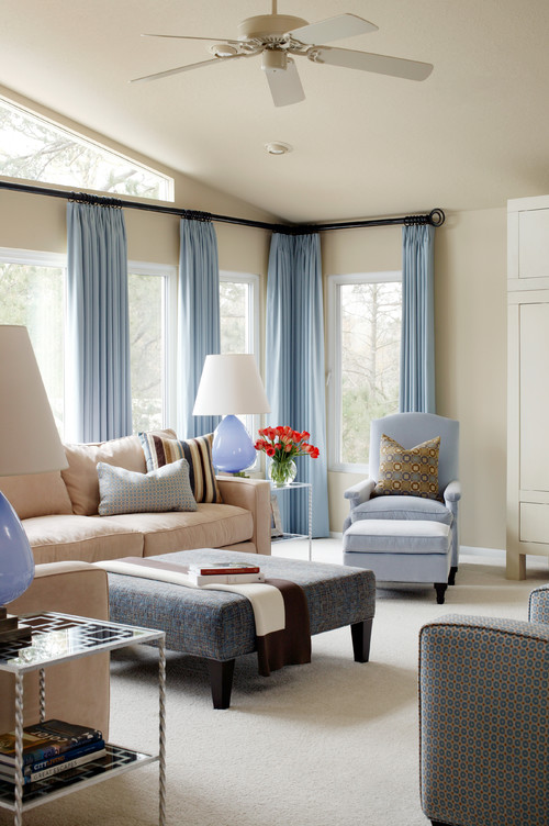
How do you feel about the coffee table choice in this lovely room?  I would like to see something longer (remember the 2/3 the length of the sofa rule). This little beauty is having a difficult time holding her own with this sofa.


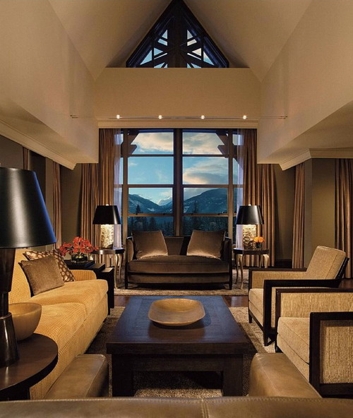
The soft colour scheme and small scale furnishings  in this room  appear overwhelmed by this large, dark, and tall coffee table, but I really like the table.  Sometimes the weight of a table is influenced by the colour and material choice not just the overall dimensions.  Darker colours and solid woods tend to look more visually weighted.

Grisell Navas contemporary living room
Grisell Navas

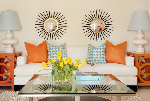
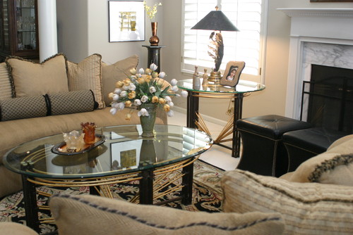
Don’t forget the size of the room when thinking about scale. Glass tables work well in smaller rooms because they give the impression of lightness -  space is not blocked out.

dakota contemporary living room

 Even with two tables this room does not look over furnished.

Great Room traditional family room

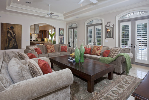
If your room is spacious and/or the furniture is large in scale, choose heavier wood tables or ones with lots of  tiers or drawers.

Willowgrove Living Room contemporary living room

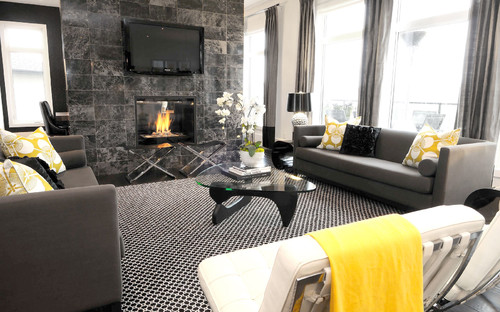
This is a beautiful room with a colour scheme I'm partial to. Does the coffee table work for you?  I wouldn't want to try to place something on the table while sitting.  I'm such a stickler for function!
Gambar Belangkas