In a home theater the TV is king, but in a smaller space meant for family living it needs to know its place. If you want a TV to be the focal point in a room you certainly don't have to work at it because it is big and black, commanding attention through scale and contrast. I must not be the only one who feels this way because questions about where to put a TV continually crop up with clients.
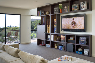
These dark bookcases provide a frame for the TV and it is tucked nicely into other aspects of the room. I don't know why so many TVs have shiny black frames! Then you need an equally dark wood to balance it.
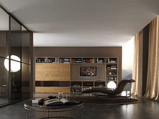
Finally a gray/silver frame. This is a similar set up, but I personally prefer the overall lightness of the bookcases and TV within it. If you use a similar set up it is important to leave open space around the TV.
Consider placing your TV on an entertainment console. In this way it is visually part of the structure. Your neck will also thank you for your efforts. Continually jutting your chin up in the air to watch a TV hung too high on a wall is not healthy for your neck. Then there's the practical aspect for people who wear bifocals.When you tip your head up you are looking out through the wrong part.
In a minimalist decor, the TV is often treated starkly. The white framing which stands out from the wall makes it look like a picture. The extra storage behind is very functional.
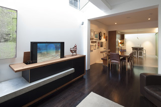
Here's another modern solution where the TV is treated like another accessory and the black banding on top and bottom connects nicely with the TV. The stacked art/photos replicate the rectangular shapes. Very pleasing overall.
And there you have it- installment 2 on that pesky TV. Hope there was an idea you liked.


