Showing posts with label design solutions. Show all posts

Thursday, November 28, 2013

8 Ways to fill empty corners

The four corners of a room are often a no man's land when it comes to design.  I am not saying that you have to fill up every corner with something, but I am advocating thinking about your space to determine if  it might need to look more "fulfilled". Here are some of my favourite solutions:

Art 


8 Ways to fill empty corners
Using Art to fill an empty corner
Margaret Ryall

 Usually you can't walk right up art you place in a corner,  so choose something that can be read from a distance. This lovely matted and framed wood sculpture is stunning for corner purposes.  It brightens up the space, fills it nicely, provides a backdrop for the dark table and lamp base and is a bit of a conversation piece. I was so excited when it was hung on my clients' wall.  


 using art to fill empty corners

This colourful mid century modern space needs art work to match.   It creates another layer for the space that invites the eye to roam and then return to the equally colourful lamp and chair. 


 Round table and two chairs


two chairs round table  in  corner
Houzz

Round tables are great for corners because they allow you to fill the awkward space and at the same time move your eye around so you don't get stuck there visually. The addition of the lamp provides the third height thus creating a more interesting design.

Tall  floral arrangement


round table and ottomans foyer

 When you have the height why not go for it and use something tall to fill the space.  Again a round table is the mainstay for  this foyer area. 

 Built in bookcase 


corner bookcase workspace
Vicente Burin Architects

This beautiful set of bookcases  tucks effortlessly into a corner.  The colour adds to the whole space and the minimal arrangement of objects and books ensures it isn't too busy. 

Chair and floor lamp 

 
vignette chair ottoman lamp corner
 Cravotta Interiors

A round floor lamp behind a chair is a perfect and quite functional solution for a corner. 


chair ottoman floor lamp in corner
 Houzz


In larger spaces the addition of a round table helps to fill the corner and provide variety in heights. 

 A  workspace 


desk chair art in small space
Siemasko + Verbridge

Tidy and interesting  art too. 


built in office desk under stairs
  Leslie Goodwin Photography

Or perhaps a larger space to make use of a corner under a stairs.  


 built in  workspace desk in corner
SchappacherWhite Architecture D.P.C.

Large scale vases/urns


large urns in dining room
InHouse Design Studio

Sometimes you need a certain something to complete a design and these two large scale floor vases do just that.  Imagine the space without them.  


large vase with greenery and sticks kitchen

 This arrangement is not in a corner, but it very well could be.  Rather than bamboo you could use birch sticks if you wanted a more rustic look.

 Corner mirror and two chairs


corner with two chairs table and mirror

Love this solution because it expands the space making it seem like it goes on forever. The glitz and sparkle doesn't hurt either . 

Then there's tall plants, built in benches, screens .... The list is as long as your imagination.  Do you have any bright ideas for filling corners?

Saturday, November 9, 2013

Design Solutions: A bed between two windows

Work is keeping me quite busy over the last several weeks and blogging always drops off when this happens.  I'm beginning a series of posts called Design Solutions that will  address common design issues that often crop up when I work with clients.This is a great way for me to come to  terms with options and at the same time it provides a written commentary that I can send clients to in the future.  If I can help my readers in any way, it's a bonus.

Being a lover of asymmetrical balance, I can't explain why I am so attracted to the placement of a bed between two windows.  But I am. The windows become part of a larger design tableau in such instances, and the whole wall must be considered as a unit including headboard, night tables, lamps, table vignettes, art, window treatments and bedding.   Here are several guiding principles to keep in mind.

 Keep it symmetrical


When you start with a layout that is symmetrical, it works best to continue using this form of balance in your design .


Consider  your headboard shape when choosing art

  No headboard

 The height  and shape of your headboard will dictate what you place over it .  When you have no headboard you have to choose something that will fill the space well, and circular shapes with lots of texture and warmth are brilliant.

High headboard

The pillows act as  the center of interest in this layout of high headboard framed by draperies.  No art is needed.


Many designers are attracted to  groupings of three objects (art) between two windows.  This is an option, but not one I usually advocate.  When there are too many rectangles my eye craves  something curved or solid. In this room  the art reaches the top of the windows filling the space in between thus making the windows, headboard, and art one large rectangle. 

Low headboard
Design Solutions: A bed between two windows

This is a beautifully designed space, both elegant and simple at the same time.   The headboard  is low and the six art works fill the space nicely.  It is always interesting how you can depend on one element or principle  of design to  negate problems with another one.  With all the lines in the windows you might expect  that 6 pieces of artwork would be overkill in this space.  Not so here.  The dark frames and lines in the romans make the window lines almost unnoticeable. Contrast always wins when vying  for attention.  The curves in the spectacular roman shades also provide some relief from all the rectangles.  I rarely hang roman shades from the ceiling, but in this case it works especially well.

Curved headboard

It is difficult to hang art over a curved headboard; it is often best to let the curves be the statement.  In this room a spectacular light fixture adds additional visual interest to the larger vignette.


And the exception to the rule... there's always one!  The lamps fill in the curves and the three pieces of art look especially good hung in a straight line.  It doesn't hurt that there is a circle in the headboard. The art is light and the bed becomes the center of interest in the room.


 Follow the lines of your curved headboard to place three pieces of art....


or use a round mirror or sculpture at the top of the curve.


Use window treatments to frame the bed


My preferred solution for a window treatment on matched windows is draperies.  They soften all the hard edges and make great frames for the bed and the night tables. Think about your table colour when choosing your drapes.  The tables should stand out not disappear. Yes, I would change the black, wrought iron rods! Love the simple pillow arrangement and circular mirror.


Consider using blinds behind draperies for privacy. and be adventurous when mixing designs  in the space. I think this combination works well because all the  patterns have the same colours.


Hanging a drape on the outside edge of both windows and using a shade of some sort is another option for a window treatment .  This solution opens up a small room and gives the bed more room to breathe.    The shades are the centre of interest in this room because they are so dark. Patterned fabric adds another element of interest.   I love  round night tables when there are two windows because they serve to soften all the straight lines.

If you want to maximize visual space keep your shades and drapes light and matching. Be careful when you choose rods for your window treatment.  Rods are functional and to my mind they should blend into the decor not make a statement that draws your eye upward. There's nothing else black in this whole room so why choose black rods? Check out a previous post on Choosing Rods.


Romans are simple and linear.  You would never call them soft, but they can frame a bed nicely when they are used in conjunction with tufted or other luxurious materials in a bedroom.  By choosing a simple monochromatic scheme these romans serve to move your eye around the room and allow the white window details to frame the bed.  The white art is a repetition of the the frames. 


 And why not make your window treatment the focal point in the room? Overload on draperies.


My parting comments:  This small  monochromatic space maximizes design in every way. If you want to put three art pieces above the bed it works best when there are soft draperies on either side.  The simple images and large white borders connect with the white bedding and lamps.  The larger white accessories are simple and perfect.   The dark furniture anchors the space and I don't even mind the black rods!

Links to all images can be found on my Pinterest board Bedrooms.

Sunday, October 14, 2012

Do you have a problem room?

We all have them, those rooms that defy all you know about design, and just continue to go about their merry way creating problems no matter what you do with them. I managed to create a monster a quarter of a century ago right  in the middle of my house because  my mind was focused on other things at the time. I've spent the intervening  years trying to make my dining room "right" by my standards - I haven't achieved that yet. 

No one has ever walked into my house and said "OMG, what a mess this dining room is."  So what's wrong with it  in my eyes?

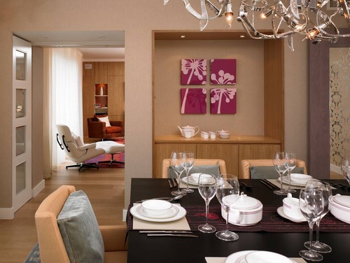
Location:  When you're standing in my entry  you look directly into the dining room.  The archway frames the table and the window.  It is also a walk through space from the living room  on the right  to the kitchen which is to the left.

 
There is an alternate hallway beside the stairs, but we never go that way. My dining room is the room in the middle with no identity. Because the walkway needs to be maintained  only half the room is really accessible for  the table - problem #1.

I noticed another problem when I looked at this photo but it was easily fixed. Can you spot the fix?

Across from the table looking  toward the front porch. 
Top art work by Angela Antle and bottom by Anita Singh

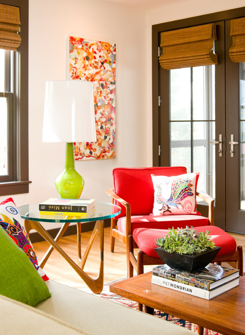
A second artwork was added to connect with the chair below it. Doesn't that look better?

Furniture: The dining room buffets, table, and chairs were handcrafted, especially for me, by my man who can do anything.  The set has that "casual contemporary with a nod toward mid -century modern look" that I love.    The scale and style fits the room and the buffets are nicely tucked away behind the table.  Have you noticed problem #2 yet?

A rather dark  view  from the living room.  Thankfully the railings aren't that orange!

You're right! The furniture is the same height as the railing causing your eye to run along the lines and never go anywhere else. I've used all my tricks to make it otherwise, with minimal success. Note all the verticals - floor lamp, tall twigs, candle sticks, vertical artwork, accentuated vertical windows in living room.  The strength of the horizontal lines and the preponderance of wood wins out every time.

Flooring and railing
Problem #3
The aged oak is so orange- my least favourite tone in wood. Because I can't rip it all up or throw away the furniture, I've decided to embrace the orange  and pick it up in interesting art works that also have lots of purples and blues to tame down the orange.  

Problem #4 
Because the furniture is in one half of the room, there isn't enough space  for an area rug which would keep the furniture from blending into the floor.  If I wanted to use an area rug I would have to cover most of the floor, but that would mean vacuuming;  I would rather use a dust mop! 

Problem #5
I have a love/ hate relationship with the railing.  It is solid wood, has a good design and fits with the age of the house and our design aesthetic. I have strong feelings about maintaining "period "architectural detailing and the railing is necessary because the living room is sunken.  But it is soooo difficult to ignore that orangey railing..  It didn't look like this in 1986.  Time ages wood to either orange or yellow especially when treated with oil based products.  


Lighting 
Problem #6

The light fixture was an impulse buy  because I liked the lines,  but its scale is too small, and it is hung too high in my efforts to make sure you could see the painting at the end of the room.   As an artist, art always takes precedent over every other design  decision in my house.  This often leads me into hot water.

Wall colour 
Problem # 7

You may be thinking at this point why doesn't she have the walls pained a cooler neutral.  Can't happen because the living room, where most of the light comes from, is north facing and the house next door blocks off any light in the dining room.  Both rooms are dull and cold.  The living room is  Elephant Tusk OC 8 Benjamin Moore and the dining room is Light Khaki  BM 2148-40.

Window treatment
Problem #8 
I love these back tab drapes for the subtle design and their softness,  but the necessity to crop them to allow for the buffet further emphasizes all the horizontal lines. I also think I should have a window treatment that covers the window in some way so you can't see the wall of the next house with is very close to the window and certainly not interesting.

Matching set 
Problem # 9
I have an aversion to matched sets of furniture and here I am living with just that. Matching always looks so uninspired in my eyes and gives the appearance of laziness.  Like you couldn't be bothered to put the room together.  Yes I like a curated room and I have a bundled set!

I'm sure if I really tried I could find a Problem 10.  Many of you may feel it is the lack of cove mouldings, but that again is not part of the architectural details of the original house. 

 Well that about explains the problems. Who knew there was so much wrong with my dining room?  Most of my friends would be very surprised by this analysis!  In the next post I'll look at some possible solutions.  If you have anything to suggest that might help with my design dilemmas, I'd love to hear from you.


Tuesday, February 7, 2012

5 +1 Design Solutions

Every home has challenges- not enough  storage space, oddly shaped rooms, nowhere to put the TV etc.  There is always a good design solution for every problem. All it takes is patience to look for the solution or some thought to figure it out yourself.  Sometimes the solution is a mixture of the two.     Do any of these ideas help solve a design problem in your house?


 No  space  for a desk

 
 Pinterest

So you think you have no room for a small desk in a room.  I love this idea of a fold up desk that turns into a framed art work.
  
Space too open


A floating wall of this type serves to partially separate a space while adding a place  to locate furniture.

 
No wall for a TV


                                                                    Pinterest

What about no wall space for a TV?  This happens in many open area homes, but there are solutions as you can see. 

No space for a buffet


Sometimes taking space from another room or a hallway is an option.  This buffet fits perfectly into a small space. 

Small foyer

Pinterest


When you have a small entrance space consider fooling the eye by using a large mirror and layering furniture in front of it.  This sleek table accepts a bench below it very nicely.  It looks good but the bench is also functional.

Looking for a home office


This is such a great solution for a small space.  The trunk can do double duty as a coffee table and a space to lay your laptop when the lid is closed


t

Tuesday, December 20, 2011

Design solutions: What do I do with the TV?


 Here I go again ranting about my favourite pet peeve in home decor- TV's! I'm always collecting ideas about this design dilemma.
 
In a home theater the TV is king,  but in a smaller space meant for family living it needs to know its place.   If you want a TV to be the focal point in a room you certainly don't have to work at it because  it is  big and black, commanding attention through  scale and contrast.  I must not be the only one who feels this way because questions about where to put a TV continually crop up with clients.

Family room contemporary family room

These dark bookcases  provide a frame for the TV and it is tucked nicely into other aspects of the room. I don't know why  so many TVs have shiny black frames! Then you need an equally dark wood to balance it.

Media Unit 002887 modern media room

Finally a gray/silver  frame.  This is a similar set up, but I personally prefer the overall lightness of the bookcases and TV within it. If you use a similar set up it is important to leave open space around the TV.


Consider placing your TV on an entertainment console.  In this way it is visually part of the structure.   Your neck will also thank you for your efforts.  Continually jutting your chin up in the air to watch a TV hung too high on a wall is not healthy for your neck.  Then there's the practical aspect for people who wear bifocals.When you tip your head up you are looking out through the wrong part. 


Newtown Terrace contemporary living room
 Crawford Architects

  And my most favourite of all is the magic disappearing TV!

 source

In a minimalist decor, the TV is often treated  starkly.  The white framing which stands out from the wall makes it look like a picture.  The extra storage behind is very functional. 


Here's another modern solution where the TV is treated like another accessory and the black banding on top and bottom connects nicely with the TV. The stacked art/photos replicate the rectangular shapes. Very pleasing overall. 

 And there you have it- installment 2 on that pesky TV.  Hope there was an idea you liked.

Gambar Belangkas