Showing posts with label art arrangement. Show all posts

Friday, February 14, 2014

Thursday Tip # 12- Art above the sofa

Do you have  one big blank space above the sofa?  Are you wondering how to fill it?  If the number of questions I get about this is any indication there are lots of question marks out there about this topic.  Ta da... answers.  I  introduced this topic a little in last week's Thursday Tip  when I discussed scale, but I wanted to give more formatting options this week. 

 This is an area where there are lots of thoughts on how to and how not to hang art for best effect.
My guideline is to think about ways to fill at least 2/3 the width of the furniture. It is often difficult to find large scale art so think about pairings of various types.  It also looks good if your art expands to the edges of the sofa.  Once you go beyond  sofa width the art starts to look very top heavy and the sofa  is diminished. You should also consider the height of the art.   Remember it is a long way to the ceiling so refrain from work that is only twelve or 14 inches high.  It will look lost even if it is long enough.

I have to thank  Interiors PL    for creating this great graphic that provides many options for what to hang over a sofa.

 ideas for hanging art over sofa
11 options for hanging art over a sofa.

My favourites in these options are  4, and 6-11.  They all fit the guidelines I discussed above.  1 and 3 are my least favourite because they don't fill up enough space for me.  I like 5 because it is asymmetrical  and I could balance this placement by adding things on the left of the sofa to create a pleasing balance. Richard Mishaan discussed  another aspect of asymmetrical placement in a House Beautiful post.


design tip hanging art assymetrical
Why asymmetrical layouts work

Here is the same idea expressed in one of my painting compositions called Breathe.

ayssemetrical composition acrylic painting Margaret Ryall
 Margaret Ryall, 2004, Breathe, acrylic on canvas, 12 x 24in.

 Are any of these options wrong?  Not really.  There are only guidelines in interior design,  no right or wrong. 

Do you have a favourite way to arrange art above your sofa?  Please share.

Thursday, February 6, 2014

Thursday Tip # 11 - Art and space

After a long hiatus I am back to Thursday Tips at the request of a reader who liked these short and to the point tips for "small improvements that have big impact".  For this week my favourite topic - art.


The biggest mistake made when hanging art is not matching the size/shape of the art work to the space you are hanging it.   Work should look "comfortable" in its space not cramped or looking like it is awash in a sea of wall.

art vertical space
Layout follows vertical space

 hanging art console
Long console needs substantial work to fill space


hanging art stairwell
Perfect  size and composition for top of stairs

hanging art bedroom
Size and shape  works with width of headboard


hanging art sofa
Art shape and size  follows wall shape

And there you have it.  Large works for large spaces or smaller works massed together for impact.  No little pieces lonely on a big wall.  No large pieces squat into a small space.  Oh, did I mention I have a lot of opinions on gallery walls?  I'll save that for another tip.

Sunday, January 26, 2014

Leaning art: 4 Guidelines to make it work

Art warms a home, makes it interesting, provides topics for conversation and contemplation , adds colour,  the list goes on indefinitely.  There are various ways to display art; some are more successful than others.  One option is leaning  art against a wall rather than hanging it, but this display option isn't always successful for a variety of reasons.  If you want to try leaning art, consider the following factors.

1. Scale - Choose artwork large enough to read from standing or sitting  position


leaning art

 
 The size of a piece of art in comparison to the space and objects around it usually determines successful placement. This painting fits the bill perfectly.   

leaning black and white large scale art
 Large scale images work best

source
When you want to lean work on the floor it needs to be large enough to observe from standing position and bold in imagery so it can be read at a distance. Even the dog get this!
 The photo on the right works better than the  the art to the left of it because the image is tiny. 


large leaning abstract art dining room

Perfect scale and beautiful work that can still be seen and read while sitting or from other areas of the room. 

simple black and white composition leaning art
Bold form and simple composition

source
The boldness and simplicity of this painting  make viewing it easier when leaned on the floor.  The objects in front of it enhance the placement and help to anchor it safely. They do not interfere with the reading of the image. Which leads to the next guideline...

2. Layering: Don't cover major parts of an artwork

abstract leaning art with chair
Successful layering

source
Layering other objects in front of an artwork is a tricky business.  This vignette is successful because the image is large, dark and has quite a bit of space where there are no details.  The chair and table lie in areas without too much detail.  You don't feel as if you are missing  important elements of the work. 

large leaning artwork behind table
Do you want to remove anything here?

source
There are so many things about this vignette I love, but I want to see all of the artwork and part is hidden by the table and books.  Even removing the books would help things considerably.   Love the candlesticks and the table, both really work with the artwork.


leaning art on mantle
Successful layering where each image is clearly seen.

source
 Layering art on shelves, consoles, and mantles can be very interesting. It is a way to display smaller pieces  to good advantage.  While this is a very simple vignette with the branch acting as a consolidating element, it is possible to have more complex collections of objects.

3. Colour scheme:  Restrict colour combinations in  leaning gallery display

 
gallery wall limited colour scheme
Limited colour scheme provides cohesion

 There are lots of small pieces in this display but they read as one unit because of the colour cohesiveness.

4. Image: Choose the right image for the space

red airplane leaning art
Art with simple bold form


I think the work that layers best in a vignette has bold form and colour.  It can compete with the other objects for your viewing attention.


Now it's your turn.  What do you think of this arrangement?

 framed art leaning


Saturday, November 9, 2013

Design Solutions: A bed between two windows

Work is keeping me quite busy over the last several weeks and blogging always drops off when this happens.  I'm beginning a series of posts called Design Solutions that will  address common design issues that often crop up when I work with clients.This is a great way for me to come to  terms with options and at the same time it provides a written commentary that I can send clients to in the future.  If I can help my readers in any way, it's a bonus.

Being a lover of asymmetrical balance, I can't explain why I am so attracted to the placement of a bed between two windows.  But I am. The windows become part of a larger design tableau in such instances, and the whole wall must be considered as a unit including headboard, night tables, lamps, table vignettes, art, window treatments and bedding.   Here are several guiding principles to keep in mind.

 Keep it symmetrical


When you start with a layout that is symmetrical, it works best to continue using this form of balance in your design .


Consider  your headboard shape when choosing art

  No headboard

 The height  and shape of your headboard will dictate what you place over it .  When you have no headboard you have to choose something that will fill the space well, and circular shapes with lots of texture and warmth are brilliant.

High headboard

The pillows act as  the center of interest in this layout of high headboard framed by draperies.  No art is needed.


Many designers are attracted to  groupings of three objects (art) between two windows.  This is an option, but not one I usually advocate.  When there are too many rectangles my eye craves  something curved or solid. In this room  the art reaches the top of the windows filling the space in between thus making the windows, headboard, and art one large rectangle. 

Low headboard
Design Solutions: A bed between two windows

This is a beautifully designed space, both elegant and simple at the same time.   The headboard  is low and the six art works fill the space nicely.  It is always interesting how you can depend on one element or principle  of design to  negate problems with another one.  With all the lines in the windows you might expect  that 6 pieces of artwork would be overkill in this space.  Not so here.  The dark frames and lines in the romans make the window lines almost unnoticeable. Contrast always wins when vying  for attention.  The curves in the spectacular roman shades also provide some relief from all the rectangles.  I rarely hang roman shades from the ceiling, but in this case it works especially well.

Curved headboard

It is difficult to hang art over a curved headboard; it is often best to let the curves be the statement.  In this room a spectacular light fixture adds additional visual interest to the larger vignette.


And the exception to the rule... there's always one!  The lamps fill in the curves and the three pieces of art look especially good hung in a straight line.  It doesn't hurt that there is a circle in the headboard. The art is light and the bed becomes the center of interest in the room.


 Follow the lines of your curved headboard to place three pieces of art....


or use a round mirror or sculpture at the top of the curve.


Use window treatments to frame the bed


My preferred solution for a window treatment on matched windows is draperies.  They soften all the hard edges and make great frames for the bed and the night tables. Think about your table colour when choosing your drapes.  The tables should stand out not disappear. Yes, I would change the black, wrought iron rods! Love the simple pillow arrangement and circular mirror.


Consider using blinds behind draperies for privacy. and be adventurous when mixing designs  in the space. I think this combination works well because all the  patterns have the same colours.


Hanging a drape on the outside edge of both windows and using a shade of some sort is another option for a window treatment .  This solution opens up a small room and gives the bed more room to breathe.    The shades are the centre of interest in this room because they are so dark. Patterned fabric adds another element of interest.   I love  round night tables when there are two windows because they serve to soften all the straight lines.

If you want to maximize visual space keep your shades and drapes light and matching. Be careful when you choose rods for your window treatment.  Rods are functional and to my mind they should blend into the decor not make a statement that draws your eye upward. There's nothing else black in this whole room so why choose black rods? Check out a previous post on Choosing Rods.


Romans are simple and linear.  You would never call them soft, but they can frame a bed nicely when they are used in conjunction with tufted or other luxurious materials in a bedroom.  By choosing a simple monochromatic scheme these romans serve to move your eye around the room and allow the white window details to frame the bed.  The white art is a repetition of the the frames. 


 And why not make your window treatment the focal point in the room? Overload on draperies.


My parting comments:  This small  monochromatic space maximizes design in every way. If you want to put three art pieces above the bed it works best when there are soft draperies on either side.  The simple images and large white borders connect with the white bedding and lamps.  The larger white accessories are simple and perfect.   The dark furniture anchors the space and I don't even mind the black rods!

Links to all images can be found on my Pinterest board Bedrooms.

Monday, September 26, 2011

It's never perfect

There's room for improvement in most decors because perfection is difficult to create and every set of eyes will see a design in a different way.  I'm amazed by the discussion that ensues when several decorators look at the same photos of a project.  Often an  aspect of a  room that I will focus on may be ignored by someone else or one of my colleagues will bring up an aspect of the design that I didn't even notice. 

  Look at each of the photos below and see how you feel about the decor. You will notice a general theme of art work running through my commentary.That's because I feel strongly that art work can make or break great decor.   What do you think are the strengths in these rooms?  Is there anything that bothers you?  Is there anything you would change  (add or take away) if you could? Or is the room just perfect in your eyes?  Decide what you think and then scroll down to my commentary.  Did we focus on the same strengths and things that could be changed to improve the overall design?  Did entirely different things come to light for you? Remember it's opinion.


Number 1

A bed between two windows calls out for symmetry which this decor has.  The colour scheme that supports the light wood tones is very soft and  pleasing  which I predict would make sleeping in this room pleasant and relaxing. Given the overall symmetry of the room, I find the artworks above the bed begging to be lined up with each other.  Better still I would have just one piece hung since the second piece almost reaches the ceiling.  I crave  pattern for variety and it could be added in pillows , a throw and/or and with the addition of an area rug under the bed. I'm personally not fond of all the wooden furniture matching  and think that something more bench like  would work at the end of the bed.   The lovely cabinet could be moved to another room.

Number 2

I like this neutral bedroom that just sings with the splashes of orange red on the bed and in the art pieces above it. Any art work arranged in a grid interests me, but this bed seems to need larger pieces above it.  Even with the massing of smaller, brightly coloured  works, the scale doesn't work with the bed.  It's crying out for something with more visual weight. I bet there is another spot in this room where these pieces could be used to better advantage.

When choosing artwork for over a bed I like to see at least 2/3 of the linear space occupied. With a queen bed,  I'd aim for  two 18 x 20 or 20 x 20 inch works or one larger piece of approximately 40 inches in length. The higher the headboard the smaller the vertical measurement.  Something brighter and larger in scale could be added to bring more visual interest to the bedside table that is visible. While there isn't much pattern in this room, the little bit on the pillows appears enough for my tastes.

Number 3 
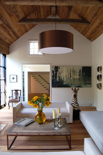
Shelter Island House #2 contemporary living room

The elements in this room are quite interesting, especially the inclusion of the yellow flowers that are beautifully framed by the doorway beyond.   The zebra is an unexpected touch and creates some pattern in this room which seems a little devoid of it. The two things I find jarring are the two pieces of artwork.  I want to line up the small piece on the left with the chair under it and the large piece on the right  is much too large for the space and looks awkward and squat. Sometimes this forced confinement of a work can be used to great advantage, but this work doesn't have that kind of imagery. I want to see it on a large wall which allows  breathing room all around it. The brown  light fixture  is  large, but it works because the room is vaulted and the dark colour connects with the wood on the ceiling.

Number 4
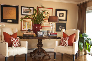
Room contemporary living room


Many times in our homes we have to use the furniture that is available  and arrange it to best advantage.  I think the table is such a piece of furniture.  It reads as just a tad too big to place between the two chairs, but thought has been put into creating  visual flow with red to connect the disparate pieces and make the vignette look inviting.  Your eyes have no choice only follow the pops of red that have been set up in the age old triangular format.  My one great annoyance in this room is the plant that obscures the art work behind it.  It is never a good idea to mount art work and then cover it up with the next layer of design.  Perhaps it is only me who has this pet peeve;  it might be the artist in me rising to the top.
 

IMHO... in my humble opinion. As I said, there's no one correct way to design a room and we all perceive a room differently.  Do you have any reaction to these rooms? 

Sunday, May 22, 2011

Displaying family photographs-2

Continuing with ideas for displaying family photographs...

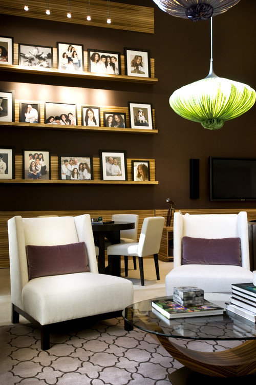
Use a photo ledge

NJ Residential contemporary living room

 CrystalTech - [ Roger Hirsch Architect ] eclectic living room
 Roger Hirsch Architect

I like the photo ledge, but I love the sofa/chair. 


 Make them part of a larger arrangement


source

How fresh the white and black photos look on the blue green wall. The tall tree like plant adds to the overall arrangement, however I find the photos a tad too close to the window trim.   


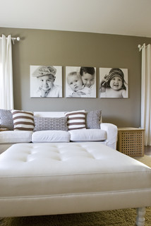
Print on large  canvases


 A grouping of squares always hang nicely together- much more interesting to my eye than rectangles.


Display without frames


source


source 

These frameless photographs are mounted on sturdy art boards and linked by small tape hinges  to create an accordion structure. This project displays well on a mantle, bookcase etc.

Memories traditional living room

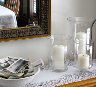
Don't these photos just beg to be handled/sorted/ looked at?  The crispness of the hurricanes and white cloths are a great juxtaposition with the untidy, "I just landed here" look of the photos.

Gambar Belangkas