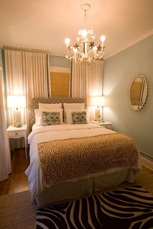
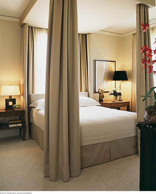
In some rooms that are narrow you can dress the window across the wall ending up with wall to wall drapes providing a soft backdrop for the bed. When the headboard is upholstered you have the option to layer various fabrics for a totally soft look. This solution can also rectify a window that is off centre.
houzz
Elements of Style
Elements of Style
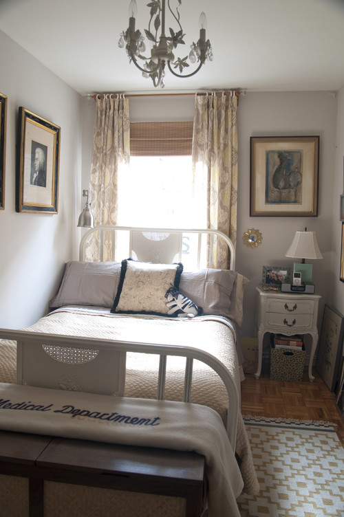
But sometimes a room is so small and the window is so off center you have to just accept it and line the bed up with the window and bring balance in other ways.
Elements of Style
An attic room is often a challenge to decorate because of the slanted ceiling and often lack of usable wall space. There's nothing like a pelmet and drapes to provide a picture like canopy for a bed. This room works well because everything is so symmetrical and the window draperies frame the bed perfectly.
If you need proof that you don't need expensive draperies to make this look work - here it is. The Roman shades do the trick and the strong verticals point at the bed and support the perfect symmetry of the placement . This is not a place were two different night tables and lamps would work.
The gentle curve of this headboard softens the look of the bed against all the horizontal and vertical lines. The vegetation outside serves as a gigantic landscape painting. If I were designing this room I would have played up the green angle to make the inside an extension of the outside.
Michael Merrill Design Studio, Inc
Sometimes a window can act as part of a canopy. This flawless design does everything right. Notice the bedside tables don't match and they don't need to. This layout is more about strong verticals than symmetry.


