Showing posts with label kitchens. Show all posts

Saturday, February 2, 2013

10 creative backsplashes

  While I let my imagination run wild in my art career, I stick to very conservative treatments in my home and  advise the same with clients.  I usually ask  two questions:
  1. Will you still love this in 5 years?
  2. How will  this  treatment affect  resale value?  
I know ... boring and predictable, but there you have it.  I think it's great that there are people who are willing to step into the abyss and let their creativity run wild.  What do you think of these?


Designer Drew Stuart placed his client's favorite Josef Frank fabric between two pieces of architectural glass above this stove.


You can have back painted glass in any colour. 


LouiseM is a French story-telling painter  who mixes pop and street art. This personalized  interior included  the names of the family members and their favourite foods and drinks.


Pebbles with dark gray grout.  


Wine corks with black and white art.


Great use for the defunct Canadian penny!  Busy for sure.  Working copper into a kitchen colour scheme could be a problem.


  Everstone is putting out uniquely shaped designs, from pointy shards to circular bubbles. Seems fitting for a backsplash!

A truly one-of-a-kind option, this colorful backsplash made with recycled skateboards is featured in a kitchen in the Lofts at Cherokee Studios multifamily project in L.A.


What about vintage bottle caps?

Monday, December 31, 2012

Are decor trends important?

I am interested in following the latest  trends in interior design.   I need to know these things to have relevant discussions with clients and to understand where the industry is headed.  Many  trends come and go without ever hitting the average home.


Colour of the year is a good example of a temporary trend.  Depending on which paint company your like, you will have a different colour of the year!   I use Benjamin Moore paint and this year the colour of the year is ....


 Lemon Sorbet 2019-60

This is an interesting fact to know, but I doubt this time next year it will make much difference  because there will be a new colour of the year.

 Then there are broader colour trends that seem to last for much longer, e.g., the change from beige/brown to grays as the predominant neutral in home decor.  This type of information  is  more important to be aware of because it produces whole palette shifts in home accessories including textiles. The  change to grays has moved palettes from warmer and earthy  to cooler and cleaner colours.

 Rather than the burnt orange/rust  of the brown/beige  era


 you will now find  a more true orange mixed with grays.


 Rather than olive/mossy greens of the brown era...


  you will find fresh apple greens.

You can have such wonderful pops of colour with grays and this is reflected in the vibrancy of home accessories available in the market place today. 

 Several years ago I looked for emerald green accessories for a client.  It was almost impossible to find any!  Pantone's colour of the year for 2013 is...


I find Pantone's colour predictions have more impact on fashion and home decor than those of specific  paint companies. This year you will have no difficulty finding emerald green accessories.

 It is important to keep up with trends that will  impact big ticket, relatively permanent products like hardwood, tile and cabinets.  You do not want to select something that will be dated  quickly.  Awareness of these trends does not mean you have to buy into them.  Sometimes choosing exactly the opposite is the the best design solution for longevity.   That is why it is wiser to choose  more neutral  long term items for your home.


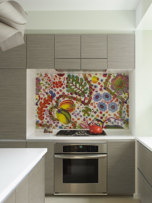
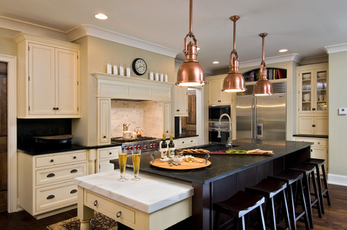
Homeowners  who jumped on the dark wood look  for kitchens will probably end up sorry for their selection sooner rather than later.     Extremes rarely work for long periods of time. I predict the patterned glass mosaic backsplash tile that is all the rage now  will have run its course soon too.


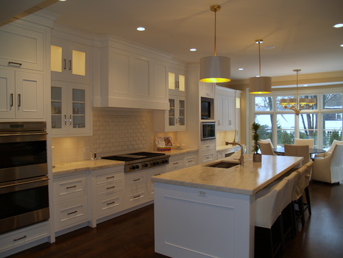
That's why classic soft white kitchen cabinets will always work. There are no extremes in this kitchen.   The style is softly traditional, the tiles are plain and the counters are  lighter granite.   I know it isn't everyone's cup of tea.  I am talking about what stands the test of time.

 
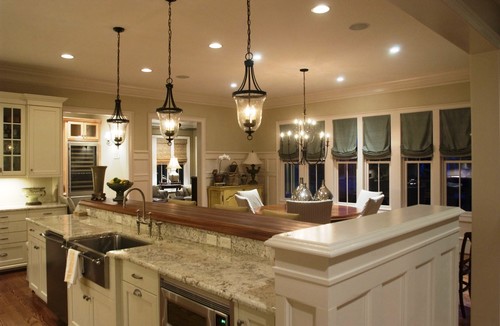
Staying with a traditional example, if you don't like white, consider a more mid tone neutral  or  ...


  mid toned stained  wood. 


Stay tuned for 2013 decor trends with staying power. 


Thursday, August 2, 2012

Can you mix metal finishes?

I love reader questions because they give  me a writing focus a post.  So here goes...

Can you mix metals in your finishes?  The answer is a resounding YES!!  You can also match all your finishes. I personally find that a  space can look  somewhat boring if you choose to slavishly match every metal finish, but that's me. I like harmony with some variety.

Marc Jacobs "Love Edge" Heart Bracelet shows that metals really do work well together.


Here are a few guidelines that will ensure that you have a cohesive look.

Work with what you like best
If you are renovating/ updating, choose the finish you like the best / is the most stylish and match to it. Be aware that a dull gold/brass look is trending right now as is chrome, and it may not be long before all that brushed nickel will have a new status.

Limit the variety of tones
If you already have things in silver tones (brushed nickel, pewter or chrome) consider mixing them with wrought iron or black finishes. Two to three tones would be the limit or you will end up with a hodge podge.

Connect with other tones in the room
In the picture below black is used predominately in the light fixtures while the faucet has silver tones and the handles are either pewter or brushed nickel, still in the silver family. Because black carries such visual weight it works best when there is something else black in the space to help anchor it.


Whitney Blair Custom Homes

The heavy black lighting fixtures in the previous picture would overwhelm this room because there's  little black in the space. The delicate application of black does not look out of place in the lighting.   


Many older homes have brass or copper fixtures that  look good  when paired with oil rubbed bronze or black. If you already have something that is dark in the room this is the tone you should select to supplement with. While copper and black breaks the keeping to the same tone guideline, it can work when you have other black furnishings.

Elaine Griffin Interiors

Copper in this space is paired with stainless steel and possibly pewter.  The copper is picking up the tones in the wood and your eye is moved around the space very nicely. It's all a matter of creating flow.


Gambar Belangkas