Showing posts with label pillows. Show all posts

Friday, April 17, 2015

Is it spring yet?

I don't know about you, but around this time of year my decor starts to look a little like I feel after a long, cold winter.  Tired and worse for wear.  I had the urge to bring some spring to my house; I tried, I really did, but mother nature had other ideas.


  I had visions  of something  like this  for my front containers with a bit of fake thrown in until the real thing is possible - that means late June here.

Source 

 I bought pussy willows and some  short, purple flowers to  add to the greenery that is there.  Unfortunately the current items from Christmas are still frozen solid.   I have  what survived the raging winds and snow of winter ....


I guess it will be red dogwood, Spanish Broom and pine for a little longer! The berries are long gone.


Then I thought what about a new wreath to hang over the containers.  I wracked my brains.  Do you know a spring motif that would look great with Christmas planters?  I  couldn't come up with one thing apart from twigs.  That wouldn't help my craving for colour.

 My only recourse was to take in my Christmas wreath in an effort to remove a little more evidence that I am not with it.


cc960 french violet Benjamin Moore


 Then I tried to convince myself that my Benjamin Moore cc960 french violet door was my spring statement!  Feeble. But hold on a moment.

Would this convince you?  "... evoking thoughts of strolling along the Seine with an armful of violet bouquets"  according to the Benjamin Moore site.  That's close, I chose it because of my memories of the lavender fields in France. My granddaughters have noticed that I love purple, at times it is a little too obvious!


 As in my latest pillow thanks to a scrap of lavender velvet left from 


this little beauty my sister made for a bench in my front porch.  Don't you just love the decorative tucks that make a pattern?  My sister is a class act when it comes to sewing and decorating.  When I got rid of the nasty red accent pillows  I thought I wanted last spring, I knew my accent would return to purple and I would have to elevate this pillow to sofa status. Bye, bye porch bench.


 If you look up you can see where the idea for purple came from.  So spring has hit my house in the form of pillows.  I admit that isn't too overwhelming.

Where does that leave me?

Still thinking about the  dining room table.  Still thinking..... Hum....


Thursday, August 16, 2012

Small details, big impact

There are so many ways to create impact in a space.  Sometimes impact is created by  subtle additions of  colour, textures, or forms  or features can be in your face - bold.

 I tend to sit in the subtle camp.  I enjoy finding treasures in a space and then visually connecting them to create points of interest- a kind of meandering trip while you sit comfortably at your computer or in someone's home.

Art


The three small artworks hung vertically (lower than usually seen) act as a perfect foil for the hanging lamp.  The flowers soften all the vertical movement and it is further calmed by  the horizontal lines of the headboard and the fluffy pillows.  In a space that is neutral, you have to rely on other elements beside colour to excite the eye. 


The artwork over the banquette keeps drawing me in.  The little hint of blue against the yellow school bus connects to the flowers and pillows.  I would be even happier seeing just the banquette, table and art.  This would allow the viewer to really appreciate the art.  Often less is more. 

Flowers

 There's so much I love about this room: the simple lines in furniture; the light floor; the minimalist arrangements in the bookcase; the purple over the fireplace.  The crowning glory for me is the tall vase of calla lilies by the window. They are like an exclamation point. 


The natural elements in this space keep your eyes moving . Nothing looks as crisp as plants in an all white space.

 Pillows

Never underestimate the power of  pillows to add interest to a blah space. This room goes from ordinary to inviting because of the pillows. The variety in size, shape and textures draws the eye.  Who know crocheted squares could look so good? The lushness of the pillows against the distressed headboard and simple bedclothes adds further interest.

Headboards


 The inclusion of a headboard that mimics waves below the picture of the whale is striking. The bedding has a simple nautical feeling in blue and white.


Something as simple as a painted strip behind a bed to act as a headboard can be very inviting. The repetition of lavender makes this a calm space. If you wanted to rev it up a little, magenta pillows would do the trick.


Lamps 


 The symmetrical placement of two lamps in this work space provides a frame for the asymmetrical  gold branch.  Your eye is led there by the gold chair.  The aqua stool creates variety in colour.


Lamps don't have to be huge to be effective.  The simple silver lamp fills the empty space above the art work. Remember lamps can do more than shed light.

Doors


Sometimes doors complete a room either through  interesting lines or colour.  These doors have both.

Friday, January 20, 2012

4 ways to make pattern sing

Adding pattern to a room is one of the quickest ways I know to create excitement in decor.  A room without pattern is a dead room.  If you want to play it safe add your pattern in smaller punches, e.g., pillows, throw or small area rug.  Here are several quick and easy  tips to have you decorating like a pro. 

 Vary the type and scale of patterns used


Personally I would not have this many pillows in a row but the patterns really work well together.  Start with a large scale print in the colour scheme you want (floral above) and choose the others based on this. Note how the linear geometrics vary in colour and size - always a good formula.  The circular raised flowers in yellow play well with the larger floral and pick up on the colour of the larger geometric.

Keep the patterns in a tight colour scheme - complementary is easy

Sunburst eclectic living room
Caitlin Wilson via Houzz


This is a more adventurous use of pattern  when you consider the wall and the ottoman.  Similar to the last  arrangement, this one uses a large scale print as a departure point for the colour scheme.  A smaller and larger linear geometric is chosen  in complementary colours.   If you want to have a lot of energy add pattern to the wall in yet another pattern.  It's too much for me, but I'm pretty plain in my tastes!

 Break up pattern with a solid 

Punta del Este Beach House contemporary bedroom
 Z3 Diseño

This is a pretty intense pattern but it is played down by using white and a solid colour in pillows.  If the chest was painted white the pattern would be further controlled.

Play down colour, go neutral


Photography : Margaret Ryall

Saturday, January 8, 2011

Think vintage wine

No, not that kind!   I Googled vintage wine and didn't get what I expected. Isn't everything about colour?  To anyone familiar with Benjamin Moore Paints ,Vintage Wine  2116-20 is the colour of the year for 2011. 


Out of all the colours in the Benjamin Moore palette,  how and why was Vintage Wine singled out as "the" colour for 2011?  Benjamin Moore's team of experts observe the world looking for inspiration and trends.   Sonu Mathew, senior interior designer at Benjamin Moore and blogger, notes that the team is always looking two years ahead.  That means that the colour of year for 2011 was chosen in 2009! The key concept for 2011 is balance -  buying into our efforts to find  calming influences  in a hectic, disorderly world. As Sonu puts it "Remember that 2011 is all about balance- work/play, nostalgia/future state, new purpose/old materials". There's no doubt Vintage Wine is a calming colour that is both comfortable and luxurious at the same time. 

What would Vintage Wine look like in our homes?

Trends in colour are just that - trends or patterns to be considered.  Does it mean we should repaint walls a deep brownish purple?  Perhaps not. If you like a colour there's a continuum of possibilities for its use from over the top to the merest hint of it.


This is my over the top application of a vintage wine colour.  I'm practical to the core and my personal design instinct for my  home is casual contemporary with lots of light colours, but  I love to contemplate extremes even when I know I could never live with  them .  This kitchen fills all my fantasy needs. I love its depth of colour and sleek lines, but I couldn't live with it for twenty years. That's my criteria when choosing hard surfaces or built ins in my home.


Soulful Living RM

This room is featured in Benjamin Moore's Envision 2011 brochure. The colour scheme is from  the Soulful palette referencing the global balance achieved through communication technology- what was once foreign is now familiar.  On the style front, these beliefs are evident in the  "ethnic glam" trend characterized by  pattern on pattern, map motifs and  arts and crafts from different cultures, etc. 

Design Hint: This is not a look for every room. Don't try this application unless you have lots of architectural details and a high ceiling.


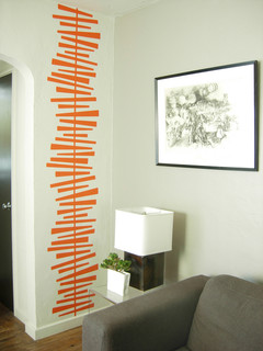
This is a good way to use a dark colour.  You aren't limiting yourself to several years of looking at 2011's trend.  If you want to change it to something else you'll need only several hours of work and a quart of paint. I love the way the dark draws you down the hallway into the main part of the house. I'm not a fond lover of accent walls everywhere, but this works.


 Design Hint
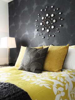
: Consider using a strong colour as a backdrop behind a light coloured  bed or sofa.  It allows you to keep your remaining walls light and  include a strong vertical line in rooms where horizontal lines dominate. It is also a great way to integrate dark and light furniture into a cohesive design. 


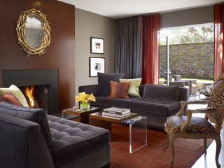
This colour, similar to Vintage Wine, is Benjamin Moore AF 650 Caponata .  It provides a great backdrop for the light  furniture and black chairs.  Without the amount of creamy white used here, this would  have been a dark, dingy room.

Design hint: Use dark colour on walls to provide contrast with  light furniture pieces. This application allows you to highlight your furniture while still controlling your  light colour balance.  My preferences are showing! Dark rooms and dark furniture depress me.


 This very sleek, modern room uses a purple green scheme as a backdrop for creamy white. I like the way that the vintage wine colour is used modestly as an accent. 

Design Hint: Are you tired of your wood grain entertainment unit? A current trend in decorating is re- purposing furniture. You many not own built ins that look like this, but you can achieve the look  with a similar paint combination. 


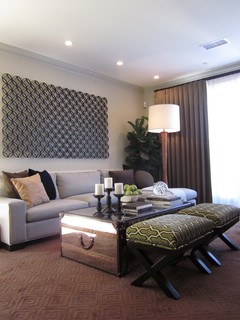
Just because I love the table and the sparseness of the room.... The sofa, plush and plum, is the luxurious item in the room.

Design Hint: Every room should have one luxurious item in it. Size doesn't count.


Sarah Richardson via Decor Pad

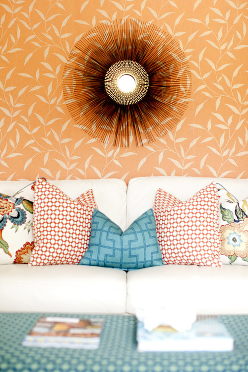
Design Hint: If you don't want to commit to design trends in a big way, accessorize with them. Pillows make great trend statements.  Consider recovering them when you want to nod toward the next colour trend. As always the magic colour, white allows you to do so much.
 
This is my idea of a luxury item for my kitchen. Le Creuset’s gorgeous enamelled pots, are the ultimate in my mind, but only in my dreams so far. I have a perfectly good set of stainless steel pots.  There's always the dream list....

What are your thoughts on using trend colours?

Sunday, January 2, 2011

Consider pattern in 2011

 The latest edition of Style at Home and most design forecasts proclaim that what you need for your home this year is pattern.   There's no limit to the ways pattern can be added to a room. Where you place it and how subtle or bold the  pattern choice will  dictate your unique look.

Walls 
 There are many ways to add pattern to your walls. 

   
source
This graphically  designed wallpaper  in two colours is the perfect backdrop to an otherwise white decor. It adds interest without being overwhelming.

 Trellis patterns seem to be popping up everywhere. It's a little busy for me but it has it adherents.

beach bungalow 8 houzz tour eclectic living room
source

Metal wall art is a great way to add subtle texture and pattern to a room.   
 
family room contemporary family room
source


There are many kinds of appliques you can buy for walls or you can make your own from contact paper. 
Design Public

Pillows

Pillows never lose favour as a way to bring pattern into your decor. Ikea offers a range of inexpensive cushions with ethnic influences.


Layered bedding is also a strong trend with mixed patterns used both boldly and subtly.


Furniture

Choosing one piece of furniture  to  designate a star in a room is another great way to add pattern.  If you choose this route, keep the pattern in check  by painting the walls  a shade that is  slightly darker or slightly lighter than your fabric. Sometimes the pattern lies quietly and just adds subtle interest.


living room contemporary living room


This stool might be small but the pattern helps it to hold its own in this room.  The wall display is a pattern in its own right.  Tobi Fairley's love of unusual colour schemes is in full swing here. 


When choosing furniture how much pattern is too much for you?  
 
 And don't forget the floor.

But sometimes things for the floor can be found in other places....  This is a very effective use of an area rug to create subtle colour and textural variation.  The pattern works well with the floral on the chair.

Personal preferences

Sometimes you can overuse  a pattern and produce a room that is more static than interesting. 

This design could do with an injection of a different pattern in my opinion. Perhaps the intent of the designer was to create a more static look by repeating the same pattern in a number of places.  I admit it is a busy pattern that does have a quiet feel to it. Once again the use of white produces its magic.


The amount of pattern that a person can live with is a very individual thing.  This room has pattern used in multiple ways.  While there's too much going on for my personal taste, my taste is mine, yours will probably differ.  

The room below also has a range of patterns, but the overall effect is quieter and more put together. 


What's your pattern preference?


Gambar Belangkas