Showing posts with label Thursday Tip. Show all posts

Friday, February 14, 2014

Thursday Tip # 12- Art above the sofa

Do you have  one big blank space above the sofa?  Are you wondering how to fill it?  If the number of questions I get about this is any indication there are lots of question marks out there about this topic.  Ta da... answers.  I  introduced this topic a little in last week's Thursday Tip  when I discussed scale, but I wanted to give more formatting options this week. 

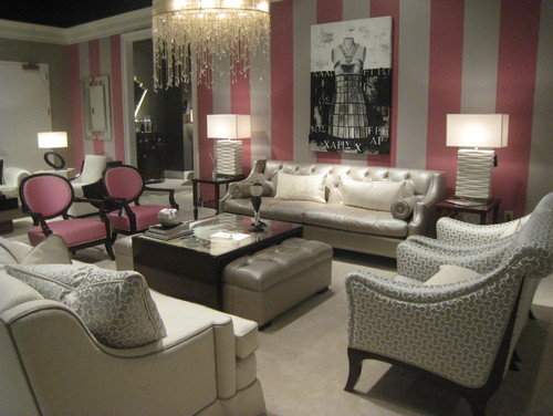
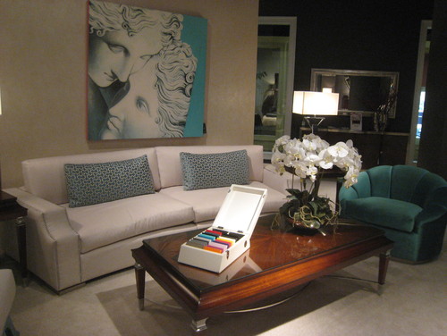
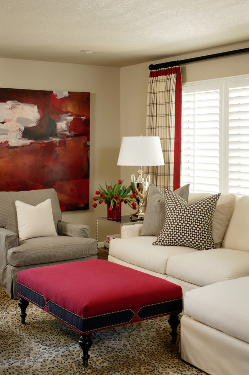
 This is an area where there are lots of thoughts on how to and how not to hang art for best effect.
My guideline is to think about ways to fill at least 2/3 the width of the furniture. It is often difficult to find large scale art so think about pairings of various types.  It also looks good if your art expands to the edges of the sofa.  Once you go beyond  sofa width the art starts to look very top heavy and the sofa  is diminished. You should also consider the height of the art.   Remember it is a long way to the ceiling so refrain from work that is only twelve or 14 inches high.  It will look lost even if it is long enough.

I have to thank  Interiors PL    for creating this great graphic that provides many options for what to hang over a sofa.

 ideas for hanging art over sofa
11 options for hanging art over a sofa.

My favourites in these options are  4, and 6-11.  They all fit the guidelines I discussed above.  1 and 3 are my least favourite because they don't fill up enough space for me.  I like 5 because it is asymmetrical  and I could balance this placement by adding things on the left of the sofa to create a pleasing balance. Richard Mishaan discussed  another aspect of asymmetrical placement in a House Beautiful post.


design tip hanging art assymetrical
Why asymmetrical layouts work

Here is the same idea expressed in one of my painting compositions called Breathe.

ayssemetrical composition acrylic painting Margaret Ryall
 Margaret Ryall, 2004, Breathe, acrylic on canvas, 12 x 24in.

 Are any of these options wrong?  Not really.  There are only guidelines in interior design,  no right or wrong. 

Do you have a favourite way to arrange art above your sofa?  Please share.

Thursday, December 1, 2011

Thursday Tip # 10 - A splash of colour

My favourite decorating style  revolves around walls and furniture in neutrals enhanced  with splashes of colour .  This is a very easy style for anyone to pull off.  The colour is usually in accessories, but sometimes it can be in  a piece of furniture.  Let's take a look at several rooms to see how it's done.


The largest block of yellow is the door. It could just as easily have been a chair or an area rug.  The yellow is repeated in a print duvet cover.  A print always adds interest.  The throw is yellow and very textured.  The yellow follows through to the bathroom in the vases, mat and towel.  That's probably enough.  After that there would be too much yellow and it would not longer be neutral and a splash!

The room below has a very subtle splash of pink in the wallpaper and two chairs.  I'm craving at least one other splash somewhere in the room to make it three (counting the chairs as one).  Perhaps it's outside of the photograph frame.
 
High Point Market 2011 Color Trends
Pangaea Interior Design, 

Turquoise blue/teal works with any decor.  We have a colour triangle in this room with the chair, pillows (as one), and art work. 
Glenwood Residence contemporary living room
Tobi Fairley

Tobi Fairley loves to use very vibrant pops of colour in here room designs.  The artwork  and ottoman are the most prominent features. but the strip on the drapes and the flowers help  move your eye around  the room and provide varying proportions of red. 

I'm getting ready to redecorate my master bedroom and I plan to use a  soft green with cream. A full post is coming up on this minor transformation.   The splashes of colour do not have to be vibrant.  Check these out.  


Similar to what I have in mind for my own room, Sara Richardson has used soft greens in different patterns on the bed, and then sprinkled several green accessories around the room. 


 The pink in this design is so soft it is barely discernible, but it enhances the gray and off white just enough to make the room interesting. Again, pattern plays a prominent role in how the pink moves around the room. 

Thursday, November 17, 2011

Thursday tip # 9 - small rooms

Stamford Bedroom Detail traditional bedroom
Hugh Jefferson Randolph Architects

There are many options when one has to decorate a small room.  These ideas are built on the principle of keeping all aspects of the decor as minimal and connected as possible. Since this is the look I prefer in any room, small rooms are never a challenge and I even prefer them. 
  • choose a monochromatic colour scheme (as above), or a neutral one with pops of colour
  • keep accessories in one colour range (in this room it's brass)
  • use multipurpose furniture ( stacking tables)
  • consider adding a shelf for storage/display to move things  off the floor
  • use multipurpose accessories (lamp that looks like a sculpture; interesting mirror instead of art work; beautiful boxes that can be used for storage
  • use many textures instead of bold patterns (in pillows, window treatments)
  • use furniture that is in proportion to the room
  • keep the lines of larger pieces simple
  • when choosing artwork focus on one striking piece and have anything else play a supporting role.  
  • use strong verticals to move your eye up (long drapes, vertical art work, tall slim lamps)
  • use your window as a backdrop for the placement of a prominent piece of furniture (bed i or chair)

Thursday, November 10, 2011

Thursday Tip # 8 - make it white

Coastal Living

There is something so soothing about a monochromatic colour scheme.  I have friends who would say boring not soothing. but to each his own.  It might seem easy to have a room is varying tones of one hue but not so.  It's even more difficult to design a white room to look interesting.  The trick is to emphasize shape and texture through repetition above all else. Don't forget that there are hundreds of whites with varying undertones and temperatures.

Why does this room work?
  •  white shows up all the textures and lines in the room;
  • the small mirrors arranged in a grid add a strong repetitive element and each looks like a small painting because of the reflections from outside (I'm assuming); that adds optical texture;
  • the walls are horizontal boards which play against the square mirrors;
  • apart from the texture of the white boards, the horizontal lines are soothing and are repeated in the cabinet below: 
  • the arrangement has various shapes( cones, spheres, stars) and surfaces (reflective, matt, rough, smooth);
  • shiny surfaces add an unknown quality because you never know what will be reflected;
  • the whites are on the warmer side and a little "dirty" which doesn't look stark.
Here are several other white rooms.  Do you think they are successful? What do they have in common with the room above?

Elle Decor


Marcelo Brito - Sao Paulo - Brazil contemporary dining room
Marcelo Brito


Which do you prefer? 

Wednesday, November 2, 2011

Thursday Tip #7- Editing a bookcase

Control your bookcase

If you're like me this is easier said than done.  I don't like a bookcase to look too edited, but grouping objects and books is a must.  I won't go so far as to suggest covering books with the same colour paper  or lining them up by colour as I've seen in some magazines.  

What works in his arrangement ?
  • the bookcase has been treated as an accent wall by painting the back a beautiful blue
  • sculptural objects are massed and are  the same colour - white- which shows against the blue
  • there's a range of objects including books, vases, photos and found objects
  • the books have been sorted by height
  • books are placed both horizontally and vertically
If you wanted to further edit this arrangement you could consider:
  • removing the photos; they are lost in the display
  • if you are arranging books horizontally, keep to that, don't start to stack vertically on top of the horizontal ones; stacking some horizontally and some vertically on the same shelf works
  • don't add a piece of sculpture on top of a books (see bowl) , this is sculptural enough to display alone and gets lost otherwise.
  • if you have an arrangement of vases, bottles etc.  don't add a picture behind it- it gets lost.
 From one extreme to the next...


 Quiet and unobtrusive, this bookcase provides a lovely backdrop for the two chairs grouped in front of it.  This is a room I would like to sit in .

 
HGTV

This is a whole other way of  organizing a bookcase.  While is is ordered, it has a very vibrant almost chaotic feel to it.  It has way too much visual energy for my taste, but there's someone who loves it. 

If you want more inspiration check out The Lennox,  a great blog that I follow.

Did you find a useful tip  in this post or do you have one to add?

Happy Shelving

Thursday, October 27, 2011

Thursday Tip #6- simple centerpieces

Keep it simple...


Dinner parties can stress the budget.  I like to have simple arrangements for the table and that usually involves fresh flowers .  Rather than large bouquets which are tall and obstruct views, think about simple ways to use flowers or leaves in a repetition.

Hosta leaves are one of my favourites and I have lots to choose from in my garden.  I love the idea of massing different sizes and shapes of glasses/vases and submerging separate leaves in each one. 
The sunflower is a great choice for fall entertaining. If you don't have access to fresh sunflowers, there are realistic looking  artificial ones. The arrangement above works because of the meandering wave and colour variety.

Thursday, October 20, 2011

Thursday Tip #5- Use geometry

rosettes  living room

Most  furniture  is predominantly rectangular.  When you're adding accents it's good to include circular shapes to play against the strong horizontal  and vertical lines. The basket, table, wooden goblet and  medallions work wonderfully with this sofa (which is not as squared off as most).  There's also lots of texture in this room. If you can't count at least five different textures in a space it is probably not that exciting!  You rarely see beige paired with yellow, but doesn't it look fabulous? In case you didn't notice.... spray paint medallions meant for ceiling applications and use them as wall decor.

Thursday, October 6, 2011

Thursday Tip # 3- Destination walls

 What do these rooms have in common?

Modern Classic contemporary entry


highland park contemporary dining room

Woodside Residence contemporary living room


HALL modern hall
Elad Gonen & Zeev Beech

All  of the walls featured are small  "destination walls" which you walk toward.  The darker colour draws the eye and helps to visually draw you toward them. They also serve to showcase the furniture that is in front of them.  Do you have a destination wall in your house that would like a shot of colour to help anchor it? Look at the end of hallways or in long narrow rooms.

Thursday, September 29, 2011

Thursday Tip #2

Caudill Lane modern hall
Webber + Studio, Architects

Use accessories to carry colour
 The vibrant yellow green in the artwork in this hallway is repeated again in the pillow in the bedroom. A darker green appears in the art work above the bed.  When walking down the hallway your eye pops from the artwork into the adjoining room  which is seen at a distance.  This causes visual movement from one room to the next.  A small thing but very effective for connecting one room with the next. Never underestimate the power of accessories to improve every room in your house. Have you carried colour from one room to another in your home? 


Check back for my next post on Colour Continuity when creating a colour scheme.
  

Thursday, September 22, 2011

Thursday Tip -Fall is in the air

Many people focus on new beginnings in January, but mine are always prompted by the arrival of September.  I put it down to my past career as a teacher when September was the month of planning and new possibilities.

I just returned from a month in Europe and my mind is agog with all the possible posts I could write and it's hard to select the best idea .  When I feel like this I have to do something to focus my thoughts. Rather than choosing one topic  I've decided to go broader.  I'm beginning a new post focus which I'm calling Thursday Tips.  Each Thursday I will feature one image and several simple ideas that could be easily translated into your home decor. 

buffet table inspiration set 1  entry

Orange gaining favour in 2012
The colour forecasts for 2012 are just beginning to appear and orange seems to be in favour.  Not the toned "dirty" oranges of past years, but a fresher variety that brings warmth and thoughts of  a fresh autumn day.

Layering in Decor
While this orange chair is very striking, you don't need  to make such a large purchase to get an up to date look.  The tulips in the vase above are lovely in spring, but think about   Chinese Lanterns to bring a blast of  fall orange. Twigs and branches in the arrangement add structural elements and height which helps focus your attention . Stacking two mirrors of different heights on a console table provides a backdrop for your arrangement and also provides  interesting layers.Always think layers when you are decorating.


If you have a neutral chair, an orange throw draped over the back or arm would add just the right amount of colour.

Crate and Barrel


When I'm adding in colour accents in this way I usually think in threes and using varying proportions  of the colour.  Think about small, medium and larger sized accessories and you can't go wrong. Variety is another key word in decorating.  Find your varying sizes in pillows, boxes or canvas totes,  a piece of artwork or large pillar candles.  Style at Home offers 10 ideas for adding Tangerine to your decor. 

What's your favourite accent colour? 

Gambar Belangkas