Showing posts with label monochromatic. Show all posts

Thursday, November 17, 2011

Thursday tip # 9 - small rooms

Stamford Bedroom Detail traditional bedroom
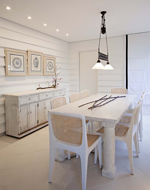
Hugh Jefferson Randolph Architects

There are many options when one has to decorate a small room.  These ideas are built on the principle of keeping all aspects of the decor as minimal and connected as possible. Since this is the look I prefer in any room, small rooms are never a challenge and I even prefer them. 
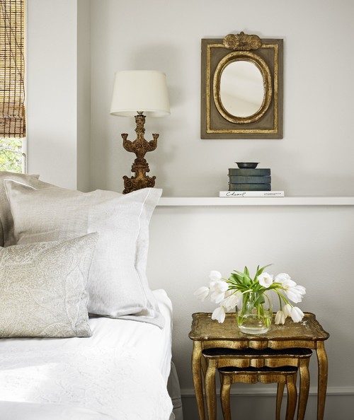
  • choose a monochromatic colour scheme (as above), or a neutral one with pops of colour
  • keep accessories in one colour range (in this room it's brass)
  • use multipurpose furniture ( stacking tables)
  • consider adding a shelf for storage/display to move things  off the floor
  • use multipurpose accessories (lamp that looks like a sculpture; interesting mirror instead of art work; beautiful boxes that can be used for storage
  • use many textures instead of bold patterns (in pillows, window treatments)
  • use furniture that is in proportion to the room
  • keep the lines of larger pieces simple
  • when choosing artwork focus on one striking piece and have anything else play a supporting role.  
  • use strong verticals to move your eye up (long drapes, vertical art work, tall slim lamps)
  • use your window as a backdrop for the placement of a prominent piece of furniture (bed i or chair)

Thursday, November 10, 2011

Thursday Tip # 8 - make it white

Coastal Living

There is something so soothing about a monochromatic colour scheme.  I have friends who would say boring not soothing. but to each his own.  It might seem easy to have a room is varying tones of one hue but not so.  It's even more difficult to design a white room to look interesting.  The trick is to emphasize shape and texture through repetition above all else. Don't forget that there are hundreds of whites with varying undertones and temperatures.

Why does this room work?
  •  white shows up all the textures and lines in the room;
  • the small mirrors arranged in a grid add a strong repetitive element and each looks like a small painting because of the reflections from outside (I'm assuming); that adds optical texture;
  • the walls are horizontal boards which play against the square mirrors;
  • apart from the texture of the white boards, the horizontal lines are soothing and are repeated in the cabinet below: 
  • the arrangement has various shapes( cones, spheres, stars) and surfaces (reflective, matt, rough, smooth);
  • shiny surfaces add an unknown quality because you never know what will be reflected;
  • the whites are on the warmer side and a little "dirty" which doesn't look stark.
Here are several other white rooms.  Do you think they are successful? What do they have in common with the room above?

Elle Decor


Marcelo Brito - Sao Paulo - Brazil contemporary dining room
Marcelo Brito


Which do you prefer? 

Gambar Belangkas