Showing posts with label white. Show all posts

Sunday, July 15, 2012

Make mine bleached

I have a love affair with wood, but I don't like the golden wood tones that come along with wood that is clear coated or lightly stained. Do I have lots of golden  wood tones in my home? 


 Yes, history looks after that because my home was built in the 80's when oak was the standard for hardwood floors and furniture. When all your furniture is handmade with love, it's difficult to get rid of it, so I accept my golden tones as period pieces.


As I've renovated  the upstairs portion of my home, I moved to natural maple flooring  which is about as warm as I can stand. This beautiful cardboard/ brown paper bag colour is very popular right now, and it is a warm tone that isn't too overwhelming.   The great hardware makes this chest look distinctive and sophisticated, but it's not mine!

 When I designed my summer home, my mantra was think driftwood.  Everything there is new, but looks bleached and old!

 There are alternatives for people like me - naturally weathered wood, bleached wood, wood that has whitewashes or gray washes. These tones seem to go so much better with today's modern interiors.  Let's explore the options....


When you make your own furniture you have more options to get the look you want. This new bed made from oak doesn't have a hint of yellow or orange in sight.  I controlled the warm tones by using a  greenish grayish wash before the final semi gloss clear coat.  The  old mid century modern dresser was stripped and treated in the same way,  but I rubbed more of the wash off  so the two pieces didn't look like a perfect match -  I like harmony  with  variety.

This is another example of a washed gray finish that allows the wood grain and imperfections in the wood  to shine through. While it is more traditional in design, the overall look of  this piece  would allow you to use it in most rooms. Give chests like this a chance in your  bedroom, bathroom,  hallway, foyer or living room .

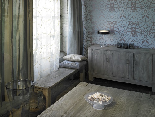
 This traditionally designed sideboard  made from mango wood  could be used in any room decor.  Mango wood is a hard, dense wood that has been seasoned and kiln dried. If left unfinished it has  hues of green brown and yellow which can be interesting .   Because mango  is quick growing,  hard and harvested after the tree has stopped giving fruit, it is  considered the wood of the future.


 I'm in love with the cool tones in this room, buy I would like to see a little more variety in the various wood tones used.  The bench could easily be removed and then the sideboard which is beautiful, could shine.

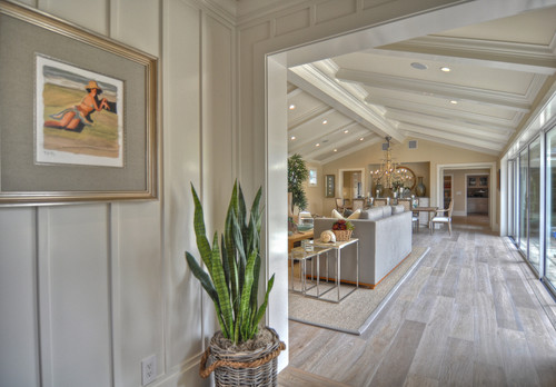
 Everything here is light and airy. The floors seem to go on forever.   It is truly  a room that would let you breathe. If I built a new home this would be my floor choice.

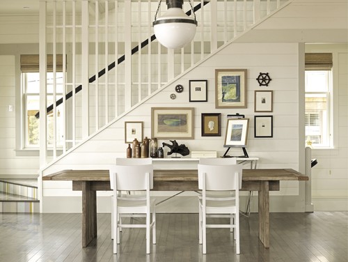
White always looks so fresh when paired with bleached or toned wood.  You have to be careful when you choose lighter woods because they are easily overwhelmed by stronger colours. 
How do you feel about bleached, washed or otherwise light woods?

Thursday, April 5, 2012

White, black and ...

YELLOW!

The colour of energy, sunshine and brightness.

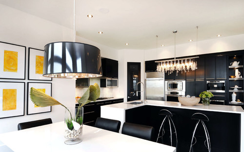
It's difficult to ignore the high contrast colour scheme of white, black,  and primary yellow.    My personal preference is to have mostly white with hints of black and yellow, but the scheme plays out in different ways. You can tell from the images I've selected that it is a very contemporary look and not one you see often  in traditional decor.  A quieter look would be created if you substituted the black for gray- my all time favourite combination.  You can have a little or a lot of yellow through accessories. I've stayed away from the obvious choice of painting walls yellow which seems to be just too much yellow  for my taste.  Perhaps you disagree.
 How do you like yellow in......

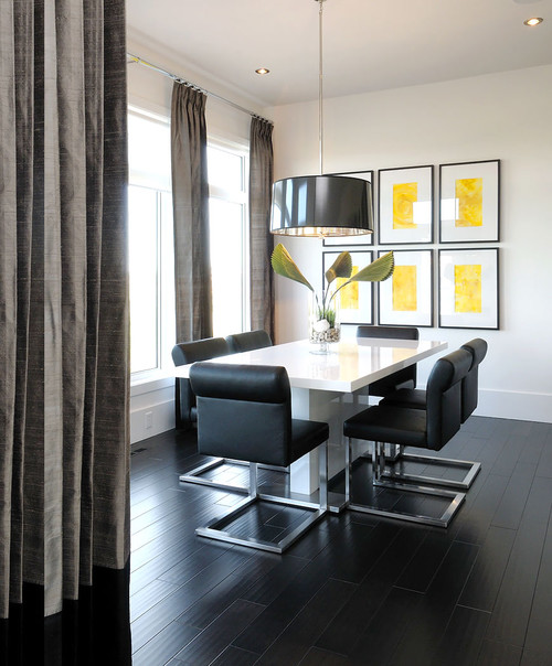
Dining areas

Willowgrove Kitchen contemporary kitchen

 Willowgrove Kitchen contemporary kitchen
Only yellow art work makes this room vibrate.
 Bedrooms....

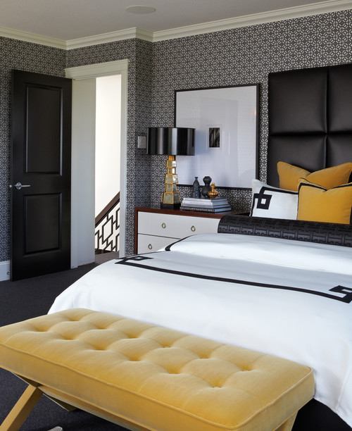
Mallin Cres - Master Bedroom contemporary bedroom
 Atmosphere Interior Design Inc
.
This yellow is more toned but still effective with white and black.

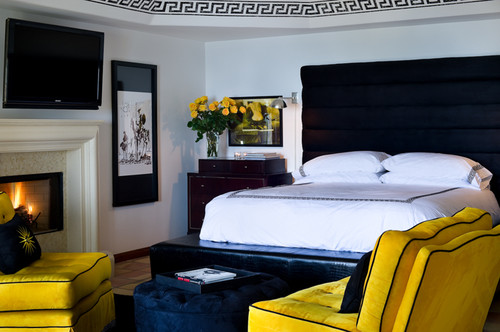
Malibu Mediterranean mediterranean bedroom
Hollywood Regency Style Detail eclectic bedroom
 Madison Modern Home

Mallin Cres - Guest Bedroom contemporary bedroom
Atmosphere Interior Design Inc
.
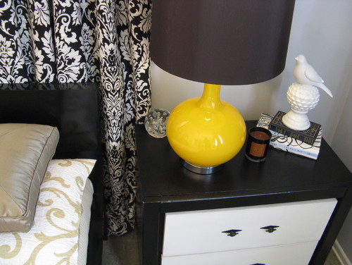
Finding the right accessories finishes a space.  Imagine the tables in the two rooms above  without the hit of yellow. 
 

Glitzy-Glam meets Farmhouse-Chic contemporary bedroom
Martha O'Hara Interiors

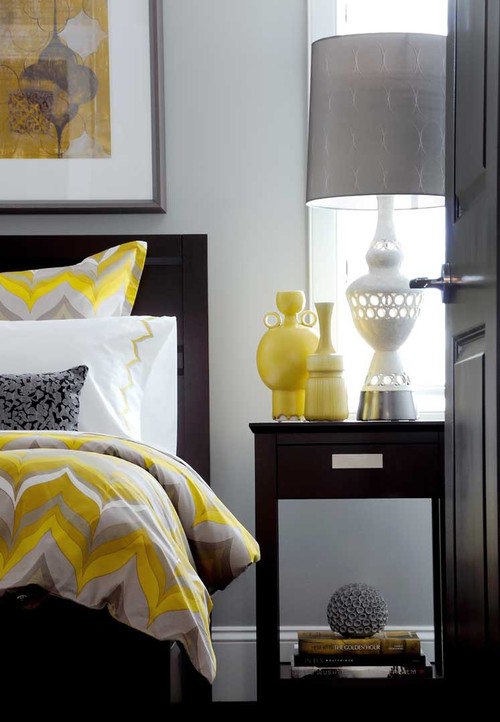
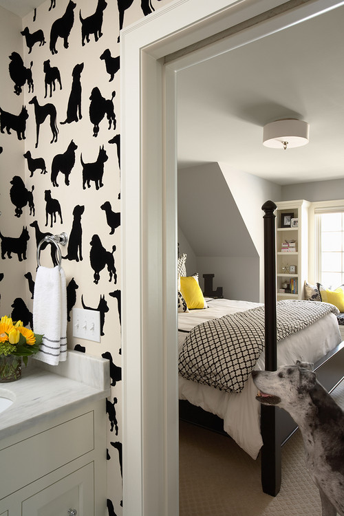
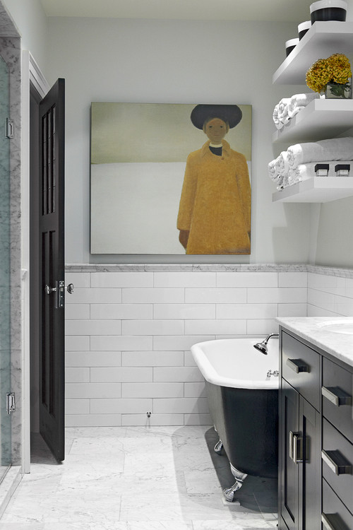
Only yellow pillows in the bedroom and yellow flowers in the bathroom but it's enough to lift the spirits of these two rooms.
 Living Rooms

Loft Living modern living room
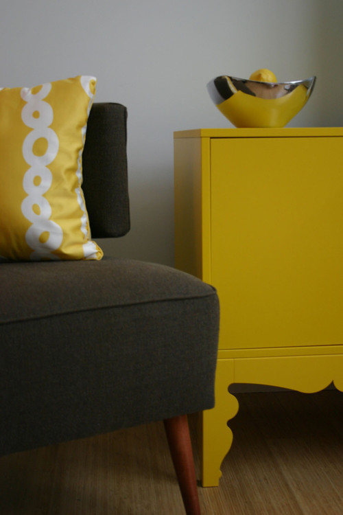
 Painted furniture brightens every room but you can't get any better than a yellow hue.

 source 

Yellow is a very commanding colour for chairs.  You certainly won't be ignoring this one.I love the way your eye moves from the chair to the art work and then to the accent pillows.  Perfect colour scatter.

Bathrooms 


Decor Pad 

One bright yellow chair speaks volumes and it's waterproof!


2010 Decorator Showcase modern bathroom
t De Meza + Architecture

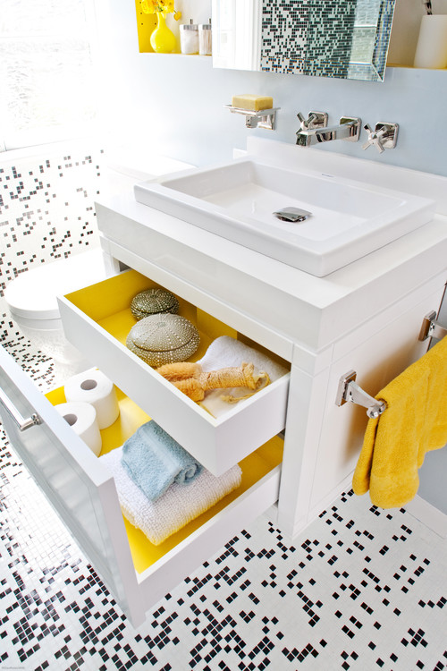
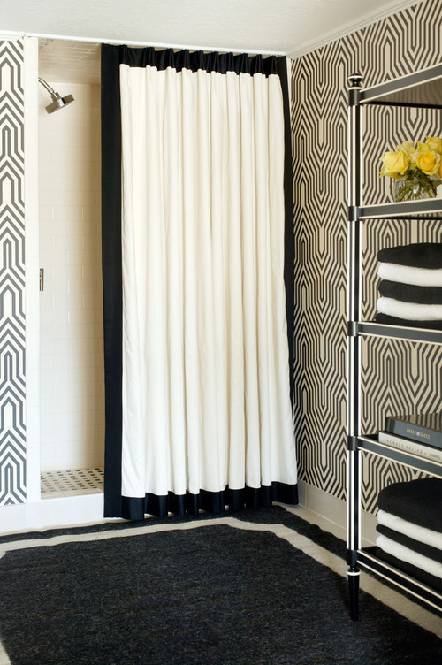
White and black small mosaic tile with splashes of bright yellow to enhance it.  Lining the drawers with yellow is an extra surprise . 

Indian Grove Bathroom eclectic bathroom
 Palmerston Design Consultants

Imagine this room without the commanding art work.
 

Glenwood Residence eclectic bathroom
 Tobi Fairley


Porches 
Sometimes one perfectly placed accent makes a room sing.  


Art as Pop traditional entry
Blue Tangerine Art

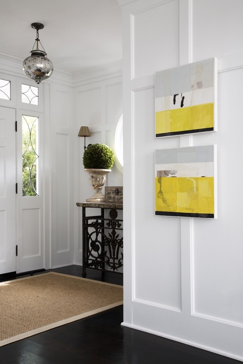
Don't forget the power of art to move a space from boring to exciting. This is one of my favourite images to show how art can lift any space to something special. 

Did you find inspiration in any of these rooms?  If you don't like yellow you could substitute yellow green, magenta, coral or turquoise.  

Thursday, November 10, 2011

Thursday Tip # 8 - make it white

Coastal Living

There is something so soothing about a monochromatic colour scheme.  I have friends who would say boring not soothing. but to each his own.  It might seem easy to have a room is varying tones of one hue but not so.  It's even more difficult to design a white room to look interesting.  The trick is to emphasize shape and texture through repetition above all else. Don't forget that there are hundreds of whites with varying undertones and temperatures.

Why does this room work?
  •  white shows up all the textures and lines in the room;
  • the small mirrors arranged in a grid add a strong repetitive element and each looks like a small painting because of the reflections from outside (I'm assuming); that adds optical texture;
  • the walls are horizontal boards which play against the square mirrors;
  • apart from the texture of the white boards, the horizontal lines are soothing and are repeated in the cabinet below: 
  • the arrangement has various shapes( cones, spheres, stars) and surfaces (reflective, matt, rough, smooth);
  • shiny surfaces add an unknown quality because you never know what will be reflected;
  • the whites are on the warmer side and a little "dirty" which doesn't look stark.
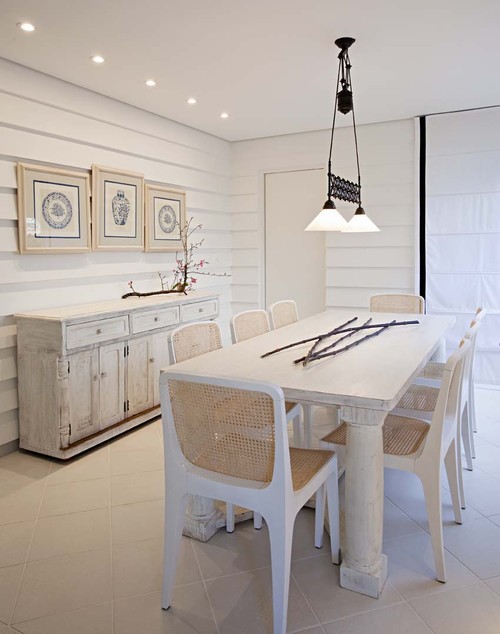
Here are several other white rooms.  Do you think they are successful? What do they have in common with the room above?

Elle Decor


Marcelo Brito - Sao Paulo - Brazil contemporary dining room
Marcelo Brito


Which do you prefer? 

Sunday, January 2, 2011

Consider pattern in 2011

 The latest edition of Style at Home and most design forecasts proclaim that what you need for your home this year is pattern.   There's no limit to the ways pattern can be added to a room. Where you place it and how subtle or bold the  pattern choice will  dictate your unique look.

Walls 
 There are many ways to add pattern to your walls. 

   
source
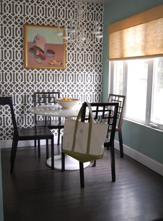
This graphically  designed wallpaper  in two colours is the perfect backdrop to an otherwise white decor. It adds interest without being overwhelming.

 Trellis patterns seem to be popping up everywhere. It's a little busy for me but it has it adherents.

beach bungalow 8 houzz tour eclectic living room
source

Metal wall art is a great way to add subtle texture and pattern to a room.   
 
family room contemporary family room
source


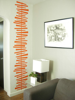
There are many kinds of appliques you can buy for walls or you can make your own from contact paper. 
Design Public

Pillows

Pillows never lose favour as a way to bring pattern into your decor. Ikea offers a range of inexpensive cushions with ethnic influences.


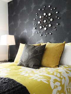
Layered bedding is also a strong trend with mixed patterns used both boldly and subtly.


Furniture

Choosing one piece of furniture  to  designate a star in a room is another great way to add pattern.  If you choose this route, keep the pattern in check  by painting the walls  a shade that is  slightly darker or slightly lighter than your fabric. Sometimes the pattern lies quietly and just adds subtle interest.


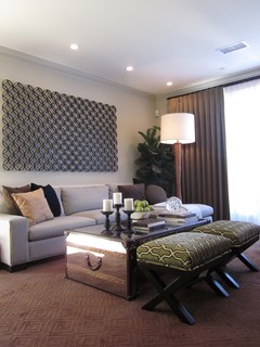
living room contemporary living room


This stool might be small but the pattern helps it to hold its own in this room.  The wall display is a pattern in its own right.  Tobi Fairley's love of unusual colour schemes is in full swing here. 


When choosing furniture how much pattern is too much for you?  
 
 And don't forget the floor.

But sometimes things for the floor can be found in other places....  This is a very effective use of an area rug to create subtle colour and textural variation.  The pattern works well with the floral on the chair.

Personal preferences

Sometimes you can overuse  a pattern and produce a room that is more static than interesting. 

This design could do with an injection of a different pattern in my opinion. Perhaps the intent of the designer was to create a more static look by repeating the same pattern in a number of places.  I admit it is a busy pattern that does have a quiet feel to it. Once again the use of white produces its magic.


The amount of pattern that a person can live with is a very individual thing.  This room has pattern used in multiple ways.  While there's too much going on for my personal taste, my taste is mine, yours will probably differ.  

The room below also has a range of patterns, but the overall effect is quieter and more put together. 


What's your pattern preference?


Sunday, December 26, 2010

The magic colour

Is there a magic colour that solves a lot of problems when developing a colour scheme? 
Read on.

white furniture with vivid colours
 White furniture provides  relief from vibrant colours

This is a vivid colour scheme that could become a problem without the balance provided by the sofa and chair.  Soft white shows the other colours to great advantage creating a clean, crisp scheme.


White furniture in a dark colour scheme
 source

Brown on walls can create quite a dreary colour scheme, but  this room it is anything but dreary. The touches of yellow brighten it and white is quietly doing its job.


Beach House Bridgehampton modern bedroom
Crisp white and green

Amy Lau Design


Can you have too much of one colour in a room?  Yes,  this could have been such a room without the judicious use of white and creamy yellow accents.


soft white furniture in modern decor
Soft white in modern decor
source

What other colour could produce this much impact with a purple wall?

More This eclectic bedroom
This-eclectic-bedroom


Blues softened and connected by white, the magic colour. 
But.....


Is white a colour?
Scientifically speaking, it’s actually the combination of all colors in the visible spectrum of light.

Gambar Belangkas