Showing posts with label color trends 2014. Show all posts

Thursday, December 5, 2013

10 Ways to use Pantone's Colour of 2014

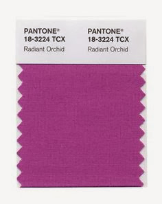
The news is out and after much  guessing  by designers the world over Pantone has declared Radiant Orchid as the colour for 2014.

10 Ways to use Pantone's 2014 colour of the year
2014 Pantone Colour of the Year

 It seems to leave people a little speechless.  Now I am a purple lover and have hits of it around my house, but I lean toward the bluish purples.  Even my front door is BM french violet. I have lavender  front porch cushions  etc.  I wear lots  of purples in clothing.   But this is more pink.

It is a far cry from last year's emerald. 


 If you bought into emerald last year here's a combination of the two.... 


Certainly colourful.  Notice how white is used to quieten this scheme.


But how to deal with this vibrant pink purple.... 


 Play it safe and use it to add a  jolt of colour in flowers... Beautiful and temporary.

 
 source

Invest in a little leather that can be moved from room to room.  


Paint a piece of furniture or a mirror.


Throw in a daring light fixture. 


 Buy an accent chair in this lovely hue and connect it with a patterned pillow. 


Mix it up in lovely patterned bedding. 


Or on a ceiling or headboard.  Notice the leather ottoman from a previous shot.


Now we are getting daring with drapes, a bold geometric pattern and peonies.  The dark furniture provides a rich backdrop for this scheme.


Or have the full meal deal with walls, bedding, drapes, pillows and art.  Thankfully the white offers the perfect foil for the vibrancy.

Did you notice any trends in how it is used? 


And good- bye with one of my paintings that works with this lovely colour


Margaret Ryall ( In Between) mixed media on canvas, 12 x 36 inches , private collection


Thursday, November 21, 2013

Are you feeling blue?

Hopefully you are into blue!  Blue seems to be a dominant colour in Pantone's colour forceasting for  both spring 2013 and upcoming 2014. Here's how it's playing out....

 Monaco Blue (Spring 2013)

 Dazzling Blue (Spring 2014)

Two blues, but with great differences.  I can't say blue is a big favourite of mine, but I am really into Monaco blue because it is a warmer blue that is approaching navy. I don't think it is a blue that you would  catagorize as trendy. Perhaps timeless would be a better descriptor.   Dazzling Blue seems to be a colour that will not be  around for the long haul.  It is cold, quite exciting ,and lends itself well to accessorizing.   It isn't exactly a colour you snooze to.  Could you have it on a wall?  Not me, but there are those who would.  

You could use it a little or go whole hog and saturate your space with it. 

 Welcome to the world of dazzling blue....


 .... put it on the outside


on furniture or pillows...

 I really like it mixed with various grays and all that texture.  Both serve to tame it down a little.  You will notice quite a bit of colour variation in the blues above. Mixing a more vibrant dazzling blue in with "tamer" blues seems to be a good solution if you aren't into bright. 


on a wall....

 Whenever I see these fresh, intense blues my mind goes to warm countries like Greece.  Since I don't live in one, it could explain why I am having trouble warming up to this selection.


or a poof...

This is a truly dazzling accent piece that could find a home in most decors.


 in glass or flowers...

and tile ...


on chairs ...

 or bowls...


 or a pillow with lots of other fun colours. 


And here it is with Celosia orange another Pantone selection for spring 2014.


These colours  show up on the runway too! 


Which type of blue decorator are you?


Gambar Belangkas