Showing posts with label styling. Show all posts

Monday, August 3, 2015

Thoughts on decorating the top of an armoire

So you have an armoire and you are eying that space between the top of it and the ceiling.  Do you or don't you put anything on top of it?   You might want to consider the following:

How much space do you have to work with?
If you have less than 24 inches  I suggest forgetting about adding something above it. Here's why:

armoire

This is a lovely  armoire, but the flowers are squished in, and they would be so much 
prettier in a different spot. The arrangement looks awkward.  The scale of the flowers and pan are perfect if only the armoire were a little shorter. If you choose to put something smaller in scale on top it would be difficult to see and you would have to stand back quite a bit to see it. 

BUT sometimes you can make it work.  There's always an exception to every  rule.

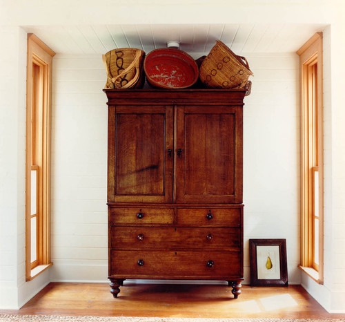
armoire

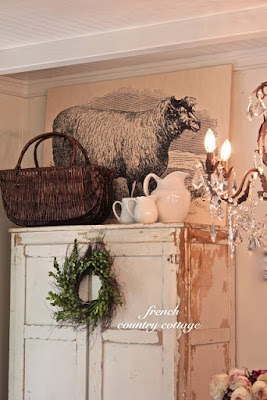
Even though these baskets touch the ceiling in places, their colour, scale and random/exciting arrangement  make them appear as if they are an extension of the armoire. The armoire is also at the end of a hall and will always be viewed from a distance allowing  you to see what's on top of it.


armoire
source

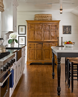
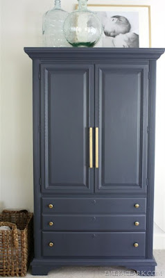
And you can usually get away with one large low object with a tall armoire

especially when the object is the same colour as the armoire. 


Do you want your eye to go to the top of the armoire?
If your armoire is a centre of interest in your space you may want to add other elements to enhance that position and make it even more commanding.   You might also want to add something if you have other tall elements in the space or you want to create some height variations among the various verticals in the space.

If you have enough space and you want to draw attention to the armoire here are some tips to consider:

Think in odd numbers. 

armoire


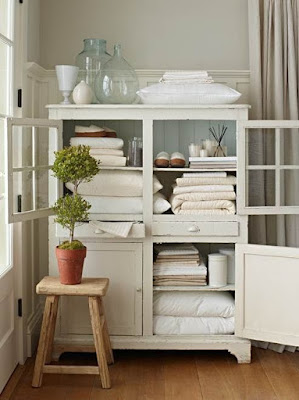
If the armoire has glass doors, consider using the same type of objects stored within it on the top.

armoire

This arrangement of bottles and bedding is a natural addition to what is already stored inside the armoire.  The light colours make the whole unit look very cohesive.


armoire

  In this child's room the top of the armoire seems to be the perfect place to store these large toys.  Because they are the same colour as the room and the armoire, they don't seem too big.  That leads me to the next tip:


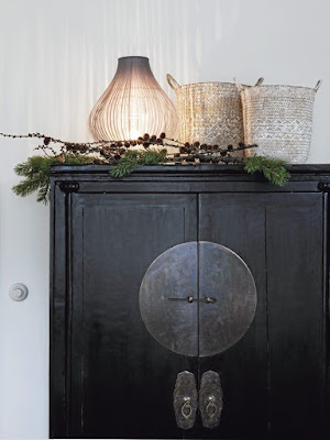
If you don't want to draw too much attention to the objects, but you want to fill in the space consider using objects that are the same or similar colour of the armoire or the wall or use clear glass. 


armoire


armoire


armoire


If you are going to add a piece of art that high make sure it is a bold image that it can be read from a distance and lean it against the wall , if you are considering using a photograph the same guidelines apply.
armoire


armoire


Think about groupings of the same object in different sizes. e.g., vases, glass bottles, boxes, baskets, birdcages, wire sculptures, spheres,  ginger jars, etc.
If you scroll back through the photos in this post you will see this tip used in a number of ways.

How about you?  Do you have any thoughts on decorating the top of an armoire? 

Tuesday, May 22, 2012

Taming open shelves

 Are your selves like mine?  They start out beautifully arranged and over time bits and pieces of things end up store there, and soon you have a  messy jumble.  If you are someone who can relax in a space no matter what is going on in it, perhaps a jumble of objects  doesn't bother you.  I'm not like that.  If my environment is in a mess that is how my head feels. 

Here are 5 great tips to  bring order to unruly  shelves.


Vary sizes of objects 


One of the simplest rules when arranging vignettes is to have a range of object sizes for variety.  Some should be small , some medium and at least one piece that is large. And remember to layer to create interest.  Put a tray at the back and then stack  books and a small object on top of them. If you layer artwork make sure it is actually visible.  There's nothing more annoying than using art work in a display and then covering it up.

Use repetition

Hillgrove Project traditional living room

Bookcase Accessorizing eclectic living room 

Repetition, when used well, creates a strong design. Choose several elements to repeat throughout the bookcase/shelving. If you have one stack of books laid horizontally, repeat this arrangement in at least two other places.  Use small sculptures, boxes or vases and rest them on top of a pile of books or magazines.

Keep it neutral 

 shelf-style-overall.jpg

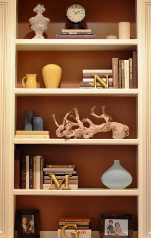
When you have a range of objects to store,  one of the best ways to keep things looking pulled together is to choose neutral colour schemes.  I love white objects for this purpose. You might also consider silver, brass, wood etc.   There's a lot going on in the space above, but because everything is white or very pale, a cohesive look is achieved.


 This neutral scheme allows the homeowner to display stored items in an interesting way.  Also notice that the organization on each shelf is organized in two sets with both having equal visual weight.


This is as neutral as you can get in both theme and colour scheme.I love the repetition of bottles and books with variety achieved through shape.

Keep interesting elements at eye level


This is an easy one and it really makes a difference. When you walk into a room , you tend to see what is at eye level first.  Don't forget about "seated" eye level  too.  Keep boring objects toward the bottom.  Also remember that if you have a line of books or really dark objects they will have a lot of visual weight and should rest at the bottom of the display.

Create relationships

 Living eclectic living room
 
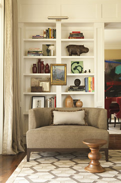
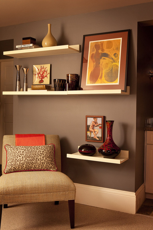
Choose a common element when you arrange shelving.  It could be similar colours, shapes or content/theme. Choose objects that relate to one another in colour and/or shape to create unity. Vary the size of objects and make sure they relate to each other in some way. In the images above the common theme is containers interspersed with art work.

Gambar Belangkas