Walls
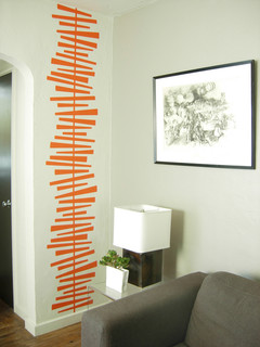
There are many ways to add pattern to your walls.
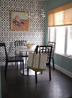
This graphically designed wallpaper in two colours is the perfect backdrop to an otherwise white decor. It adds interest without being overwhelming.
Trellis patterns seem to be popping up everywhere. It's a little busy for me but it has it adherents.
Pillows never lose favour as a way to bring pattern into your decor. Ikea offers a range of inexpensive cushions with ethnic influences.
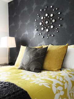
Layered bedding is also a strong trend with mixed patterns used both boldly and subtly.
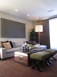
This stool might be small but the pattern helps it to hold its own in this room. The wall display is a pattern in its own right. Tobi Fairley's love of unusual colour schemes is in full swing here.
When choosing furniture how much pattern is too much for you?
And don't forget the floor.
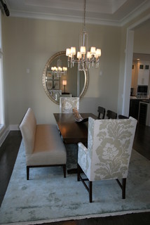
But sometimes things for the floor can be found in other places.... This is a very effective use of an area rug to create subtle colour and textural variation. The pattern works well with the floral on the chair.
Personal preferences
Sometimes you can overuse a pattern and produce a room that is more static than interesting.
This design could do with an injection of a different pattern in my opinion. Perhaps the intent of the designer was to create a more static look by repeating the same pattern in a number of places. I admit it is a busy pattern that does have a quiet feel to it. Once again the use of white produces its magic.
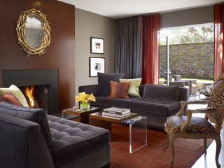
The amount of pattern that a person can live with is a very individual thing. This room has pattern used in multiple ways. While there's too much going on for my personal taste, my taste is mine, yours will probably differ.
What's your pattern preference?

