Showing posts with label colour trends. Show all posts

Wednesday, December 24, 2014

Colour Trends: Looking back and looking forward

There's nothing like the end of a year to make you hop around in your thinking.  While I'm busy considering the colour trends for 2015, I'm  also looking back to see connections and possible threads that can make these new colours have a little more staying power.

I'm interested in creating fresh looks through creative use of what is in a home, energized  with a few new purchases.  To pull this off you need a long term view of what is happening in the world of colour.  

Last year dark blues were prominent in  many of the images you saw in magazines and online, first appearing in Pantone's fall 2013 predictions.  That is still a strong look and one that  will  hang around for awhile.

If you look at Pantone's spring  2015 predictions you will see several tints/shades of blue.

Pantone colours spring 2015
source

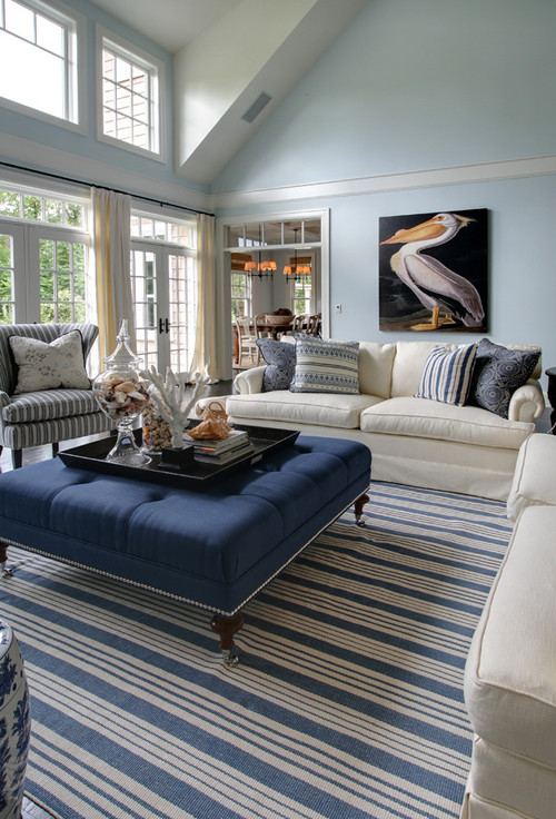
My favourite is 4 Classic Blue because it is crisp and deep without being too cold.  Check out  this combination of dark blue with natural colours.

Designing Home; colour trends 2015, modern country

There is also a fresh take on the "old" country look emerging with clean lines, less clutter, natural materials and prominent textures mixed with lighter woods.   Think pared down Pottery Barn.  I've packed a number of possibilities into this style board, but you wouldn't want to use them all in one space.

colour trends 2015, olive green, Scandinavian , Designing Home style board

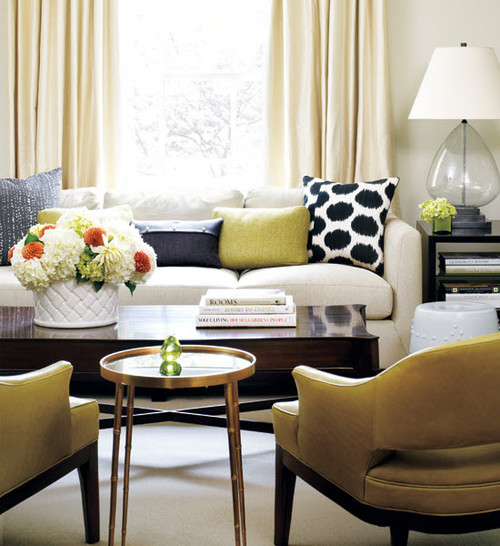
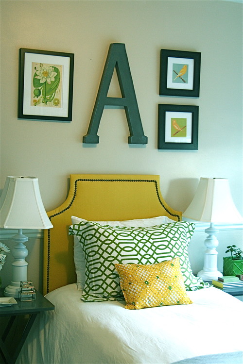
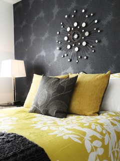
My personal preference  is more a mix of West Elm meets the Scandinavian countries. Notice the olive green which will be big in 2015.


Designing Home, Margaret Ryall, style board, colour predictions 2015, olive green
This colour would work just as well as the dark blue in the Modern Country look.   And it is so sharp with black and cream.


Pantone's 2014 colour of the year Radiant Orchid came in like a lion, and obviously went out like a lamb because apart from what I saw online, it did not impact my life or design practice in any way.

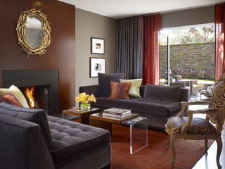
 I actually liked this colour where many designers didn't.  I've always loved those redish purple hues especially in textiles, but not so much in furniture.  If you bought into this trend, it is easily updated and made even more interesting when combined with yellowish greens.   Just check out the pillow lower left  for an indication of this blend as well as the rug and artworks.

And now for 2015 Pantone is staying in the same arena with its choice of marsala, but definitely browning it down quite a bit to create a heavy bodied colour.  Again not a favourite of many designers.

Pantone 2015, marsala, Designing Home, Margaret Ryall, style board
 I've seen combinations of it with a variety of blues even cool ones and they all look fantastic. It also looks great with the oddest combinations as you can see below. I'm particularly loving it with blues and light creams.

Pantone 2015, marsala, Designing Home, Margaret Ryall, style board

Who knew it would work so well with orange and coral? 

Since I only spec Benjamin Moore paint colours in my business, I am always interested in their colour trends. 


Benjamin Moore's  2014 Breath of Fresh Air at least supported the spa/beach vibe that is still a go- to look with many homeowners.  It is a versatile colour that looks great with pearly grays, driftwood colours and soft or chrisp whites.  It also combines well with marsala and the current  Benjamin Moore colour for 2015, Guilford green.


 How can you possibly go wrong when you have two obvious "earth" colours like blue and green.  Nature never makes mistakes!


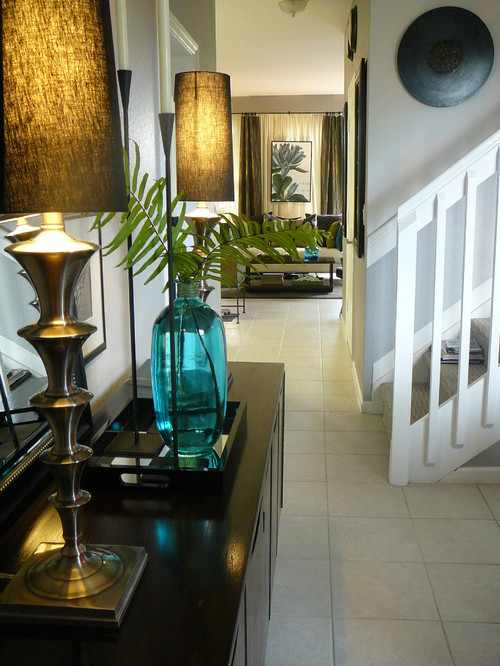
When you consider the metallics in your home, the move to warm metals is even more pronounced this year.


Brittany Makes Blog 

source 

 In  European markets  copper and pink gold are hot commodities. They are not as versatile for all over use especially the pink gold which always comes across as very delicate/feminine.  

source 

 In North American decor golds and  brass are prevalent. I'm fond of a more burnished look with these metals.  I can't seem to bring myself around to the shine of yellow brass - too much history. The yellow metallics look great with greens, dark blues and brownish reds like marsala.  And mixing metals is still very trendy.  Go for it.

Lots of connections.  Do you ever consider colour trends when you decorate?


Saturday, December 6, 2014

10 reasons to love Olive Green for 2015


Many shades of olive green 

You may have lived through the avocado phase many years ago, but don't nix olive green automatically because of that.  I am talking about a new updated olive green look.  One that can be both traditional or contemporary.  One that takes on many faces depending on its pairing.  Just think about it this way. It....


  1. is more of a neutral, so the combinations you can come up with are almost limitless;
  2. can easily push a hint of it into any decor you already have;
  3. sits there and lets you manipulate it;
  4. references nature, how can it be a bad thing? (mossy rocks, under side of a leaf);
  5. mixes with all the warm metals that are now in vogue; 
  6. is warm and organic and will make a space look that way;
  7. can be mixed with fresh or muddy colours;
  8. works well with Pantone's 2014 colour of the year - marsala;
  9. won't be a one hit wonder because of its special qualities listed above;
  10. just because.


How much of it you want to add to your decor is up to you.  Personally I won't be going out and getting a new green kitchen, but it could be pretty spectacular.... 


I love olive green with white and black as you can see from my style board.  This green is more vibrant, approaching apple green. Some people refer to it as olive green, but it needs to be "dirtier" to fit my definition of olive green. 


Yes!  My two favourites with olive green - black and white.  So fresh.   What happens when you start to muddy up olive?  Check out below.  Still an interesting look. 


Spicing it up with pattern always helps.  A range of greens that have been popular over the last several years are mixed with the olive. in the chairs and pillow .  Note the connection of the brownish green wall with the scheme in the next photo.


 This is a very different olive green that is approaching greenish brown. If you've mixed paint you know how easily that can happen.   It certainly helps  you see how the colours relate when they are separated out . 


This room is built around variations on the lightest colour in the photo above.
Now we're talking my idea of a serene olive green.  Everything in this space is understated with just the the merest hint of olive. Love the textures.


Perhaps olive is the answer to my ongoing love hate relationship with the accent colour in my living room.  I'm not living well with my rusty red. It has never sat well in the space. Something to think about.

Stay tuned for other pairings for this interesting colour.  Do you think olive green will feature in any way in your home in 2015?


Sunday, December 18, 2011

Benjamin Moore colour trends 2012

 Benjamin Moore's Color Pulse trend forecasts have won  awards and international recognition in the design world. Each forecast is compiled by leaders in the industry at  least two years in advance and other bloggers have had their go at this topic long before me.  It's not because I'm tardy, it's because I like to wait until people are thinking about change in the new year.
The 2012 forecast theme Preservation reflects our current social and economic climate and connects our past with our future.  The impending palette from this forecast will be influenced by four key elements:

 our past
 our journey
our vulnerability 
 our future

Image source: MeCC Interiors

What will all this mean for your walls or accessories  in the coming year or so? 

Doty Horn, director of color and design for Benjamin Moore, explained that the palette continues to be reflective of the gray and brown scale that’s been prevalent the past few years. “We’re seeing camel and khaki as the new neutrals upon which richer, more traditional hues can be layered and accented,” she said.

As in most Color Pulse forecasts there's something for everyone.  The grays are still prevalent, as are the purples from last year.  Yellows seem to be moving more toward the gold which isn't surprising with the current trend to brass and gold away from silvers in metallics.

Great Room Re-Styled eclectic living room
houzz

There's a range of greens from silvery to teal tinged. An obvious pairing is green with the heavier yellow golds.

Yellow girls bedroom eclectic bedroom

Reds range from the feminine to orange tones.

Same room - different look eclectic dining room

Blues are experiencing  a resurgence.

West Coast Hampton traditional living room

From the four categories above I'm personally attracted to  Protection and Enlightenment.  I like my colours light and fresh and my neutral preference has always been gray- long before it gained popularity.

What are your thoughts?

Saturday, January 8, 2011

Think vintage wine

No, not that kind!   I Googled vintage wine and didn't get what I expected. Isn't everything about colour?  To anyone familiar with Benjamin Moore Paints ,Vintage Wine  2116-20 is the colour of the year for 2011. 


Out of all the colours in the Benjamin Moore palette,  how and why was Vintage Wine singled out as "the" colour for 2011?  Benjamin Moore's team of experts observe the world looking for inspiration and trends.   Sonu Mathew, senior interior designer at Benjamin Moore and blogger, notes that the team is always looking two years ahead.  That means that the colour of year for 2011 was chosen in 2009! The key concept for 2011 is balance -  buying into our efforts to find  calming influences  in a hectic, disorderly world. As Sonu puts it "Remember that 2011 is all about balance- work/play, nostalgia/future state, new purpose/old materials". There's no doubt Vintage Wine is a calming colour that is both comfortable and luxurious at the same time. 

What would Vintage Wine look like in our homes?

Trends in colour are just that - trends or patterns to be considered.  Does it mean we should repaint walls a deep brownish purple?  Perhaps not. If you like a colour there's a continuum of possibilities for its use from over the top to the merest hint of it.


This is my over the top application of a vintage wine colour.  I'm practical to the core and my personal design instinct for my  home is casual contemporary with lots of light colours, but  I love to contemplate extremes even when I know I could never live with  them .  This kitchen fills all my fantasy needs. I love its depth of colour and sleek lines, but I couldn't live with it for twenty years. That's my criteria when choosing hard surfaces or built ins in my home.


Soulful Living RM

This room is featured in Benjamin Moore's Envision 2011 brochure. The colour scheme is from  the Soulful palette referencing the global balance achieved through communication technology- what was once foreign is now familiar.  On the style front, these beliefs are evident in the  "ethnic glam" trend characterized by  pattern on pattern, map motifs and  arts and crafts from different cultures, etc. 

Design Hint: This is not a look for every room. Don't try this application unless you have lots of architectural details and a high ceiling.


This is a good way to use a dark colour.  You aren't limiting yourself to several years of looking at 2011's trend.  If you want to change it to something else you'll need only several hours of work and a quart of paint. I love the way the dark draws you down the hallway into the main part of the house. I'm not a fond lover of accent walls everywhere, but this works.


 Design Hint: Consider using a strong colour as a backdrop behind a light coloured  bed or sofa.  It allows you to keep your remaining walls light and  include a strong vertical line in rooms where horizontal lines dominate. It is also a great way to integrate dark and light furniture into a cohesive design. 


This colour, similar to Vintage Wine, is Benjamin Moore AF 650 Caponata .  It provides a great backdrop for the light  furniture and black chairs.  Without the amount of creamy white used here, this would  have been a dark, dingy room.

Design hint: Use dark colour on walls to provide contrast with  light furniture pieces. This application allows you to highlight your furniture while still controlling your  light colour balance.  My preferences are showing! Dark rooms and dark furniture depress me.


 This very sleek, modern room uses a purple green scheme as a backdrop for creamy white. I like the way that the vintage wine colour is used modestly as an accent. 

Design Hint: Are you tired of your wood grain entertainment unit? A current trend in decorating is re- purposing furniture. You many not own built ins that look like this, but you can achieve the look  with a similar paint combination. 


Just because I love the table and the sparseness of the room.... The sofa, plush and plum, is the luxurious item in the room.

Design Hint: Every room should have one luxurious item in it. Size doesn't count.


Sarah Richardson via Decor Pad

Design Hint: If you don't want to commit to design trends in a big way, accessorize with them. Pillows make great trend statements.  Consider recovering them when you want to nod toward the next colour trend. As always the magic colour, white allows you to do so much.
 
This is my idea of a luxury item for my kitchen. Le Creuset’s gorgeous enamelled pots, are the ultimate in my mind, but only in my dreams so far. I have a perfectly good set of stainless steel pots.  There's always the dream list....

What are your thoughts on using trend colours?

Sunday, January 2, 2011

Consider pattern in 2011

 The latest edition of Style at Home and most design forecasts proclaim that what you need for your home this year is pattern.   There's no limit to the ways pattern can be added to a room. Where you place it and how subtle or bold the  pattern choice will  dictate your unique look.

Walls 
 There are many ways to add pattern to your walls. 

   
source
This graphically  designed wallpaper  in two colours is the perfect backdrop to an otherwise white decor. It adds interest without being overwhelming.

 Trellis patterns seem to be popping up everywhere. It's a little busy for me but it has it adherents.

beach bungalow 8 houzz tour eclectic living room
source

Metal wall art is a great way to add subtle texture and pattern to a room.   
 
family room contemporary family room
source


There are many kinds of appliques you can buy for walls or you can make your own from contact paper. 
Design Public

Pillows

Pillows never lose favour as a way to bring pattern into your decor. Ikea offers a range of inexpensive cushions with ethnic influences.


Layered bedding is also a strong trend with mixed patterns used both boldly and subtly.


Furniture

Choosing one piece of furniture  to  designate a star in a room is another great way to add pattern.  If you choose this route, keep the pattern in check  by painting the walls  a shade that is  slightly darker or slightly lighter than your fabric. Sometimes the pattern lies quietly and just adds subtle interest.


living room contemporary living room


This stool might be small but the pattern helps it to hold its own in this room.  The wall display is a pattern in its own right.  Tobi Fairley's love of unusual colour schemes is in full swing here. 


When choosing furniture how much pattern is too much for you?  
 
 And don't forget the floor.

But sometimes things for the floor can be found in other places....  This is a very effective use of an area rug to create subtle colour and textural variation.  The pattern works well with the floral on the chair.

Personal preferences

Sometimes you can overuse  a pattern and produce a room that is more static than interesting. 

This design could do with an injection of a different pattern in my opinion. Perhaps the intent of the designer was to create a more static look by repeating the same pattern in a number of places.  I admit it is a busy pattern that does have a quiet feel to it. Once again the use of white produces its magic.


The amount of pattern that a person can live with is a very individual thing.  This room has pattern used in multiple ways.  While there's too much going on for my personal taste, my taste is mine, yours will probably differ.  

The room below also has a range of patterns, but the overall effect is quieter and more put together. 


What's your pattern preference?


Gambar Belangkas