Doesn't implied lines sound very technical? It refers to lines from separate objects that run into each other and seem to form a single edge. This is sometimes called a hidden edge. Such visual anomalies cause confusion and/or boredom in our homes (and in artwork).
I like this well put together vignette and what I'm going to point out is probably the result of the angle from which the photo was taken, but it works well to illustrate this point. You can see that the lamp looks like it shares the same edge as the art work.
This is another shot of the room and indeed the lamp is placed away from the edge of the artwork. If it wasn't that is all you would need to do to tweek the arrangement.
A similar problem is created when you have implied lines set up when several objects are the same height in an arrangement. A prime example of this implied line happens when lamps are exactly the same height as a headboard in bedrooms. Sometimes this works well and other times it doesn't. You have to decide your intent when doing it.
There are such beautiful colours and patterns in this room and the designer probably had a good reason for choosing the lamps shown here. It is often difficult to determine why choices are made when you can't see the whole room or you have no understanding of the homeowner intent. In my humble opinion, I want to see the lamps less overwhelming in pattern and shorter so the headboard shines. Again that is one person's opinion! Excitement/interest is usually created by variety and something has to shine in an arrangement. I am not fond of visual competition/fighting.
Then of course there is the room where the masterful designer makes implied lines work to fantastic advantage. In this space the lamps extend the visual line of the headboard and creates great bottom weight for the large scale, highly textured IKEA shade.
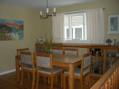
Can you see the implied lines in this dining room? Your eye runs horizontally on three levels. It is boring! I can say that because it is an old shot of the dining room in my house. A few simple changes helped greatly.
The strong line that ran from the buffet to the railing was broken by moving the buffet to the opposite wall and creating a visual break by hanging long drapes . These are temporary while my custom order ones are being made. A new round light fixture hung lower also helps break the horizontal lines. Thankfully none of the wood is a orange as the photos suggest!


