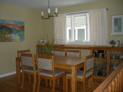
Before
After
I moved the furniture, placing the buffets along the kitchen wall. and set the table up vertically in the space. That allowed me to hang floor length draperies; these are temporary until my custom ones are ready. My new ones will be off white and hung higher. Yes, I do know these are too short!
The strong vertical of the draperies plays nicely against the railing and breaks up the horizontal lines. I have a new light fixture which is larger in scale and hung a little lower, but not so low that my tall family will bang into it! I still want to see the art work over the buffets while seated in the living room. I always choose function over anything else.
I also like the fact you can't look directly into the buffets from the front porch! I'm thinking about stripping the natural finish on the furniture and doing a gray wash to change the colour and make it stand out from the floor. I'd love new chairs, lamps for the buffet, something more interesting in the corner by the railing..... We'll see......
What do you think?


No comments:
Post a Comment