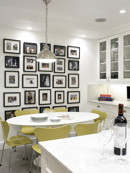
Showing posts with label lighting. Show all posts

Saturday, March 21, 2015

Lighting your dining table

The right lighting can make a room sing, but often our rooms are  off key. When you have a house of a certain age (30 years for me) there comes a time when you know you have  to update your look. When I started to change the lighting in my home, I began with the two over my tables because they would have the most impact.

dining table, lighting, drum pendant, contemporary,Designing Home, Margaret Ryall
Kitchen table 

When you're buying lighting to hang over a table you should consider these  factors:


 Height of ceiling

A taller ceiling  often requires  larger fixtures; many new home builds in my area now have 9 foot ceilings.

Size and shape of table

Your fixture should complement not overpower your table.  You can also have lighting fixtures that are too small for a table.  I am particular about  what shape fixture I mount over a round table; I like to repeat the shape with a circular format, but that's just me.

Height of homeowners

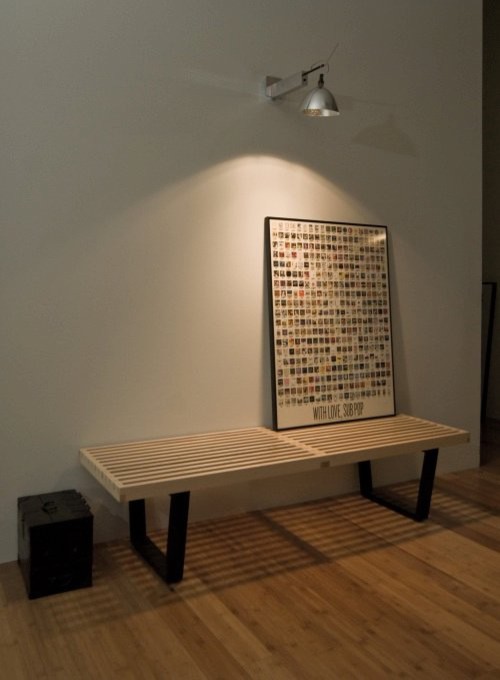
It is a fact that tall homeowners have a greater chance of continually bumping into lights hung too low over a table when they are setting or removing dishes.  Some people are so tall your would never mount pendants high enough!


Height above table

The specifics of how high to hang your fixture can be confusing because you will find a range of suggestions depending on which sites you consult.  Don't let that deter you.  My adage is "Common sense prevails".

 I tend to think in terms of a range while taking other factors into account including: personal preference, the height of the homeowners, fixture size, style of fixture, ceiling height, task to be illuminated etc.  Read on for examples.


    graphic lighting your dining table


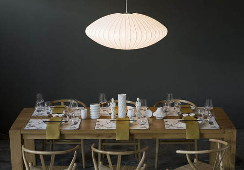
    The general recommendations for  hanging a fixture over a table is 28 - 32 inches above the table if you have an eight foot ceiling.  This graphic from wegotlites recommends 30 inches from the table for an 8 foot ceiling.   I placed my kitchen table pendant  at 32 inches from the table top so I wouldn't continually bump it when working. It works most times, but when I reach in too far I still bump it.


    dining room pendant, hanging height,


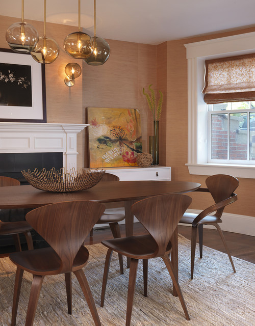
    My dining room pendant is 34 inches from the table.   Being able to view my art collection to best advantage in very important to me, so  I moved the  dining room pendant up an additional two inches from the hanging height in the kitchen  so visitors can  view the art over the buffet without disruption while sitting in the living room.  You may not find this consideration in any lighting guide!

    Another set of guidelines recommend measuring  from the floor  to the bottom of the shade and suggest 60 - 66 inches as reasonable.  Most tables are 30 inches high.  That would put the height from the floor  to my kitchen  shade at 62 inches, and my dining shade at 64 inches, both are within this guideline.

    If you have ceilings higher than eight feet, go up 3 inches for each additional foot above eight feet.

     Size of fixture

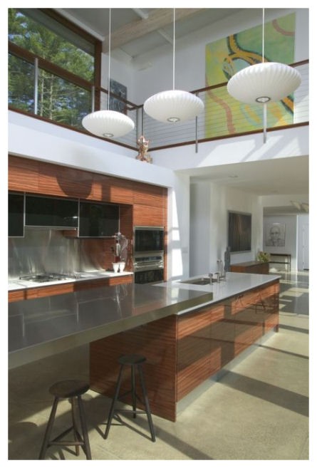
     For most applications the diameter of your light fixture should be at least 1/2 the width of your table or even up to 2/3 the width of your table.   My kitchen fixture is exactly one half the width of the table at 18 inches in diameter.  That's the proportion I like.  I could have gone with a diameter of up to 24 in. without it looking too large.  My dining fixture is only 16 inches  in diameter, but looks larger.

    Sizing based on room dimensions

    graphic lighting your dining table, Designing Home, Margaret Ryall


    There is another guideline for determining the size of your fixture. Add the length and width of your room together ( eg., 11 feet +14 feet ) and convert the sum to inches (25in.) and that should be the diameter of your  fixture.

     Of course that is not a hard and fast rule, but it will provide a light fixture that is a focal point for the room.  This formula works better for a statement fixture  in an entrance or stairway.  You can see how it could get out of control in a dining room.  Eg. 15 feet + 20 feet would give a fixture diameter  of 35 in.  That's the width of most dining tables. 

    Function of fixtures

    The illumination given off by drum shades  is soft and calming,  but  bright enough to provide lighting for an entire room.  When a large drum pendant is hung over a table it not only anchors the vignette, but if placed on a dimmer the fixture can provide brighter light for any tasks done at the table and softer light while dining. While I don't have anything against chandeliers, I don't have any in my own home.I'm definitely into clean lines and a very sparse contemporary feel.


    I am planning another post about lighting selection for various rooms as I get ready to replace the fixtures in my summer house.   Stay tuned.  

    What variables do you consider when hanging a light over a dining table?

    Friday, February 13, 2015

    From snow to eggs

     We are hunkered down for a winter storm with 40 cm. of snow predicted.  Everything is closed so there are no schedules to keep. It's the kind of day where I have lots of time to let my mind wander where it may.  That's a dangerous thing when you can go from one thought to a hundred in a minute.  So let's see how I got from snow to this post.

    White, cold, wishing for spring,  Easter, eggs, decorating eggs, symbolism of eggs, egg imagery through history, eggs in art, design trend for 2015 (read it on Houzz this week),  Las Vegas Market trends Winter 2015, should write a new blog post because I have time today, anyone else predicting eggs are hot, search Pinterest.  Yep!  That's how my head works.


    What is a trend?


    Decor trends  are predictions based on patterns recognized from multiple viewings of similar material.  Anyone can make trend predictions if they have enough information and time to look for patterns.


     Here are some of the patterns I'm seeing on Olioboard, Pinterest and design blogs that indicate that eggs and egg shapes or oval shapes are appearing in textiles, lighting and home accents.


    Sometimes  eggs are represented literally and recognizable as what they are.  You will often see nests accompanying the eggs as in the pillow and art works above.  Sometimes the egg shapes are abstracted and used in repetition to create patterns.  These are the ones I find most pleasing.  

    egg motifs, eggs decor trend 2015, egg shapes, egg patterns in textiles

    Is it just me or do you find anything egg shaped or hinting of it pleasing/soothing to the eye? This characteristic makes it a perfect shape to choose when you want a lighting fixture to just sit there and hold a place without being  too dominant in the decor.  Sometimes this is not what you want!  For excitement do not choose  of the lights above (except the red one).


    Jeff Koons, Cracked Egg- Blue

    Egg shapes have always been a favourite of artists through the centuries.  Not only is it a pleasing shape, but the symbolism of promise of things to come, fertility, and creation  makes eggs a multifaceted starting point for many artistic explorations.

    Paul Lichetenhan - Nest 
    This work created by Paul Lichtenhan couldn't be more different than Koon's  reflective, slick and very large cracked egg above.  In this piece the aged patina of the recycled metals stand in striking contrast to the delicate ceramic eggs. 


    Andy Goldsworthy 
     Goldsworthy, an environmental artist, makes a different statement with his large, stone egg defying our usual interpretation of this delicate, fragile shape. 

    Ron Layport
    Finally Ron Layport creates  intricate, egg shaped carvings from wood.  In all of the presented  works the material used to create them is as important as the subject matter.  Each has its own beauty. 

    Eggs, simple or complicated, realistic or abstracted, may appear in some form in your decor this year. Perhaps you are ahead of the game!  Have you noticed egg motifs in your online viewing or shopping experiences?

    Tuesday, October 16, 2012

    One simple move

     In my last post I presented my problem dining  room. I feel I've put the space on the road to salvation.  Here's the update so far.  I have more ideas, but they require a lot of elbow grease and won't happen before Christmas.  I think it's looking more spacious and welcoming.

    Before

     After


     I moved  the furniture, placing the  buffets along the kitchen wall. and set the table up vertically in the space.   That allowed me to hang floor length draperies; these are temporary until  my custom ones are ready. My new ones will be off white and hung higher.  Yes, I do know these are too short! 

     The strong vertical of the draperies plays nicely against the railing and breaks up the horizontal lines.  I have a new light fixture which is larger in scale and hung a little lower, but not so low that  my tall family will bang into it! I still want to see the art work over the buffets while seated in the living room. I always choose function over anything else.

    I also like the fact you can't look directly into the buffets from the front porch!  I'm  thinking about stripping the natural finish on the furniture and doing a gray wash to change the colour and make it stand out from the floor.  I'd love new chairs, lamps for the buffet,  something more interesting in the corner by the railing.....  We'll see......

    What do you think?


    Sunday, October 14, 2012

    Do you have a problem room?

    We all have them, those rooms that defy all you know about design, and just continue to go about their merry way creating problems no matter what you do with them. I managed to create a monster a quarter of a century ago right  in the middle of my house because  my mind was focused on other things at the time. I've spent the intervening  years trying to make my dining room "right" by my standards - I haven't achieved that yet. 

    No one has ever walked into my house and said "OMG, what a mess this dining room is."  So what's wrong with it  in my eyes?

    Location:  When you're standing in my entry  you look directly into the dining room.  The archway frames the table and the window.  It is also a walk through space from the living room  on the right  to the kitchen which is to the left.

     
    There is an alternate hallway beside the stairs, but we never go that way. My dining room is the room in the middle with no identity. Because the walkway needs to be maintained  only half the room is really accessible for  the table - problem #1.

    I noticed another problem when I looked at this photo but it was easily fixed. Can you spot the fix?

    Across from the table looking  toward the front porch. 
    Top art work by Angela Antle and bottom by Anita Singh

    A second artwork was added to connect with the chair below it. Doesn't that look better?

    Furniture: The dining room buffets, table, and chairs were handcrafted, especially for me, by my man who can do anything.  The set has that "casual contemporary with a nod toward mid -century modern look" that I love.    The scale and style fits the room and the buffets are nicely tucked away behind the table.  Have you noticed problem #2 yet?

    A rather dark  view  from the living room.  Thankfully the railings aren't that orange!

    You're right! The furniture is the same height as the railing causing your eye to run along the lines and never go anywhere else. I've used all my tricks to make it otherwise, with minimal success. Note all the verticals - floor lamp, tall twigs, candle sticks, vertical artwork, accentuated vertical windows in living room.  The strength of the horizontal lines and the preponderance of wood wins out every time.

    Flooring and railing
    Problem #3
    The aged oak is so orange- my least favourite tone in wood. Because I can't rip it all up or throw away the furniture, I've decided to embrace the orange  and pick it up in interesting art works that also have lots of purples and blues to tame down the orange.  

    Problem #4 
    Because the furniture is in one half of the room, there isn't enough space  for an area rug which would keep the furniture from blending into the floor.  If I wanted to use an area rug I would have to cover most of the floor, but that would mean vacuuming;  I would rather use a dust mop! 

    Problem #5
    I have a love/ hate relationship with the railing.  It is solid wood, has a good design and fits with the age of the house and our design aesthetic. I have strong feelings about maintaining "period "architectural detailing and the railing is necessary because the living room is sunken.  But it is soooo difficult to ignore that orangey railing..  It didn't look like this in 1986.  Time ages wood to either orange or yellow especially when treated with oil based products.  


    Lighting 
    Problem #6

    The light fixture was an impulse buy  because I liked the lines,  but its scale is too small, and it is hung too high in my efforts to make sure you could see the painting at the end of the room.   As an artist, art always takes precedent over every other design  decision in my house.  This often leads me into hot water.

    Wall colour 
    Problem # 7

    You may be thinking at this point why doesn't she have the walls pained a cooler neutral.  Can't happen because the living room, where most of the light comes from, is north facing and the house next door blocks off any light in the dining room.  Both rooms are dull and cold.  The living room is  Elephant Tusk OC 8 Benjamin Moore and the dining room is Light Khaki  BM 2148-40.

    Window treatment
    Problem #8 
    I love these back tab drapes for the subtle design and their softness,  but the necessity to crop them to allow for the buffet further emphasizes all the horizontal lines. I also think I should have a window treatment that covers the window in some way so you can't see the wall of the next house with is very close to the window and certainly not interesting.

    Matching set 
    Problem # 9
    I have an aversion to matched sets of furniture and here I am living with just that. Matching always looks so uninspired in my eyes and gives the appearance of laziness.  Like you couldn't be bothered to put the room together.  Yes I like a curated room and I have a bundled set!

    I'm sure if I really tried I could find a Problem 10.  Many of you may feel it is the lack of cove mouldings, but that again is not part of the architectural details of the original house. 

     Well that about explains the problems. Who knew there was so much wrong with my dining room?  Most of my friends would be very surprised by this analysis!  In the next post I'll look at some possible solutions.  If you have anything to suggest that might help with my design dilemmas, I'd love to hear from you.


    Thursday, April 26, 2012

    10 Iconic furniture designs


    Continuing on from my previous post, I'm exploring some of the iconic furniture styles that were designed mid century and still are sought for  contemporary decor. Here are 10 of my favourites.

    Eero Saarinen Womb Chair

    Lake District Residence

     The beautiful Womb Chair, designed by Eero Saarinen for  Florence Knoll in 1948, is  available in many vivid colours. This green is perfect with the pale floors and gray walls. 


    The Eames Molded Plywood Chair

    Amoroso Design modern living room
     Amoroso Design

    Time  Magazine called The Eames Molded Plywood Chair "the best design of the 20th century" and it continues to be a staple into the 21 century. It was designed by Charles and Ray Eames in 1946 for Herman Miller. 

    Arne Jacobsen Series 7 Chair 

    || C O B U R N - A R C H I T E C T U R E || contemporary dining room

     Arne Jacobsen designed this chair in  1955. The curves  move your eyes in a restful rhythm and there is such softness to the overall look. I love the colour of these  particular chairs and the shape has always appealed to me.

    Arne Jacobsen Egg Chair

    Vintage Furniture modern bedroom

    Arne Jacobsen designed the egg chair in 1958 for the Radisson Royal Hotel. I visited Prague this past summer and this was the style of chair in one of the lounges.  They are super comfortable.

     George Nelson  Platform Bench 
     
    pearl district loft - entry modern entry

    The  George Nelson Platform Bench manufactured by Herman Miller

    You see the George Nelson Platform Bench quite frequently in trade magazines .  It is very versatile and works equally well as a coffee table or a bench.  Place it in a hallway, at the end of your bed, in an entrance where space is at a premium.  or in a living room. 

                                                          Florence Knoll  Lounge Settee

    European Salon traditional entry
     Lucy Interior Design

    This beautiful,  white Florence Knoll  Lounge Settee fits perfectly in this tiny space. The straight lines, tubted back and seat provide all t he detail that is needed to see why this is a  highly popular design in the 21 century.   


    Isamu Noguchi Coffee Table 
     
    source

      Isamu Noguchi tables are widely available and relatively affordable. They were in constant production from 1947 until 1973, and then returned to production in 1984, and  are still available.  Because of its rounded triangular shape it works well with one edge parallel to a sofa and the the other two edges facing two chairs on angles.  I have also seen it used to great effect with a sectional sofa and a chair arrangement. 

    Wegner Wishbone Chair

    Design Public, Dwell Studio

    Have you ever seen The Wishbone Chair in anyone's home?  It is i probably the most popular Hans J. Wegner chair because its rounded style fits with so many other different styles of  furniture. .  This  designer  began his career as a cabinetmaker and then spent time as a furniture designer with  Arne Jacobsen's architectural practice. The Nelson Pendant light is another iconic mid century design. 

    Nelson Bubble Light 
    Kitchen design contemporary kitchen
    Urban Homes

    The first Nelson Bubble Light was designed by George Nelson in 1947.  They are hanging shades comprised of sculptural wire skeletons covered in translucent plastic. There are a variety of forms including: the Propeller, the Cigar, the Crisscross, the Ball, the Saucer, the Apple, the Pear, and the Lantern which are still in production today.

    .Cherner Armchair  Side Chair

    Dining Room modern dining room
    Rachel Reider Interiors

    Norman  Cherner designed this beautifully curved chair in 1958 and it went out of production in the 70'd. His sons started producing them again in 1999. 


    Do you have a favourite?


    Gambar Belangkas