Showing posts with label design tips. Show all posts

Friday, April 17, 2015

Is it spring yet?

I don't know about you, but around this time of year my decor starts to look a little like I feel after a long, cold winter.  Tired and worse for wear.  I had the urge to bring some spring to my house; I tried, I really did, but mother nature had other ideas.


  I had visions  of something  like this  for my front containers with a bit of fake thrown in until the real thing is possible - that means late June here.

Source 

 I bought pussy willows and some  short, purple flowers to  add to the greenery that is there.  Unfortunately the current items from Christmas are still frozen solid.   I have  what survived the raging winds and snow of winter ....


I guess it will be red dogwood, Spanish Broom and pine for a little longer! The berries are long gone.


Then I thought what about a new wreath to hang over the containers.  I wracked my brains.  Do you know a spring motif that would look great with Christmas planters?  I  couldn't come up with one thing apart from twigs.  That wouldn't help my craving for colour.

 My only recourse was to take in my Christmas wreath in an effort to remove a little more evidence that I am not with it.


cc960 french violet Benjamin Moore


 Then I tried to convince myself that my Benjamin Moore cc960 french violet door was my spring statement!  Feeble. But hold on a moment.

Would this convince you?  "... evoking thoughts of strolling along the Seine with an armful of violet bouquets"  according to the Benjamin Moore site.  That's close, I chose it because of my memories of the lavender fields in France. My granddaughters have noticed that I love purple, at times it is a little too obvious!


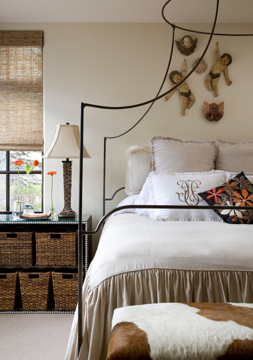
 As in my latest pillow thanks to a scrap of lavender velvet left from 


this little beauty my sister made for a bench in my front porch.  Don't you just love the decorative tucks that make a pattern?  My sister is a class act when it comes to sewing and decorating.  When I got rid of the nasty red accent pillows  I thought I wanted last spring, I knew my accent would return to purple and I would have to elevate this pillow to sofa status. Bye, bye porch bench.


 If you look up you can see where the idea for purple came from.  So spring has hit my house in the form of pillows.  I admit that isn't too overwhelming.

Where does that leave me?

Still thinking about the  dining room table.  Still thinking..... Hum....


Monday, April 13, 2015

Design lesson: Giving a large look to a small dining space

Large can have a lot of meanings, but in Newfoundland large often  mean great or good or the best as in " it's a large day".   Given that understanding here's  a "large" dining room and a closer look at why it merits that rating.

small dining room, design lesson, tips
Liz Levin Interiors 

This room has a lot packed into a very small space.    Just imagine this space with a matched dining set.  It would blend into the floor and be totally blah.  How did the designer achieve this look? Perhaps there's something in her kit of tricks that you could use.


Upholstered chairs


  If you have a dining table you love, and hate the chairs, consider changing them  to coloured leather or fully upholstered ones.  It helps break up all the wood that you tend to get in dining rooms.  This approach usually means you can get away without the area rug that many people have to resort to so their set doesn't disappear into a similar wood floor.

Mixing styles

I know this isn't for everyone, but if you like a more curated rather than matched look, it's the way to go.  The days of sets are long gone.

Contrast

Nothing attracts the eye better than contrast.  It is a design fact.  If you want a more neutral space without it being boring use contrast widely.   The dark table, cream chairs, and white and brown draperies work so well together.  Reusing the cream in the centrepiece adds another contrast point.

Pattern

I'm a big believer in using pattern to add interest to a space.  The geometric pattern in these drapes
 mimics other shapes in the room, both circles and rectangles. The colour scheme is replicated in the drapes. The drapes also provide  what I like to think about as destination viewing- a spot for your eye to seek in a room and rest before moving on.  Pattern is often the bow that ties up a space.

Mirrors

A mirror goes a long way to enlarge and add interest to small places. Personally, I like a framed mirror where this one appears to be  adhered to the wall.  Don't be afraid to go large when you hang a mirror in  a dining space.  A word of caution.  Check what is reflected in it.  Perhaps it might be something you would rather not draw attention to.

 Living things

And most importantly this space has living things in it.  There is nothing like plants and flowers to add a dynamic touch to any space.

Texture

While this is a small space it is packed with subtle textures and sheens: wood, glass, pottery, weave in drapes, and plants.  Texture is the most overlooked design element in many spaces.   If your own space looks blah maybe adding some texture will help.


Fine craft

 I like the form and texture of the vases on the table.  While I don't know for sure they look like fine craft. Nothing is more boring than a room full of "accessories"  from big box stores.  There's so many unique, hand built objects in every city and town.  I contend it is more interesting to have one or two interesting objects than a house full of mass produced stuff.  You may disagree.

All of these elements work equally well  in a small space or a large space.


And here's a space to check out to see if any of the points I mentioned above are present.  It's isn't a small space, but you will see a lot of the same elements and principles applied.

Blackband Design 

Lots of points to consider and possible some you might like to play around with.  What are your strategies to create a "large" room?

Monday, March 30, 2015

Using mirrors to solve decorating problems

Sometimes I have to remind myself of the power of mirrors to solve common decorating problems.   Here are seven  fantastic uses of mirrors that might not be on your radar.

1. To reflect light


mirrors, living room, reflecting light


This is one great space for a number of reasons, but the mirrors make it in my opinion.  Not only do they break up a dark wall and provide height to match the window, they reflect light in what might otherwise be a blah room.

2. To create a window in a windowless room 


mirrors, windowless room, living room mirror


dining room mirrors, windowless dining room, 3 large mirrors

There are often sections of a space that are dark and windowless.  Mirrors can give the illusion of a window and light without having to make architectural changes.  In both rooms above the mirrors also add dramatic focal points.


3. Add drama to an open space


foyer mirror, large foyer mirror, lucite table and mirror

This high ceilinged space demands a large scale treatment.  This mirror fills the bill when it comes to matching the scale of the space.  The choice of a lucite table ensures that the lines of the mirror remain dominant.


4. To replace art


mirror over bed, mirror focal point


 Sometimes a mirror when used well can replace art over a bed or mantle.  In this space the sculptural light is reflected in the mirror,  providing an interesting visual focus.


5. To highlight art/collections


mirror behind art collection, three mirrors living room


6. To create impact 

repetition of arched mirrors, mirrors living room, mirrors impact

 One of the best ways to create impact is through repetition.  Imagine the scene above if you just has three or four mirrors.


7. To balance large windows 


mirror with large window, large mirror living room

I love how the mirror is large scale, soft with its rounded top, and the height relates well to the window.  The gold relates to the lamps and the table which also mimics the rounded top of the mirror.


large mirror fireplace

I am definitely interested in any solution that helps balance heights/scale  in a room.  One of the best things about this mirror treatment is how it relates to the window next to it and the furniture in the space.   You read the fireplace and mirrors as one unit. The fireplace alone is small and delicate.  Keeping the mirror frame lighter and gold helps it to relate to the other furnishings in the space.

Seven reasons why you should have a mirror in your home apart from the obvious.  Who knew? Are you a mirror lover?  I'm sad to say my mirror choices are purely functional.  What about yours?

Please find links to photos on my Pinterest board Mirrors.

Tuesday, February 10, 2015

What every neutral colour scheme needs


I love serendipitous events that add to my thoughts on an interior decorating topic.  I recently experienced this  as I was preparing to write about neutral colour schemes.  Just like a gift  La Dolce Vita, one of my favourite blogs, appeared  in my inbox with the perfect visuals to support  several of the points I wanted to make.  Paloma always finds the best spaces to present to readers! Check out her blog, you won't be sorry.

 Making a neutral scheme work requires skill.  Once you  remove colour from the equation you have to make the most of the  other elements of design especially: pattern, texture, value/contrast and form.  Of course the principles of design remain in tact. Every successful space  has  good balance, harmony, emphasis, scale/proportion and rhythm.

Sounds great, but what does that look like in a space?

Check out all takes of this  living room  by Bill Ingram & William McLure of Bill Ingram Architect.

 Quiz time:  Jot down what  you think makes  the space  work.  If you are used to colour being your main decor element you might need to shift gears for a moment to see the beauty in neutral schemes.


living room,  neutral scheme, pattern, texture, contrast


living room, neutral scheme


living room, neutral scheme


living room, neutral scheme

Contrast

The first element that jumps out at me is contrast.  You cannot have a successful room without good contrast, even when you have lots of colour.   It's the same way in art.   I wrote about this  topic in depth here.  You get contrast by manipulating your values from light to dark.  This space goes from black to white and has every conceivable value in between.

Texture

This space also gets an A+ for texture.  Not everyone can have the stone work evident in this space but you might have a stone  or brick fireplace   Check out the wood stacked in the open hearth, the tree stump table and the rough wood planters.   A variety of textiles are used from the subtly textured obviously wool carpet to the white smooth fabric on the drapery and chair.  The knit pillows are perfect by the stone,  nothing like the garter stitch for obvious texture. But the coffee table is the show stopper with its reflective high gloss.  Don't miss the folded fur throw on the chair.   There is also subtle texture on the frame of the gold chair, the doors of the armoire and the statue.

Pattern

Geometric motifs predominate with diamonds, stripes  and circles repeated around the room.

Form

This can be a hard one if you like everything matched in furniture style.  I think use of a variety of forms make this space.

My own element that every space needs -- organic elements 

Imagine this space without the two fig trees.  I rest my case.  You need organic references in every space and this one has it in spades.

Only one thing

If I could change one thing about this space it would be the scale of the artwork between the windows.  Love the art work, but it needs a little breathing space around the edges.  Too much competition with the grids in the window. Sorry, it's the artist in me.  On the other hand I love the large scale fig trees and they might account for the scale of the art!

True, this space might not be your cup of tea, but it is interesting; it invites the eye to move around and to touch the various elements in the space.

Now it's your turn...
What are your thoughts on this space?  Could you live here?

Monday, November 10, 2014

Accessorizing: Learning from a pro - Vicente Wolf

Part 4 of 4 Accessorizing your home

I am intrigued by the designs of Vicente Wolf.   I've studied them as I study compositions by famous artists  in an effort to dissect  the lines of design, and the thought processes he engages in as he creates beautiful spaces.  In my opinion a good  design never looks too put together, too matched, but has  an effortless, collected feel. His always do.


source


source

Pale backdrops  and a mix of antiques and cultural artifacts are his trademarks, but there is so much more to his designs.  When you observe his work closely you find that there are design features he is drawn to that get repeated in variations in different spaces.  While each space is unique, you can see similarities in  his choice and arrangement of objects.

source

His background in photography obviously informs  his interior design aesthetic or maybe it's the other way around.  When I look at any space he has created, I see so many compositions within compositions, layers that cause you to look throughout his spaces.  I am  also sure they are photographed  to make you do just that.


The artist in me is attracted to how he organizes random objects into vignettes (object compositions).  So after much viewing, thought, and reading, here's what I've learned from this brilliant, self-taught, New York designer.

Repeat  still life elements


source

Wolf  often uses a painting to inform a vignette created near it.  Elements are repeated from the artwork as in the tree and scrubby plants  in the tray.The three candles mimic the strong vertical in the left of the painting and there's really three table tops- one in the art, the table itself, and the tray on the table.

Layer furniture


source

Not only is layering furniture a way to deal with limited space and provide versatility to meet various entertaining needs, it is also an effective strategy  to  provide visual interest and a focal point in an otherwise simple space. I like how the  large ottoman (often a signature piece for Wolf) is the only pattern in the room.  It is also a way to move  circular shapes around  an otherwise rectangular space.


source

Another idea for layering a table and an ottoman. Circular motifs play in this space too.  Have you noticed the use of higher tables? 

source

Circular motifs and layering under a bedside table.  The textural and geometric  elements of  pieced or woven wooden elements are also prominent as you can see below. 


Use texture and geometry in wood


Sometimes these effects are used over mirror to create intricacy and depth. 


source

Suspend mirrors/art  in space


source


 Frame  compositions in compositions 


source

This vignette illustrates  how to organize objects and frame them with what lies behind.  In this case the fireplace frames the vignette in front of it.  I also love how the mirror acts as an additional backdrop element in this vignette.

I'll finish with an important observation.  While I have highlighted some of the common themes I see in Wolf's designs I do not feel that his spaces are all the same.  He obviously feels it's important to work with clients to create personal spaces for them.  When you look at the slideshows on his website this is very apparent.  As he notes in Lifting the Curtain on Design (one of my favourite design books of all time)  page 128, " I know how to paddle a canoe.  But I approach each river in a different way"


If you're intrigued check out this interview done by Canadian House and Home.


And here's a great read  if you like the glimpse I've given you of this designer's work.  

Floating shelves, mixed chair styles,  limited patterns, repeating shapes and so much more not covered here.  I am limiting myself severely on this topic because I would break my self imposed post length rule. 

Feel free to add your comments to keep the conversation going. 


Friday, October 17, 2014

Budget friendly design

I'm handing over the reins  today to Tom Smith writing about a favourite decorating topic - practical suggestions for decorating on a budget.


When designing your home and choosing different pieces to incorporate into the space, it can be expensive to add new furnishings, rugs, and features. Although it can be costly to purchase new decor, there are several ways to stay within your budget and limit the amount that you spend. With DIY crafts and by shopping at discount locations, it's easy to create an interior that feels like home.


Shop for Used Furniture


More people are creating an eclectic and bohemian style in their living quarters for a cozy and mismatched style that offers plenty of details. Instead of breaking the bank on new furniture, opt for shopping at thrift stores or flea markets for treasures that will add extra dimension and character to each room. You can also consider revamping old furniture by sanding down wood pieces or reupholstering accent chairs with modern fabric.


Add Drama with an Accent Wall


Incorporate wallpaper into the design of your home — it’ll create a high-end look as if the space was professionally decorated. Instead of spending hundreds of dollars wallpapering a single room with multiple walls, focus on an accent wall where the material can be applied. Use wallpaper on the wall that is facing the entrance of the room for a great focal point in the space.


 Sew the Linens Yourself

From curtains to couch pillows, linens add a cozy touch and are one of the main features with interior decor. Choose the fabric yourself and sew accent pillows and slipcovers for an inexpensive way of using new patterns in each room. It makes for a budget-friendly way of making over an old couch or adding a fresh tablecloth to a kitchen table without spending twice as much on the linens.


Use Antique Accessories


source

Antique accessories can add character to the decor and allow it to look more expensive with hand-picked items that are unique. Opt for mixing different types of metals for a modern style, which can include gold bookends or silver candlestick holders. You can also dress up a bare corner with an antique tricycle or decorate a fireplace mantle with old statues.


 Incorporate Baskets


Allow your home to feel cozy with baskets that can be used throughout every area. Baskets are not only functional for organizational purposes, but also add a decorative element for a rustic and chic style. Use a dip-dyed basket to hold shoes by the front door or a wicker basket in the living room to store throws and blankets. You can also fill in blank spaces on bookcases and consoles with old baskets for an affordable product that can hold goods.


Tim Smith writes for Modernize.


Wednesday, June 11, 2014

5 Tips for painitng small spaces

 The one topic I've written about on my blog that gets attention from thousands of decor happy readers is decorating small spaces.  I think that is because rooms and homes today are smaller than they once were.  People living in condos or apartments must be conscious of using every trick in the book to enlarge their living spaces. So stay awhile and see how colour can solve some of your small space dilemmas.  Perhaps in these suggestions you will find a treatment for your small space.


Use one colour everywhere


This might seem like an extreme solution but it isn't really.  Using one colour all over a room makes the different planes blend together  to give a more unified look.  You can even use the same colour on the floor and ceiling if you wish.  Since your eye continues to move  freely around the room you have no sense of the boundaries of it.

same colour on walls and ceiling bedroom

If I could change one thing about this room above, I would paint the trim a soft pink too to keep the eye moving. Painting  trim white creates vertical and horizontal lines that your eyes automatically go to and follow. You can see the difference in the room below where the trim is painted out.  The room has an unbroken field of colour that is certainly expansive even though a dark colour was used.


painting trim and walls same colour


source

More blue, but the trim is painted a coordinating colour that is closer in value to the walls decreasing the emphasis on  the trim which seems to just blend in.

dark colours in small living room

Use cool colours 


 The rooms above are using the same colour almost everywhere, but they  are also utilizing another colour trick. Cool colours like blues, blue grays etc. make the walls of a room recede thus making the space appear larger than it actually is. Blues are an excellent choice for small bathrooms, laundry rooms, spare bedrooms, etc.  When walls recede you tend to notice the furnishings rather than the  "box" that contains them.

There's nothing like a cool lavender with white and light grays to expand a space.  
 

dark walls small living room

Use a dark colour on the walls


That's right, a dark colour!  Would you ever think that would work?  It does because  the corners disappear in the shadows and your eye moves around easily. Darker colours are often perceived as  visually deeper. There are  decorators who take the opposite approach to keeping walls light in a small space.  And the final trick with dark colours in small rooms is to paint them in a semi-gloss or gloss to reflect light.  This approach is not for the faint of heart,  but it can be quite stunning.   If you're afraid to go really dark choose a mid value gray or taupe.


Use a colour you see outside


Blues and greens give the impression that the room continues beyond the windows. You can paint the walls an outside colour or use one  in your fabric choices.  I love the freshness of the room below. It certainly is reminiscent of  plants.


blue and green living room


blending outside and inside colours

Designer Christina Murphy uses green to great effect  to visually extend this room by connecting it to the view outside the window.  Keeping a simple colour scheme is also visually enlarging.


blending outside and inside in decor 

Everything about this room invites the outside in and blends the two together. Lighter floors always enlarge a space.  There are no dark hardwoods in my life, I like light and airy all the way.

Keep walls and furniture a similar colour 


 When you keep the furniture and walls close to the same colour you are blurring the lines between them. As a result the mass of the furniture is decreased and the overall volume of the room is increased.  If you don't wish to have all the furniture the same colour consider having at least  the bigger items like armoires and chests close to the wall colour so they will begin to blend into the room and widen it out.


Decor by Jennifer Inc contemporary family room

I also want the cabinet for the TV to be a lighter colour, but it is undeniably a focal point in the room  and every room needs one. I'd also skip the dark wood rods which your eye travels to automatically because of the contrast, but I also understand why the decorator chose them (all the woods in the room are dark).   Overall I love these two rooms.  They are warm and inviting.

Alexandru Apartment lviing room contemporary living room

I equally love the cool minimal look  of this room, but it isn't for everyone.

Paint a Focal Wall


 I'm not a large fan of painting a focal wall.  I think sometimes it works to great advantage, but most times it is a less than creative solution in a space. This strategy  can work wonders in a small space, Don't be afraid to paint an accent wall a darker receding color thus  making the space look larger.


Living Room  dark focal wall

 And there you have it.  The only thing left to do is decide which of these solutions will work in your space. 
 Happy painting.

Gambar Belangkas