Showing posts with label colour scheme. Show all posts

Thursday, November 27, 2014

Choosing a drapery colour

Ah, the dreaded question.  What colour draperies should I have?

Part of being a decorator is making informed decisions about design.  Keeping current with trends  through reading and viewing is a must, but trend knowledge is not enough.  You have to understand what affect your choices will have on a space.

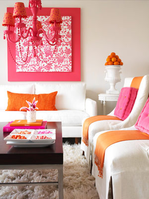
I posted this picture on Designing Home Facebook Page as an example of a style board I create for clients.  I am not one for vivid colour, but I didn't have to live with the colour, a young lady who loves rich colours did.   Should I have argued with her and said you shouldn't have bright draperies. NO!  I have to balance my client's likes with the principles and elements of design.

vibrant drapes, turquoise drapes, vibrant living room, Designing Home
Vibrant  draperies 

Let's look at what this colour choice  did for this room.

 You can't ignore this window treatment, it's not only the vibrant colour, it's the placement and amount of it. That means a lot of colour jumping forward in the space. The draperies also serve to  frame the artwork and the sofa. The more muted sofa is anchored and held captive, and you need an equally vibrant art work to compete with the windows. When you look at this space blue is primary and everything else is secondary.

The overall effect is focused and the room appears smaller than it actually is.  That's a great tip if you have a large space that you want to appear smaller/cosier.  Go for darker/brighter  window treatments that draw the eye.

 I see this as a lively, energetic scheme that is equally matched to a sparkling, vivacious young lady.


On to number two example....

soft white drapes, roman shade, fresh living room scheme, Designing Home

I removed the vibrant draperies and choose something more in line with my personal taste.  I like my spaces to be expansive, and tone -on tone- window treatments  (keeping the colour of the drapes and the walls very similar) is  one way to achieve that look/feel especially in a smaller space.  

Now the sofa and artwork stand out as they didn't before.  Your eye connects the light colour in the chairs with the draperies and you visually wander the space. 

On to example number three....  


fresh living room scheme, fresh green, turquoise


Same window treatments, but I'm tweeking a few other things. Without the blue pillows on the chairs,  and the blue vase on the table, the space is even even more opened up.  The overall effect is fresh and inviting,  reminiscent of a summer garden - always a look I gravitate to.  The wooden tables help that feel too. 

So there is no right answer to the question "What colour draperies  should I have?"  It all depends on how you want your room to look/feel. 

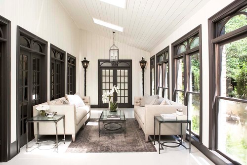
If you wan to find out more about current trends in window treatments check out this post and several others in my side bar. 

What's your preference when buying  window treatments ?  Are you a neutral or a colour lover?


Thursday, October 24, 2013

May I suggest aqua?

Although I am interested in the latest colour trends in home decor, I am not a slave to them.  I choose gray as the neutral in my house in 1986 and it wasn't a  growing trend until 2011!  It will still be my neutral ten years from now because I feel comfortable with gray as a backdrop.

 We should all choose colours for our homes that we like.  My first order of business in a colour consultation is to determine what kind of colours a client really likes.   Next I check the room's light  orientation and lastly I look at the furniture and art in a space.

I just went through all my pins on  my colour inspiration board on Pinterest to look for trends in my own pinning.  I have quite a few with aqua.  I do not have aqua in either of my homes, but I am obviously attracted to it  because I love blue greens.  How about you?

Aqua is a versatile, fresh colour as you can see from the interiors below.   You can use it for an accent wall, to paint furniture, in pillows, or even on  a ceiling....use a little or a lot....


 Aqua as an accent wall with lots of cream is stunning.

 A more intense aqua with citron green and a pop of magenta... perfect for a teen's room!


 Serene gray with aqua accessories.

The same scheme as above with black added. 

 Aqua and white with a hit of darker  blue.


 And who wouldn't want to have a chat in this sun room? Creamy white mixed with green and aqua is so  fresh and inviting.

 Just loving the hit of red with aqua in this boy's space. I think aqua is the perfect colour to paint a piece of furniture and look at those shutters!

 I've always loved this colour combination  with rattan or any mid toned wood. A liberal amount of white is needed to prevent over saturation.

 And here we have the merest hint of a dark aqua with magenta and off white.  This is a great way to have pops of colour without over committing.

  An interesting colour combination with great pattern choices too.


 If you're feeling a little vintage aqua makes a great accent.

  And just this one little pop of aqua glass makes a nice punctuation mark to end the post. 

All links on my Pinterest board indicated above


Thursday, April 18, 2013

6 Options for painting trim


  There are so many decisions to make when you begin decorating a new home or renovating. Something as basic as what colour to paint the trim often causes homeowners hours of deliberation.  How about you?  What decision have you made about painting your trim work?


1.  White/off white

This is  the most common solution to painting trim .  It works with every style and is fresh and crisp. 


Even if you have white walls your trim can also be white. Consider changing the paint sheen to semi gloss or gloss if you want to accentuate the trim in a white room.        

2. Wood - natural  or stained 

There was a period of time when many homes had natural or stained wood trim, but this trend has slipped a little in the last ten years.  When you have wood your decision is often to leave it natural or stain it.  When your floors are also wood, it can help you decide which stain option to go with.

 Contrary to popular belief wood trim is not sacred.  If you want to paint it don't hold back.  Interestingly enough it is mostly men who revere wood. When you choose this application your are making a decision to outline a room.  Make sure this is what you want to accomplish.


 Rebekah Zaveloff

 In this space the trim colour is in keeping with the floor tones and is just a little darker.  

Houzz

With light wood floors you always have the option to choose your trim stain  to work  with your furniture. I think the omission of crown in this space really works well to provide a lofty look and keep the viewer's eye at living level.


Your wood trim  doesn't have to be dark to be effective.  You often see natural wood trim  in more modern spaces  where the walls are usually a  light colour  Hint. If you want to achieve a lofty look as in the previous room shown, paint your crown the same colour as the wall.

3.  Same colour  as walls
I often use this application in modern spaces or in rooms where there are too many doors.  When you do this a seamless look is created and the walls become the perfect place to display art without  all those lines you get with alternate colour trim. If you have a more traditionally styled home and modern furniture,  painting your trim the same as your walls will provide an updated look. 


Wondering about chair railing or other paneled effects ?  Rather than removing it, paint it the same as the wall.


4. Colours 

If you are someone who loves colour, this might be the look for you.  It also works well in kids' rooms.    Beware this application creates strong outlines in a room and can chop up your space. Some would say it adds energy because your eyes are always wandering.

5. Darker Than the Walls

This is a good solution in certain spaces. When you paint your trim darker, choose a colour that is roughly two values darker than the walls. This is a great treatment for modern spaces or commercial spaces.


6. Black
This is a daring solution for trim.  When used with white/off white  walls it provides a crisp look that is elegant and serious.  Black looks equally good with soft gray walls.

 Architect Neuhaus Design Architecture, P.C.

If you have very ornate trim , black can really accentuate this sculptural element in your home. Don't be afraid to use it. 


Lots of options....


Sunday, June 24, 2012

Not your average colour scheme

Some colour schemes are a dime a dozen and others are just daring and interesting. Today I'm looking at salmon/coral/melon and pink/rose/magenta.

Now I'm not saying I would use these colours in my own home. You can appreciate from afar without committing!  These rooms have just too much colour for my personal style.  I'm attracted to them because they are so vibrant and fresh.  Isn't it a good thing we don't all like the same colours?

 How do you feel about these rooms?  If you could transport any of them into your own home would you?

This colour scheme seems to be most popular in bedrooms. 

 Interior Designer Artistic Designs for Living, Tineke Triggs

The white bedding  and accessories work well to balance the hot colours.  White has many uses in decor and acting as a backdrop is just one of them.


You can't deny that these colours are great for a kid's room.  I'm really liking the hit of lime green as an accent.


This is the subtle version of this scheme.  Just a hint of melon with a deeper pink. Both are tempered with lots of off white.  That seems to be a common thread through most of these rooms.

More vibrant colours against light walls and furniture. The pink is leaning toward purple and there isn't that much of it. 

 This room turns it around and focuses on a rich magenta with smaller pops of orange. Do you think the headboard is dramatic enough or would you like to see a big piece of art over it?


Do you fancy one of these?

Living rooms


 Lots of white to play with these two vibrant colours. I'm longing for a little more pattern, perhaps a stripe with a third colour thrown in to replace the pink cushions. 

Here are some choice....


I would go for the purple one. How about you?
 
 While we're at it what let's think about the white vase... Hummm...

Choose one.  No matter what pillows you choose there's a vase that works.

  Can a room be over matched?  YES!


Deeper pink leaning toward red with just hints of orange give a totally different look.  In this room a neutral tan  in varying values serves as a backdrop to the vibrant colour. I like the fact that this room is not too over matched.  Lots of pattern in the pillows.


Simplified Bee®: Sweet, Modern Pink & Orange Nursery Room for Baby...

Thursday, January 26, 2012

Details- gray vintage


Some images need to stand alone to enable us to thoroughly enjoy all the nuances they contain.  Because  too much text can wear out an image as well as a post I'm  planning  a series of posts titled Details that highlight things that please me visually.

Gray is not everyone's cup of tea, but it's been my neutral go to colour since the mid 80's.  Gray is actually a very complex colour and it's "nature" is defined by the colours that have been neutralized to make it.  

The details I love:
  •  the shape of the vintage credenza with all those drawers
  • the variety in the values of  gray used
  • the high sheen on the door makes it stand out from the other more matt textures
  • the one hit of colour in the flowers
  • the ornate crown mouldings contrasting with the simplicity of everything else
 is there anything about this vignette you like?


Saturday, October 1, 2011

Achieving colour continuity

Colour continuity in a colour scheme is important for a smooth transition from one room to the next in your home.  It is even more important if you have an open concept home, a smaller home or one that is organized around a central hall plan.  If you were to stand in one spot in your house and do a 360 degree turn you should have a harmonized look.  Many people understand this basic concept in decorating, but often it's the execution that causes difficulties.

Colour continuity does not mean having every room painted the same colour (but your can).  It means a smooth colour transition from room to room.  My preference is to choose up to 6 neutral colours for walls in a two story home and then organize them in an interesting flow from room to room. I like some surprises and greatly dislike a look that is too put together (matchey, matchey is my term).   Walls are an envelope to contain the excitement you create with accessory choices.

 The simplest way is to begin with a colour key or inspiration piece.  It could be an art work, a piece of fabric, a photo of a scene, an area rug a piece of pottery or china - the sky's the limit.  In my case I began with an artwork by Elena Popova   France 11 that  has a personal connection for me and always makes me feel happy....


I kept the wall colours in the house very neutral with warmer tones in north facing rooms and cooler ones  south facing. Then I used  colours from  the artwork to choose furniture and accessories.  My window treatments tend to be as neutral as my wall choices.

Deciding what your accent colours will be and how you  allocate them is  a personal choice.  I happen to love the peaceful nature of green; I feel fresh and relaxed in its presence.  It appears in many guises and in varying degrees in each room  in my home. I also like purple and green together (my favourite plants are often purple). There is a direct relationship between the colour palettes I use in painting and my subject matter and what I put in my house. Sometimes we understand why we are drawn to certain colours  and other times we just know what we like. 

My accessory colours are green, buttery yellow and purple, 

 but orange keeps popping up in the art work I buy or trade (and I keep saying I dislike orange). In the dining room the walls are BM Light Khaki which has a greenish undertone. It is the only wall that is actually a "colour". I had to warm it up because it gets little light.
My accent colours move around my house in happy harmony  existing in  varying proportions from room to room. 

But what happens when you already have major furniture pieces and you want to establish a new colour scheme?  Look for a  fabric that already has some of your furniture colours as part of its colour scheme and move on from there.I find paintings and textiles the best sources for colour inspiration.

Here's a glimpse of how  my colour scheme works .

 My living room wall colour is BM Elephant Tusk which is a great neutral colour for a north facing room.  The largest portion of green in my colour  scheme is my living room sofa and chair. You can also see the purple reflected in the cabinet, pillow, and the flowers in the vase.


More purple, a touch of golden yellow, and one hit of red.  Every room need at least one unexpected colour somewhere. My favourite "hit" colours are turquoise, lime green and red.  I like to mix up patterns too. Over the years I've tired of wood tones and have been slowly removing them from furniture.  The floors are enough. I've committed the worst sin by painting solid wood furniture a neutral gray!

My kitchen wall colour is BM Rockport Grey. The room  sports a recycled wicker chair purchased for $40.00.  A little spray paint and away you go.  I've paired a  golden beige with it. Remember the hit of golden in the border on the Turkish throw in the living room? A lighter version can be found in the artwork above the chair.


The sofa in the family room was the inspiration for the cabinet in the kitchen and the mantle colour. Notice the purple/ blue used as accents.  Gray  is repeated in this room in furniture, pillows and other accessories in slightly differing proportions than in the living room. The walls are BM Rockport Gray. It works well in this south facing room that has warm light most of the day.


And my vase of pods moves around! The table is painted BM Iron Mountain.  Love that gray.


You can see purple and green used in accessories in the porch. I now have a lovely light purple pillow. The drawers are on casters and pull out  for storage. The bench is Wish AF 680 in Affinity line by BM. The walls are AF 675 Fusion (lower picture is closes to real colour).  My house is as much about comfort and convenience as it is about style. It can't just look good, it has to work.


A  yellow green is used as an accent in the study upstairs. This is an unusual  colour combination that I took from  the fabric that I used to create a stretched fabric piece.
 
And how about this great roman shade?

And that's how I went about developing my colour scheme.  My home isn't a showpiece, it's a place where you can relax and mess  it up a bit and it's always in transition. Stay tuned for  my dining room make over....

Gambar Belangkas