Showing posts with label mid century modern. Show all posts

Tuesday, November 12, 2013

The making of an interior decorator

  What's your interior design aesthetic?
             "
"What's that you ask?  Design aesthetic?
Should I have one ?  Perhaps I do! " 

This is not a question I could have answered in my teenage years, but it was those early years that laid the foundation for what I would come to understand and appreciate about design in my adult life.

 I believe our  interior design aesthetic (aspects of interior environments we are attracted to) is developed from what we've been exposed to  through our life experiences:  the house we grew up in,  homes of friends, your home town, reading, travel, and various forms of  media, etc. 

 The road to my house just before my birth

My house age 8

 Is this a town that raises a design conscious gal? 

"Yep!" 
 How did that happen?

I was exposed to very functional decor growing up in a small town in Newfoundland in the the  50's and 60's, but there were always  handcrafted  items in our home and I was encouraged to participate in their creation. There always seemed to be lots of scraps of wool, fabric and thread around.  I  appreciated what an individual could create with very modest materials, and I  believed at an early age that I could create anything I wanted.  That's a pretty powerful beginning.

The Singer sewing machine got lots of use in our home. It was a sound I did homework to, read to and even made it hum myself. 

What came off it was varied: curtains, quilts, bedspreads, and even mini skirts and tent dresses. Fabric remnants came from family members in New York.  That link assured I was current in textile designs! When not sewing I was busy with  crocheting , knitting , and hooking  rugs. All added warmth to our home.


At 13 I discovered the library in the next community and my design world expanded. 


Good Housekeeping

 There were books and magazines  that took me well beyond the small town I grew up in.  I devoured them, imagined, sketched, and rearranged our bedroom (with my sister's help) numerous times.  Mom took it all in stride. 


 Quite the design statement!  I had nothing to do with this decor, but I did make the dress! Not bad for a 15 year old.  At the time, I thought I would be a fashion designer, but good old Newfoundland practicality took over. 


TV programming added to my understanding of what was in style. I jet setted around the world with The Man (Men) from Uncle without ever leaving my living room. 

 And got my first taste of that famous British style on the Avengers. 

What we now refer to as Mid Century Modern design was in its prime in my formative years.  For the youngun' reading this think  Mad Men. 


When I was 19 I spent the summer in New York. It was a trip of firsts.  First time I went to large department stores,  first time to see art galleries,  first play.....   And what about what I saw on the streets and in store windows?  It all went in and somehow came together into a feeling, a sense of what I liked and wanted in future interiors.While this type of decorating was happening in New York....


Albert Hadley, New York, 1971

The average homeowner was living in this.

That was a pivotal time in my understanding of the broader world and the vast discrepancies among the homes I was used to and the homes of the "out of reach". I began to read more and think about what elements and principles interested me  in the designed interiors I was viewing on TV and reading about. My design aesthetic was forming.  

In 1973 I got my first apartment and  it had a lively colour scheme of white with red and navy accents.  All very fresh and simple.   All second hand and dressed up with lots of covers and paint.   I moved from being a university student to a teacher - a different kind of designing! I continued to read about design and do lots of DIY projects. 

It wasn't until the mid 80's that I decided to study interior decorating and it would be another twenty years before I officially advertized as a decorator.  I would contend I was always one. During that time I also began to paint.  It was this activity that honed my colour sense and gave me a firm understanding of the elements and principles of design. 

 My design interests today can be traced back  to my roots as a mid century modern girl.  I still love clean design without too much "fussy".  I like  furniture with straight lines,  geometric motifs especially circles, lots of texture, light colours, hand made items and abstract art.  I describe my look  as casual contemporary with a quiet edge.

What's your design aesthetic?

Monday, February 18, 2013

The dish on modern design


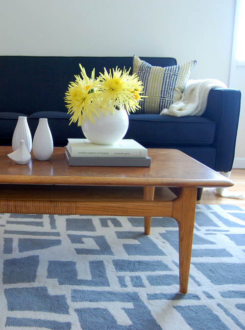
Modern style is a clean, streamlined furniture and architecture style that first appeared in the  1930s with roots in the German Bauhaus School of Design and Scandinavian modern design.   The modern movement was a response to what happened in design and history up to that point.  Art, architecture and  interior design broke from traditional detailing and styles and forged a new path. Modern design is still a prominent style in today's homes where homeowners seek original mid century modern furniture and accessories or resort to reproduction pieces.

  Defining characteristics of  modern interior design include:

 John Maniscalco Architecture
  •  simple, minimal, flat surfaces and unbroken lines 
  • low profile furniture with raised legs for an airy look 
  • wood floors but sometimes, cork, cement or rubber
  • minimal accessories


  • emphasis on form, geometric shapes
  • large windows that let the outside in
  • natural elements for accessories (large plants, sculptural twigs)
 

    • use of metals, leather and glass

      •  molded plywood, clear and white plastics for furniture

       
      •  simple or no hardware


      George Nijland
      •  predominately light walls, especially white
      • controlled use of pure colours in furniture/accessories ( mostly red, yellow, blue) 
      • use of texture 
      • use of art to add colour,  design elements and a focal point


        use of geometric patterning


        Many of the iconic furniture pieces of mid century design are still reproduced today and this confuses people because modern  is not that new! What some consider leading edge has been popular since the middle of the century.
         

         One of the strongest trends in home decor  today is to mix  modern pieces with contemporary decor.   The overall tone of this room is mid century  modern , but the severity of line and the more minimal approach has been softened with accessories.  Removing flowers, books, vases and pillows would create a truly modern decor.


         In my own home I like to mix mid century modern  pieces like the dresser, bed and chair with softer accents and a range of patterns and textures.


        Thursday, April 26, 2012

        10 Iconic furniture designs


        Continuing on from my previous post, I'm exploring some of the iconic furniture styles that were designed mid century and still are sought for  contemporary decor. Here are 10 of my favourites.

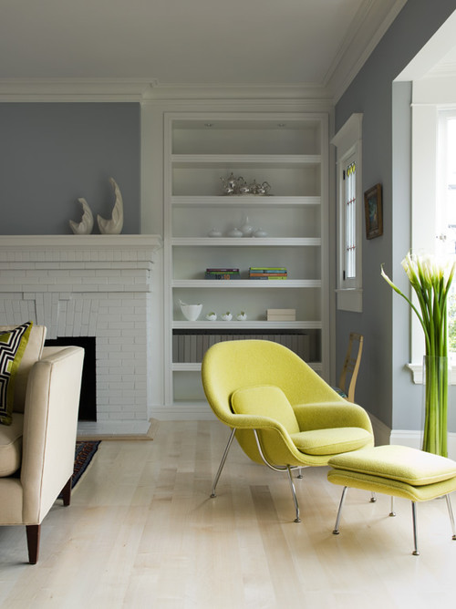
        Eero Saarinen Womb Chair

        Lake District Residence

         The beautiful Womb Chair, designed by Eero Saarinen for  Florence Knoll in 1948, is  available in many vivid colours. This green is perfect with the pale floors and gray walls. 


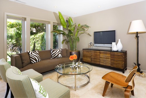
        The Eames Molded Plywood Chair

        Amoroso Design modern living room
         Amoroso Design

        Time  Magazine called The Eames Molded Plywood Chair "the best design of the 20th century" and it continues to be a staple into the 21 century. It was designed by Charles and Ray Eames in 1946 for Herman Miller. 

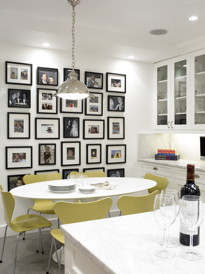
        Arne Jacobsen Series 7 Chair 

        || C O B U R N - A R C H I T E C T U R E || contemporary dining room

         Arne Jacobsen designed this chair in  1955. The curves  move your eyes in a restful rhythm and there is such softness to the overall look. I love the colour of these  particular chairs and the shape has always appealed to me.

        Arne Jacobsen Egg Chair

        Vintage Furniture modern bedroom

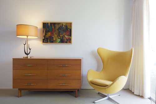
        Arne Jacobsen designed the egg chair in 1958 for the Radisson Royal Hotel. I visited Prague this past summer and this was the style of chair in one of the lounges.  They are super comfortable.

         George Nelson  Platform Bench 
         
        pearl district loft - entry modern entry

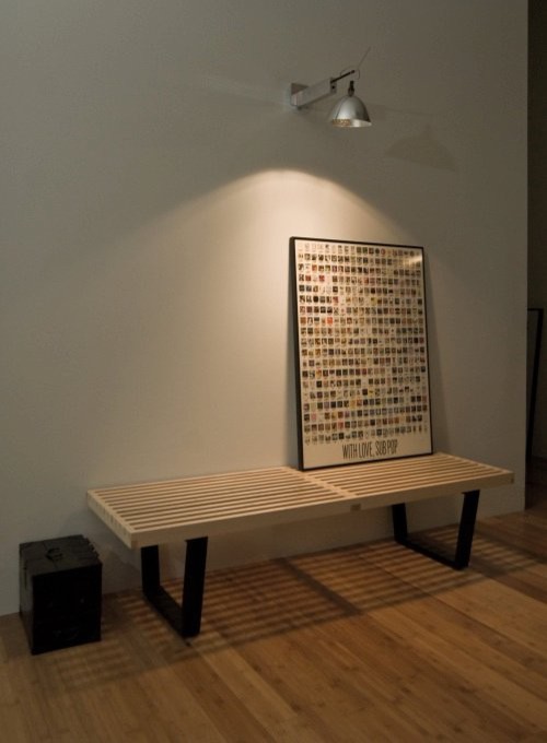
        The  George Nelson Platform Bench manufactured by Herman Miller

        You see the George Nelson Platform Bench quite frequently in trade magazines .  It is very versatile and works equally well as a coffee table or a bench.  Place it in a hallway, at the end of your bed, in an entrance where space is at a premium.  or in a living room. 

                                                              Florence Knoll  Lounge Settee

        European Salon traditional entry
         Lucy Interior Design

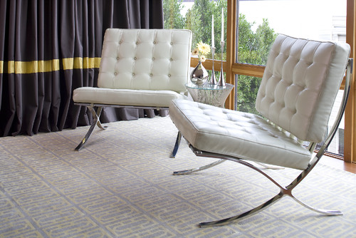
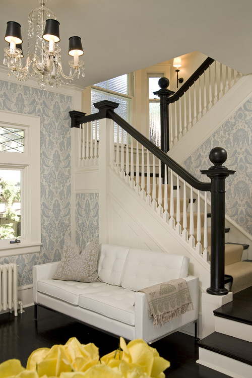
        This beautiful,  white Florence Knoll  Lounge Settee fits perfectly in this tiny space. The straight lines, tubted back and seat provide all t he detail that is needed to see why this is a  highly popular design in the 21 century.   


        Isamu Noguchi Coffee Table 
         
        source

          Isamu Noguchi tables are widely available and relatively affordable. They were in constant production from 1947 until 1973, and then returned to production in 1984, and  are still available.  Because of its rounded triangular shape it works well with one edge parallel to a sofa and the the other two edges facing two chairs on angles.  I have also seen it used to great effect with a sectional sofa and a chair arrangement. 

        Wegner Wishbone Chair

        Design Public, Dwell Studio

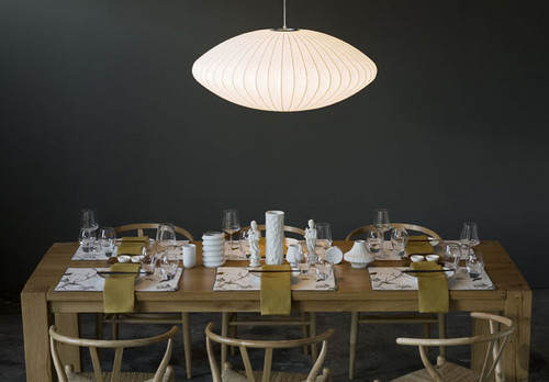
        Have you ever seen The Wishbone Chair in anyone's home?  It is i probably the most popular Hans J. Wegner chair because its rounded style fits with so many other different styles of  furniture. .  This  designer  began his career as a cabinetmaker and then spent time as a furniture designer with  Arne Jacobsen's architectural practice. The Nelson Pendant light is another iconic mid century design. 

        Nelson Bubble Light 
        Kitchen design contemporary kitchen
        Urban Homes

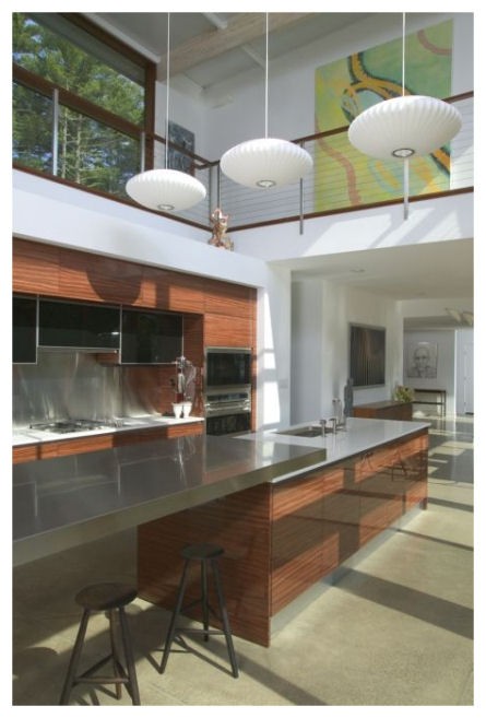
        The first Nelson Bubble Light was designed by George Nelson in 1947.  They are hanging shades comprised of sculptural wire skeletons covered in translucent plastic. There are a variety of forms including: the Propeller, the Cigar, the Crisscross, the Ball, the Saucer, the Apple, the Pear, and the Lantern which are still in production today.

        .Cherner Armchair  Side Chair

        Dining Room modern dining room
        Rachel Reider Interiors

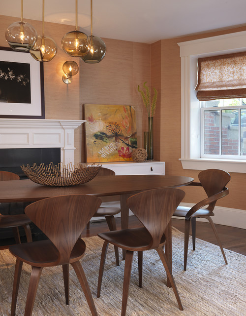
        Norman  Cherner designed this beautifully curved chair in 1958 and it went out of production in the 70'd. His sons started producing them again in 1999. 


        Do you have a favourite?


        Sunday, April 22, 2012

        Make mine MCM

          I'm a baby boomer who  loves a sleek, open and slightly boxy look and  hates "do dads".  I was chatting with a  friend the other day and  praised  the mid century modern  (MCM)  period in home decor and was met with a quizzical look.  "Ah", I thought a good topic for a blog post.

        Just as the name implies, this style  spanned a period of roughly thirty years  in the middle of the 20th century, from the mid-1940s to 1970. This fresh aesthetic developed  after  the Second World War when there was a desire to  recast earlier design to be more in keeping with  the bold new world that was expected. 

          HGTV 

        Mid century modern  took from the simplicity of Scandinavian design and gained inspiration from the earlier Bauhaus style in Germany. During that period of time architects like Frank Lloyd Wright were designing  using organic, natural shapes  and bringing a whole new aesthetic to design.  This was also the era of mass production of furniture and accessories which made them more accessible to the average family.

        The elements of MCM I like best are the  pared-down forms, contemporary patterns and  natural materials. 
        I like to pick and  choose aspects from this design era and mix them with contemporary pieces. The 50's space age look - metal and mesh chairs,  sunburst clocks, bubble lamps and pole tension lights- is not to my personal taste, but I love to see it paired in someone else's decor. 

        If you want to reference a mid century modern look in your decor consider the following: 


         Choose round and sleek


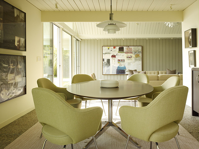
        Saarinen Executive Chairs, a Florence Knoll table and a PH Pendant create the ultimate mid-century dining area.   The MCM  look is  about spaciousness and light. Think lots of windows, minimal walls,  clean and sparse styling with eye-catching elements.   The rounded lines and monochromatic colour scheme here produces a very calming look. I particularly like the tone of green which is similar to the wall colour in the room below.  Versions of George Nelson's bubble fixtures are still found in today's decor.

         Margaret Ryall

         Even mid century styled  rectangular furniture often had slightly  rounded edges as seen in this  hand crafted dining room furniture.  

         Explore Medium Toned Wooden Furniture

        Mid-century style entry modern entry
        Niche Interiors: San Francisco Interior Design Services modern living room
        Niche Interiors

          As this era was about embracing nature, lighter  woods such as teak, oak and fir made their way into living rooms. 

        Use  mid century modern  materials 

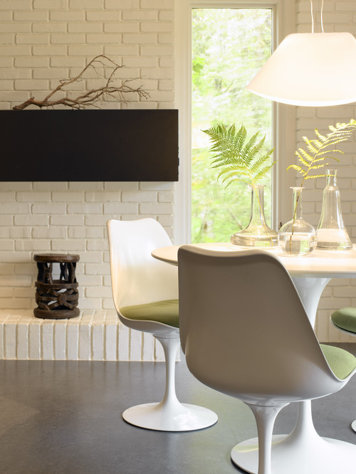
        While the use of wood was a prominent feature of mid century modern decor, man made materials were just as prominent. Plastic including Bakelite on table tops, along with Plexiglass and Lucite, were all the rage.Other common materials wer  molded plywood and  wire mesh.   A good example of  how plastic was molded and is still popular today is  the tulip chair by Saaranin.

        Kitchen table modern kitchen


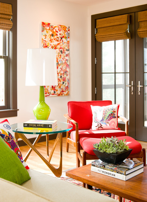
        Use bold textures and colours 
        Living Room modern living room

        There are so many mid century modern designs that are still popular today that I'll need another post to do them justice. Stay tuned. 


        Saturday, January 28, 2012

        Sneak peek

        It seems I've been in the middle of a bedroom update forever.  It takes so long when you are doing things yourself.  This is the before picture.  My husband loves black and I love geometric patterns.  Everything in this picture including the carpet and window seat are gone or going.

        The new look will be the opposite to the strong contrast of this one.

        The new look:
        Soft and serene, no one thing standing out- harmonized to the hilt
        Lots of textures and gentle patterns

         My new duvet cover is very patterned but soft looking.I'm still working on accessory pillows to play with this design. I like to do that when everything else is completed.


         Love this basket I found at Winners.  Don't like the dark interior so a little spray paint will be in order.  I want some  very tall  natural colour sticks to put in it.  Still looking.

         New light fixture from Rona.  I spied this when I was shopping with a client and loved it.  When I went back to buy it,  both styles were marked down to $20.00!  I bought  one of each.  Here's the other style just waiting for a new home possibly in my summer house.


         My refinished oak mid century modern bureau.

         
           Can you believe that I had this beauty in my studio? I stripped it, sanded, created a grayed green wash (water and paint), brushed it on, wiped it off, dried overnight,  and then applied a coat of satin varathane. I left the exposed border and areas behind the drawers natural colour.

        You can see that I like my hardwood light no matter what the current trends!  This mirror is temporary until I can bring the one I want back from my summer house.

         Handy hubby made dividers for the skinny top drawer and now I have a very tidy storage space for all my jewellrey. 

         New tray from my sister, two vases originally black got the spray paint treatment. Still working on the arrangement of all these piece and still collecting.


        One of my  mixed media art works called Turning Point, new drapes which are tone on tone with the wall colour - Benjamin Moore AF Collector's Item.  I can't praise this colour enough if you want a warm, soft neutral for any room in your house.


        More art work.  I'll always love this piece created by a friend  Cathy Driedzic.    I'm working on a new painting for over the bed. 

         This trunk/bench  is currently being used in place of my built in window seat which had to be removed to lay the hardwood.  Haven't decided if it will stay here or go to the other side of the room where is originally resided. Colour Benjamin Moore AF Wind Chime

         How it currently looks.  Painting is coming down because it is lost in this space. One nail hole to fill in. It will probably go on the wall by the closet - nice narrow space for it.

        An there you have it.  We are moving to a king size bed and trying to decide on a design for hubby to make.  Too many ideas, too many discussions, and not a lot of patience because I want it done, like yesterday.  The full reveal will come later. 


        Gambar Belangkas