Showing posts with label decor trends. Show all posts

Friday, February 13, 2015

From snow to eggs

 We are hunkered down for a winter storm with 40 cm. of snow predicted.  Everything is closed so there are no schedules to keep. It's the kind of day where I have lots of time to let my mind wander where it may.  That's a dangerous thing when you can go from one thought to a hundred in a minute.  So let's see how I got from snow to this post.

White, cold, wishing for spring,  Easter, eggs, decorating eggs, symbolism of eggs, egg imagery through history, eggs in art, design trend for 2015 (read it on Houzz this week),  Las Vegas Market trends Winter 2015, should write a new blog post because I have time today, anyone else predicting eggs are hot, search Pinterest.  Yep!  That's how my head works.


What is a trend?


Decor trends  are predictions based on patterns recognized from multiple viewings of similar material.  Anyone can make trend predictions if they have enough information and time to look for patterns.


 Here are some of the patterns I'm seeing on Olioboard, Pinterest and design blogs that indicate that eggs and egg shapes or oval shapes are appearing in textiles, lighting and home accents.


Sometimes  eggs are represented literally and recognizable as what they are.  You will often see nests accompanying the eggs as in the pillow and art works above.  Sometimes the egg shapes are abstracted and used in repetition to create patterns.  These are the ones I find most pleasing.  

egg motifs, eggs decor trend 2015, egg shapes, egg patterns in textiles

Is it just me or do you find anything egg shaped or hinting of it pleasing/soothing to the eye? This characteristic makes it a perfect shape to choose when you want a lighting fixture to just sit there and hold a place without being  too dominant in the decor.  Sometimes this is not what you want!  For excitement do not choose  of the lights above (except the red one).


Jeff Koons, Cracked Egg- Blue

Egg shapes have always been a favourite of artists through the centuries.  Not only is it a pleasing shape, but the symbolism of promise of things to come, fertility, and creation  makes eggs a multifaceted starting point for many artistic explorations.

Paul Lichetenhan - Nest 
This work created by Paul Lichtenhan couldn't be more different than Koon's  reflective, slick and very large cracked egg above.  In this piece the aged patina of the recycled metals stand in striking contrast to the delicate ceramic eggs. 


Andy Goldsworthy 
 Goldsworthy, an environmental artist, makes a different statement with his large, stone egg defying our usual interpretation of this delicate, fragile shape. 

Ron Layport
Finally Ron Layport creates  intricate, egg shaped carvings from wood.  In all of the presented  works the material used to create them is as important as the subject matter.  Each has its own beauty. 

Eggs, simple or complicated, realistic or abstracted, may appear in some form in your decor this year. Perhaps you are ahead of the game!  Have you noticed egg motifs in your online viewing or shopping experiences?

Tuesday, December 2, 2014

Design trend 2015: Move over Ikat and Suzani


It's that time of year again. People are beginning to think about 2015 and what it will bring. When you're a home decor blogger that always means checking out the hot new trends.

So here goes- my first trend snippet for 2015.

Sometimes even patterns we love can lose favour if they are overused.  Chevron comes to mind.  What was once a fantastic pattern that played well with other patterns because of simple, graphic lines has been overused to the point of -dare I say it- nausea.

Ikat                                     Suzani 


I fear that Ikat (chevron is a staple of this traditional Indonesian design) and  Persian Suzani (with it's bold circular motifs ) are not far behind in the over used category.


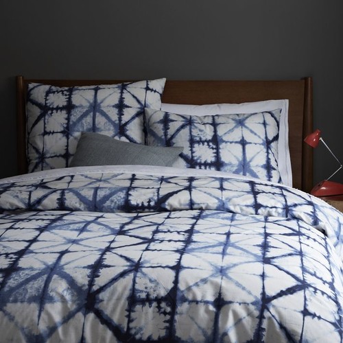
 There is chatter that Shibori (Japanese tie dyeing) is the next new pattern to take over in textiles. I can see the appeal of Shibori.  It is geometric (very hot right now), simple on a white background, has multiple patterns possibilities  depending on how it is produced, and has cultural references.  Then there's that indigo blue which feeds into the resurgence of blues and navy in colour trends.

You many not be familiar with this age old Japanese technique. Shibori patterns are usually created on white silk by binding, clamping and wrapping around poles and then dipping into indigo dyes. If you are hankering for the 60's again, or don't remember them and are ready for a new DIY experince, check out this article 


Red was all over High Point Market this fall and just seeing the little hit of red in the lamp tells you traditional indigo shibori would look great with any amount of red. Certainly whites and other blues would also work and why not yellow?

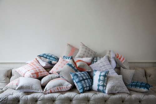
It is definitely a keeper when it comes to pillows.


shibori pillows

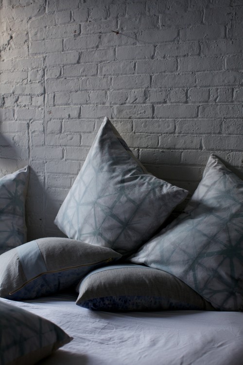
This proves that it is possible to have subtle colour ranges using contemporary dyes


shibori pillows

shibori colours
source 

and different colours...


shibori chair

shibori sofa

used in  different ways .

shibori bedding , shibori curtains

I am certainly liking it with very neutral schemes because it is fresh and interesting without too much fuss. 

Only time will tell if shibori will bethe next big thing. Do you think this pattern will have a place in your home?

Wednesday, February 19, 2014

Blue- A home decor trend to watch


 It seems like only yesterday I  wrote my  2013  home decor trends  post,  and I've already looked at Pantone's Colour of the year, Radiant Orchid, and suggested  ways to integrate this vibrant colour into your decor. What else can we expect in the coming year?

While Radiant Orchid is Pantone's colour of the year, I think it will be the blues that will take over the stage in 2014.  Joan Mitchell had this all figured out in her 1972 painting!  She painted the best blues ever and these are the ones you'll be seeing more of in 2014.

decor trend 2014 blues
Joan Mitchell, “Blue Territory,” 1972


 And here's a modern interpretation of the darker side of blue...

2014 blue trend home decor
A range of blues for 2014


This year the popular blues are much deeper leaning toward cobalt and navy.  But what can you put with so much blue? 


decor trend 2014 blue and yellow
Add yellow as an accent in 2014


decor trends 2014 navy and gold
Gold accents work well  with navy blue and cobalt
And don't forget vibrant oranges or greens with dark blues.  The sky is the limit with this colour.  I thought the art work in the mood board above gives lots of accent choices. 

navy blue cobalt blue 2014 trend Designing Home
Versatile green blue looks great with white and radiant orchid

And never forget that blue has a green side that mixes with all sorts of colours especially the pinkish purples like Radiant Orchid. That way you can bet two trends for the price of one.  Think turquoise, aqua and any blue you may see on a Caribbean holiday.


Benjamin Moore highlighted the lighter side of blue for their 2014 Colour of the year. It is reminiscent of summer breezes blowing lightly under a pale sky. Cool and inviting and perfect for a summer house or a spa retreat.
 

It seems all versions of blue are hot this year. Is there blue in your future? 


Monday, December 31, 2012

Are decor trends important?

I am interested in following the latest  trends in interior design.   I need to know these things to have relevant discussions with clients and to understand where the industry is headed.  Many  trends come and go without ever hitting the average home.


Colour of the year is a good example of a temporary trend.  Depending on which paint company your like, you will have a different colour of the year!   I use Benjamin Moore paint and this year the colour of the year is ....


 Lemon Sorbet 2019-60

This is an interesting fact to know, but I doubt this time next year it will make much difference  because there will be a new colour of the year.

 Then there are broader colour trends that seem to last for much longer, e.g., the change from beige/brown to grays as the predominant neutral in home decor.  This type of information  is  more important to be aware of because it produces whole palette shifts in home accessories including textiles. The  change to grays has moved palettes from warmer and earthy  to cooler and cleaner colours.

 Rather than the burnt orange/rust  of the brown/beige  era


 you will now find  a more true orange mixed with grays.


 Rather than olive/mossy greens of the brown era...


  you will find fresh apple greens.

You can have such wonderful pops of colour with grays and this is reflected in the vibrancy of home accessories available in the market place today. 

 Several years ago I looked for emerald green accessories for a client.  It was almost impossible to find any!  Pantone's colour of the year for 2013 is...


I find Pantone's colour predictions have more impact on fashion and home decor than those of specific  paint companies. This year you will have no difficulty finding emerald green accessories.

 It is important to keep up with trends that will  impact big ticket, relatively permanent products like hardwood, tile and cabinets.  You do not want to select something that will be dated  quickly.  Awareness of these trends does not mean you have to buy into them.  Sometimes choosing exactly the opposite is the the best design solution for longevity.   That is why it is wiser to choose  more neutral  long term items for your home.


Homeowners  who jumped on the dark wood look  for kitchens will probably end up sorry for their selection sooner rather than later.     Extremes rarely work for long periods of time. I predict the patterned glass mosaic backsplash tile that is all the rage now  will have run its course soon too.


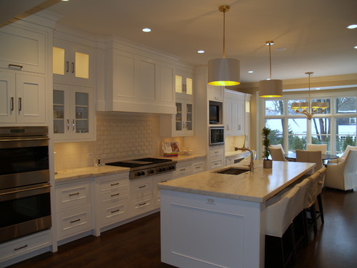
That's why classic soft white kitchen cabinets will always work. There are no extremes in this kitchen.   The style is softly traditional, the tiles are plain and the counters are  lighter granite.   I know it isn't everyone's cup of tea.  I am talking about what stands the test of time.

 
Staying with a traditional example, if you don't like white, consider a more mid tone neutral  or  ...


  mid toned stained  wood. 


Stay tuned for 2013 decor trends with staying power. 


Gambar Belangkas