Showing posts with label dining room. Show all posts

Thursday, May 28, 2015

5 Ways to add interest to a dining room

When someone says dining room, what picture appears in your mind?  Try  it.  List the elements.

For many of us these words conjure up a dining room set with everything matching, a chandelier and some sort of hutch or maybe buffet.  Probably a picture of some sort will be included.  I bet matching is the most obvious characteristic.

It doesn't have to be that way unless that's what you like.

 Here are 5 ways you can  make your dining space stand out a little.

Mix and match your chairs and table


dining table, upholstered chairs,


The days of dining sets have moved behind us.  In many magazines you will see all sorts of mixing of styles, materials and colours. I love the look of upholstered chairs with a wood table. They soften the hard edges and provide some relief in the "wood" department. Some adventurous types will go for two different styles of chairs.

mixing modern table and traditional chairs
 Adore magazine

 Another option if you aren't too adventurous is to upholster each of your wooden chairs with a different, but co-ordinated fabric.  Note how this room sports more traditional chairs with a very simple table.


mid century modern dining chairs, charcoal dining chairs, buffets

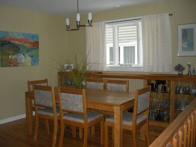
In the case of my own dining space, I painted my matching chairs charcoal  and upholstered them with a much lighter fabric to make them the centre of interest in  my sea of golden tones. I am trying to get up enough nerve to paint the solid ash buffets the same colour.   I'm not there yet.  It's difficult when your furniture is all hand made with love.

Look for a harmonious  buffet 

Forget about having a matching buffet (I wish I could!).  Look for one with the same undertone as your table  or chairs and similar lines if you like, or go for something painted or a different style entirely.  Some element of it should relate it to the room as a whole: wood tone, style, or colour of other objects in room.

Here are two I would choose for my space to work with my chairs.


They certainly harmonize with the darkness of the chairs, the style is mid centuryish like the table and I like the fact they are both raised off the floor.  This openness will give the illusion of space, always an added plus in a small room. 


Have at least one hand made/original item


 We live in a mass produced economy where the answer  to everything is in a big box store.  Not so.  Save your pennies, visit an antique shop, a fine craft store or gallery.  Look for something you love, made by the hand of an artist, and place it with pride knowing it's unique.  It doesn't have to be large.

ceramic pot, Anita Singh, barnacle

This month I have a lovely pot on my buffet created by an artist friend, Anita Singh.  I love her work 
because it always relates to the natural world.  Barnacle is always a conversation piece.  It is also the perfect example of my next point.

Use a variety of textures


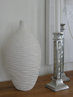
white textured vase, silver candlesticks, mother of pearl


Textures make the most interesting addition to spaces, and it is the element that I see under-utilized  in homes. In my space I have silk drapes, lots of wood grain, a highly textured plant container made from ceramic, a white wavy vase, metal candlesticks with mother of pearl, and two plants.  I love texture!

Choose one unexpected element

Right now the pot my ferns are in is my an unexpected item.  It is so rough and worn looking and I have it paired with silk drapes. Other options could be your light fixture, a painting, something on your tabletop or a small piece of furniture in a corner.  Some would say it should have bling, but I'll leave that up to you.

textured trough, boston ferns

What's your "interesting " score?

 This is a very arbitrary checklist, based on what is "current"  in my  decor reading and viewing.   Hardly scientific!

No my dining room isn't perfect but hopefully it is interesting.
Just because I write about design doesn't mean my space is perfect (whatever that means) or that it even lives up to what I know about the elements and principles of design.  There's the small matter of competing priorities including: budget, interest and energy, connections to objects and furniture, beliefs about your role consuming and junking, and the desire for good old predictability in your environment etc.


Friday, April 4, 2014

Paint solves many problems


You know how it goes with decorating.  You get one thing to a point where you love it and that improvement only makes other things in the space look dismal.  And that is the point where we left off in the last post-  loving the chairs and not liking what is happening on top of the buffet.  

painting upholstery dining chairs  buffet vignette
Almost but not quite

One problem area

Let's start with the lamp.  I've always loved this lamp and when  I recently moved it from the living room it needed a new home. I perched it on several books as a way to increase the height and  connect the dark chair colour to the buffet.

  I left it for several days, but I knew what would happen.  Every time I passed by I had the same thought
 ( that shade is way too white).  Problem arising... what were the chances I would find this type of lamp shade in St. John's?  NIL  What was left?  Paint it or cover it with fabric or paper.  I chose paint knowing if I totally messed  it up I could use fabric or paper to cover it. 

What colour? 

 The lamp had to relate to the drapes without overmatching, I trotted to my studio to see what I had there and chose  BM floral white OC29 left over from painting  frames for an dart show.


Benjamin Moore Floral White OC 29 
This  is a dirty white with the faintest hint of warmth without looking too yellow. Perfect in my book. Some bloggers recommend it as a good white for cabinets if you have white appliances.

How to?

 I watered down the paint by half  and brushed it on with a 2 inch art brush -synthetic soft hair for acrylic paint.  It's a  messy business so have something to catch the drips. If you are careful you only need one coat.   It worked like a charm with no buckling or patchy areas.  You definitely have to water down  the paint or it will look too solid and not be absorbed into the fabric. 

  Some references I consulted said to use a fabric medium with the paint but I didn't.  From my art experience I think you could add acrylic matte medium to replace the fabric medium if you so desired. 

Problem two

Once I used  red as an accent on the buffet and in my living room, my beautiful landscape by Carolyne Honey Harrison started to remind me of a Christmas tree.  The green frame (which hubby made for it) had to be changed. I have a terrible aversion  to "seasonal" colour connections.

What colour?

 First I  painted the frame BM Black panther, a soft black I use for art frames, but it was too harsh for this particular  artwork and space.  All you could see was the frame.  I prefer the art to show and the frame to support it.


Benjamin Moore Black Panther 2125-10


Benjamin Moore Iron Mountain  2134-30


Next try was  BM Iron Mountain left over from painting my Media unit (see here). Worked like a charm.  It brought more dark to that side of the room and played off the chair colour without matching perfectly.   My daughter joked that everything in my house would soon be some form of charcoal.  Possibly!

The reveal 


painting upholstery dining chairs  buffet vignette
Almost but not quite

painted chairs  painted lampshade painted frame
Subtle changes make a difference 

And you might think this room is now complete.   I wish!  More problems and solutions to come.
Is paint a solution in your home decor?  I'd love to hear what you've done with it.  

Monday, March 31, 2014

Dining room solutions

In January during a blackout our pipes broke resulting in water damage to a number of rooms in our home. What was a bit of a disaster turned into a positive for me because it finally got me moving to do something about  one of my biggest decorating problems.  That would be my dining room.... See my complaints in this  post .  It's quite a list. 


Too much of a good thing


This is how it all looked  in early 2000 .....

problems furniture arrangement dining room
Wood, wood and more wood


Problem lines  

Wood everywhere isn't the only problem.  Note the all the horizontal lines from the buffets to the railing,  a light hung too high and a window that has a view of the window next door.   Below is my first attempt to solve some of the highlighted problems.


arranging dining room furniture
 A different orientation solves some problems

Rearrange and add


I liked the changes and that satisfied me for a short time.  The new light was a good height and the roundness worked well against all the rectangles.  I also added longer (very temporary and too short) drapes to break some of the horizontal lines.    I moved the art work from  the living room to dining room,  and created some height and brightness on the dining table.  Still seriously problematic in my book because I did nothing to alleviate the wood issue, but it was improved but sorely lacking  pizazz.

Enter 2014... 

The power of paint and fabric

One of the cheapest updates you can make to any space is to paint something.  I don't care if it is furniture, accessories or walls, it works every time. Since we had to repaint all the walls (BM Glacier white) I continued on to paint quite a few things which I will reveal over the next several posts.  


painting upholstery dining chairs gray circles
 Bringing  it into 2014


To break up the wood and the set,  I was determined to sell all the dining chairs and buy new ones. I still don't know how I got hubby to agree to selling 8 hand made solid ash chairs because they were too matched. He was probably fed up listening to complaints!

After an extensive search,  I realized the chairs that looked best with the table  were the ones my husband made for it. I don't like sets, but in this case I had to concede.  So ... after much discussion with sister and daughter and varying opinions, I found a fabric I loved and then choose spray paint to work with it. 

I would like to say that cleaning and spray painting 8 chairs was exciting.  Not so.... But I got to use my favourite motif (circles) and my favourite colour gray. What could be better!   Part 2 coming soon... new problems and solutions. Hint:  Look at the vignettes on the buffet and table.

What do you think?  


Tuesday, October 16, 2012

One simple move

 In my last post I presented my problem dining  room. I feel I've put the space on the road to salvation.  Here's the update so far.  I have more ideas, but they require a lot of elbow grease and won't happen before Christmas.  I think it's looking more spacious and welcoming.

Before

 After


 I moved  the furniture, placing the  buffets along the kitchen wall. and set the table up vertically in the space.   That allowed me to hang floor length draperies; these are temporary until  my custom ones are ready. My new ones will be off white and hung higher.  Yes, I do know these are too short! 

 The strong vertical of the draperies plays nicely against the railing and breaks up the horizontal lines.  I have a new light fixture which is larger in scale and hung a little lower, but not so low that  my tall family will bang into it! I still want to see the art work over the buffets while seated in the living room. I always choose function over anything else.

I also like the fact you can't look directly into the buffets from the front porch!  I'm  thinking about stripping the natural finish on the furniture and doing a gray wash to change the colour and make it stand out from the floor.  I'd love new chairs, lamps for the buffet,  something more interesting in the corner by the railing.....  We'll see......

What do you think?


Sunday, October 14, 2012

Do you have a problem room?

We all have them, those rooms that defy all you know about design, and just continue to go about their merry way creating problems no matter what you do with them. I managed to create a monster a quarter of a century ago right  in the middle of my house because  my mind was focused on other things at the time. I've spent the intervening  years trying to make my dining room "right" by my standards - I haven't achieved that yet. 

No one has ever walked into my house and said "OMG, what a mess this dining room is."  So what's wrong with it  in my eyes?

Location:  When you're standing in my entry  you look directly into the dining room.  The archway frames the table and the window.  It is also a walk through space from the living room  on the right  to the kitchen which is to the left.

 
There is an alternate hallway beside the stairs, but we never go that way. My dining room is the room in the middle with no identity. Because the walkway needs to be maintained  only half the room is really accessible for  the table - problem #1.

I noticed another problem when I looked at this photo but it was easily fixed. Can you spot the fix?

Across from the table looking  toward the front porch. 
Top art work by Angela Antle and bottom by Anita Singh

A second artwork was added to connect with the chair below it. Doesn't that look better?

Furniture: The dining room buffets, table, and chairs were handcrafted, especially for me, by my man who can do anything.  The set has that "casual contemporary with a nod toward mid -century modern look" that I love.    The scale and style fits the room and the buffets are nicely tucked away behind the table.  Have you noticed problem #2 yet?

A rather dark  view  from the living room.  Thankfully the railings aren't that orange!

You're right! The furniture is the same height as the railing causing your eye to run along the lines and never go anywhere else. I've used all my tricks to make it otherwise, with minimal success. Note all the verticals - floor lamp, tall twigs, candle sticks, vertical artwork, accentuated vertical windows in living room.  The strength of the horizontal lines and the preponderance of wood wins out every time.

Flooring and railing
Problem #3
The aged oak is so orange- my least favourite tone in wood. Because I can't rip it all up or throw away the furniture, I've decided to embrace the orange  and pick it up in interesting art works that also have lots of purples and blues to tame down the orange.  

Problem #4 
Because the furniture is in one half of the room, there isn't enough space  for an area rug which would keep the furniture from blending into the floor.  If I wanted to use an area rug I would have to cover most of the floor, but that would mean vacuuming;  I would rather use a dust mop! 

Problem #5
I have a love/ hate relationship with the railing.  It is solid wood, has a good design and fits with the age of the house and our design aesthetic. I have strong feelings about maintaining "period "architectural detailing and the railing is necessary because the living room is sunken.  But it is soooo difficult to ignore that orangey railing..  It didn't look like this in 1986.  Time ages wood to either orange or yellow especially when treated with oil based products.  


Lighting 
Problem #6

The light fixture was an impulse buy  because I liked the lines,  but its scale is too small, and it is hung too high in my efforts to make sure you could see the painting at the end of the room.   As an artist, art always takes precedent over every other design  decision in my house.  This often leads me into hot water.

Wall colour 
Problem # 7

You may be thinking at this point why doesn't she have the walls pained a cooler neutral.  Can't happen because the living room, where most of the light comes from, is north facing and the house next door blocks off any light in the dining room.  Both rooms are dull and cold.  The living room is  Elephant Tusk OC 8 Benjamin Moore and the dining room is Light Khaki  BM 2148-40.

Window treatment
Problem #8 
I love these back tab drapes for the subtle design and their softness,  but the necessity to crop them to allow for the buffet further emphasizes all the horizontal lines. I also think I should have a window treatment that covers the window in some way so you can't see the wall of the next house with is very close to the window and certainly not interesting.

Matching set 
Problem # 9
I have an aversion to matched sets of furniture and here I am living with just that. Matching always looks so uninspired in my eyes and gives the appearance of laziness.  Like you couldn't be bothered to put the room together.  Yes I like a curated room and I have a bundled set!

I'm sure if I really tried I could find a Problem 10.  Many of you may feel it is the lack of cove mouldings, but that again is not part of the architectural details of the original house. 

 Well that about explains the problems. Who knew there was so much wrong with my dining room?  Most of my friends would be very surprised by this analysis!  In the next post I'll look at some possible solutions.  If you have anything to suggest that might help with my design dilemmas, I'd love to hear from you.


Tuesday, June 19, 2012

Hot seats


Dining rooms have a tendency to be formal affairs with matching table and chairs. but that doesn't mean they have to be. You can shake it up with unique styles and colours.    Here are some of my favourite Wow dining "sets" from my Pinterest collection. 

Make it  patterned


These luxurious chairs invite you to cozy up to the table. I'm a sucker for texture, and I would totally enjoy having a meal at this table.  Think of how soft the fabric would be!   I like the fact that the chairs  are patterned on the back and  plain on the opposite side.  The tufting supports the more traditional design and the high back chairs at the ends work well with the size of the space and the curves of the other chairs. The  hobbled roman shade is is a soft but clean window treatment in this room.  Lots of ideas to steal in this set up.

Repeated curves

 Lately I'm very attracted to everything aqua. Doesn't this colour look great with dark wood?  Curves abound in this room - in the draperies, the stairs, the chair arms, the vines in the carpet and in the light fixture. A soothing room all around with an unconventional chair colour.

 Popping yellow


Who could ignore these canary yellow chairs? I love the way everything else in the room plays second fiddle to the chairs and allows them to be the star. I want to whisk those red flowers away though. Don't we all have our opinions about what looks best.

Serene colour scheme


This room is different in every way from the one above. I love the clean lines of the benches and chairs . Remember that you need a central leg or an X leg if you want to move easily to and from a bench style seat. Armless banquettes are the most versatile.   The texture on the front of the buffet;  the circular ceramic vases with  twigs, and the rounded edges of the table add interesting lines and some complexity to the room. The colour and lines of the light fixture work well with everything else.  Doesn't this room look serene?

 Repetition of curves


More  banquettes, but this time paired with patterned chairs and a curvy table. The four leg table design will make getting into the banquette a little more difficult.The arms will add to the problem.    The chair  shape is repeated in the  mirror and the doors of the buffet.   An interesting mix.


There's nothing formal about this room! It will definitely appeal to the colour and texture lovers out there. I want to see a more substantial table with all this colour, but that's just me.

How do you feel about chairs and tables not matching?

Gambar Belangkas