Showing posts with label colour of the year. Show all posts

Saturday, January 5, 2013

2013 decor trends with staying power

Here are predictions for 2013 that should  have some staying power.....

Geometric patterning
Really, geometric patterning has never  gone out of style; it has periods of resurgence and 2012-13 seems to be one of those periods.


Pantone's colour of t he year 2013 (Emerald) in a  geometric trellis pattern  with a botanical motif on cushions.  I've always loved the look of florals and other nature inspired themes  with geometrics.What is fresher than white and green?

Nature motifs 
Naural elements run the gamut from  flora or fauna to stones and seashells.  Use of feather motifs and faux furs are on the upswing .   Look for botanical or animal motifs in art,  fabrics, or accessories. 


 Peacock feathers are everywhere lately.  I just saw a great display on the Pier 1 website and here's another selection.  The colours are so fresh; you can't go wrong with a peacock blue accent in your home.  It works with so many colours from chocolate brown to cream.

 
 Laurie Pearson 

More feathers, but this time the real thing used as a centerpiece.  

 Etsy
Found treasures on a lovely printed runner. 

 source 


And feathers lead to birds of every variety.  The lovely black and white accent chair or the graphic bird sheets  would work well with bold pops of colour - remember the peacock blue? 

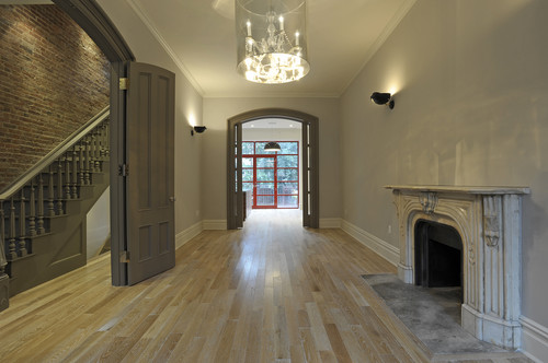
Lighter hardwood floors 
I know everyone was talking about dark, dark, dark floors and cabinets over the last several years, but the trend is swinging back quickly.  That doesn't mean you have to follow it.  Go with what you love.  Personally you would never get me to put dark wood in my home - too oppressive and heavy.  Whatever is in style my floors will be as light as I can get them. 


A move back to lighter and mid tone woods especially bamboo is  trending in the new year. Bleached  and grayed woods are everywhere.  Lighter tones are so much easier to decorate around and they provide a more expansive look  in smaller homes than the darker woods of the last several years. From Veranda magazine..."When wood flooring is reclaimed or has the look of being previously used even if it wasn't, it has a softer quality that allows it to blend in as another neutral without calling too much attention to itself or instantly drawing your eye downward."

Resurgence in gold toned accents


 Gold finishes are becoming more prevalent  in  furniture, lighting, and hardware.  They work especially well with complex grays and dark chocolate browns.

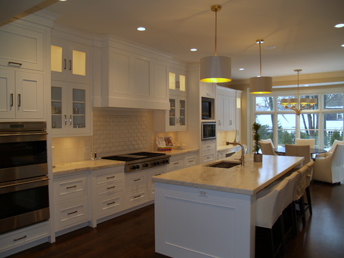
Open walls in kitchens

Pinterest 

Much of what is trending in kitchen design comes to North America from European design centres.  Travelling provides a glimpse into how different our kitchens are when compared to those in Europe where lighter and sleeker looks prevail. Slab doors, no handles etc.  Be prepared for a decrease in upper cabinets and more open space, supported by larger pantry areas.

Backsplash to the ceiling 

 Style at Home

With the appearance of open spaces on walls above the stove or around a window, tiling goes to the  ceiling. Stainless backsplash tiles in both glossy and matte finishes are popular and will have good staying power as long as stainless appliances are around.  They work with wood and light cabinets. 

Mixed colours in cabinets


 Cabinets in two colours are currently trendy, but be careful that you don't create problems in balance when you have high contrast colours.  Be especially careful of this look in smaller spaces where it can look very chopped up.

 Houzz

 A darker island is always an option if you want to use two colours. Visual weight can be balanced by other darks in the space.

Reclaimed materials/eco friendly 

 Stylizimo

The patina of reclaimed materials adds depth to a neutral scheme. Repurposing, recycling and reusing  has been a strong trend for a number of years now and will continue as an earth friendly alternative to the consumption of new materials.  In eco- friendly style only the basics are considered necessary and a  less cluttered, more zen-like environment is created.

 
 Pinterest 

 You will often see the use of simple materials  paired with more upscale objects like the zinc lamps and upholstered ottoman. You can create an interesting room by blending objects of low and high prices, textures and design elements.

Monday, December 31, 2012

Are decor trends important?

I am interested in following the latest  trends in interior design.   I need to know these things to have relevant discussions with clients and to understand where the industry is headed.  Many  trends come and go without ever hitting the average home.


Colour of the year is a good example of a temporary trend.  Depending on which paint company your like, you will have a different colour of the year!   I use Benjamin Moore paint and this year the colour of the year is ....


 Lemon Sorbet 2019-60

This is an interesting fact to know, but I doubt this time next year it will make much difference  because there will be a new colour of the year.

 Then there are broader colour trends that seem to last for much longer, e.g., the change from beige/brown to grays as the predominant neutral in home decor.  This type of information  is  more important to be aware of because it produces whole palette shifts in home accessories including textiles. The  change to grays has moved palettes from warmer and earthy  to cooler and cleaner colours.

 Rather than the burnt orange/rust  of the brown/beige  era


 you will now find  a more true orange mixed with grays.


 Rather than olive/mossy greens of the brown era...


  you will find fresh apple greens.

You can have such wonderful pops of colour with grays and this is reflected in the vibrancy of home accessories available in the market place today. 

 Several years ago I looked for emerald green accessories for a client.  It was almost impossible to find any!  Pantone's colour of the year for 2013 is...


I find Pantone's colour predictions have more impact on fashion and home decor than those of specific  paint companies. This year you will have no difficulty finding emerald green accessories.

 It is important to keep up with trends that will  impact big ticket, relatively permanent products like hardwood, tile and cabinets.  You do not want to select something that will be dated  quickly.  Awareness of these trends does not mean you have to buy into them.  Sometimes choosing exactly the opposite is the the best design solution for longevity.   That is why it is wiser to choose  more neutral  long term items for your home.


Homeowners  who jumped on the dark wood look  for kitchens will probably end up sorry for their selection sooner rather than later.     Extremes rarely work for long periods of time. I predict the patterned glass mosaic backsplash tile that is all the rage now  will have run its course soon too.


That's why classic soft white kitchen cabinets will always work. There are no extremes in this kitchen.   The style is softly traditional, the tiles are plain and the counters are  lighter granite.   I know it isn't everyone's cup of tea.  I am talking about what stands the test of time.

 
Staying with a traditional example, if you don't like white, consider a more mid tone neutral  or  ...


  mid toned stained  wood. 


Stay tuned for 2013 decor trends with staying power. 


Gambar Belangkas