Showing posts with label decorating small spaces. Show all posts

Monday, April 13, 2015

Design lesson: Giving a large look to a small dining space

Large can have a lot of meanings, but in Newfoundland large often  mean great or good or the best as in " it's a large day".   Given that understanding here's  a "large" dining room and a closer look at why it merits that rating.

small dining room, design lesson, tips
Liz Levin Interiors 

This room has a lot packed into a very small space.    Just imagine this space with a matched dining set.  It would blend into the floor and be totally blah.  How did the designer achieve this look? Perhaps there's something in her kit of tricks that you could use.


Upholstered chairs


  If you have a dining table you love, and hate the chairs, consider changing them  to coloured leather or fully upholstered ones.  It helps break up all the wood that you tend to get in dining rooms.  This approach usually means you can get away without the area rug that many people have to resort to so their set doesn't disappear into a similar wood floor.

Mixing styles

I know this isn't for everyone, but if you like a more curated rather than matched look, it's the way to go.  The days of sets are long gone.

Contrast

Nothing attracts the eye better than contrast.  It is a design fact.  If you want a more neutral space without it being boring use contrast widely.   The dark table, cream chairs, and white and brown draperies work so well together.  Reusing the cream in the centrepiece adds another contrast point.

Pattern

I'm a big believer in using pattern to add interest to a space.  The geometric pattern in these drapes
 mimics other shapes in the room, both circles and rectangles. The colour scheme is replicated in the drapes. The drapes also provide  what I like to think about as destination viewing- a spot for your eye to seek in a room and rest before moving on.  Pattern is often the bow that ties up a space.

Mirrors

A mirror goes a long way to enlarge and add interest to small places. Personally, I like a framed mirror where this one appears to be  adhered to the wall.  Don't be afraid to go large when you hang a mirror in  a dining space.  A word of caution.  Check what is reflected in it.  Perhaps it might be something you would rather not draw attention to.

 Living things

And most importantly this space has living things in it.  There is nothing like plants and flowers to add a dynamic touch to any space.

Texture

While this is a small space it is packed with subtle textures and sheens: wood, glass, pottery, weave in drapes, and plants.  Texture is the most overlooked design element in many spaces.   If your own space looks blah maybe adding some texture will help.


Fine craft

 I like the form and texture of the vases on the table.  While I don't know for sure they look like fine craft. Nothing is more boring than a room full of "accessories"  from big box stores.  There's so many unique, hand built objects in every city and town.  I contend it is more interesting to have one or two interesting objects than a house full of mass produced stuff.  You may disagree.

All of these elements work equally well  in a small space or a large space.


And here's a space to check out to see if any of the points I mentioned above are present.  It's isn't a small space, but you will see a lot of the same elements and principles applied.

Blackband Design 

Lots of points to consider and possible some you might like to play around with.  What are your strategies to create a "large" room?

Saturday, September 27, 2014

Are you a design rebel?


What's your first instinct if someone tells says you shouldn't do something?

Do you automatically want to do it?  I do! 

 Most people would agree that there are rules/guidelines in interior design. They impact decisions about all sorts of things,  e.g.,  hanging lights, choosing the right scale furniture, selecting colour schemes, etc.   I guess following them is a little like following a recipe - you get a predictable result. Someone else has done all the thinking for you which makes it easy but, you also get a very generic looking space where everything looks controlled.

 I always think about those generic spaces  as the "Pinterest look" . You know  the rooms, all  beautifully organized, cutely accessorized with whatever is trendy at the time, and perfectly matched.   Does that make them wrong?  Definitely not.  I firmly believe we should all live in spaces that make us happy and comfortable.   What I am saying is that there are options in design that produce interesting, one of a kind spaces that are  usually achieved by playing around with design elements and principles. They are not for everyone.

 Take the room below.....

 breaking design rules, scale,
source

  Have a close look at this space  and decide what you like or don't like about it.  Check out my thoughts  at the end of this post. There are no right or wrong answers.

 How closely you adhere to rules is dependent on what results you want to achieve, how well you understand the elements/ principles  of design,  and how creative you are at applying them.  You can do anything in decorating, you just need to act bravely, and figure out how to pull it off.  But, before you can break the rules you have to know them.

Can you spot which  rules/guidelines were  thrown to the four winds in these rooms? 

1.
 breaking design rules, mixing styles, modern and traditional,
 source

 breaking design rules, mixing styles, modern, traditional
source


2.
 mixing metals, breaking design rules
source

 mixing metals, breaking design rules
source

 3.

breaking design rules, scale, accessories
 source

 breaking design rules, scale


4.

breaking design rules, monochromatic schemes, neutral schemes
 source

 breaking design rules, neutral spaces, monochromatic schemes

source

5.

breaking design rules, mixing wood tones,
 source

 breaking design rules, mixing wood tones
source


6.


breaking design rules, dark walls, small spaces


breaking design rules, small spaces, bright colours


Here are the results: 

breaking design rules, mixing styles, modern and traditional,  breaking design rules, mixing styles, modern, traditional

1. Stick to one style 
 These spaces show that when you mix traditional and modern the juxtaposition draws attention to both.  If only one style was used the various elements would be lost in their sameness. I particularly like the richness of wood and lots of curves with modern furnishings.  Of course art of any style works in any space.  

mixing metals, breaking design rules mixing metals, breaking design rules

2. Use consistent finishes (don't mix metals)
This is definitely a good place to start your little rebellion.  You certainly can mix metals. Just make sure you have some of each one in the space.  Think about a piece of jewellery that uses white gold, pink gold and yellow gold. It works. Check out this post on the topic.

 breaking design rules, scale breaking design rules, scale, accessories

3. Pay attention to scale when selecting furniture/objects
I have to admit this is the one I have the most difficult time ignoring because  I am so attuned to scale considerations in drawing and painting.  I think I also have a  thing about objects too large bearing down on me. They make me uncomfortable. Large scale objects make riveting focal points. You can also have objects that are too small in scale, and end up looking insignificant and/or cluttered. Scale is usually the issue when a client tells me there is something wrong with a space, but he/she can't name it.

breaking design rules, monochromatic schemes, neutral schemes   breaking design rules, neutral spaces, monochromatic schemes

 
4. Every room needs an accent colour
Definitely not! Monochromatic rooms are so relaxing and depend on value changes and texture to wow.  If you want a quiet room, forget the pops of colour.

 breaking design rules, mixing wood tones  breaking design rules, mixing wood tones,

5. Keep wood tones consistent
When you slavishly adhere to this dictate you end up with a very boring space.  Check out this post for ways to mix wood tones effectively.

breaking design rules, dark walls, small spacesbreaking design rules, small spaces, bright colours

6. Choose light colours for small spaces
That would be your first instinct, but the two rooms in #6 shows that breaking this rule produces distinctive and very different spaces.  Sorry, but I couldn't live in either of them.  I am a neutral colour gal in my own home. This post provides various options for painting small spaces.

How did you do?

And now back to the reflection pic....

 
There's no doubt this space breaks a lot of rules, but it sure is memorable, and no one could call it boring. 

  •  styles are mixed freely, moving from traditional to modern;
  •  the colour scheme is monochromatic, no accent colours here;
  • scale is manipulated big time in the high back chairs, plant, circular light fixture as well as in the smaller lamp shades in adjoining room;
  • wood tones are liberally mixed.

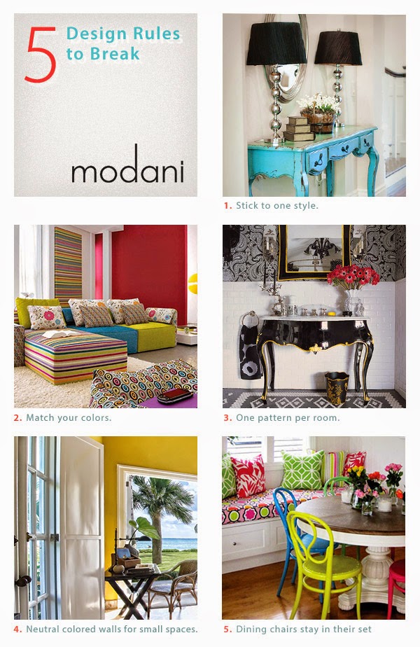
And here's another take on some of the points above and few new ones. Modani modern furniture specializes in modern furniture and accessories.  Check them out online or at their newly opened modern furniture store in Toronto. Remember you can combine modern elements with any decor.


breaking design rules, modani, modern furniture  
How do you feel about breaking design rules? 

Wednesday, June 11, 2014

5 Tips for painitng small spaces

 The one topic I've written about on my blog that gets attention from thousands of decor happy readers is decorating small spaces.  I think that is because rooms and homes today are smaller than they once were.  People living in condos or apartments must be conscious of using every trick in the book to enlarge their living spaces. So stay awhile and see how colour can solve some of your small space dilemmas.  Perhaps in these suggestions you will find a treatment for your small space.


Use one colour everywhere


This might seem like an extreme solution but it isn't really.  Using one colour all over a room makes the different planes blend together  to give a more unified look.  You can even use the same colour on the floor and ceiling if you wish.  Since your eye continues to move  freely around the room you have no sense of the boundaries of it.

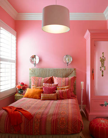
same colour on walls and ceiling bedroom

If I could change one thing about this room above, I would paint the trim a soft pink too to keep the eye moving. Painting  trim white creates vertical and horizontal lines that your eyes automatically go to and follow. You can see the difference in the room below where the trim is painted out.  The room has an unbroken field of colour that is certainly expansive even though a dark colour was used.


painting trim and walls same colour


source

More blue, but the trim is painted a coordinating colour that is closer in value to the walls decreasing the emphasis on  the trim which seems to just blend in.

dark colours in small living room

Use cool colours 


 The rooms above are using the same colour almost everywhere, but they  are also utilizing another colour trick. Cool colours like blues, blue grays etc. make the walls of a room recede thus making the space appear larger than it actually is. Blues are an excellent choice for small bathrooms, laundry rooms, spare bedrooms, etc.  When walls recede you tend to notice the furnishings rather than the  "box" that contains them.

There's nothing like a cool lavender with white and light grays to expand a space.  
 

dark walls small living room

Use a dark colour on the walls


That's right, a dark colour!  Would you ever think that would work?  It does because  the corners disappear in the shadows and your eye moves around easily. Darker colours are often perceived as  visually deeper. There are  decorators who take the opposite approach to keeping walls light in a small space.  And the final trick with dark colours in small rooms is to paint them in a semi-gloss or gloss to reflect light.  This approach is not for the faint of heart,  but it can be quite stunning.   If you're afraid to go really dark choose a mid value gray or taupe.


Use a colour you see outside


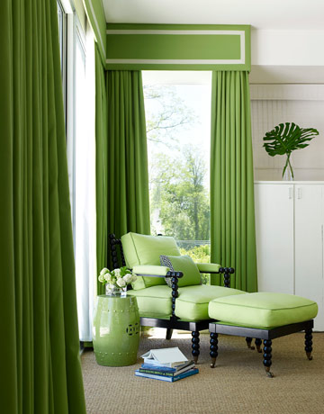
Blues and greens give the impression that the room continues beyond the windows. You can paint the walls an outside colour or use one  in your fabric choices.  I love the freshness of the room below. It certainly is reminiscent of  plants.


blue and green living room


blending outside and inside colours

Designer Christina Murphy uses green to great effect  to visually extend this room by connecting it to the view outside the window.  Keeping a simple colour scheme is also visually enlarging.


blending outside and inside in decor 

Everything about this room invites the outside in and blends the two together. Lighter floors always enlarge a space.  There are no dark hardwoods in my life, I like light and airy all the way.

Keep walls and furniture a similar colour 


 When you keep the furniture and walls close to the same colour you are blurring the lines between them. As a result the mass of the furniture is decreased and the overall volume of the room is increased.  If you don't wish to have all the furniture the same colour consider having at least  the bigger items like armoires and chests close to the wall colour so they will begin to blend into the room and widen it out.


Decor by Jennifer Inc contemporary family room

I also want the cabinet for the TV to be a lighter colour, but it is undeniably a focal point in the room  and every room needs one. I'd also skip the dark wood rods which your eye travels to automatically because of the contrast, but I also understand why the decorator chose them (all the woods in the room are dark).   Overall I love these two rooms.  They are warm and inviting.

Alexandru Apartment lviing room contemporary living room

I equally love the cool minimal look  of this room, but it isn't for everyone.

Paint a Focal Wall


 I'm not a large fan of painting a focal wall.  I think sometimes it works to great advantage, but most times it is a less than creative solution in a space. This strategy  can work wonders in a small space, Don't be afraid to paint an accent wall a darker receding color thus  making the space look larger.


Living Room  dark focal wall

 And there you have it.  The only thing left to do is decide which of these solutions will work in your space. 
 Happy painting.

Gambar Belangkas