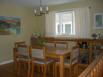
No one has ever walked into my house and said "OMG, what a mess this dining room is." So what's wrong with it in my eyes?
Location: When you're standing in my entry you look directly into the dining room. The archway frames the table and the window. It is also a walk through space from the living room on the right to the kitchen which is to the left.
There is an alternate hallway beside the stairs, but we never go that way. My dining room is the room in the middle with no identity. Because the walkway needs to be maintained only half the room is really accessible for the table - problem #1.
I noticed another problem when I looked at this photo but it was easily fixed. Can you spot the fix?
Across from the table looking toward the front porch.
Top art work by Angela Antle and bottom by Anita Singh
A second artwork was added to connect with the chair below it. Doesn't that look better?
Furniture: The dining room buffets, table, and chairs were handcrafted, especially for me, by my man who can do anything. The set has that "casual contemporary with a nod toward mid -century modern look" that I love. The scale and style fits the room and the buffets are nicely tucked away behind the table. Have you noticed problem #2 yet?
A rather dark view from the living room. Thankfully the railings aren't that orange!
You're right! The furniture is the same height as the railing causing your eye to run along the lines and never go anywhere else. I've used all my tricks to make it otherwise, with minimal success. Note all the verticals - floor lamp, tall twigs, candle sticks, vertical artwork, accentuated vertical windows in living room. The strength of the horizontal lines and the preponderance of wood wins out every time.
Flooring and railing
Problem #3
The aged oak is so orange- my least favourite tone in wood. Because I can't rip it all up or throw away the furniture, I've decided to embrace the orange and pick it up in interesting art works that also have lots of purples and blues to tame down the orange.
Problem #4
Because the furniture is in one half of the room, there isn't enough space for an area rug which would keep the furniture from blending into the floor. If I wanted to use an area rug I would have to cover most of the floor, but that would mean vacuuming; I would rather use a dust mop!
Problem #5
I have a love/ hate relationship with the railing. It is solid wood, has a good design and fits with the age of the house and our design aesthetic. I have strong feelings about maintaining "period "architectural detailing and the railing is necessary because the living room is sunken. But it is soooo difficult to ignore that orangey railing.. It didn't look like this in 1986. Time ages wood to either orange or yellow especially when treated with oil based products.
Lighting
Problem #6
The light fixture was an impulse buy because I liked the lines, but its scale is too small, and it is hung too high in my efforts to make sure you could see the painting at the end of the room. As an artist, art always takes precedent over every other design decision in my house. This often leads me into hot water.
Wall colour
Problem # 7
You may be thinking at this point why doesn't she have the walls pained a cooler neutral. Can't happen because the living room, where most of the light comes from, is north facing and the house next door blocks off any light in the dining room. Both rooms are dull and cold. The living room is Elephant Tusk OC 8 Benjamin Moore and the dining room is Light Khaki BM 2148-40.
Window treatment
Problem #8
I love these back tab drapes for the subtle design and their softness, but the necessity to crop them to allow for the buffet further emphasizes all the horizontal lines. I also think I should have a window treatment that covers the window in some way so you can't see the wall of the next house with is very close to the window and certainly not interesting.
Matching set
Problem # 9
I have an aversion to matched sets of furniture and here I am living with just that. Matching always looks so uninspired in my eyes and gives the appearance of laziness. Like you couldn't be bothered to put the room together. Yes I like a curated room and I have a bundled set!
I'm sure if I really tried I could find a Problem 10. Many of you may feel it is the lack of cove mouldings, but that again is not part of the architectural details of the original house.
Well that about explains the problems. Who knew there was so much wrong with my dining room? Most of my friends would be very surprised by this analysis! In the next post I'll look at some possible solutions. If you have anything to suggest that might help with my design dilemmas, I'd love to hear from you.


