Do you automatically want to do it? I do!
Most people would agree that there are rules/guidelines in interior design. They impact decisions about all sorts of things, e.g., hanging lights, choosing the right scale furniture, selecting colour schemes, etc. I guess following them is a little like following a recipe - you get a predictable result. Someone else has done all the thinking for you which makes it easy but, you also get a very generic looking space where everything looks controlled.
I always think about those generic spaces as the "Pinterest look" . You know the rooms, all beautifully organized, cutely accessorized with whatever is trendy at the time, and perfectly matched. Does that make them wrong? Definitely not. I firmly believe we should all live in spaces that make us happy and comfortable. What I am saying is that there are options in design that produce interesting, one of a kind spaces that are usually achieved by playing around with design elements and principles. They are not for everyone.
Take the room below.....

Have a close look at this space and decide what you like or don't like about it. Check out my thoughts at the end of this post. There are no right or wrong answers.
How closely you adhere to rules is dependent on what results you want to achieve, how well you understand the elements/ principles of design, and how creative you are at applying them. You can do anything in decorating, you just need to act bravely, and figure out how to pull it off. But, before you can break the rules you have to know them.
Can you spot which rules/guidelines were thrown to the four winds in these rooms?
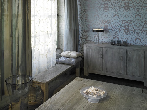
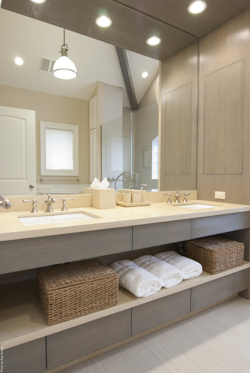
1.


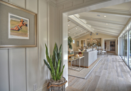
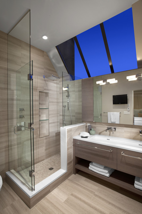
2.


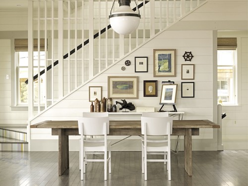
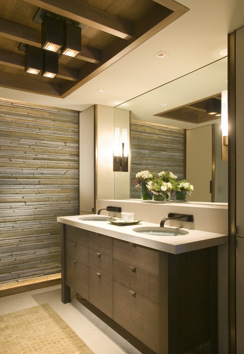
3.


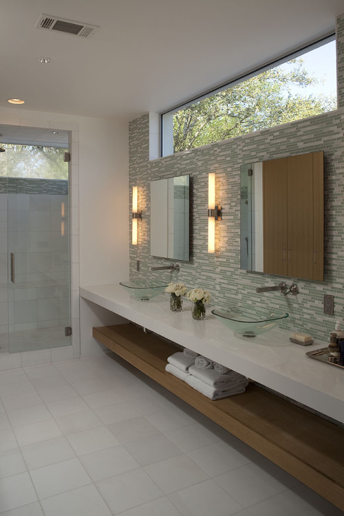
4.


source
5.


source
6.


Here are the results:
1. Stick to one style
These spaces show that when you mix traditional and modern the juxtaposition draws attention to both. If only one style was used the various elements would be lost in their sameness. I particularly like the richness of wood and lots of curves with modern furnishings. Of course art of any style works in any space.
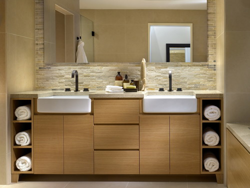
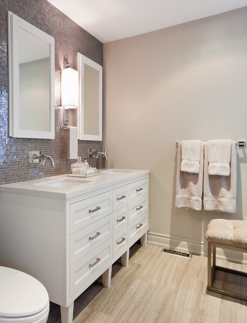
2. Use consistent finishes (don't mix metals)
This is definitely a good place to start your little rebellion. You certainly can mix metals. Just make sure you have some of each one in the space. Think about a piece of jewellery that uses white gold, pink gold and yellow gold. It works. Check out this post on the topic. 3. Pay attention to scale when selecting furniture/objects
I have to admit this is the one I have the most difficult time ignoring because I am so attuned to scale considerations in drawing and painting. I think I also have a thing about objects too large bearing down on me. They make me uncomfortable. Large scale objects make riveting focal points. You can also have objects that are too small in scale, and end up looking insignificant and/or cluttered. Scale is usually the issue when a client tells me there is something wrong with a space, but he/she can't name it.
4. Every room needs an accent colour
Definitely not! Monochromatic rooms are so relaxing and depend on value changes and texture to wow. If you want a quiet room, forget the pops of colour.
5. Keep wood tones consistent
When you slavishly adhere to this dictate you end up with a very boring space. Check out this post for ways to mix wood tones effectively.
6. Choose light colours for small spaces
That would be your first instinct, but the two rooms in #6 shows that breaking this rule produces distinctive and very different spaces. Sorry, but I couldn't live in either of them. I am a neutral colour gal in my own home. This post provides various options for painting small spaces.
How did you do?
And now back to the reflection pic....
There's no doubt this space breaks a lot of rules, but it sure is memorable, and no one could call it boring.
- styles are mixed freely, moving from traditional to modern;
- the colour scheme is monochromatic, no accent colours here;
- scale is manipulated big time in the high back chairs, plant, circular light fixture as well as in the smaller lamp shades in adjoining room;
- wood tones are liberally mixed.
And here's another take on some of the points above and few new ones. Modani modern furniture specializes in modern furniture and accessories. Check them out online or at their newly opened modern furniture store in Toronto. Remember you can combine modern elements with any decor.

How do you feel about breaking design rules?


