Showing posts with label headboards. Show all posts

Wednesday, September 23, 2015

What to do with louvered doors

 I have a love hate relationship with louvered doors.   I like the free flow of air into closets,  but I dislike all the vertical lines and fussiness.   Many houses built in the eighties sport this type of door.  We have removed some of ours and replaced them with a contemporary looking slab door more in keeping with the streamlined look I like, and we decided to update others.  


And here's the last remaining set we have just waiting for a facelift.....

How to update louvered doors

Designing Home: Updated louvered doors 


All you need is 1/8 inch MDF or plywood  (some doors may have enough room for 1/4 in. ) and construction adhesive, (PL Premium is my favourite). 

 Lay the doors on a table or bench and measure the size of each panel area.  Cut the wood  to cover each  louvered panel section,  add a dot of adhesive every third slat next to the border and press the wood panel in place.  It should fit snugly, if not you can always caulk any seams before painting.

Use clamps or add something heavy to hold each panel in place and let it dry overnight.  Add new handles of your choice.

Reusing louvered doors for new projects 


When you remove the doors in favour of new ones you are left with two perfectly good doors that need a new life.  

Designing Home: Louvered bathroom cabinet


Here's the cabinet my husband made for our summer house  from the top half of two closet doors.  It nestles nicely into a small alcove in the main bath and holds things you don't want on display. It also gives you a great surface for changing vignettes.  We decided against hardware because you can easily open by using a louver as a pull.  It also gives it a more contemporary feel. And now what to make from the bottoms???

There are so many creative ideas for louvers on Pinterest.  I admit that many of them have a very country or beach feel to them,  but if you crave a more contemporary look there are ways to achieve it.

These are my top three faves:

Headboard 

source

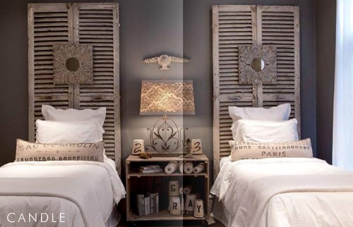
Painting the louvers  black  the headboard  a very contemporary feel that I quite like.


This treatment is much more country, but could be updated  if they were painted charcoal and the bedding was adjusted accordingly.


Sofa table 


The straight lines of this table make it suitable for any decor. Colour and what you put on it can automatically update the look.


Standing Shelves 


Jessica Monroe

If you wanted this to have a more contemporary feel you could paint shelves and sides the same colour and add plain crown to the top and bottom.

So many creative uses for louvers.  I love to see materials getting a new life!

Thursday, August 16, 2012

Small details, big impact

There are so many ways to create impact in a space.  Sometimes impact is created by  subtle additions of  colour, textures, or forms  or features can be in your face - bold.

 I tend to sit in the subtle camp.  I enjoy finding treasures in a space and then visually connecting them to create points of interest- a kind of meandering trip while you sit comfortably at your computer or in someone's home.

Art


The three small artworks hung vertically (lower than usually seen) act as a perfect foil for the hanging lamp.  The flowers soften all the vertical movement and it is further calmed by  the horizontal lines of the headboard and the fluffy pillows.  In a space that is neutral, you have to rely on other elements beside colour to excite the eye. 


The artwork over the banquette keeps drawing me in.  The little hint of blue against the yellow school bus connects to the flowers and pillows.  I would be even happier seeing just the banquette, table and art.  This would allow the viewer to really appreciate the art.  Often less is more. 

Flowers

 There's so much I love about this room: the simple lines in furniture; the light floor; the minimalist arrangements in the bookcase; the purple over the fireplace.  The crowning glory for me is the tall vase of calla lilies by the window. They are like an exclamation point. 


The natural elements in this space keep your eyes moving . Nothing looks as crisp as plants in an all white space.

 Pillows

Never underestimate the power of  pillows to add interest to a blah space. This room goes from ordinary to inviting because of the pillows. The variety in size, shape and textures draws the eye.  Who know crocheted squares could look so good? The lushness of the pillows against the distressed headboard and simple bedclothes adds further interest.

Headboards


 The inclusion of a headboard that mimics waves below the picture of the whale is striking. The bedding has a simple nautical feeling in blue and white.


Something as simple as a painted strip behind a bed to act as a headboard can be very inviting. The repetition of lavender makes this a calm space. If you wanted to rev it up a little, magenta pillows would do the trick.


Lamps 


 The symmetrical placement of two lamps in this work space provides a frame for the asymmetrical  gold branch.  Your eye is led there by the gold chair.  The aqua stool creates variety in colour.


Lamps don't have to be huge to be effective.  The simple silver lamp fills the empty space above the art work. Remember lamps can do more than shed light.

Doors


Sometimes doors complete a room either through  interesting lines or colour.  These doors have both.

Monday, November 14, 2011

5 ways to use a screen

I'm surprised I don't see more screens used in decorating because they are very versatile and there are so many styles to choose. Have you thought about using a screen in a recent home decorating re do?People have been using them for centuries in their homes beginning in 4th century BC in China.

 Through the centuries Chinese folding screens were ornately decorated with traditional symbols of health, prosperity, and joy and some were  painted with up to 30 layers of lacquer making them appear illuminated from within. In contrast, when screens migrated to Japan they took on a much different look  with their thin wood frames and paper panels. Eventually, the folding screen was imported into the West via European traders. Throughout history, the folding screen has had both decorative and functional uses.  Today the folding screen is still a multi-purpose decorating tool.

Create an accent wall

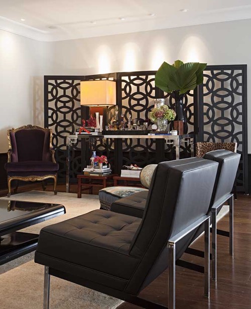
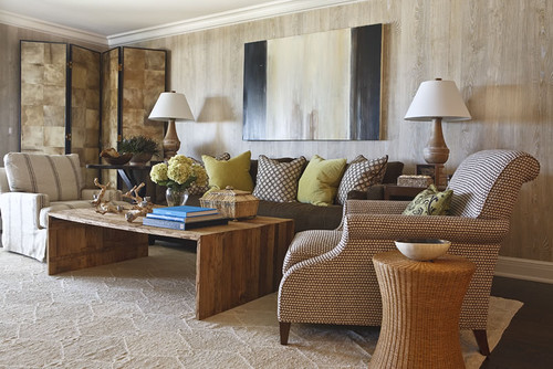
Large screens can be used as a backdrop along a plain, uninspired wall.  If you use one for this purpose it's important to choose one that fits the scale of the room.

Marcelo Brito - Sao Paulo - Brazil contemporary living room
Marcelo Brito

Often you will see an application that will prompt other ideas.  If I had this beautiful screen to work with I would put a  plain light coloured sofa in front of it.  The clean lines would show up well against the intricate design. Did you notice how the pot lights shine down on the wall behind the screen adding a layer of light? 

 Alessandra Branca

 Chinoiserie Screen are design classics. They add an exotic, dramatic  note to any room.  Since they are often multipanelled and quite striking they work beautifully as a major accent.  They will not be overlooked! Imagine this room without the floor lamps.  Would you like or dislike the effect?


I love the layered look of this room . The screen has been placed on top of a  patterned wall.. Pattern and textures have been employed so well.  The pop of yellow is a masterful finishing touch and it makes the black screen so much more dramatic.. 
  

This treatment is simple and very effective. I like the way the screen  extends and includes the night tables drawing everything into the largest element.  Keeping all objects close in colour/value makes this small room expand. This  screen would be so easy to construct from plywood or MDF and then cover with wallpaper or metallic fabric.
 
Use as wall art
 
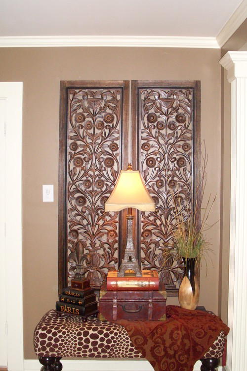
Ral99 eclectic entry


Using a bench as a table and then backing it  with this fantastic carved screen is an interesting idea.  This screen would look equally good hung on a wall as a sculpture.

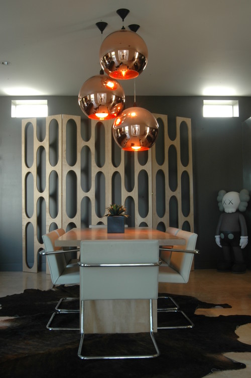
dining room modern dining room
twenty7 design

This  screen is quite stunning and sculptural.  It works so well with the contemporary furnishings. But what is that doll sculpture doing in the corner?


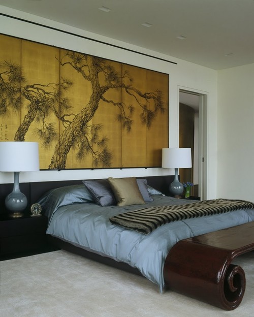
Laight Loft modern bedroom
Incorporated

Everything about this room hangs together.


Pueblo St Master Bedroom mediterranean bedroom
Lori Smyth

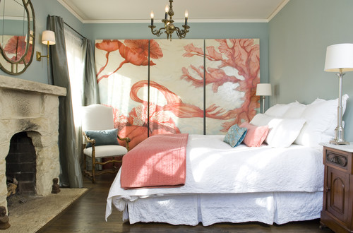
I'm not a lover of salmon and blue but it is very effective in this room. This room works because  large amounts of white was used to let the painting shine.

Fill an empty corner 

Breakers Project
 Phoebe Howard

This  screen does more than fill an empty corner.  It adds visual height to the space and draws your eye across the room while providing an additional texture.


Hollywood Residence eclectic living room

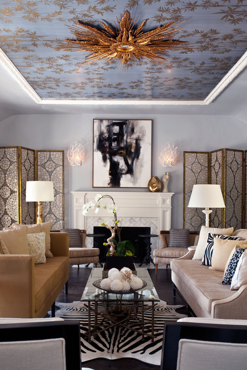
You can also use screens effectively to emphasize a symmetrical layout. The vertical flow draws your eye through the room.

 Make a headboard


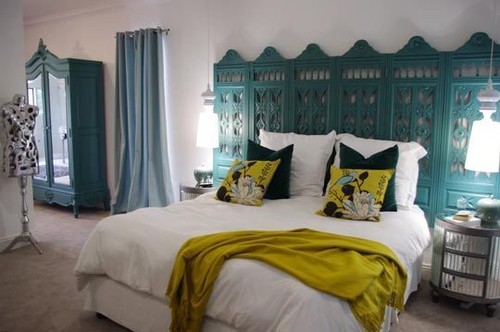
This is quite an amazing colour! You could also remove one section and hang the two parts horizontally.

Sacha & Johans High Risk / High Reward Home House Call | Apartment Therapy New eclectic bedroom
Apartment Therapy

Who would not like this room?  I love the colour combination in addition to the fantastic headboard.  With the degree of intricacy  in the screen you need to keep everything else simple.

houzz

To think I was planning to send my louvered doors to  RESTORE!  This changes my mind totally.  This room works so well because all the elements are similar in colour. Nothing stands out; everything plays a subtle role in creating the whole.

Divide a room

 Downtown penthouse contemporary bedroom
 Amelie de Gaulle Interiors

Do you have a favourite use for folding screens ? Feel free to share.

Gambar Belangkas