Showing posts with label wallpaper. Show all posts

Saturday, March 31, 2012

Flying high

Lately I'm seeing birds in many design magazines and home decor shops. They keep popping up on wallpaper, pillows, bedding, pottery, art work and in cages.  It seems the sky's the limit!  Here are some of my favourite ways to integrate a theme into your home. It doesn't have to be birds, it could be butterflies, fish etc.

Wallpaper 

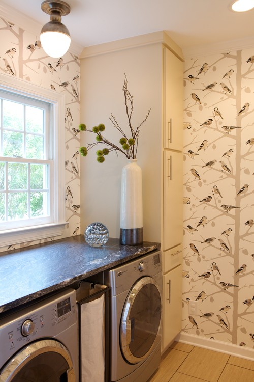
Heather Garrett eclectic laundry room
 Houzz
 I love the design possibilities of wallpaper, but I can also remember all those hours of scraping it off walls.  My preference now  is to use wallpaper on smaller spaces or as an accent.  The colours in this pattern work perfectly with other colours in the room. In a small space which isn't lived in daily you can be a little more whimsical or adventurous.

living room eclectic living room
maison21

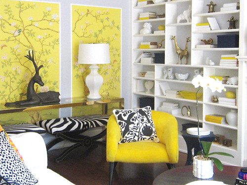
This vibrant yellow is hard to ignore and it is used sparingly.  Framing sections is a perfect solution for a shot of pattern and colour.  Look closely and you will see tiny birds.  The graphic pillow repeats the motif in a much bolder way.  
Creating Exploration eclectic kids

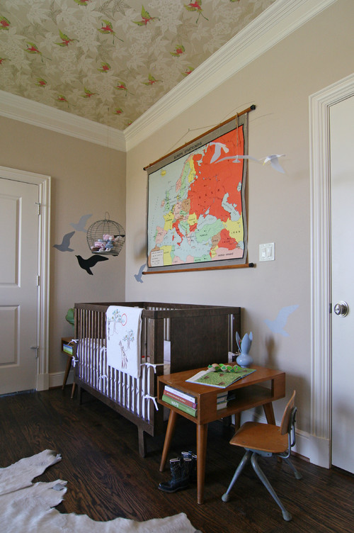
 And the bird theme is carried through this nursery even to the ceiling.


Wall Decals and Stencils

Four Walls and a Roof contemporary kids
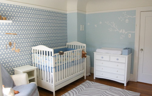
 These white birds  are subtle and fresh even with the addition of pattern on another wall. I think white drawings are so minimal  because they just hint at their presence.   


Look up!  Look waaaay up! What a lovely finishing touch in a nursery!   

oniroco eclectic kids
 Oniroco

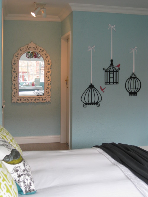
  You have to love these graphic birdcages and birds on the wall, but don't miss the pillows!


And here they  are again in  graphic black providing a  backdrop for this dark sofa.  I like how the curved lines of the sofa interact with the curves of the cages. And following up with the real thing......

Birdcages

Family Room Details traditional family room
 Cristi Holcombe

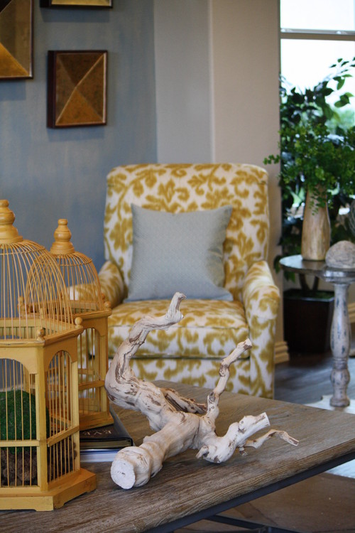
Using cages is a way to reference our fine feathered friends without having them actually  appear.  The absence of presence so to speak. I love the weathered driftwood with the straight lines of the cages.  


 You can also attach birdcages to your wall for a very three dimensional look which leads me to other forms of 3 D accessories....  


Sculpture
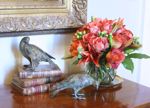
Accessory Closeup traditional entry
Nelson Wilson Interiors

Tucked away on a table top amidst  a display of flowers and books, 
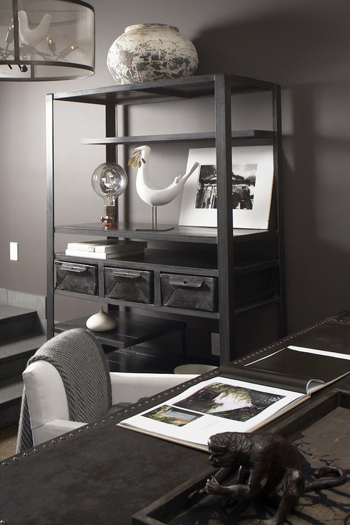
Interieurs Showroom by Francine Gardner eclectic home office

 commanding a shelf in a very contemporary office space,


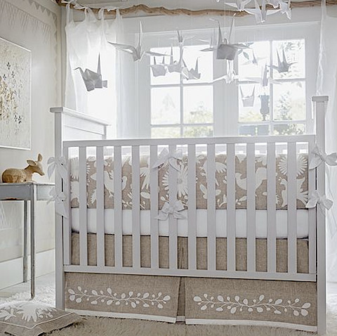
 or hanging in pristine whiteness to delight a new baby, birds take many forms in homes.


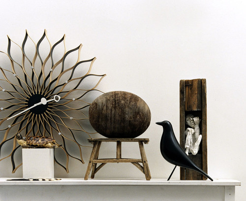
Eames House Bird by Vitra modern artwork

 The iconic Eames bird can be found in many styled homes. Charles and Ray Eames had the original carved bird and constantly rearranged  it in various vignettes around their home and when styling photos. Because of the colour and simple lines the bird was sought by Eames fans.   Using 3 D scans of the original bird Vitra is now creating reproductions of it.


Art work


Edgewood Townhouse modern

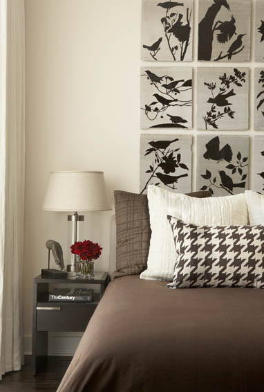
Silhouettes of birds and branches provide a very eye catching headboard design. 


Black & White Master Bedroom with a Touch of Teal contemporary bedroom
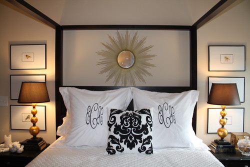
Small prints of various birds matted large and stacked on either side of this bed make for an interesting symmetrical layout.

Spring 2009 British Colonial Entry Room Design Ideas | Williams-Sonoma Home tropical

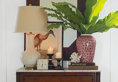
 Don't forget you don't have to hang artwork.  It can be beautifully displayed as part of a vignette.


Painted Furniture 
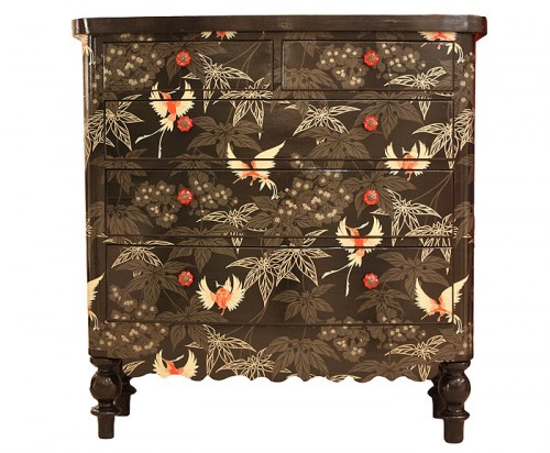
black birds

Birds appear to be a favourite motif on painted furniture.  This striking combination begs your attention.  It would make a fantastic art piece at the end of a hallway.


 What a difference from the dresser above.  This one is all calmness and delicacy. 

 Lighting

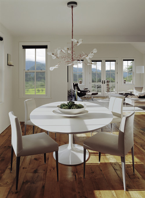
Mountain House eclectic dining room

 Ingo Maurer  birdy chandelier is a modern classic that will always inspire interest.


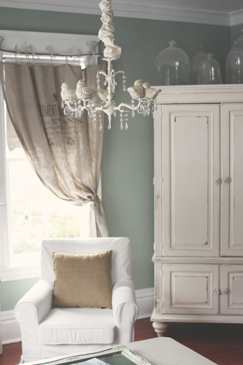
Lola Bs traditional living room

 And a more traditional take on a birdie chandelier.

 I could keep going but this post is already too long!


Do you have an interesting way you have included bird motifs in your decor?  Just click on the comments button and have your say.
Thursday, March 22, 2012

Create a wow powder room


 How often does a powder room get the royal treatment?   In many homes  powder rooms are  small,  windowless with functional aspects.  These elements usually defy  anything exciting happening in the space.  I'm out to prove that a powder room can be the star of your  house.


 Use tile as an accent


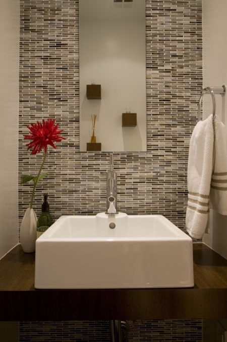
FORMA Design modern powder room


Buy exciting accessories


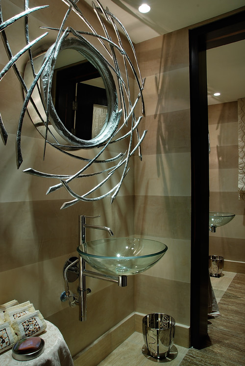
utopia projects modern powder room
Houzz
The contemporary nature of the wall mounted vessel sink and hand crafted mirror is further enhanced by  horizontal striping on the walls. There is no doubt what the star of this room is.

Choose a theme 

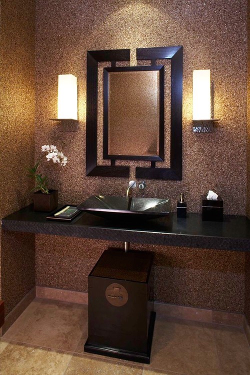
Powder at Hualalai tropical powder room
Willman Interiors / Gina Willman, ASID via Houzz

The subtle Asian details in this room have been duplicated in all of the pieces.  If you choose a theme for a room its success is always in the details.  

Use wood effectively

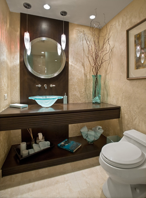
Modern/Contemporary Powder Room contemporary powder room
Marius Daugvila  via Houzz

This bathroom design is enhanced by the addition of the vertical strip of wood that backs the vanity and accentuates the asymmetrical placement of the sink.  A round mirror works against the vertical line. The vase of twigs (wood again) mimics the vertical lines and helps to balance the asymmetrical layout.

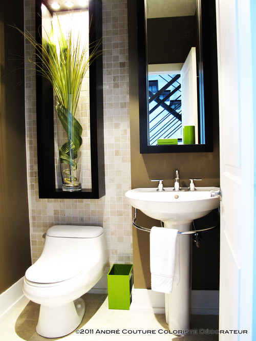
Lively powder room contemporary powder room
Andre Couture Coloriste Decorateur

This bathroom also relies on vertical wood  detailing for interest.   The pops of green bring  a natural  feel to the room.

Rely on large mirrors to increase your space

Residential  powder room
 Ownby Design

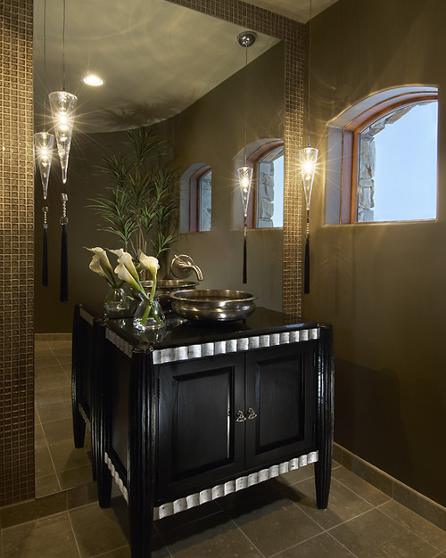
When you have a free standing vanity using a floor to ceiling mirror behind it enlarges the room significantly and it also creates strong vertical lines.  The dark cabinet with silver banding shows up well against the mirror.   


Formal Power Room contemporary bathroom 
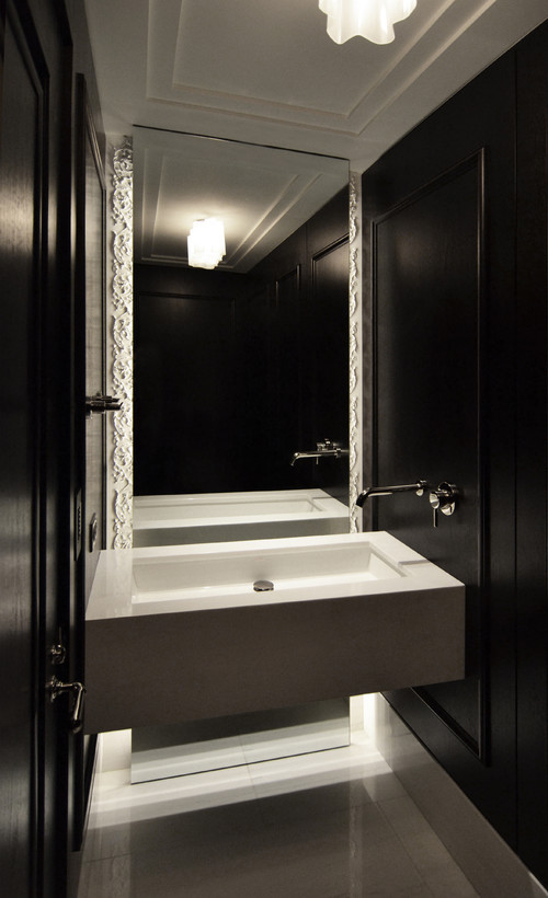
dSPACE Studio Ltd

Choose a bold wallpaper


Tiptoe through the Tulips contemporary powder room
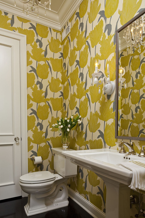
Martha O'Hara Interiors

 
Go for contrast  

HHL 2010 - Bathrooms contemporary bathroom
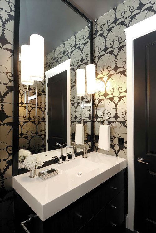
Atmosphere Interior Design Inc.

You can count on high contrast to bring a room to life.  There's nothing like black and white to create impact. 

Saturday, February 18, 2012

Wallpaper as an accent


Having an accent wall is popular  in home decorating, but many decorators are very selective or down right negative about the idea. I wrote at length about accent walls in another post and listed 5 reasons to consider an accent wall. Accent walls either work well or are dismal failures. Make sure yours is in the successful category.  

Recently a reader requested that  I write a post about using wallpaper  to create a focus wall.  Ask and you shall receive. Here are my thoughts on the topic.

The most obvious wall


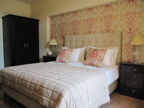
Golf House contemporary bedroom

 Any recessed area works well as an accent wall because it allows you to use the  architectural features of the room to good advantage. This bedroom shows how well a recessed feature can be highlighted . In addition, the paint colour totally supports the wallpaper design.  This is one of the biggest areas where you can mess up. 


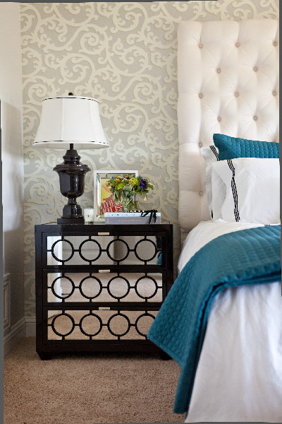
Living Room Chic eclectic bedroom

This is another bedroom where the pattern beautifully accentuates everything else in the room.  The colour scheme is quiet and the wall colour blends well with the tones in the paper.  


This room has a completely different vibe with its pinkish red walls and white and black accent pattern.  It isn't a look I personally like because there is just too much colour for me. That doesn't make the design wrong. With the white furniture you really need  colour on the walls. 

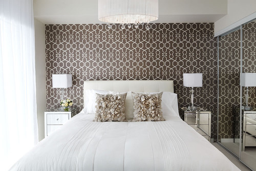
Queensway master contemporary bedroom

The wall behind a bed is the most advantageous wall to accent The furniture placement  makes it the focal point in the room and you are merely enhancing it with your wallpaper choice.  Consider the effect that large mirrors have on this design.  The mirrored doors create two accent walls and the  impact effect is diminished and for some people it would be visually confusing..


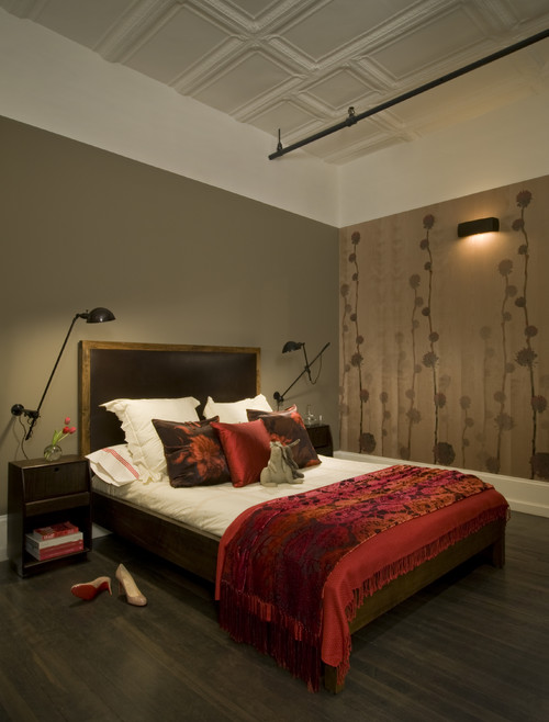
 David Howell Design contemporary bedroom

How do you feel about the accent wall in this room? Do you think the designer choose the best wall to highlight? Does the wall colour work well with the colour scheme in the wallpaper?  My answer would be negative on all counts.  To be fair, one could argue the use of pattern on the opposite wall as a way to  distribute visual  weight in the room. There's always more than one way to look at design.

 To highlight furniture


Light coloured furniture always looks great with a pattern behind it.  When you add pattern that is this dark and strong remember to consider how it will look with what is happening in the next room. 


Don't be afraid of large scale pattern on one wall.  There is lots of pattern in this room, but it works because the designer stuck to a tight colour scheme. When you choose bold patterns remember how much harder you have to work to find art that will hold its own on the pattern.  The two small pieces  above are lost in the pattern.  Something bolder and larger would have been a better choice. Sometimes the devil is in the smallest details.  When you look at this design what is the first thing you notice?  For me it's the sofa and not the patterned end wall.  Perhaps this is what the designer wanted to achieve and that might account for the downplay of art on the wallpaper.  Again, more than one way to look at things. 

 Stand alone walls and dividers


Look for opportunities to wallpaper where you have stand alone walls that will work well as an accent.  Often temporary walls or stand alone walls are used as dividers in condos or basement apartments.  It is a way to divide space without closing it off. 

  Wallpaper as art


 Think about all the ways you could use wallpaper as art . Use trim to emphasize a design and fill in with wallpaper.  The sky's the limit for this. I particularly like the grid created for the dining room wall with two colours of wallpaper.  The colour tones work very well together.

Highlight a small area


 Fireplace walls  that extend beyond the  main wall offer a perfect place to add pattern.   You can be very bold because there isn't much pattern used.  Would you use these accents on the mantle or different ones?  Do they stand out or are the lost? Does the arrangement need some height.  Displaying objects against a bold pattern takes some thought . There's lots of choice in things to move around in this room. Check out lots of other images on this great post about wallpaper accents.


Define a  space with just a strip or two of wallpaper as a backdrop. 

And there you have it.  There are all kinds of ways to brighten your home with wallpaper accents.  This only scratches the surface.  You might want to refer to this other post I wrote on the topic last year. I also have a growing collection of ideas for your walls on Pinterest.

Friday, October 21, 2011

At Home: An ocean getaway

As a child I often imagined how a house would look on the inside as I drove or walked about the town where I lived.  I'm assuming I'm no different from most people.  My Open Doors  series of posts will fill the need to peek inside everyday homes- not the grand designs of decor magazines, but interesting homes that are achievable for most people.  Come along on a visit to my friends' ocean beach house. 

 The patio overlooking the Atlantic Ocean has lots of beach finds.   There's a wind up today. 

 From the kitchen looking out through the screened window.  Even I would like to wash dishes here. The exterior of the house is red with a soft creamy white trim.

Pat and Janna travel all the way from British Columbia to Newfoundland every summer to enjoy life on an opposite ocean. I met Pat  when she and a friend  came to visit my studio/gallery in my summer house.   Ever since we've been looking forward to our summer time visits. When they left this year I received a key to the premises so I could photograph.  

 After one visit to the Bonavista Peninsula , Pat and Janna fell in  love with the place and purchased a typical Newfoundland outport house and began to remodel it.  Remodel doesn't seem the right word though. They worked backward until they reached the original boards, removing layers of wallpaper and wallboard.  I was lucky enough to photograph some of this process for my wallpaper archive which is part of an art project I'm working on.  Here's what it looked like then....


 And look what was hiding under the layers of wallpaper, a newspaper article about The Kennedy family.  After much patience and elbow grease they were ready to simplify the decor.

 They painted the whole interior  white and added their personal touches. That's what makes a home in my book.  I appreciate the way they have arranged/displayed their finds.


 The accent colour throughout the house is red.  What a fitting use for these cod jiggers!


Sea urchins in a bottle, beach glass, a boat and sea birds on an old trunk flanked by windows and oars.  

 More splashes of red against white and navy blue.  The sofa is red,  but it was covered for its winter rest.

 Some  of my favourite things in the house... the checkerboard that has two colours of beach stones for checkers, and a book about sea glass which prompted me to get my own copy.  It just arrived and I'm reading every word getting ready for next summer's hunt.

 Most of the furnishings are from IKEA which is a feat when you live in Newfoundland- they have to be shipped or driven.   I covet the aqua coloured lantern on the bookcase. Would they notice if it wasn't there next summer?

 I love seeing the remnant of an old window (I'm guessing) above the left chair. Shutters are a very practical window treatment because these windows are visible from the street and there could be nosy people just like me hovering outside.


  I call this the gallery of "Walked On" .  Pat salvaged scraps of the various floor coverings from the house and framed them in simple IKEA frames.   The stark simplicity of the frames show off the contents.  Keeping the stairway all white further enhances the overall look of this very effective display.

Upstairs hallway leading to....

..... a great desk area .  Now where did they find that old map of Newfoundland that was on the school room wall in my day?

There are more rooms for another time, but I ran out of battery power before I could finish my job.  Do you have any favourites?

Thanks to Janna and Pat for leaving me with the key and welcoming my intrusion.

Gambar Belangkas