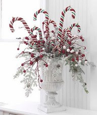
The traditional colour of the Christmas season is red. I like the simplicity of using just one colour in repetition to create sleek designs. It's the repetition of shape that gives them that wow factor.
How simple can it get? These snowflake designs are made out of craft sticks glued and spray painted. They look smashing with this white chair and light coloured walls. There's always positives when you choose a neutral colour scheme! This would not look half as interesting on a darker wall. I think I would also have red candles.
Here's a variation on the idea above. Add cranberries to the bottom and then water and add an amaryllis. Invest in two artificial ones and you can re-use each year. I've gotten mileage out of mine I purchased at Michael's. I'd skip the ribbon, but that is a personal preference; I'm not a gal for visual clutter.
The sleight is the focal point in this display, the reindeer add visual interest and energy, and the trees add strength. The leaves soften the whole look. This is so effective against the white.
Trendy Tree
Another take on using red trees, this time with "sparkle pods" garland giving lots of energy to the strong verticals the trees provide.
You often see large candy canes from plastic or glass, but what do you do with them to make an interesting display? This is a simple idea easily put together from the dollar store. The white vase is the necessary part. It has interesting details and height and is the prefect sophisticated element to add oomph to this design.
Here's another table centerpiece built on one colour and repetition. Two shapes always makes it more interesting- roses and berries. Carnations would be a more cost effective substitute.
BHG
Ornaments, the larger the better, provide a striking look when hung from a drapery rod with sheer ribbon. Alternate satin, shiny and sparkly.


