Showing posts with label accent walls. Show all posts

Tuesday, May 14, 2013

Accenting with wood

  There are so many ways you can make your space inviting .  My recommendation today is to  consider wood because it can add both warmth and architectural interest to any space.  Choose a little or a lot, there's something for every space. If you don't  like the warm tones of wood but love the grain and texture, think about white washing or gray washing it.   How about using  wood  in......

Accessories 


A few twigs or pinecones as part of a table display or sliced wood attached to board or a recessed box shape can add instant interest to small areas.

These houses cut from weathered 2 x 4 are the essence of simple, but when massed together they provide big impact  when displayed on simple white vertical  shelving  attached to white painted board. 

 source 

If you find beautiful wooden boxes like the ones above grab them.  They not only provide extra storage but they look great in any application.  You can tuck them away or use them out in the open as an end table in a living room or as a night table in a bedroom.  They are so versatile. 


Room Dividers 

 I am not overly fond of room dividers, but some are so well done they look like an art installation rather than a functional aspect of a home. Here are some of my favourite ones.....


source

This  divider is attached to the ceiling and floor with rods but it appears to  float.  It also allows the homeowner to place a piece of furniture in front of it.   I think I would like to see the buffet a different colour so it stands out from the wood, but there are just as many arguments for having it the same colour.

 
 source 

I just love this divider because you can move around it on both sides and it is so substantial looking and works well with the flooring.  

source

 This is perfect in every way, but the addition of a concrete sphere against all those horizontal and verticals is inspired. 

 Bathrooms  

All of these bathrooms have a mix of wood and other surfaces.  Each provides relief for the other and in this way work together to create a stronger aesthetic statement.

source 

 There is just enough wood spread around this room to create a wonderful balance with the abundance of marble. 


This is both an accent wall and an integrated storage space.

source 

Sliding doors and drawer and open shelving.  This space has it all.

Isn't the asymmetrical placement of this wood strip just a prefect balance for all the white and glass on the left of it?

Fireplaces
source 

 Rough hewn logs in an asymmetrical placement work really well .  Chunky and demanding they make quite a statement.

While this is probably rough wood that is stained, it looks like charred wood.  It is this quality that is so appealing in this application.


I guess you are getting the message that I love asymmetry.  This delicate shelf that extends beyond the fireplace on one side is the perfect resting place for two white vases that reference the colour of the fireplace surround.

Accent Walls  

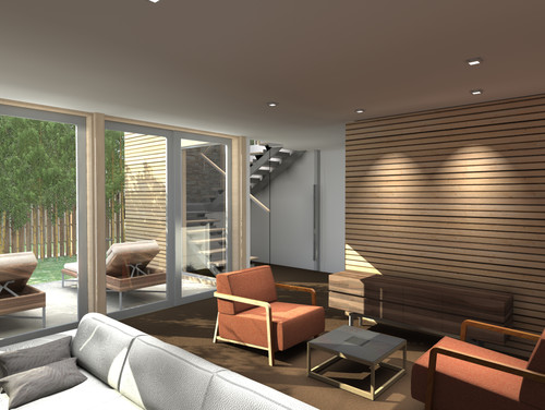
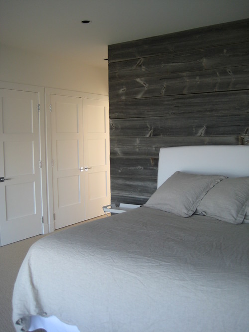
And don't forget the power of wood for an accent wall.  Either natural or stained, you can't beat the  warmth of real wood.  I especially love it paired with white walls and furniture.


Saturday, March 31, 2012

Flying high

Lately I'm seeing birds in many design magazines and home decor shops. They keep popping up on wallpaper, pillows, bedding, pottery, art work and in cages.  It seems the sky's the limit!  Here are some of my favourite ways to integrate a theme into your home. It doesn't have to be birds, it could be butterflies, fish etc.

Wallpaper 

Heather Garrett eclectic laundry room
 Houzz
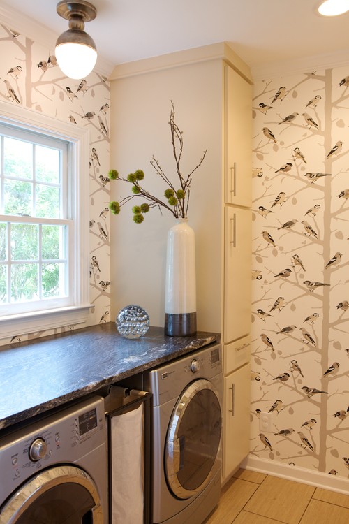
 I love the design possibilities of wallpaper, but I can also remember all those hours of scraping it off walls.  My preference now  is to use wallpaper on smaller spaces or as an accent.  The colours in this pattern work perfectly with other colours in the room. In a small space which isn't lived in daily you can be a little more whimsical or adventurous.

living room eclectic living room
maison21

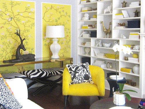
This vibrant yellow is hard to ignore and it is used sparingly.  Framing sections is a perfect solution for a shot of pattern and colour.  Look closely and you will see tiny birds.  The graphic pillow repeats the motif in a much bolder way.  
Creating Exploration eclectic kids

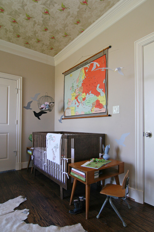
 And the bird theme is carried through this nursery even to the ceiling.


Wall Decals and Stencils

Four Walls and a Roof contemporary kids
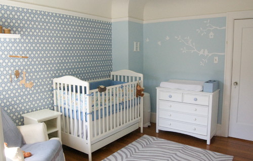
 These white birds  are subtle and fresh even with the addition of pattern on another wall. I think white drawings are so minimal  because they just hint at their presence.   


Look up!  Look waaaay up! What a lovely finishing touch in a nursery!   

oniroco eclectic kids
 Oniroco

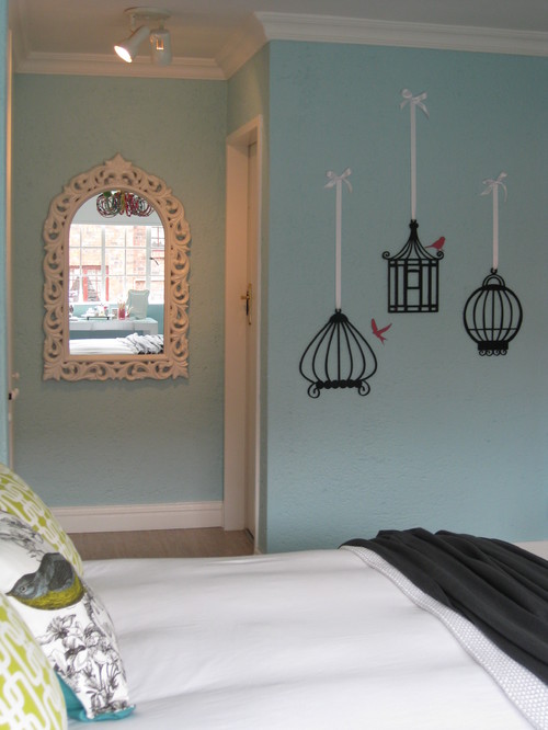
  You have to love these graphic birdcages and birds on the wall, but don't miss the pillows!


And here they  are again in  graphic black providing a  backdrop for this dark sofa.  I like how the curved lines of the sofa interact with the curves of the cages. And following up with the real thing......

Birdcages

Family Room Details traditional family room
 Cristi Holcombe

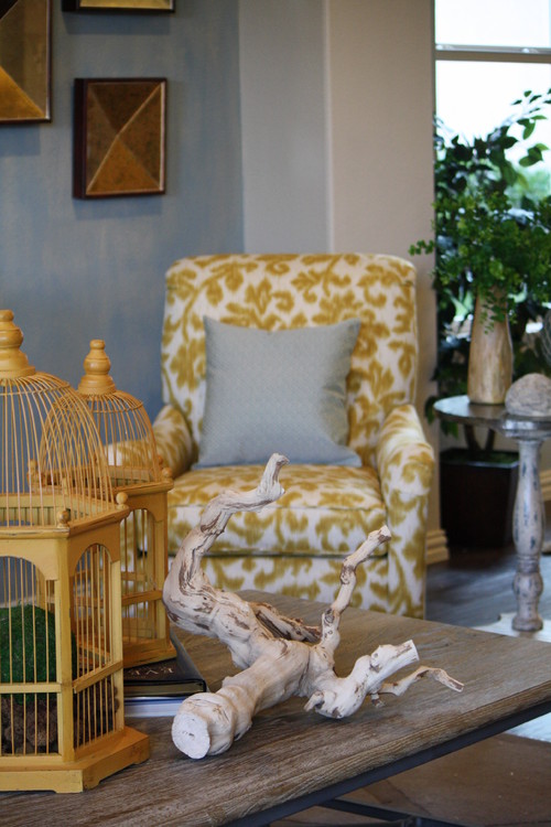
Using cages is a way to reference our fine feathered friends without having them actually  appear.  The absence of presence so to speak. I love the weathered driftwood with the straight lines of the cages.  


 You can also attach birdcages to your wall for a very three dimensional look which leads me to other forms of 3 D accessories....  


Sculpture
Accessory Closeup traditional entry
Nelson Wilson Interiors

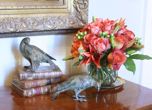
Tucked away on a table top amidst  a display of flowers and books, 
Interieurs Showroom by Francine Gardner eclectic home office

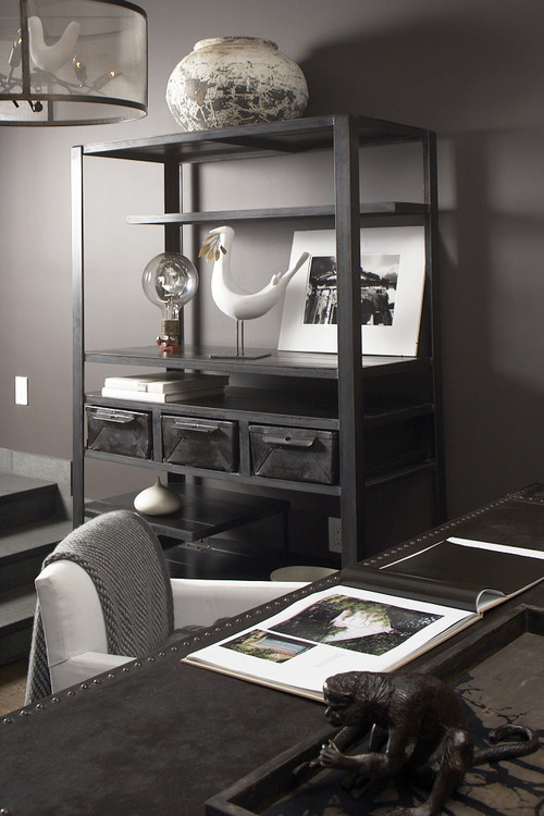
 commanding a shelf in a very contemporary office space,


 or hanging in pristine whiteness to delight a new baby, birds take many forms in homes.


Eames House Bird by Vitra modern artwork

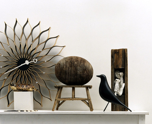
 The iconic Eames bird can be found in many styled homes. Charles and Ray Eames had the original carved bird and constantly rearranged  it in various vignettes around their home and when styling photos. Because of the colour and simple lines the bird was sought by Eames fans.   Using 3 D scans of the original bird Vitra is now creating reproductions of it.


Art work


Edgewood Townhouse modern

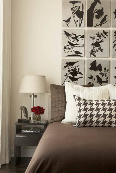
Silhouettes of birds and branches provide a very eye catching headboard design. 


Black & White Master Bedroom with a Touch of Teal contemporary bedroom
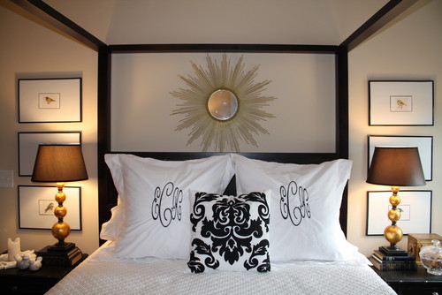
Small prints of various birds matted large and stacked on either side of this bed make for an interesting symmetrical layout.

Spring 2009 British Colonial Entry Room Design Ideas | Williams-Sonoma Home tropical

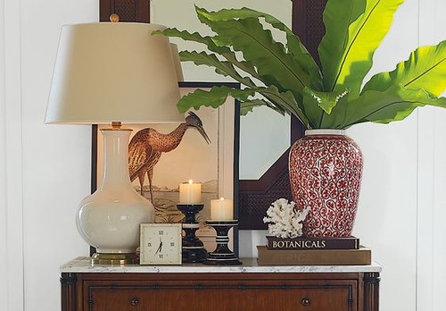
 Don't forget you don't have to hang artwork.  It can be beautifully displayed as part of a vignette.


Painted Furniture 
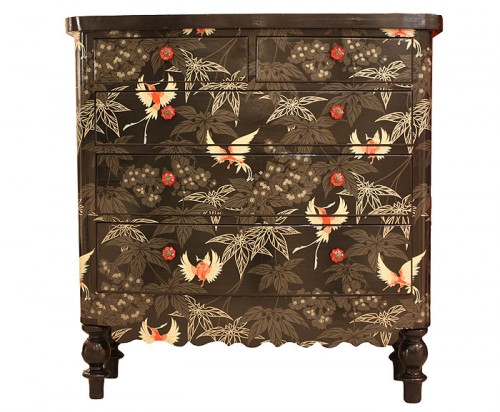
black birds

Birds appear to be a favourite motif on painted furniture.  This striking combination begs your attention.  It would make a fantastic art piece at the end of a hallway.
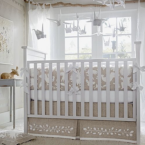


 What a difference from the dresser above.  This one is all calmness and delicacy. 

 Lighting

Mountain House eclectic dining room

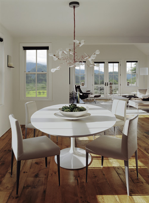
 Ingo Maurer  birdy chandelier is a modern classic that will always inspire interest.


Lola Bs traditional living room

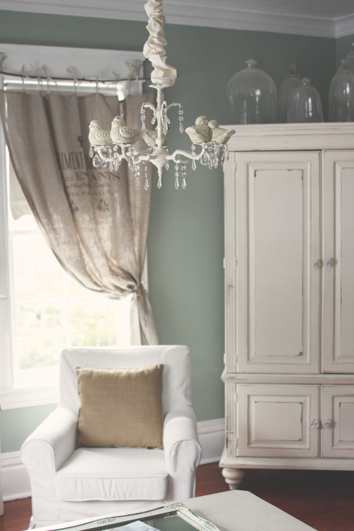
 And a more traditional take on a birdie chandelier.

 I could keep going but this post is already too long!


Do you have an interesting way you have included bird motifs in your decor?  Just click on the comments button and have your say.

Monday, November 14, 2011

5 ways to use a screen

I'm surprised I don't see more screens used in decorating because they are very versatile and there are so many styles to choose. Have you thought about using a screen in a recent home decorating re do?People have been using them for centuries in their homes beginning in 4th century BC in China.

 Through the centuries Chinese folding screens were ornately decorated with traditional symbols of health, prosperity, and joy and some were  painted with up to 30 layers of lacquer making them appear illuminated from within. In contrast, when screens migrated to Japan they took on a much different look  with their thin wood frames and paper panels. Eventually, the folding screen was imported into the West via European traders. Throughout history, the folding screen has had both decorative and functional uses.  Today the folding screen is still a multi-purpose decorating tool.

Create an accent wall

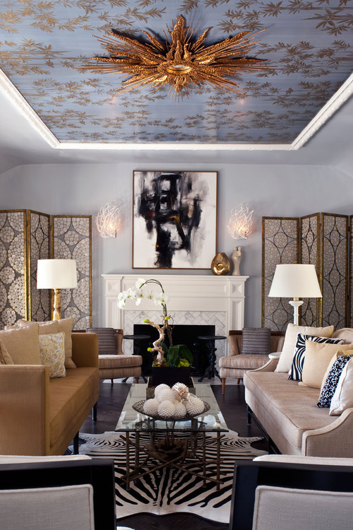
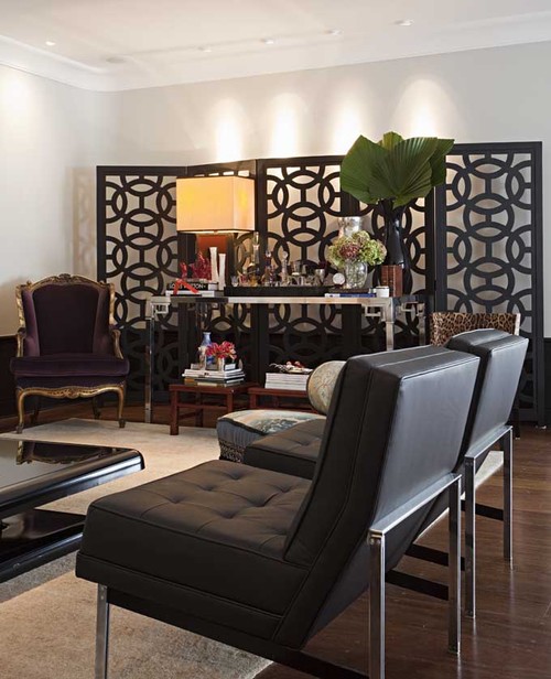
Large screens can be used as a backdrop along a plain, uninspired wall.  If you use one for this purpose it's important to choose one that fits the scale of the room.

Marcelo Brito - Sao Paulo - Brazil contemporary living room
Marcelo Brito

Often you will see an application that will prompt other ideas.  If I had this beautiful screen to work with I would put a  plain light coloured sofa in front of it.  The clean lines would show up well against the intricate design. Did you notice how the pot lights shine down on the wall behind the screen adding a layer of light? 

 Alessandra Branca

 Chinoiserie Screen are design classics. They add an exotic, dramatic  note to any room.  Since they are often multipanelled and quite striking they work beautifully as a major accent.  They will not be overlooked! Imagine this room without the floor lamps.  Would you like or dislike the effect?


I love the layered look of this room . The screen has been placed on top of a  patterned wall.. Pattern and textures have been employed so well.  The pop of yellow is a masterful finishing touch and it makes the black screen so much more dramatic.. 
  

This treatment is simple and very effective. I like the way the screen  extends and includes the night tables drawing everything into the largest element.  Keeping all objects close in colour/value makes this small room expand. This  screen would be so easy to construct from plywood or MDF and then cover with wallpaper or metallic fabric.
 
Use as wall art
 
Ral99 eclectic entry


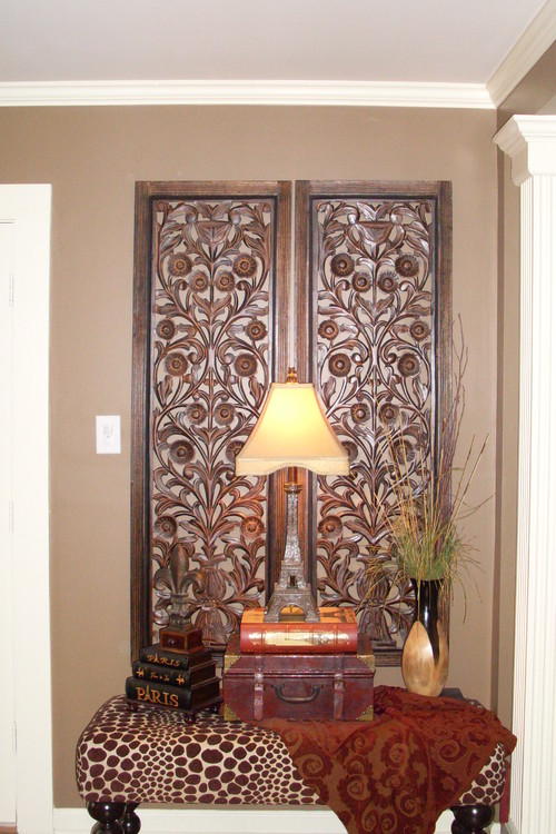
Using a bench as a table and then backing it  with this fantastic carved screen is an interesting idea.  This screen would look equally good hung on a wall as a sculpture.
dining room modern dining room
twenty7 design

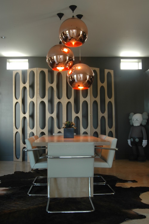
This  screen is quite stunning and sculptural.  It works so well with the contemporary furnishings. But what is that doll sculpture doing in the corner?


Laight Loft modern bedroom
Incorporated

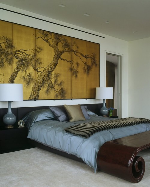
Everything about this room hangs together.


Pueblo St Master Bedroom mediterranean bedroom
Lori Smyth

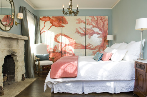
I'm not a lover of salmon and blue but it is very effective in this room. This room works because  large amounts of white was used to let the painting shine.

Fill an empty corner 

Breakers Project
 Phoebe Howard

This  screen does more than fill an empty corner.  It adds visual height to the space and draws your eye across the room while providing an additional texture.

Hollywood Residence eclectic living room

You can also use screens effectively to emphasize a symmetrical layout. The vertical flow draws your eye through the room.

 Make a headboard


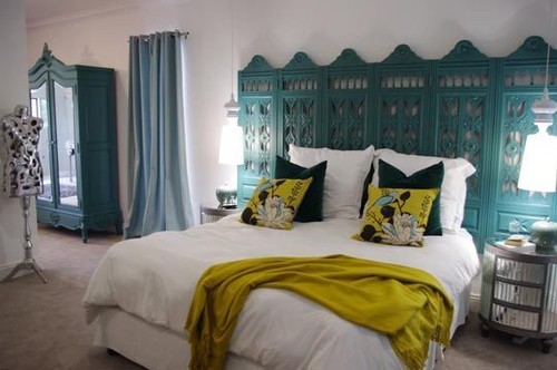
This is quite an amazing colour! You could also remove one section and hang the two parts horizontally.

Sacha & Johans High Risk / High Reward Home House Call | Apartment Therapy New eclectic bedroom
Apartment Therapy

Who would not like this room?  I love the colour combination in addition to the fantastic headboard.  With the degree of intricacy  in the screen you need to keep everything else simple.

houzz

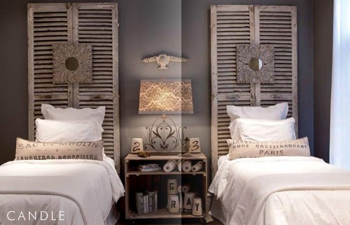
To think I was planning to send my louvered doors to  RESTORE!  This changes my mind totally.  This room works so well because all the elements are similar in colour. Nothing stands out; everything plays a subtle role in creating the whole.

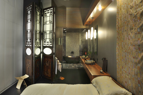
Divide a room

 Downtown penthouse contemporary bedroom
 Amelie de Gaulle Interiors

Do you have a favourite use for folding screens ? Feel free to share.
Gambar Belangkas