The largest block of yellow is the door. It could just as easily have been a chair or an area rug. The yellow is repeated in a print duvet cover. A print always adds interest. The throw is yellow and very textured. The yellow follows through to the bathroom in the vases, mat and towel. That's probably enough. After that there would be too much yellow and it would not longer be neutral and a splash!
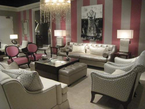
The room below has a very subtle splash of pink in the wallpaper and two chairs. I'm craving at least one other splash somewhere in the room to make it three (counting the chairs as one). Perhaps it's outside of the photograph frame.
Pangaea Interior Design,
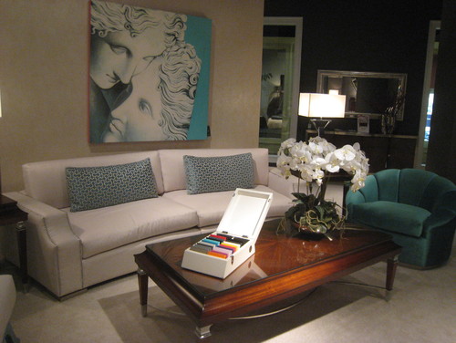
Turquoise blue/teal works with any decor. We have a colour triangle in this room with the chair, pillows (as one), and art work.
Tobi Fairley
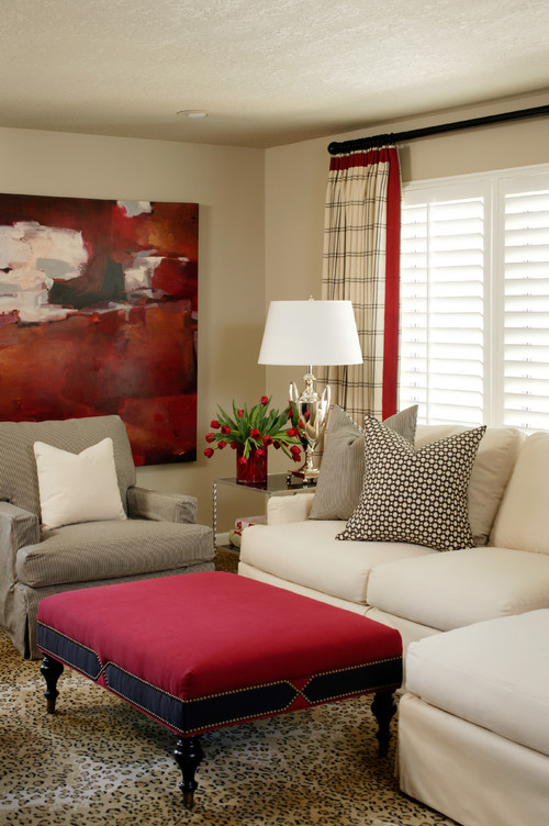
Tobi Fairley loves to use very vibrant pops of colour in here room designs. The artwork and ottoman are the most prominent features. but the strip on the drapes and the flowers help move your eye around the room and provide varying proportions of red.
I'm getting ready to redecorate my master bedroom and I plan to use a soft green with cream. A full post is coming up on this minor transformation. The splashes of colour do not have to be vibrant. Check these out.
Similar to what I have in mind for my own room, Sara Richardson has used soft greens in different patterns on the bed, and then sprinkled several green accessories around the room.
The pink in this design is so soft it is barely discernible, but it enhances the gray and off white just enough to make the room interesting. Again, pattern plays a prominent role in how the pink moves around the room.


