Showing posts with label accessories. Show all posts

Monday, September 21, 2015

Designing an inviting home

Have you ever gone into someone's home  and it was so perfect in every way that you were almost afraid to sit down or move?

When everything looks new, co-ordinated and just so, you end up with an unwelcoming and often boring home.   Such spaces can make visitors feel confined and uncomfortable.  Nothing invites you in because when  everything is  perfectly matched objects become a blur.

 Is there a middle road?

What makes an interesting  and inviting space? Do you need a large budget to have a great home?

Fortunately you can have a very interesting space on a modest budget.  It just takes a little ingenuity.  As with most things in home decor what someone finds interesting  or inviting is dependent on their likes and dislikes;  I can only write about what I find interesting in a space.  Here are some of the characteristics I think   create interesting spaces.

It has a collected feel

That simply means that the home has objects that have been acquired over time and in different ways.   It could be objects collected from travels, antiques, personal items,  family heirlooms, original art etc.  The space does not look like you went out to several stores on one day and outfitted the place. It definitely does not look like a model home!


The rooms are arranged for conversation

Nothing is as bad as going to someone's home and not feeling like you are meant to be there.  You can have that feeling for many reasons, but  it often boils down to not feeling part of the conversation or not having a comfortable place to sit or lay down a beverage.


I would love to spend an evening here chatting with friends.


There's a mix of old and new

Pristine is not that interesting.  Often when everything is new you don't appreciate any of it.  You need a yardstick against which you can appreciate the newness, and that means having some things that are older.  Another great thing about  old pieces is the sense of history and intrigue they create.  Visitors are left wondering why the pieces are so important that you've decided to keep them.  If you like very contemporary or modern decor, there is still a place to add interesting objects with a history.

Briggs and Solomon 

There's a mix of hand crafted and manufactured products 

In our world of mass production, it is so easy to forget the importance of the marks left by the hands of an artist and the presence of ideas in objects.  Having  art, fine craft and the hand made is like having a whole pile of interesting people over at one time.  There is a merging of ideas and various takes on the natural and man made world. Then there's the one of a kind aspect.

Designing Home/Margaret Ryall

Everything in this space is hand made by various artists.   Even the plant was grown locally.


The natural world is referenced  

Designing Home/Margaret Ryall


This unique vessel titled Barnacle by Anita Singh plays nicely with the glass bowl of sea urchins and wild ferns.  The nautilus design on the pillow supports the overall outdoorsy theme in this casual summer house.  The table in the photo above can be seen in the background. 


 Accessories are moved/changed 


Designing Home/Margaret Ryall


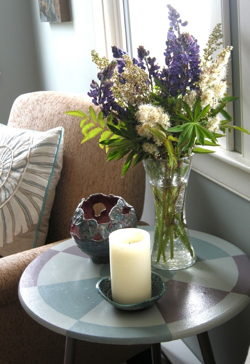
Another week and a different  wild flower arrangement  and vessel by Anita Singh on the little  hand painted table.  The objects and flowers add colour, texture and variety in forms to the vignette.  A painting by a local artist peeks out behind the chair, something new to be discovered.  Candles are always inviting. 


Thought has been given to space planning 


The room is arranged as well as it can be given the space available.  The layout is conducive to flow through the space.  There is an obvious visual flow as well as  defined traffic lanes.  There's variety in heights of objects and  textures. Even a monochromatic colour scheme needs contrast.


There are surprises to be discovered

I love a bit of the unexpected.   There are all kinds of ways to achieve this.  It could be a colour that you might not think about pairing with your colour scheme.  It could be an a family heirloom, some of your child's artwork scanned and made into a book, a vase you made in high school art, the work of a friend,  a display of framed post cards from trips you've taken arranged in a grid, a piece of furniture in a place where you wouldn't expect to see it, etc.  The sky is the limit.


How pleasant these doilies look backed with blue and enclosed with white frames .  Such a great way to display family heirlooms.


 I am intrigued by the chain hanging from the candlestick.  Does it have significance to the homeowner? Did a visitor drop it and it's placed here to keep it safe?  Did the homeowner change her mind just before going out?


 Each piece has its own compartment that acts like a mini frame.  Together there is coherency in the pieces and it is very pleasing to the eye.  My favourite is the white doll.  Where did that come from?


And why not end with glowing forsythia, bold in scale and vivid in colour? The arrangement look so great in front of a simple, repetitive composition of fish. 

What tricks do you use to create an inviting home?

Thursday, July 16, 2015

Arranging vignettes: Do you know your design letters?


 Are you challenged when it comes to arranging  accessories? Do you look at details in  decorating magazines and marvel at how everything  looks just right? Many people think the final touches are the most difficult part of home decor, but they don't have to be.  There are all kinds of tips and tricks of the trade. 

One of the simplest design tips I can offer is the use  of  letter formations to organize interesting accessory vignettes. I'm calling on my background in visual art and floral arrangement to offer you this advice.  Other decorators may have different ways of describing their approach. 

The most useful letters for designing vignettes are ....  A, V,  O, C, L, and M.  

Here goes...

A


eclectic bedroom traditional bedroom bedroom vignette


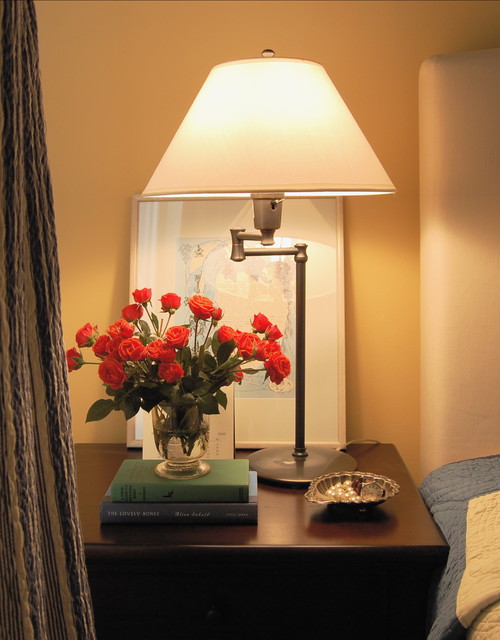
This is a very tight A line of design.  The visual height is always through the middle and the base is wider, but the bottom width can vary.  My eye wants to see something slightly taller than the dish - a sphere  would be lovely here. Perhaps the owner is like me,  always looking for just the right object to finish a room.


vignette, black and white, A line of design

source

Another A with a tall vertical.  Because this is a monochromatic scheme the overall A shape is more evident.  Are you noticing how the height is usually a piece of art?  It  could also be a sculpture, a mirror,  a  tall vase of twigs or flowers or photos hung on the wall.  The base can also  be much wider and the height much less than these examples. 


console table, vignette, V line of design
 
The reverse of A is V. In a V the lowest point is usually in the middle of the arrangement.  Sometimes thinking about it as a check mark is helpful because one side is usually taller and one is shorter.  A V line of design doesn't  have the height through the middle that an A line of design does. Sometimes only these two shapes are presented in vignette discussions, but there are so many more ways to think about it.  


C


Quintessential Dressing Table eclectic bedroom
 Lucid Interior Design Inc.

vignette, console table, C line of design


source 

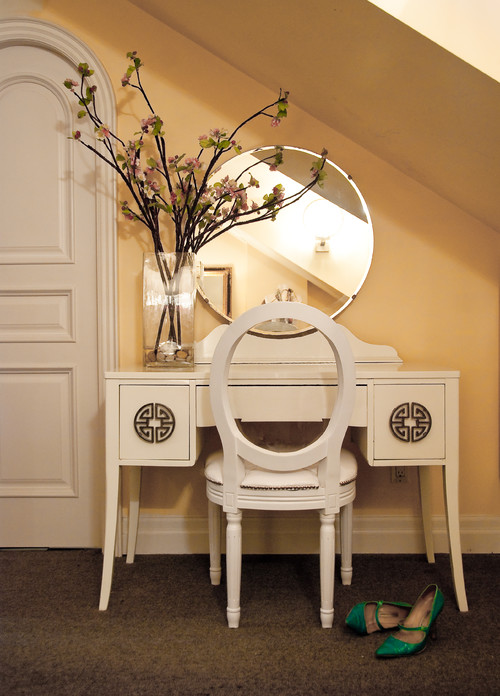
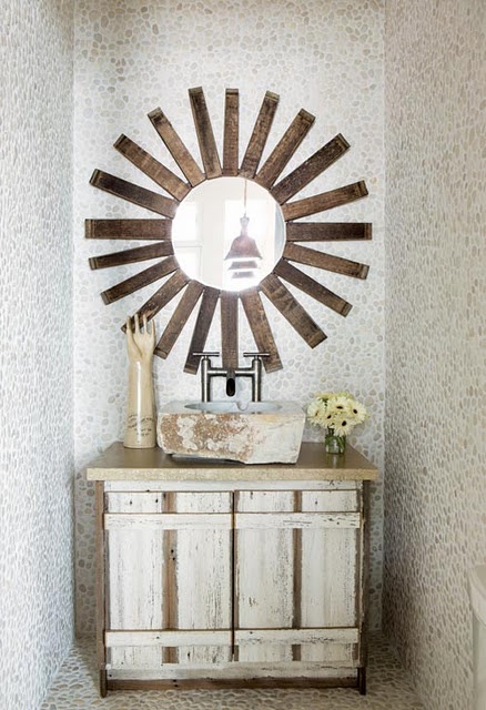
 You don't often find C lines of design and they are the most obvious when there's only one object banked by something that is circular as with the mirror and twigs.  Your eye just wants to make that sweep.  But sometimes it is the placement of objects that creates a C sweep with the largest object placed at the beginning of the C as in the photo above. 


 o
Joni Spear Interior Design contemporary dining room, vignette
 Joni Spear Interior Design

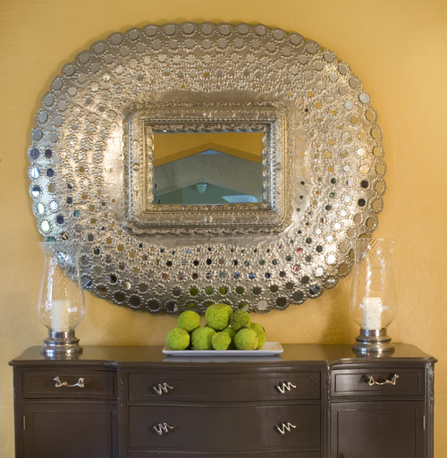
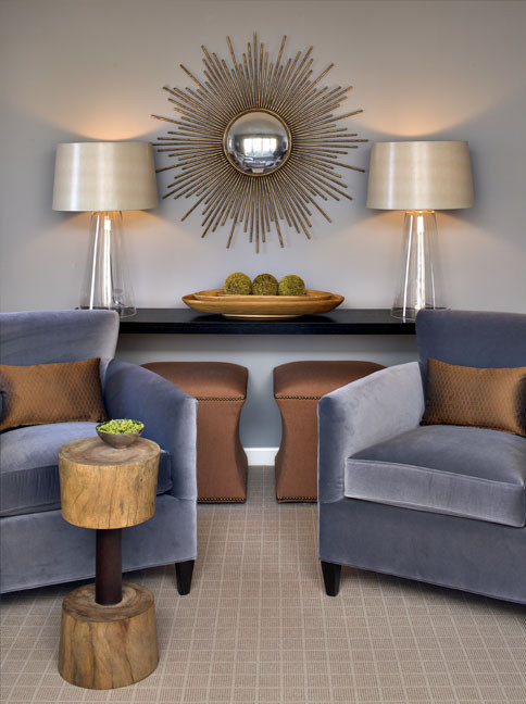
 Some designers may argue this is a classic V formation but I would disagree because the mirror causes the eye to move in a circular fashion around the display.  The lamps are taken in with that sweep.

 Wakefield Residence modern living room, vignette, console table
 Rachel Reider Interiors

 Another  symmetrical O line of design.  The base is set so broadly that your eye just wants to do the circular movement around the objects. The three rounded shapes  add to the circular movement.  


vignette, starburst mirror, o line of design

Another very strong O line of design.  It is even more obvious when you have a narrow base. 


Metal decor modern living room, console table vignette
  CNW PRODUCTION

Urrutia Design contemporary , console table
Urrutia Design


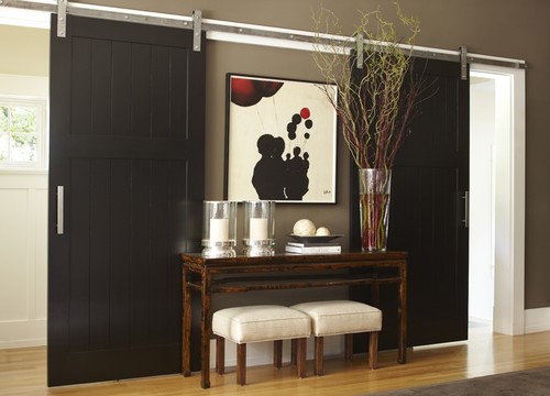
The requirement for an L line of design is a very tall object placed on the edge of the design with a broad base.  Of course you can also reverse the L.  If the hurricanes were taller I would call the  vignette above a V. 


M


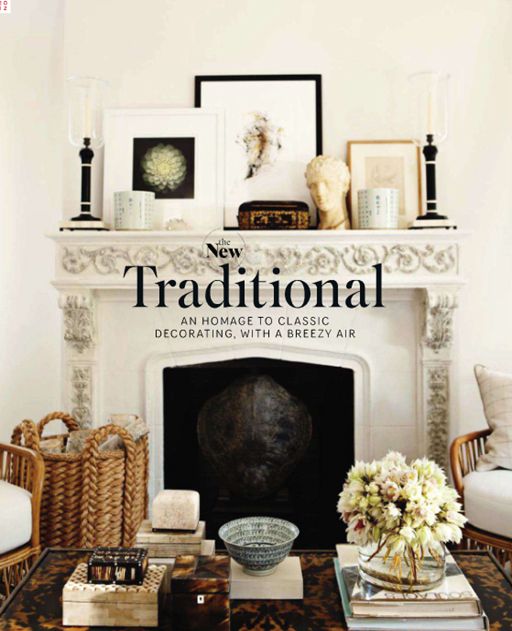
You don't often see the M line of design used, but it works well when you are displaying collections where you have several heights with dips in the middle and you start with shorter objects on the ends.  


traditional mantle vignette

source 

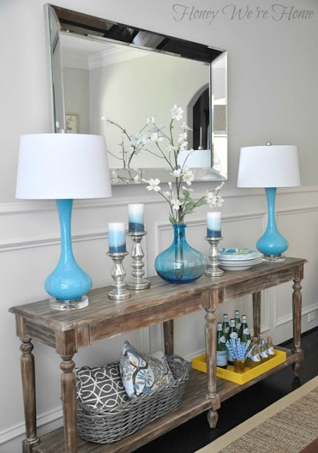
console table vignette blue lamps


If the shorter objects are on either end it is an M, but when you start with taller objects on the ends and it is also high in the middle  it moves into a W.  


What line of design do these vignettes follow? 

1.


2.


3.


1.This is  an A because of the wide base and the tall height through the middle. 

2.  Whenever you see a  lot of objects of similar heights spread out and starting and ending with a shorter object it is an M.  The more objects there are it can turn into a long zig zag of Ms. 

3.  Oh so tricky.  Without the curved object to the right it would be an O line of design, but your eye stops on it making it  a C. 

 
And there you have it.   Keep your eyes open when you see arrangements and observe the  lines of design  used. Then start arranging! 


Tuesday, February 17, 2015

5 decorating solutions for one traditional mantle


Mantles can bring out your inner decorator or cause you frustration.  I hope at the end of this post your inner decorator will be leaping.  If you don't have a mantle, but have a buffet, console table or even a wide window ledge all the principles/design tips  still apply.  for additional information about  decorating above a fireplace check here.

Come along to a traditional home that is getting a foyer facelift.

Fireplaces and mantles are usually a focal point in a space.  Often there are other architectural details that ensure it is a dominant feature.  In this case, there are two archways on either side of  the fireplace, one into  the living room and the other into the dining room.  While the fixtures in the home are traditional, the homeowners have mixed in contemporary furniture while still honouring the original feel of the house.


Original photo from homeowner
Initial observations:

The mirror:
  • reflects the chandelier adding interest 
  • has simple traditional styling  that relates well to the  the other architectural features
  • will  reflect what is put in front of it adding  visual depth
  • frame has same tones as floor only darker
  • fits the width of mantle, but seems to overpower it (less so when you are in the space)
  • is heavy and mounted on original plaster walls, it stays 

Thanks to the program Olioboard, I can import the original photo from the homeowner and layer options on top of it. That's designer's dream when presenting ideas to a client.

With the central position of  the fireplace between two archways, a symmetrical design would  be a fitting line of design. l

Solution One:

 Emphasize a vertical layout using art to bring the eye up.


Including art work with a white matt  connects with the mantle colour (try to match the white matt with mantle, yes, this one is a tad too bright). You can play with the style of art work.  Sometimes adding a modern piece is a way to combine styles. 


traditional mantle, mantle vignette, art, decorating a mantle

traditional mantle, mantle vignette, art, decorating a mantle

traditional mantle, mantle vignette, art, decorating a mantle

Thoughts:
I like the simple calla better  because  the lines are vertical and the simplicity of composition and colour scheme is calming and works better with whatever objects you choose to put beside it.  I like rounded shapes next to verticals or if not rounded, something with soft, irregular  edges.  My choice would be the vases  rather than the topiaries because I like a lighter, softer look.

traditional mantle, mantle vignette, art, decorating a mantle


Here's the same idea with a more traditional painting without any white.  The look is dark and a little overpowering and with no overlapping it looks a tad to boring.  All of this can be adjusted of course.  Which  painting works best? 


Solution Two 

Bring your eye in from the sides of the mirror by creating two strong verticals. 

traditional mantle, mantle vignette, flowers, decorating a mantle, sculpture

This is the opposite of the first solution but you are still using verticals to direct the  eye up. Having the flowers in a dark/clear frame connects with the darks in the fireplace, and also with the white in the mantle.  The vases are contemporary as is the sculptural piece but they all "play nicely together".


Solution Three 

Go neutral contemporary and layer symmetrically.

traditional mantle, mantle vignette, decorating a mantle, vases,

This arrangement still brings your eye in from the sides of the mirror and emphasizes the vertical, but it is an overall softer look.


Solution 4

Pick up the  colours in the fireplace and layer symmetrically with a mix of traditional and contemporary.

Solution 5

Use battery operated console lamps and soften  the arrangement in the centre.

traditional mantle, mantle vignette,  decorating a mantle, asymmetrical design


Just for fun...

the girls in the house would pick this one!


and I am  more comfortable with asymmetrical designs.


There are so many options  and each has its own reasoning.  In the end it all boils down to personal taste. Which would you choose if you were the homeowner? 

Friday, February 13, 2015

From snow to eggs

 We are hunkered down for a winter storm with 40 cm. of snow predicted.  Everything is closed so there are no schedules to keep. It's the kind of day where I have lots of time to let my mind wander where it may.  That's a dangerous thing when you can go from one thought to a hundred in a minute.  So let's see how I got from snow to this post.

White, cold, wishing for spring,  Easter, eggs, decorating eggs, symbolism of eggs, egg imagery through history, eggs in art, design trend for 2015 (read it on Houzz this week),  Las Vegas Market trends Winter 2015, should write a new blog post because I have time today, anyone else predicting eggs are hot, search Pinterest.  Yep!  That's how my head works.


What is a trend?


Decor trends  are predictions based on patterns recognized from multiple viewings of similar material.  Anyone can make trend predictions if they have enough information and time to look for patterns.


 Here are some of the patterns I'm seeing on Olioboard, Pinterest and design blogs that indicate that eggs and egg shapes or oval shapes are appearing in textiles, lighting and home accents.


Sometimes  eggs are represented literally and recognizable as what they are.  You will often see nests accompanying the eggs as in the pillow and art works above.  Sometimes the egg shapes are abstracted and used in repetition to create patterns.  These are the ones I find most pleasing.  

egg motifs, eggs decor trend 2015, egg shapes, egg patterns in textiles

Is it just me or do you find anything egg shaped or hinting of it pleasing/soothing to the eye? This characteristic makes it a perfect shape to choose when you want a lighting fixture to just sit there and hold a place without being  too dominant in the decor.  Sometimes this is not what you want!  For excitement do not choose  of the lights above (except the red one).


Jeff Koons, Cracked Egg- Blue

Egg shapes have always been a favourite of artists through the centuries.  Not only is it a pleasing shape, but the symbolism of promise of things to come, fertility, and creation  makes eggs a multifaceted starting point for many artistic explorations.

Paul Lichetenhan - Nest 
This work created by Paul Lichtenhan couldn't be more different than Koon's  reflective, slick and very large cracked egg above.  In this piece the aged patina of the recycled metals stand in striking contrast to the delicate ceramic eggs. 


Andy Goldsworthy 
 Goldsworthy, an environmental artist, makes a different statement with his large, stone egg defying our usual interpretation of this delicate, fragile shape. 

Ron Layport
Finally Ron Layport creates  intricate, egg shaped carvings from wood.  In all of the presented  works the material used to create them is as important as the subject matter.  Each has its own beauty. 

Eggs, simple or complicated, realistic or abstracted, may appear in some form in your decor this year. Perhaps you are ahead of the game!  Have you noticed egg motifs in your online viewing or shopping experiences?

Tuesday, December 2, 2014

Design trend 2015: Move over Ikat and Suzani


It's that time of year again. People are beginning to think about 2015 and what it will bring. When you're a home decor blogger that always means checking out the hot new trends.

So here goes- my first trend snippet for 2015.

Sometimes even patterns we love can lose favour if they are overused.  Chevron comes to mind.  What was once a fantastic pattern that played well with other patterns because of simple, graphic lines has been overused to the point of -dare I say it- nausea.

Ikat                                     Suzani 


I fear that Ikat (chevron is a staple of this traditional Indonesian design) and  Persian Suzani (with it's bold circular motifs ) are not far behind in the over used category.


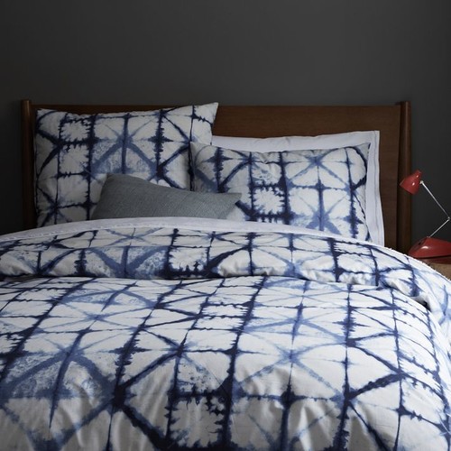
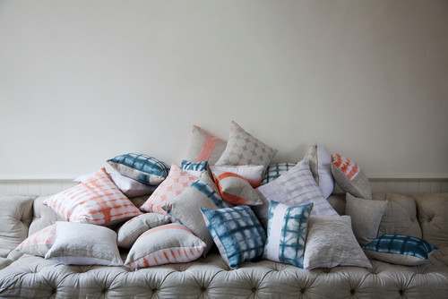
 There is chatter that Shibori (Japanese tie dyeing) is the next new pattern to take over in textiles. I can see the appeal of Shibori.  It is geometric (very hot right now), simple on a white background, has multiple patterns possibilities  depending on how it is produced, and has cultural references.  Then there's that indigo blue which feeds into the resurgence of blues and navy in colour trends.

You many not be familiar with this age old Japanese technique. Shibori patterns are usually created on white silk by binding, clamping and wrapping around poles and then dipping into indigo dyes. If you are hankering for the 60's again, or don't remember them and are ready for a new DIY experince, check out this article 


Red was all over High Point Market this fall and just seeing the little hit of red in the lamp tells you traditional indigo shibori would look great with any amount of red. Certainly whites and other blues would also work and why not yellow?

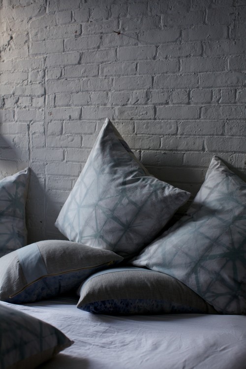
It is definitely a keeper when it comes to pillows.


shibori pillows

This proves that it is possible to have subtle colour ranges using contemporary dyes


shibori pillows

shibori colours
source 

and different colours...


shibori chair

shibori sofa

used in  different ways .

shibori bedding , shibori curtains

I am certainly liking it with very neutral schemes because it is fresh and interesting without too much fuss. 

Only time will tell if shibori will bethe next big thing. Do you think this pattern will have a place in your home?

Gambar Belangkas