Coastal Living
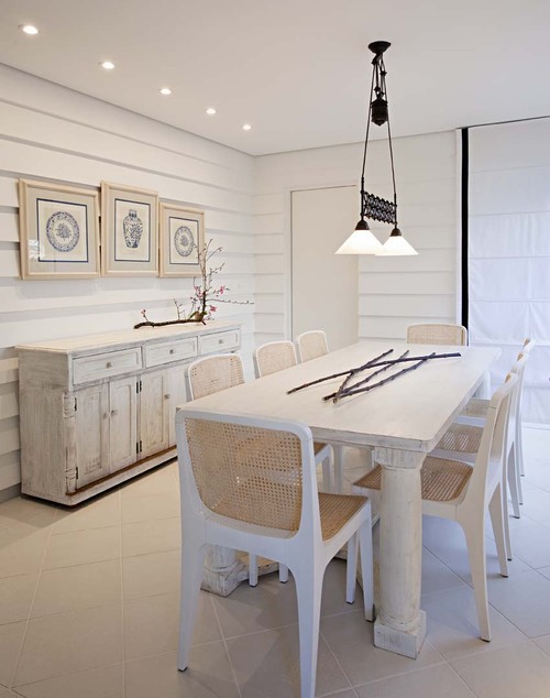
There is something so soothing about a monochromatic colour scheme. I have friends who would say boring not soothing. but to each his own. It might seem easy to have a room is varying tones of one hue but not so. It's even more difficult to design a white room to look interesting. The trick is to emphasize shape and texture through repetition above all else. Don't forget that there are hundreds of whites with varying undertones and temperatures.
Why does this room work?
- white shows up all the textures and lines in the room;
- the small mirrors arranged in a grid add a strong repetitive element and each looks like a small painting because of the reflections from outside (I'm assuming); that adds optical texture;
- the walls are horizontal boards which play against the square mirrors;
- apart from the texture of the white boards, the horizontal lines are soothing and are repeated in the cabinet below:
- the arrangement has various shapes( cones, spheres, stars) and surfaces (reflective, matt, rough, smooth);
- shiny surfaces add an unknown quality because you never know what will be reflected;
- the whites are on the warmer side and a little "dirty" which doesn't look stark.
Elle Decor


No comments:
Post a Comment