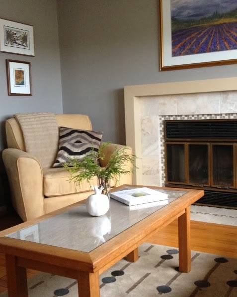
I am interested in comfort and function as well as style. While this throw gets used almost daily it also adds to the overall feel of our family room. In terms of design, the main attraction when I first saw it at Costco was its texture and muted colour; I knew it would sit nicely on my family room sofa and not disrupt the pattern play of the two pillows.
Margaret Ryall
Here is where it first lived when I brought it home. After several new furniture purchases the chair has moved to another room and the throw and pillow are now on the sofa. As you can see, it still serves the same design purpose as on the chair by adding texture. Apart from function, here are some of the reasons a throw might be a good purchase for your living room:
Use a throw to add texture to a space.
This throw has two elements for the price of one.... lots of pattern too.
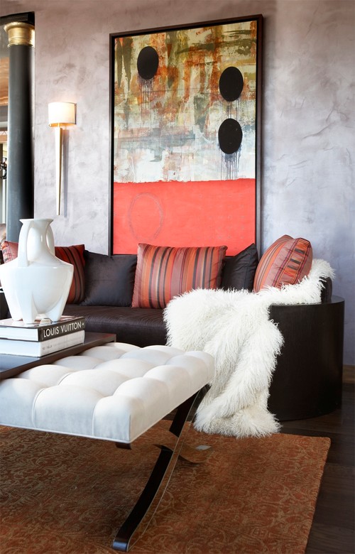
The ultimate texture ... fur real or fake.
In this perfectly neutral scheme the throw adds very subtle texture.
Use a throw to solve a design dilemma
Margaret Ryall
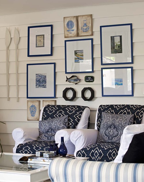
If these lovely navy and white throws were not on these chairs they would totally disappear into the wall. They also serve to add a third pattern into the scheme.
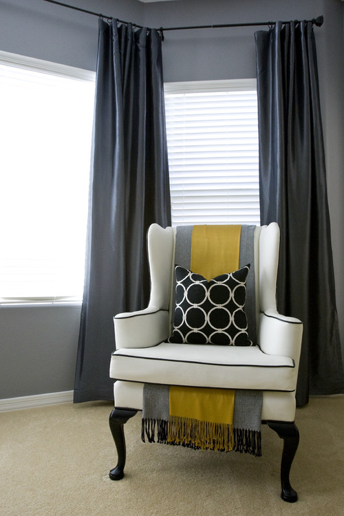
Use a throw to add an accent colour
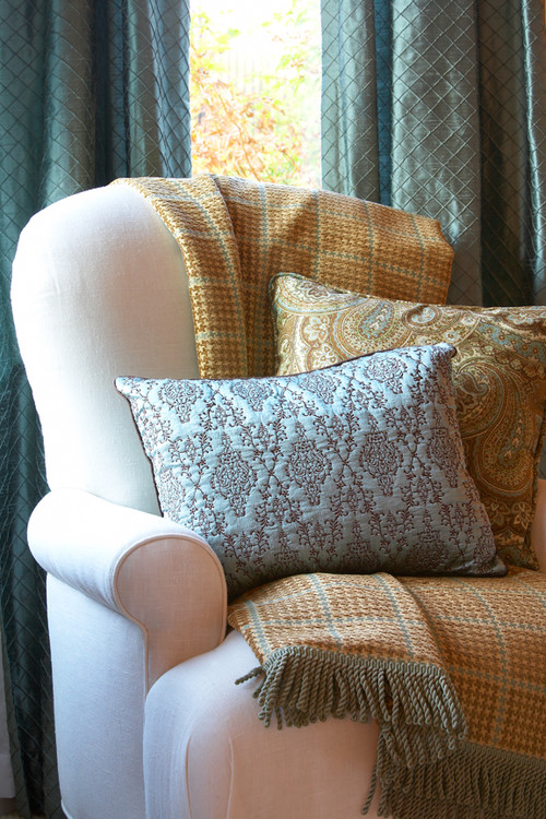
This is an interesting arrangement of throws in a chair. I would rather not see the fringes, but the layering is subtle and lovely. Love the yellow and gray.
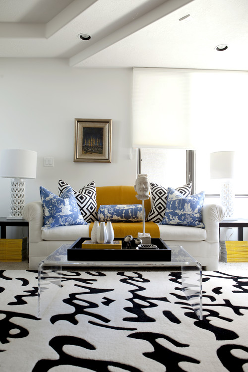
It seems yellow is a very popular colour accent! The National Geographic magazines under each table are an interesting touch given the area rug looks like written text.
This room has a lovely colour flow and the folded throw moves the green to the two ottomans.
Use a throw to add pattern
I have throw envy with this one. Love the bold geometric pattern, and I quite like a throw over the arm of a chair. Notice the other one on the lounge section. Lots of texture. Two seems excessive to me, but probably there are two homeowners who like to cover up.
Stephanie Wiley Photography
Although the pattern is very subtle on these chairs, it does add to the room. I think I would have added it in the pillows, but that's just me.








No comments:
Post a Comment