As a child I often imagined how a house would look on the inside as I drove or walked about the town where I lived. I'm assuming I'm no different from most people. My
Open Doors series of posts will fill the need to peek inside everyday homes- not the grand designs of decor magazines, but interesting homes that are achievable for most people. Come along on a visit to my friends' ocean beach house.
The patio overlooking the Atlantic Ocean has lots of beach finds. There's a wind up today.
From the kitchen looking out through the screened window. Even I would like to wash dishes here. The exterior of the house is red with a soft creamy white trim.
Pat and Janna travel all the way from British Columbia to Newfoundland every summer to enjoy life on an opposite ocean. I met Pat when she and a friend came to visit my studio/gallery in my summer house. Ever since we've been looking forward to our summer time visits. When they left this year I received a key to the premises so I could photograph.
After one visit to the Bonavista Peninsula , Pat and Janna fell in love with the place and purchased a typical Newfoundland outport house and began to remodel it. Remodel doesn't seem the right word though. They worked backward until they reached the original boards, removing layers of wallpaper and wallboard. I was lucky enough to photograph some of this process for my wallpaper archive which is part of an art project I'm working on. Here's what it looked like then....
And look what was hiding under the layers of wallpaper, a newspaper article about The Kennedy family. After much patience and elbow grease they were ready to simplify the decor.
They painted the whole interior white and added their personal touches. That's what makes a home in my book. I appreciate the way they have arranged/displayed their finds.
The accent colour throughout the house is red. What a fitting use for these cod jiggers!
Sea urchins in a bottle, beach glass, a boat and sea birds on an old trunk flanked by windows and oars.
More splashes of red against white and navy blue. The sofa is red, but it was covered for its winter rest.
Some of my favourite things in the house... the checkerboard that has two colours of beach stones for checkers, and a book about sea glass which prompted me to get my own copy. It just arrived and I'm reading every word getting ready for next summer's hunt.
Most of the furnishings are from IKEA which is a feat when you live in Newfoundland- they have to be shipped or driven. I covet the aqua coloured lantern on the bookcase. Would they notice if it wasn't there next summer?
I love seeing the remnant of an old window (I'm guessing) above the left chair. Shutters are a very practical window treatment because these windows are visible from the street and there could be nosy people just like me hovering outside.
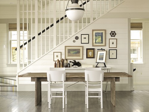
I call this the gallery of "Walked On" . Pat salvaged scraps of the various floor coverings from the house and framed them in simple IKEA frames. The stark simplicity of the frames show off the contents. Keeping the stairway all white further enhances the overall look of this very effective display.
Upstairs hallway leading to....
..... a great desk area . Now where did they find that old map of Newfoundland that was on the school room wall in my day?
There are more rooms for another time, but I ran out of battery power before I could finish my job. Do you have any favourites?
Thanks to Janna and Pat for leaving me with the key and welcoming my intrusion.


