Showing posts with label design tips. Show all posts

Monday, May 26, 2014

5 ways to avoid boring decor

Many of my clients remark  that my home must be perfectly decorated.   The answer is a resounding NO.   I actually have little interest in perfectly decorated homes because that usually means boring in my book. Besides, the reality is that there is only so much money and time that one can devote to a place to live.  You have a life, you have things you want to do, and often home projects get pushed to the bottom of the pile as you live with your decisions.  It's called setting priorities.

If you are spending your hard earned money on a place to live, how can you have the best space possible within your budget parameters?  This is a roundup of suggestions supported by  past posts that you might want to consider as you decide how to create an interesting home.

1. Don't try to keep up with the neighbours

  Don't go there. I've had lots of chats especially with young  professional first time homeowners who feel trapped in the friends' comparison games. You know the checks and balances  of where something was bought, the cost, the  hot style you need to have to be "successful". This is a trap for more than young homeowners.   Designing your house considering  such dictates will lead to a  very cookie cutter product (the show home look) and will possibly deplete your bank account at the same time.


white kitchen granite counter
Today's most popular kitchen look
 source


teal kitchen

 Rather than questioning if your home is up to par with the neighbour's, switch your thinking to how can I make my home unique. Not everyone is daring enough to have a teal kitchen, but it looks lovely and inviting and certainly isn't like ever other kitchen.  Read this to find  ways to add interest  your space.

 2.  Don't be a slave to trends  

 Trends come and go and adhering to them often means  changing  accessories, appliances and furniture more frequently than is warranted by normal wear and tear.  Are there trends that you should pay attention to?  I've discussed that topic here.  Would you be horrified to have white appliances,  natural oak hardwood or 80's European style cabinets?  ( I have all three)  Is granite the only countertop you would accept?  ( I have butcher block and laminate)!

yellow dining chairs timeless design
Timeless v.s. trendy
 
source

 Right now yellow, gray,  and black and white are "on trend", but I wouldn't call this space trendy.  Ten years from now this modern space warmed with wood and art will still look distinctive and inviting. 


chevrons antlers gray nursery
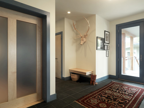
Chrvrons, antlers and gray

 source

 If you are at a home decor store every week  looking for accessories to add to your home,  you might be  going down the trend road. If you have chevron patterns, a chalkboard wall, antlers, cute lettered signs about family, love or keeping calm, lots of  baskets, or starburst mirrors, you are an accessory  trend follower.  Pinterest tells all!

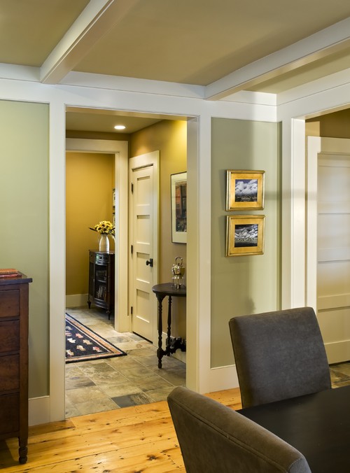
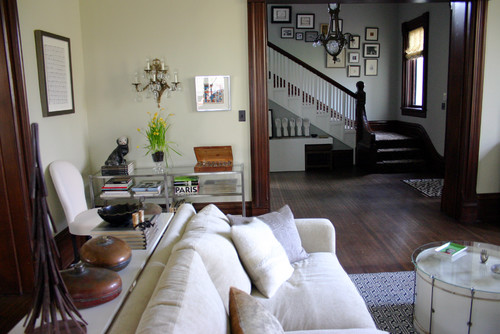
3. Dare to have a personal style

 A more creative solution to home decor is  to determine what your personal style is and stick with that, adding select pieces over time. Make choices that reflect your family lifestyle and history. What makes your home yours?  Do you like antiques; are you a painted furniture aficionado; do you collect things or have travel mementos;  are you into yoga and zen spaces;  is music important to you;  are you a painter,  a wood worker,  a stained glass artist or photographer?  Reflect your loves in your space.  Check out this post for a more in depth look at what your house says about you.

zen bathroom
Distinctive zen bathroom

This is not your average bathroom space nor will it be everyone's cup of tea. That's the thing about personal style.  It should not be cookie cutter.   Each element is distinctive and they are creatively combined to produce a quiet, zen like space. 

green antique cabinet bathroom storage
 Antiques and interesting finds
source

 This bath has an interesting combination of antiques and practical objects.


 4. Forget about over matching 

There is nothing that sucks the soul out of a space more  than over matching. If I went through fifty spaces in a row on Pinterest on any one day, way too many of them are so perfectly matched they are downright boring.   Every space needs an edge, you choose what that edge is.  This post discusses the matchy match look and how to avoid it.

spa bathroom
 A well matched spa inspired bathroom

There is no doubt this is a restful space reminiscent of cool ocean breezes, but I would love to see at least one thing that was "out of theme". Something unexpected... a different mirror,  shelf  or light fixture.   


spa bathroom
Spa bathroom with interest
source

This is still a small bathroom space but materials have been used more creatively to produce a distinctive look. Imagine this space without the art work over the tub.  I would nix the plant.  I could see myself tripping over it every time I moved.


5. Move around what you have

 One of the first things I do when I begin a project with  clients who has hired me to  accessorize their space is ask them to pull out what they have stored. You would be surprised by  some of the finds that went from the basement to front and centre.   This post  will give you an idea of this type of thinking.

With so many ways to to create inviting, individual environments, do you have a favourite one that works in your space? 


Tuesday, March 4, 2014

Seeing double


 I couldn't resist this title. Anyone who knows me well will laugh when they see it because I do in fact have double vision  resulting from a fall.  Not to worry clients, it is corrected with a special lens in my glasses.

Two of something is often  considered boring in interior design, but as you know there are exceptions to every rule. Usually you will find one mirror in an interior, but in some cases two can be much more interesting and effective than one.

Think about  using two mirrors when you :

 Have double sinks

double mirrors bathroom
Double mirrors in bathroom

 I like the change from the predictable one large mirror you see in most bathrooms.  While there are lots of  double mirror applications above sinks,  what brings this one up a notch is the inclusion of art in the space between the mirrors.

 Need to extend horizontal lines


double mirrors bedroom
Mirrors supporting a  headboard

This is an interesting take on using mirrors in a bedroom. We have all seen them mounted mirror height behind night  tables, but this placement brings mirror use to a new level.     The mirrors add depth to the room and provide a reflective surface that is so necessary in every space.  I feel a conscious decision was made to extend the visual line of the bed itself into a larger rectangle. How do I know this?   The art work above the bed has been added to complete the second rectangle.  Very nice.

Want to add symmetry and depth


 Adding depth in a small dining space

 Double mirrors are a fantastic solution when you want to add symmetry to a space. Everything about this space is right especially the scale.  Think how uninspiring the room would be with two small mirrors or how out of proportion the mirrors would look without the equally large twig arrangement.  I call this effect creating a visual destination.

Want to replace art work 


Above a sofa

Mirrors are used to good advantage in a small space because they visually enlarge it.  Check out what is reflected in your mirrors.  If it's something you don't like skip the mirror idea and go with a piece of art that has depth.

  Need to fill an awkward space


Vertically stacked round mirrors
Sara Richardson

This take on mid-century styling is one of my favourite Sara Richardson  designs.  The stacked mirrors fill the narrow vertical space so nicely,  repeat the circular shape in the coffee table, and soften the many rectangular and triangular motifs used throughout the space.


Repeat a shape


Mirrors repeat door shape

Mirrors add sparkle to a bathroom and they are certainly functional.  Not quite sure I would want to sit in a tub and look at myself, but I do like how the stacked mirrors draw your attention away from the fact that the tub extends out into the room.  The mirrors are also placed to create a larger rectangle with the door.

Solve several problems


Mirrors repeat shape in pillows
source

These mirrors are a powerhouse of design:  they expand the space by mimicking the window; create depth in a small space;  increase the visual width so the window doesn't overpower the sofa; reflect the light from the lamps; repeat the geometric motif in the pillows;  provide symmetrical elements; and add subtle darks with the inlay. That's the whole meal deal!

Mirrors aren't just for looking in.  They are strong design  elements in any space and when you use them wisely they provide huge impact. I've written about mirrors before and provided a link to a great article on mirrors in it.  Check it out.  We seldom think about mirrors as problem solvers, but they can be.   Do you have a space where double mirrors would solve a design problem? Do tell.


Monday, August 26, 2013

Do you know the rule of three?


Three  is a very popular number in many aspects of life from religion to fairy tales, and it is extremely  popular and important  in all aspects of  design .  When you understand how to use the rule of three you have a powerful agent for design change in your home.  Often improvements are free because you simply have to move around what you already have.
 
 In design, using threes helps you build interest and drama, as well as  harmony, and it a very effective way to create visual movement in a room . Three works for function e.g., kitchen work triangle, furniture arrangement, sofa and two chairs.  It also is frequently used for colour and fabric schemes and groupings of accessories and vignettes.  Three can effectively establish a focal point. Here's how you can liven up your space and help improve function.


This is a wonderful graphic produced by Adi Edlin that shows the rule of 3 working twice in a vignette. First in the grouping of accessories in sections and then in the overall design of the vignette.  


A simpler version  of the rule of three where you have three bottles mixed with three other objects (2 bunches of flowers and a shell ). 


Art collections always look great in groupings of 3.  This one is perfect because it totally fits the wall space and is in keeping with the graphic nature of the colour scheme. I also love the visual relief the circle provides for all the straight lines.  Circles in a grouping also move the eye effortlessly. They are great pivots.

 VT Interiors

This dramatic space  is further enhanced by the inclusion of the three arched mirrors which provide a focal point ( not an easy task in this space).  Relief from the straight lines in the rest of the room is also provided by the curves. 

Do you see three in this arrangement?  Often you get  furniture with very distinct divisions as in this settee.  Because it visually reads as two with the centre legs it provides the perfect foil for this artwork.


Look carefully at this vignette  because it is masterfully put together in variety and scale . First we have two windows and a mirror mimicking the windows for a total of 3, then there are three hats visible in the mirror and three objects in the vignette (bench, floral arrangement and mirror). The scale of the bench is perfect for the width of the 3 "windows' behind it and the flower arrangement works so well with the weighty bench.


Lots of threes here: colour scheme of yellow, blue and gray; vignette of art, chair and table; and three shelves and three groupings of objects on each shelf.  There are also at least three yellow and blue objects spread throughout the vignette to move the colours around.

Perhaps you can look around your home and see places where the rule of three can be put to use  to refine  how you have arranged things. Don't overdo it ! Remember that any odd number is effective.  I particularly love five mixed with three. Have fun.....

Thursday, April 18, 2013

6 Options for painting trim


  There are so many decisions to make when you begin decorating a new home or renovating. Something as basic as what colour to paint the trim often causes homeowners hours of deliberation.  How about you?  What decision have you made about painting your trim work?


1.  White/off white

This is  the most common solution to painting trim .  It works with every style and is fresh and crisp. 


Even if you have white walls your trim can also be white. Consider changing the paint sheen to semi gloss or gloss if you want to accentuate the trim in a white room.        

2. Wood - natural  or stained 

There was a period of time when many homes had natural or stained wood trim, but this trend has slipped a little in the last ten years.  When you have wood your decision is often to leave it natural or stain it.  When your floors are also wood, it can help you decide which stain option to go with.

 Contrary to popular belief wood trim is not sacred.  If you want to paint it don't hold back.  Interestingly enough it is mostly men who revere wood. When you choose this application your are making a decision to outline a room.  Make sure this is what you want to accomplish.


 Rebekah Zaveloff

 In this space the trim colour is in keeping with the floor tones and is just a little darker.  

Houzz

With light wood floors you always have the option to choose your trim stain  to work  with your furniture. I think the omission of crown in this space really works well to provide a lofty look and keep the viewer's eye at living level.


Your wood trim  doesn't have to be dark to be effective.  You often see natural wood trim  in more modern spaces  where the walls are usually a  light colour  Hint. If you want to achieve a lofty look as in the previous room shown, paint your crown the same colour as the wall.

3.  Same colour  as walls
I often use this application in modern spaces or in rooms where there are too many doors.  When you do this a seamless look is created and the walls become the perfect place to display art without  all those lines you get with alternate colour trim. If you have a more traditionally styled home and modern furniture,  painting your trim the same as your walls will provide an updated look. 


Wondering about chair railing or other paneled effects ?  Rather than removing it, paint it the same as the wall.


4. Colours 

If you are someone who loves colour, this might be the look for you.  It also works well in kids' rooms.    Beware this application creates strong outlines in a room and can chop up your space. Some would say it adds energy because your eyes are always wandering.

5. Darker Than the Walls

This is a good solution in certain spaces. When you paint your trim darker, choose a colour that is roughly two values darker than the walls. This is a great treatment for modern spaces or commercial spaces.


6. Black
This is a daring solution for trim.  When used with white/off white  walls it provides a crisp look that is elegant and serious.  Black looks equally good with soft gray walls.

 Architect Neuhaus Design Architecture, P.C.

If you have very ornate trim , black can really accentuate this sculptural element in your home. Don't be afraid to use it. 


Lots of options....


Saturday, March 16, 2013

Implied lines in design

Part 3  of composing inviting interiors ...


Doesn't  implied lines sound very  technical? It refers to  lines from separate objects that run into each other and seem to form a single edge. This is sometimes called a hidden edge. Such visual anomalies cause confusion and/or boredom in our homes (and in artwork).


I like this well put together vignette and what I'm going to point out is probably the result of  the angle from which the photo was taken, but it works well to illustrate this point.  You can see that the lamp looks like it shares the same edge as the art work.


This is another shot of the room and  indeed the lamp is placed away from the edge of the artwork.  If it wasn't that is all you would need to do to tweek the arrangement.

A similar problem is created when you have implied lines set up when  several objects are the same height  in an arrangement.  A prime example of this implied line happens  when  lamps are exactly the same height as a headboard in bedrooms.  Sometimes this works well and other times it doesn't.  You have to decide your intent when doing it.


There are such beautiful colours and patterns in this room and the designer probably had a  good reason for choosing the lamps shown here.  It is often difficult to determine why choices are made when you can't  see the whole room or you have no understanding of the homeowner intent.  In my humble opinion, I want to see the lamps less overwhelming in pattern and shorter so the headboard shines.  Again that is one person's opinion!  Excitement/interest  is usually created by variety and something has to shine in an arrangement.   I am not fond of  visual competition/fighting.


 In this room the lamps and headboard are roughly the same height and provide a line to support the arrangement of art work that runs beyond the the headboard. A successful use of implied line.


 Then of course there is the room where the masterful designer makes implied lines work to fantastic advantage.  In this space the lamps extend the visual line of the headboard and creates  great bottom weight for the large scale, highly textured  IKEA shade.


  Can you see the implied lines in this dining room?  Your eye runs horizontally on three  levels.  It is boring!  I can say that because it is an old shot of the dining room in my house.  A few simple changes  helped greatly.


 The strong line that ran from the buffet to the railing was broken by moving the buffet to the opposite wall and creating a visual break by hanging long drapes .  These are temporary while my custom order ones are being made.  A new round  light fixture hung lower also helps break the horizontal lines.  Thankfully none of the wood is a orange as the photos suggest!

Sunday, March 10, 2013

Arranging objects - scattering

And now for Part 2 of my arranging objects series....  Scattering objects to the the edges of a table or mantle can  either create a visual mess or a striking composition using repetition.  Think about how you want to arrange a collection. What do you have in the collection that could be the star or the weightiest object? 

  Scattering objects to the edges of  can create a problem in two ways:

  1. When you arrange objects in a vignette  and you spread the object  along the length of the tabletop from side to side you are pulling  the focus to the edges and the cohesiveness  usually falls apart. 

Some effort was made in this vignette to have a centre of interest by placing the bell jar and the plant pick in the centre.  Unfortunately height and colour in the plants take command and your eye runs both up and off the edges.

 When you want to anchor your eye the tallest objects  (several massed)  should be placed together.  The shorter ones can  lead to the edges.  This vignette could be arranged like the one below for a stronger composition.


This is a masterful display in one colour.  It has variety in heights and shapes and the massing of the objects in the classic A formation anchors the eye on the vignette. 


This is the same solution as above, but the height is added using a dark wall and a painting that  anchors the vignette. 


While the objects in this vignette are focused toward the edges they are connected by the large circular mirror/sculpture/  I would prefer that the taller objects bank the mirror and the shorter ones approach the edges.  This organization works too. 


       2.    Sometimes you group objects to one side of a tabletop and it creates an unbalanced look. If the 
              objects are similar in height there is no variety.   


This composed correction created variety in shapes, heights and placement. You could also reverse the placement and have the lamp on the right which would move the frame away from the other frames on the wall.


Exception to the rule:
Although this vignette is on the edge of the counter it is extremely well placed.  It  connects with the strong black vertical  on the left and the black rectangle on the counter.  All work together to create a vignette within a vignette.


Gambar Belangkas