Showing posts with label colour schemes. Show all posts

Wednesday, June 11, 2014

5 Tips for painitng small spaces

 The one topic I've written about on my blog that gets attention from thousands of decor happy readers is decorating small spaces.  I think that is because rooms and homes today are smaller than they once were.  People living in condos or apartments must be conscious of using every trick in the book to enlarge their living spaces. So stay awhile and see how colour can solve some of your small space dilemmas.  Perhaps in these suggestions you will find a treatment for your small space.


Use one colour everywhere


This might seem like an extreme solution but it isn't really.  Using one colour all over a room makes the different planes blend together  to give a more unified look.  You can even use the same colour on the floor and ceiling if you wish.  Since your eye continues to move  freely around the room you have no sense of the boundaries of it.

same colour on walls and ceiling bedroom

If I could change one thing about this room above, I would paint the trim a soft pink too to keep the eye moving. Painting  trim white creates vertical and horizontal lines that your eyes automatically go to and follow. You can see the difference in the room below where the trim is painted out.  The room has an unbroken field of colour that is certainly expansive even though a dark colour was used.


painting trim and walls same colour


source

More blue, but the trim is painted a coordinating colour that is closer in value to the walls decreasing the emphasis on  the trim which seems to just blend in.

dark colours in small living room

Use cool colours 


 The rooms above are using the same colour almost everywhere, but they  are also utilizing another colour trick. Cool colours like blues, blue grays etc. make the walls of a room recede thus making the space appear larger than it actually is. Blues are an excellent choice for small bathrooms, laundry rooms, spare bedrooms, etc.  When walls recede you tend to notice the furnishings rather than the  "box" that contains them.

There's nothing like a cool lavender with white and light grays to expand a space.  
 

dark walls small living room

Use a dark colour on the walls


That's right, a dark colour!  Would you ever think that would work?  It does because  the corners disappear in the shadows and your eye moves around easily. Darker colours are often perceived as  visually deeper. There are  decorators who take the opposite approach to keeping walls light in a small space.  And the final trick with dark colours in small rooms is to paint them in a semi-gloss or gloss to reflect light.  This approach is not for the faint of heart,  but it can be quite stunning.   If you're afraid to go really dark choose a mid value gray or taupe.


Use a colour you see outside


Blues and greens give the impression that the room continues beyond the windows. You can paint the walls an outside colour or use one  in your fabric choices.  I love the freshness of the room below. It certainly is reminiscent of  plants.


blue and green living room


blending outside and inside colours

Designer Christina Murphy uses green to great effect  to visually extend this room by connecting it to the view outside the window.  Keeping a simple colour scheme is also visually enlarging.


blending outside and inside in decor 

Everything about this room invites the outside in and blends the two together. Lighter floors always enlarge a space.  There are no dark hardwoods in my life, I like light and airy all the way.

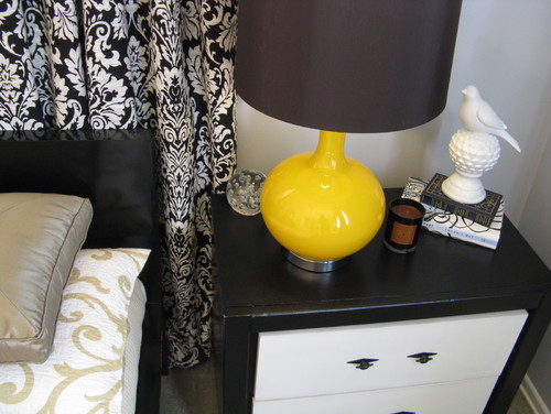
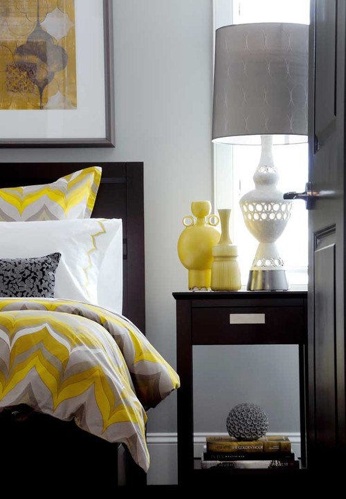
Keep walls and furniture a similar colour 


 When you keep the furniture and walls close to the same colour you are blurring the lines between them. As a result the mass of the furniture is decreased and the overall volume of the room is increased.  If you don't wish to have all the furniture the same colour consider having at least  the bigger items like armoires and chests close to the wall colour so they will begin to blend into the room and widen it out.


Decor by Jennifer Inc contemporary family room

I also want the cabinet for the TV to be a lighter colour, but it is undeniably a focal point in the room  and every room needs one. I'd also skip the dark wood rods which your eye travels to automatically because of the contrast, but I also understand why the decorator chose them (all the woods in the room are dark).   Overall I love these two rooms.  They are warm and inviting.

Alexandru Apartment lviing room contemporary living room

I equally love the cool minimal look  of this room, but it isn't for everyone.

Paint a Focal Wall


 I'm not a large fan of painting a focal wall.  I think sometimes it works to great advantage, but most times it is a less than creative solution in a space. This strategy  can work wonders in a small space, Don't be afraid to paint an accent wall a darker receding color thus  making the space look larger.


Living Room  dark focal wall

 And there you have it.  The only thing left to do is decide which of these solutions will work in your space. 
 Happy painting.

Wednesday, February 19, 2014

Blue- A home decor trend to watch


 It seems like only yesterday I  wrote my  2013  home decor trends  post,  and I've already looked at Pantone's Colour of the year, Radiant Orchid, and suggested  ways to integrate this vibrant colour into your decor. What else can we expect in the coming year?

While Radiant Orchid is Pantone's colour of the year, I think it will be the blues that will take over the stage in 2014.  Joan Mitchell had this all figured out in her 1972 painting!  She painted the best blues ever and these are the ones you'll be seeing more of in 2014.

decor trend 2014 blues
Joan Mitchell, “Blue Territory,” 1972


 And here's a modern interpretation of the darker side of blue...

2014 blue trend home decor
A range of blues for 2014


This year the popular blues are much deeper leaning toward cobalt and navy.  But what can you put with so much blue? 


decor trend 2014 blue and yellow
Add yellow as an accent in 2014


decor trends 2014 navy and gold
Gold accents work well  with navy blue and cobalt
And don't forget vibrant oranges or greens with dark blues.  The sky is the limit with this colour.  I thought the art work in the mood board above gives lots of accent choices. 

navy blue cobalt blue 2014 trend Designing Home
Versatile green blue looks great with white and radiant orchid

And never forget that blue has a green side that mixes with all sorts of colours especially the pinkish purples like Radiant Orchid. That way you can bet two trends for the price of one.  Think turquoise, aqua and any blue you may see on a Caribbean holiday.


Benjamin Moore highlighted the lighter side of blue for their 2014 Colour of the year. It is reminiscent of summer breezes blowing lightly under a pale sky. Cool and inviting and perfect for a summer house or a spa retreat.
 

It seems all versions of blue are hot this year. Is there blue in your future? 


Friday, January 17, 2014

Feeling red

I'm a firm believer that colour provides us with certain benefits at certain times and  I take note when I find myself attracted to a certain colour.  My past loves have been black, green and purple.   All of a sudden I am hugely attracted tored  and I want it around me in my home.  This is a first for me.


red accessories
Red accessories

I catch myself looking at red things on Pinterest and Olioboard. 


I want to hang up one of my red paintings.
 
 meaning red poppy art Margaret Ryall
Evoked, 2013, Margaret Ryall, encaustic
 “Painters use red like spice.” — Derek Jarman.....  If so this is one hot painting.

 Why red now?

 From yoga I know that red  is the color for the base or root chakra located at the base of the spine; this chakra allows us to be grounded and connected to universal energies.

Red also affects us physically.  It is stimulating and boosts our physical energy levels, increases enthusiasm, action and confidence, and provides a sense of protection from anxiety and fear. Don't forget that red relates to physical desire in all its forms- sexual, appetite and cravings. Pretty powerful stuff. Who wouldn't want a dose of red around with all those benefits?

I've written about red before so this must not be a new thing.  Check this  post .

I must need a boost of red.  I'm listening.  How will it play out in my space? 

 Is red a part of your home decor?

Friday, October 25, 2013

And more aqua

This must be aqua week! I am noticing it everywhere.  After writing a post yesterday about aqua, I opened one of the blogs I follow this morning to be greeted by a lovely room make -over by Kelly Porter of Color Sizzle and the walls are painted aqua. The accents are red.  I wanted to share this lively combination.  While it is too much colour for me, I know it will appeal to lots of my readers. 

Pillow and lamp love on my part! 


And another living room with the same colour scheme, but the colours are used in a very understated way. It is all about the intensity of the hues.

Which room would you be most comfortable in?

Monday, March 25, 2013

Fresh colour schemes

 Traditionally many homeowners get the re-decorating bug in spring.  I'm no exception.  I am planning a major painting job for the downstairs of my home.


As I age, I seem to want less and less colour on my walls.  My choice for living room, dining room and hallways is  Ben Moore Acadia White OC 35 (#5)  to  replace Elephant Tusk (#6). Acadia White is a warm white without being too yellow.  It is darker (not by much) than Cloud White which is the colour on my trim.


If you love colour here are some crisp, fresh combinations for spring updates. 


Saturday, January 19, 2013

How do you like your blue?


I spend part of every year living on the edge of the Atlantic Ocean in a small community in Newfoundland.  Being in such close proximity to the sea influences my colour interests.  It is no surprise that I like watery blue greens. These combinations show up in both of my homes and even in my art work.   

  Margaret Ryall, Slow Drift (2012)  6x8 in.  encaustic monotype on board


When you mix spring greens and  watery blues the result is always  fresh and lively. There are lots of patterns and textures in this room and the use of an old map as wall art references  land and sea.  Are you beginning to see how both of my careers dovetail?  Interior design and visual art feed each other on a daily basis in my life. Lots of times looking at a room will give me an idea of an art series!


This is lovely combination  inspired by the spectacular art work over the sofa.  The room is fresh and inviting and the plant adds to that vibrancy.  White, cream and the softest yellows  are the perfect foils for blue green combinations. If you would like to see more of this room check the link above.


Yellow brings out the best in aqua because there's yellow in its composition . The magenta area rug grounds the design, but for me it has to much energy for a bedroom.  I like my floors muted and just there. Do you like this combination?


A vibrant, casual  sun room in blues and greens.   Just the place to sit and have a cool drink with friends. The colour scheme helps to draw together the variety in furniture pieces. Don't be afraid to use what you have in a room and then  use colour to link the design together.  Matching furniture  is highly over rated!

Waverly Solar Flair Lime/Indigo

Look to fabrics for colour scheme inspiration.  Deeper blues can serve as a good grounding colour in a blue green scheme.  If you like painted furniture choose this colour for high impact . Deep blues are trending for 2013.  


Or reverse your combination and use a striking aqua colour and support it with deep blue. Not everyone can live with this much pattern, but you don't have to.  Imagine this piece against  soft creams, charcoal or even purple!
  
How do you like your blue and what's your favourite combination? 

As you can see I like mine with lots of yellow and leaning into green.  Check this fascinating survey to see how people feel about blue depending on sex and age.


Saturday, January 12, 2013

Is coral an 80's colour?


 Colour is the least expensive change you can make to your space and still have huge impact.   Certain colours often get a bad reputation because they were overly popular at a certain period.  No colours get more ridicule than the salmons, corals  and peaches because they were everywhere is the mid 80's.  But don't let that stop you from using them. It's all in the pairings.  These designs are timely and inviting.   What do you think?


Salmony orange  with charcoal gray can be extremely elegant and contemporary.  Many Turkish rugs use salmon as one of the main colours which makes this a timeless colour.


 You can put any colour with black and white and it looks stunning.

 
 And with white and soft gray this version of orange  is positively fresh.

 If  you like something a little more restful consider muted oranges with  earth tones ...


like in this lovely living room...

or mix in blue with earth tones like the bedroom below. 


 I would mix  these colours with an cream walls but the blue works well too.  Colour is such a personal thing; I never want to see too many colours in  a room where I want a  restful look.  

   A crisp look with a salmon /tangerine combination.

 
And for a girl's bedroom mix it with a pale aqua.

or  with true blue and white  in a living room...
  
or even with a muted purple in a bedroom or nursery. 

But I'm trying to warm up to mixing it with greens.  Too many memories there ....

especially this particular green


 I'm perfectly fine with it in a kid's room.... and a few hints of magenta would liven it up and make it more current.

But I just don't like the combination when it is mixed with toned olive greens. 

This green is a fresh spring green  mixed with lots of lights and the salmon is deeper  so it gets my nod.

Would you use coral/salmon/peach in your home?

All links to images can be found on my Pinterest board for Colour scheme inspiration.

Thursday, April 5, 2012

White, black and ...

YELLOW!

The colour of energy, sunshine and brightness.

It's difficult to ignore the high contrast colour scheme of white, black,  and primary yellow.    My personal preference is to have mostly white with hints of black and yellow, but the scheme plays out in different ways. You can tell from the images I've selected that it is a very contemporary look and not one you see often  in traditional decor.  A quieter look would be created if you substituted the black for gray- my all time favourite combination.  You can have a little or a lot of yellow through accessories. I've stayed away from the obvious choice of painting walls yellow which seems to be just too much yellow  for my taste.  Perhaps you disagree.
 How do you like yellow in......

Dining areas

Willowgrove Kitchen contemporary kitchen

 Willowgrove Kitchen contemporary kitchen
Only yellow art work makes this room vibrate.
 Bedrooms....

Mallin Cres - Master Bedroom contemporary bedroom
 Atmosphere Interior Design Inc
.
This yellow is more toned but still effective with white and black.

Malibu Mediterranean mediterranean bedroom
Hollywood Regency Style Detail eclectic bedroom
 Madison Modern Home

Mallin Cres - Guest Bedroom contemporary bedroom
Atmosphere Interior Design Inc
.
Finding the right accessories finishes a space.  Imagine the tables in the two rooms above  without the hit of yellow. 
 

Glitzy-Glam meets Farmhouse-Chic contemporary bedroom
Martha O'Hara Interiors

Only yellow pillows in the bedroom and yellow flowers in the bathroom but it's enough to lift the spirits of these two rooms.
 Living Rooms

Loft Living modern living room
 Painted furniture brightens every room but you can't get any better than a yellow hue.

 source 

Yellow is a very commanding colour for chairs.  You certainly won't be ignoring this one.I love the way your eye moves from the chair to the art work and then to the accent pillows.  Perfect colour scatter.

Bathrooms 


Decor Pad 

One bright yellow chair speaks volumes and it's waterproof!


2010 Decorator Showcase modern bathroom
t De Meza + Architecture

White and black small mosaic tile with splashes of bright yellow to enhance it.  Lining the drawers with yellow is an extra surprise . 

Indian Grove Bathroom eclectic bathroom
 Palmerston Design Consultants

Imagine this room without the commanding art work.
 

Glenwood Residence eclectic bathroom
 Tobi Fairley


Porches 
Sometimes one perfectly placed accent makes a room sing.  


Art as Pop traditional entry
Blue Tangerine Art

Don't forget the power of art to move a space from boring to exciting. This is one of my favourite images to show how art can lift any space to something special. 

Did you find inspiration in any of these rooms?  If you don't like yellow you could substitute yellow green, magenta, coral or turquoise.  

Gambar Belangkas