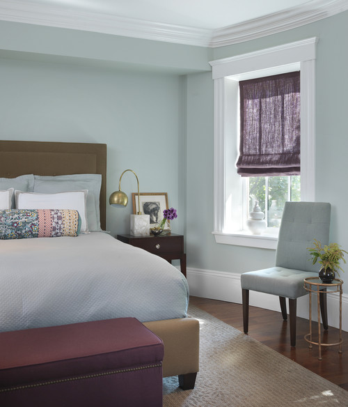
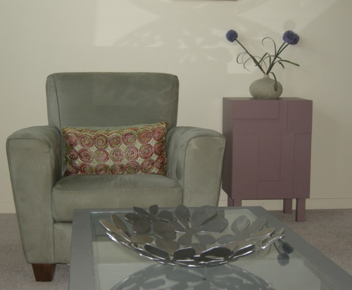
Showing posts with label colour schemes. Show all posts

Thursday, February 2, 2012

Does a ceiling have to be white?


That's an easy one.  Of course the answer is no, but very few people veer away from this standard. If you're feeling adventurous and want to break away from the pack  here are some suggestions.

Consider practicalities 
When you decide to paint your ceiling a colour you need to think about  how that colour will flow into other rooms both physically and visually.

Is there a place (e.g., molding or beam) where you can stop the colour? 
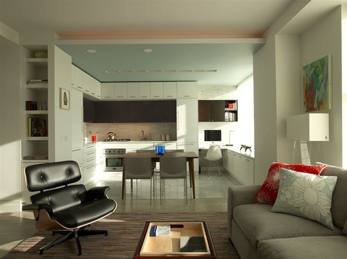
      Minimalist kitchen design modern kitchen
       The ceiling in the kitchen is on a different plane than the living room, thus providing an easy break for painting.
      How will the colour look when viewed from the next room or rooms?
        In the room above the ceiling is acting as an "accent wall" and flows nicely into the living room.  The same blue is used in hints around the room creating a visual flow.

        Will you have to  change the colour again when you paint your walls? 
        Chances are you will.  Are you up to painting several coats to cover a colour?


        Is your ceiling in good condition?  
        Flaws will show up more with darker colours.

          Consider ceiling height
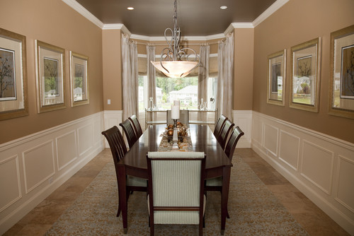
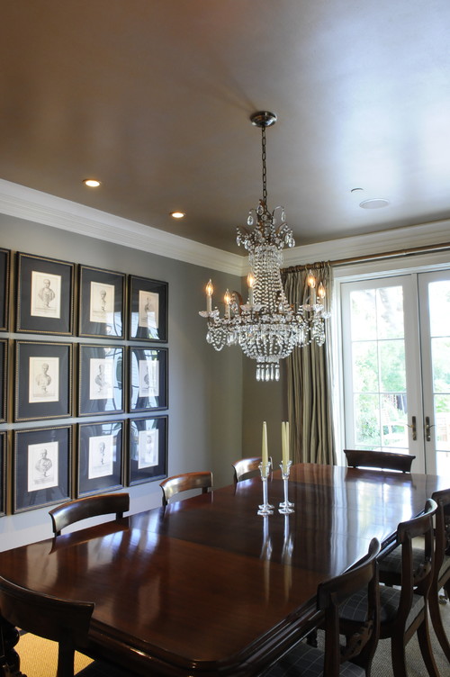
          How high is your ceiling?  Nine feet or above will provide lots of height for darker or warmer colours.

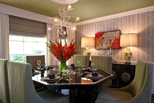
          Beverly Bradshaw Interiors, Seattle, WA eclectic dining room

          Luxurious Gold and Silver Painted Dining Room Ceiling traditional dining room

           However, if you have standard ceilings (8 feet) and your rooms are smallish you might consider lighter, cooler colours to help the ceiling recede and give the feeling of greater distance.


            Traditional Home
          Blue seems to be a popular ceiling colour.


          Consider your  wall colour

          If you really want to paint your ceiling and aren't sure which colour to choose, take the cue from your wall colour and simply go several values lighter.

           Toby Fairley 

          Or keep the ceiling and walls the same colour and break it up with crown moulding.....

           or go a value or two darker for the ceiling.


          Consider your trim colour
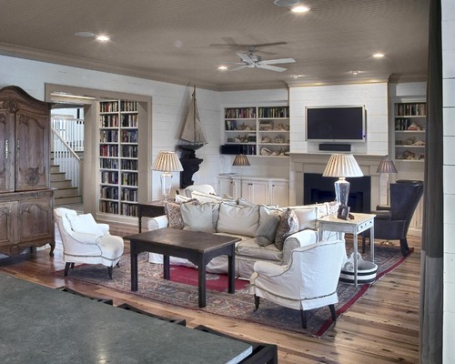
           If you have a trim colour other than white/cream, look to it for ideas for your ceiling.These room have a very pulled together look by using the trim  colour  as a branching off point.

          Real Simple
           The ceiling is darker than the trim colour

          Residences in DeBordieu Colony, Georgetown, SC traditional living room

           The ceiling is the same colour as the trim. 


          Consider your accessories 
          This is where things could get exciting...
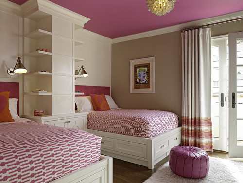
          tineke triggs contemporary bedroom

          Can you imagine this room with a red ceiling?
          Hollywood Residence eclectic dining room

          Thursday, September 29, 2011

          Thursday Tip #2

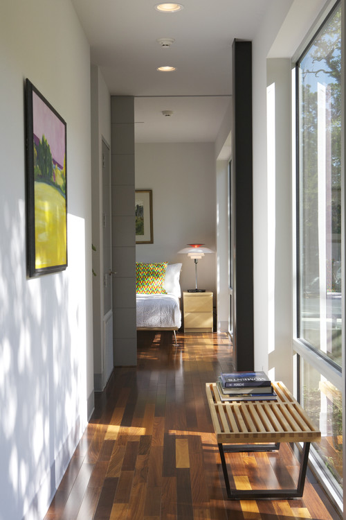
          Caudill Lane modern hall
          Webber + Studio, Architects

          Use accessories to carry colour
           The vibrant yellow green in the artwork in this hallway is repeated again in the pillow in the bedroom. A darker green appears in the art work above the bed.  When walking down the hallway your eye pops from the artwork into the adjoining room  which is seen at a distance.  This causes visual movement from one room to the next.  A small thing but very effective for connecting one room with the next. Never underestimate the power of accessories to improve every room in your house. Have you carried colour from one room to another in your home? 


          Check back for my next post on Colour Continuity when creating a colour scheme.
            

          Monday, September 26, 2011

          It's never perfect

          There's room for improvement in most decors because perfection is difficult to create and every set of eyes will see a design in a different way.  I'm amazed by the discussion that ensues when several decorators look at the same photos of a project.  Often an  aspect of a  room that I will focus on may be ignored by someone else or one of my colleagues will bring up an aspect of the design that I didn't even notice. 

            Look at each of the photos below and see how you feel about the decor. You will notice a general theme of art work running through my commentary.That's because I feel strongly that art work can make or break great decor.   What do you think are the strengths in these rooms?  Is there anything that bothers you?  Is there anything you would change  (add or take away) if you could? Or is the room just perfect in your eyes?  Decide what you think and then scroll down to my commentary.  Did we focus on the same strengths and things that could be changed to improve the overall design?  Did entirely different things come to light for you? Remember it's opinion.


          Number 1

          A bed between two windows calls out for symmetry which this decor has.  The colour scheme that supports the light wood tones is very soft and  pleasing  which I predict would make sleeping in this room pleasant and relaxing. Given the overall symmetry of the room, I find the artworks above the bed begging to be lined up with each other.  Better still I would have just one piece hung since the second piece almost reaches the ceiling.  I crave  pattern for variety and it could be added in pillows , a throw and/or and with the addition of an area rug under the bed. I'm personally not fond of all the wooden furniture matching  and think that something more bench like  would work at the end of the bed.   The lovely cabinet could be moved to another room.


          Number 2

          I like this neutral bedroom that just sings with the splashes of orange red on the bed and in the art pieces above it. Any art work arranged in a grid interests me, but this bed seems to need larger pieces above it.  Even with the massing of smaller, brightly coloured  works, the scale doesn't work with the bed.  It's crying out for something with more visual weight. I bet there is another spot in this room where these pieces could be used to better advantage.

          When choosing artwork for over a bed I like to see at least 2/3 of the linear space occupied. With a queen bed,  I'd aim for  two 18 x 20 or 20 x 20 inch works or one larger piece of approximately 40 inches in length. The higher the headboard the smaller the vertical measurement.  Something brighter and larger in scale could be added to bring more visual interest to the bedside table that is visible. While there isn't much pattern in this room, the little bit on the pillows appears enough for my tastes.

          Number 3 
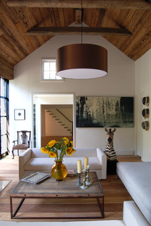
          Shelter Island House #2 contemporary living room

          The elements in this room are quite interesting, especially the inclusion of the yellow flowers that are beautifully framed by the doorway beyond.   The zebra is an unexpected touch and creates some pattern in this room which seems a little devoid of it. The two things I find jarring are the two pieces of artwork.  I want to line up the small piece on the left with the chair under it and the large piece on the right  is much too large for the space and looks awkward and squat. Sometimes this forced confinement of a work can be used to great advantage, but this work doesn't have that kind of imagery. I want to see it on a large wall which allows  breathing room all around it. The brown  light fixture  is  large, but it works because the room is vaulted and the dark colour connects with the wood on the ceiling.

          Number 4
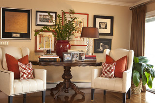
          Room contemporary living room


          Many times in our homes we have to use the furniture that is available  and arrange it to best advantage.  I think the table is such a piece of furniture.  It reads as just a tad too big to place between the two chairs, but thought has been put into creating  visual flow with red to connect the disparate pieces and make the vignette look inviting.  Your eyes have no choice only follow the pops of red that have been set up in the age old triangular format.  My one great annoyance in this room is the plant that obscures the art work behind it.  It is never a good idea to mount art work and then cover it up with the next layer of design.  Perhaps it is only me who has this pet peeve;  it might be the artist in me rising to the top.
           

          IMHO... in my humble opinion. As I said, there's no one correct way to design a room and we all perceive a room differently.  Do you have any reaction to these rooms? 

          Sunday, August 7, 2011

          Growing a room


           Function and budget are two words I use quite a bit in my design work. It makes  no sense to have a beautiful room if it doesn't work for the people who use it, nor does it make sense to develop a plan for a room that is not within a client's financial reach. That's where creativity and a good sense of what's possible in DIY comes in. It also helps to know where to get a good deal. I've had lots of practice with both as I've decorated my own homes. I never seem to completely redo a room; my rooms are usually in a subtle, constant transition. It's a state I've come to define as "growing a room". The guest room in my summer house is a perfect example of this.

          Before

           Going back in time to 2002 when we built our summer place, we constructed frames for two twin beds and  purchased a  bedside  table from a second hand store.  Functional but certainly not interesting.

           Time passed....  new headboards were made by the resident handyman and we found a way to connect the two frames to make a king size bed when we had company who wanted more than a twin.  That meant two separate lots of bedding to store, but it sure is practical! 

          We recycled an old IKEA chair from our basement but it needs  recovering and the area over the bed is very bare. Needless to say the white pillow in the chair doesn't work. 

          What happened to that dark brown bedside table? 


          It had new life when painted Benjamin Moore Calming Cream. I love the richness of that colour.  It has a slightly yellow undertone but it has lots of body and works well with most colours.  The vignette on the bedside table is lacking. I didn't like the lamp, flowers and headboard being the same height. The vase below is a great find at a local store and elephant grass from an existing arrangement in my porch helped to add height.  This solution cost exactly $11.44.

           
          The books were tidied and the hand carved bird on a piece of driftwood helps to bridge the two heights.


          The IKEA chair was painted Calming Cream and recovered with a striped cotton and  a  pillow to match the one on the bed was made. 

          And something appeared over the bed as if by magic. 


          One of the best things about being an artist is that you can whip up an artwork to fill any empty spaces you have on your walls.  My favourite fun approach is collage with hand made textured papers and subtle applications of paint. 


          This landscape strata references the many colours and textures that can be seen outside the bedroom window especially in fall. 


          My favourite way to dress a bed is to turn back the sheets.  I took away the striped grayish pillows and now I need to make one more striped one to match the one above.  The rectangular pillow was made from the bottom of a ready made panel that has a beautiful cherry blossom design.  Of course  I bought it on sale.I managed to squeeze  two pillows out of one panel.  


          And now for my next challenge.. the closet doors.  They are too choppy with the three colours ... what to do next? I think I will try painting the inside  rectangles Monroe Bisque the same as the walls. And if that doesn't please me the whole door will be Cloud White.  That light has got to go.  Something softer and more rounded.  Thrift shop or Homesense  here I come.... What about the handles on the bureau? And you can't see the very ugly light fixture that needs replacing. 
          Stay tuned for more updates.

          Sunday, July 17, 2011

          High contrast

          Do you like dramatic colour schemes? They have too much energy for me to live in, but I certainly find them attractive and I love the edgy a dramatic combination  produces. Contrast always demands attention and there's nothing like a combination of white and black to add high drama to a room.  Getting the colour balance right and finding interesting textures are challenges that must be overcome when you set out to command interest in any room. There can be degrees of contrast in a white/black scheme;  some are toned with the addition of grays or are heightened by the addition of a bold accent colour, some are white with a little black and some are black with a little white..

          Perhaps you will be inspired to take the leap and create a white and black decor.  These rooms should provide lots of inspiration. 

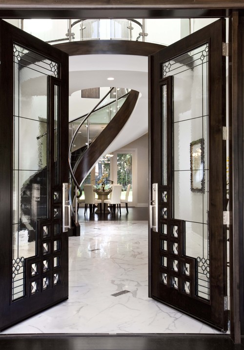
          front door view to stair contemporary entry
          Mark English Architects, AIA

          What an entrance!  Don't you wish you could visit this  house? 


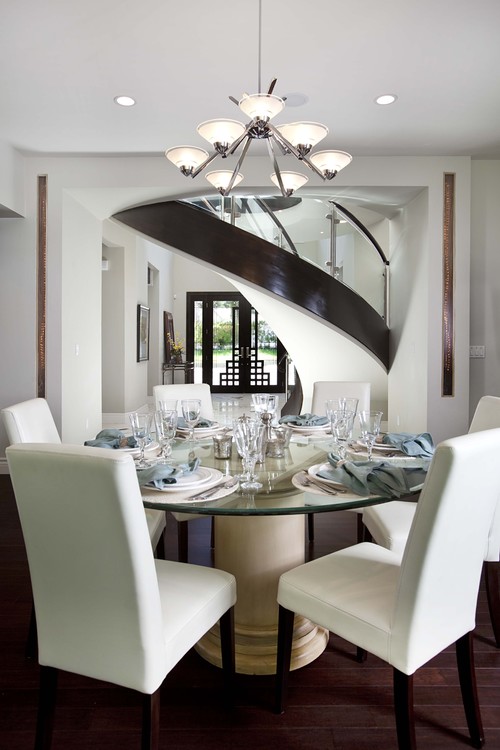
          And now for the view from the opposite end. 


          There's no doubt that the geometric rug is the eye catcher in this design . Even the patterned drapes are forced to play second fiddle! The simple hotel bedding calms down the energy of the room and adds a splash of brightness.


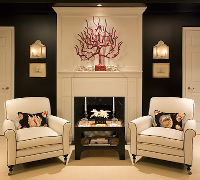
          Kelley Proxmire of Kelley Interior Design  creates tailored traditional interiors.  Many of her designs show an "appreciation for the fresh sophistication of white and the daring elegance of black". Strong black walls set the tone for this dramatic bedroom with colourful shell patterned accents.  

          And now for the other side of the room.... 
          Kelley Interior Design

          Christine Ralphs and Michelle Lloyd make up a dynamic design team (Ralphs Lloyd Design) as you can see from the high contrast rooms I've highlighted below. 


           In this one white is the predominant colour with just enough black to provide contrast. The addition of the yellow flowers adds a simple but commanding touch.

          Lloyd Ralphs Design

          The addition of soft gray white on the walls  of this bedroom provides a soothing backdrop for this mostly white design. The splash of yellow again - just enough to provide a touch of energy.  

          Lloyd Ralphs Design

           This is another room anchored by a dramatic area rug.  When you choose something this strong you've already established your future selections.  Note the touch of yellow  in the paintings.

          Showhouse contemporary family room
          Dillard Design Group, LLC

          Red is another colour frequently seen as an accent with white and black. This room has just enough of it for my taste.  Judicious use of red with black is important to prevent that bordello look you probably wouldn't want to have in your house.  Love the artwork. 

          Tobi Fairley


           Black with a hint of green in accents is one of my favourite combinations.  Designer Greg Natale  has created beautiful rooms black and white rooms with just touches of green. 


           Greg Natale


          When you view the portfolio of Sydney designer Greg Natale  you quickly recognize that he has a way with using black and white and subtle accents of colour.  In this  room it's green in the rug and repeated again in the ferns. 

           Greg Natale

          Greg Natale

          Have you noticed that one of the elements present in many of these  high contrast rooms is a strongly patterned area rug?

          White with some black, black with a little white, white and black with a colour accent... Which do you prefer?

          Sunday, April 3, 2011

          Think iris or allium

           Do we develop an interest in a colour because we are exposed to it in different environments or do we like colours naturally and then see them everywhere we look?  A good question, but the answer is really irrelevant.  We are attracted to certain colours and having them around us adds  a positive note to our lives.

           I  encourage clients to pay attention to their colour voice. If someone comes to me and likes deep, earthy colours (really not in the  top ten right now), I don't try to convince them that light and airy is what is current.  It doesn't make any sense to paint your home in colours  you don't like just to be "in style".  Colour trends come and go, but if you look at really interesting  environments you will see that the most obvious characteristic they share  is their reflection of  the personality of the individuals living there.

           I love purple!  Do I love it because it is  a hot colour choice right now?  No, I've always loved it and it has existed in various ways in my home for many years. I love purple in all its guises and it just so happens that I love flowers and there are many purple varieties that are close to my heart...


           In my garden...

          What hue looks best with purple?  Just look above, the answer is always in mother nature. Green in my book. If you want a neutral,  gray is best.  

           There are many ways to interpret a purple green colour scheme.

          Canadian House and Home


          Try it with a little dash of pink thrown in and make the green chartreuse.  


           A white sofa permits interesting wall colours.  While I love every shade of purple I could not live with it on my walls unless it was so toned it reads as gray. 
           

          Master Bedroom modern bedroom
          Rachel Reider Interiors

          Think about the blue green of the sea on a quiet summer day for a different take on a purple green combo. 

          cabinet contemporary living room
          Smokey lilac always looks good with sage green. 

          decorpad 

          Sometimes a  neutral with a slight greenish undertone is just enough to do the trick. 

          lovehome
           

          Gambar Belangkas