Showing posts with label DIY. Show all posts

Saturday, October 8, 2011

Not the same old doors

Comparisons are easy when you are an interior decorator.  You get to visit different homes build at different times, with different styles.  One feature in home decor that rarely has much variety (at least where I live)  is interior doors; most are white with raised panels and round knobs.  Pretty understated, pretty boring, but it doesn't have to be like that.  Let's look at some options.


Paint them dark
Paint is one of the cheapest solutions for making your doors standout and invite.  If you like drama go for dark.  Stick to painting the doors only and keep the trim colour neutral unless you have a very high contrast look going on. Dark trim colour outlines a room.


 I love this door painted Benjamin Moore Overcoat CC 544 in Cameron MacNeil's home because it is a destination for the eye.You have no choice but pay attention to it.  The four pieces of art work hung vertically add to the overall look of the space.   It's easy to get away with a dark door if you have glass in it and if it is a front or back door.   I prefer dark charcoal doors to black and my favourite colour is  Benjamin Moore Iron Mountain (2134-30).

House and Home

Solid black doors are more imposing and double doors painted a dark colour beg to be noticed. In this room the floor colour  supports the black scheme. The rectangular hardware adds interest too.  There's nothing as boring as a stainless round knob.

And stencil it

 Check out the other 24 ideas on this blog for black doors. 

 Paint them bright

Sarahs Houses Photos - Sarahs House: Season 3 | Facebook  entry

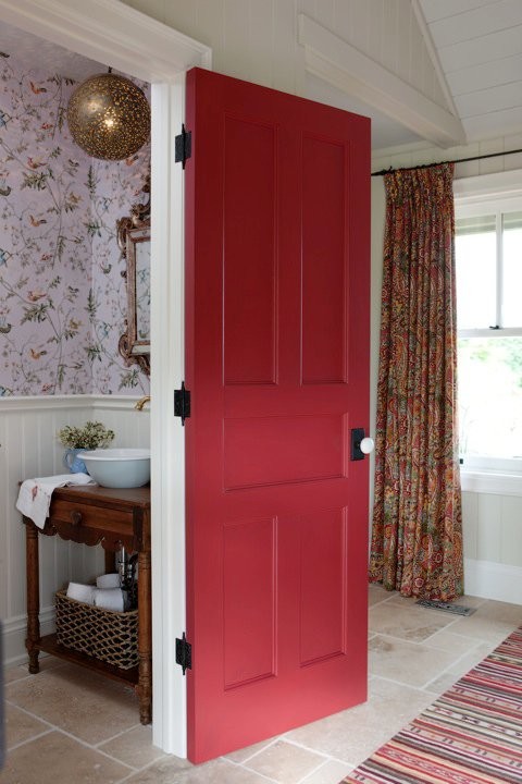
I found a large number of red exterior doors, but red works equally well on interior doors as Sarah Richardson proved in one of her many makeovers. 
Marin County House contemporary entry

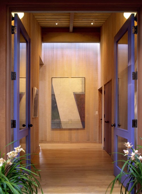
We don't often think of purple when we are trying to come up with a hue that goes well with most wood tones, but it does.I love the splash of colour with this basically wood toned room. Can you have too much wood?  Yes, in my opinion, no happens to be my husband's take on this much debated question in our home.
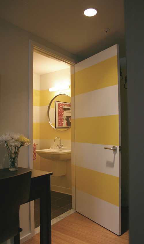
Paint a stripe
Loft Living modern powder room
Emily Elizabeth Interior Design

I like the way the stripe on the wall is extended across the door and the door trim. You have to really love stripes for this application.  I want to close it and see the full effect. Interesting and fresh.
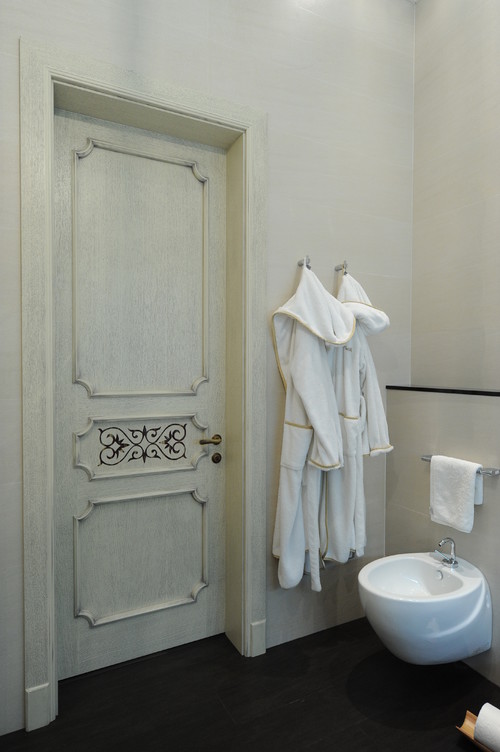
Paint the detailing
Centsational girl traditional living room

Sometimes painting details can create a fussy and cluttered look.  That is not the case in this room because of it's very neutral palette.
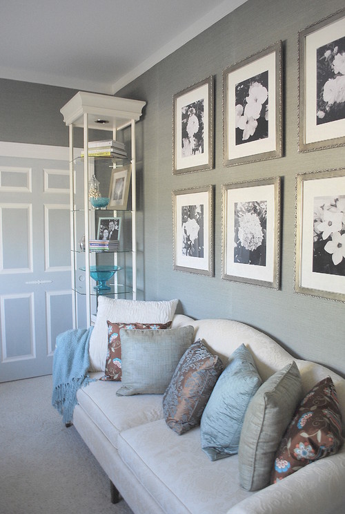
Add trim  

Interior Design modern bathroom
Gauhar


This more traditional look can be created by gluing (construction adhesive) ready made trim to plain doors. All you need is a miter box and saw.  You won't get the lovely curved corners, but everything else is possible.A stencil can produce the  design  in the middle panel.  

Use wallpaper

If you have a door with a recessed panel or a plain slab (hollow core) door you have many options to use wallpaper to embellish  it. The trick is to integrate the door into your decor in a seamless way.  This is an idea that could go very wrong and look absolutely cheap.  Keep your wallpaper colour the same as the wall colour for best effect.


Add  3 D detailing

Using upholstery tacks can create very interesting door detailing. If you like to cross stitch this is the door idea for you!  I can't imagine being this repetitive but to some it's a pure form of meditation.


Nail head trim can be  a great solution for decorating a plain door.  You can make  the door colour  colourful or dark.  Depending on the colour you choose to paint the door, this look works well in a den/ study or boy's room.

That's a quick roundup of great DIY door solutions.  Hope you found one you liked. 

Sunday, August 7, 2011

Growing a room


 Function and budget are two words I use quite a bit in my design work. It makes  no sense to have a beautiful room if it doesn't work for the people who use it, nor does it make sense to develop a plan for a room that is not within a client's financial reach. That's where creativity and a good sense of what's possible in DIY comes in. It also helps to know where to get a good deal. I've had lots of practice with both as I've decorated my own homes. I never seem to completely redo a room; my rooms are usually in a subtle, constant transition. It's a state I've come to define as "growing a room". The guest room in my summer house is a perfect example of this.

Before

 Going back in time to 2002 when we built our summer place, we constructed frames for two twin beds and  purchased a  bedside  table from a second hand store.  Functional but certainly not interesting.

 Time passed....  new headboards were made by the resident handyman and we found a way to connect the two frames to make a king size bed when we had company who wanted more than a twin.  That meant two separate lots of bedding to store, but it sure is practical! 

We recycled an old IKEA chair from our basement but it needs  recovering and the area over the bed is very bare. Needless to say the white pillow in the chair doesn't work. 

What happened to that dark brown bedside table? 


It had new life when painted Benjamin Moore Calming Cream. I love the richness of that colour.  It has a slightly yellow undertone but it has lots of body and works well with most colours.  The vignette on the bedside table is lacking. I didn't like the lamp, flowers and headboard being the same height. The vase below is a great find at a local store and elephant grass from an existing arrangement in my porch helped to add height.  This solution cost exactly $11.44.

 
The books were tidied and the hand carved bird on a piece of driftwood helps to bridge the two heights.


The IKEA chair was painted Calming Cream and recovered with a striped cotton and  a  pillow to match the one on the bed was made. 

And something appeared over the bed as if by magic. 


One of the best things about being an artist is that you can whip up an artwork to fill any empty spaces you have on your walls.  My favourite fun approach is collage with hand made textured papers and subtle applications of paint. 


This landscape strata references the many colours and textures that can be seen outside the bedroom window especially in fall. 


My favourite way to dress a bed is to turn back the sheets.  I took away the striped grayish pillows and now I need to make one more striped one to match the one above.  The rectangular pillow was made from the bottom of a ready made panel that has a beautiful cherry blossom design.  Of course  I bought it on sale.I managed to squeeze  two pillows out of one panel.  


And now for my next challenge.. the closet doors.  They are too choppy with the three colours ... what to do next? I think I will try painting the inside  rectangles Monroe Bisque the same as the walls. And if that doesn't please me the whole door will be Cloud White.  That light has got to go.  Something softer and more rounded.  Thrift shop or Homesense  here I come.... What about the handles on the bureau? And you can't see the very ugly light fixture that needs replacing. 
Stay tuned for more updates.

Saturday, July 9, 2011

5 Kids' window treatments with a twist


There are so many fantastic ideas for economical window treatments.    Here are 5 of my favouites from Better Homes and Gardens website that could be used for kid's rooms.

 Fun and Funky Buttons

You can buy jars of mismatched buttons for very reasonable prices and have a field day decorating drapes for kids'  rooms.  Glue them on rather than sewing them which is time consuming. This idea would not work in a young child's room for safety reasons.
buttons                                                         


 BHG
Geometric Borders

Follow the link under the photo for ideas on how to apply these fabric diamonds to a plain panel.  You could also make a diamond stencil from cardboard and paint the diamonds with fabric paint.


Princess Sheers 

This is such a cute idea for a little girl's room to  add richness and softness to plain drapes. I like the application of the diamond belt buckle for that extra bit of glitz. .  Check the Better Homes and Gardens  link for directions.


 Velvet Ribbons

Dress up any draperies with velvet ribbon applied using washable fabric glue.Nothing beats white for a fresh crisp look and lots of colour options. 

 Name stencils

Purchase large letter stencils to decorate draperies.  The vertical application on one side is interesting and unexpected. Trace the letters with a pencil and paint inside the lines. Great for a boy's room.

Friday, March 25, 2011

Summer house DIY

As I sit here in the middle of a raging snowstorm, I'm thinking about my summer house which I want to open next month. Maybe optimism will pay off!  This is the time of year I run through my "to do" list of what I want to accomplish in the coming season.  Most summer home/cottage owners want an inviting, homey atmosphere that can be accomplished on a budget.  I'm no different. Our place is small and quite ordinary looking from the outside, but  we have a million dollar view.

 We are perched on the edge of the Atlantic Ocean on the Bonavista Peninsula in Newfoundland and through the seasons we see icebergs, seabirds, whales and beautiful full moons.  One October I even saw my first display of the Northern Lights.

Come for a virtual visit.

View outside my studio window mid summer
 
Visitors in May

After the storm

Full moon over Bonavista

Before we ever put the plans for the house on paper, the colour scheme  was etched in my mind from my time spend in the community when I was younger.  The inside is a continuation of the outside - ocean, pink/purple slate/ fall meadow and fog. 


It's a back door kind of place (note the dishes in the rack) so we enter into the kitchen area.  Only slate could be used on the kitchen floor because it is a prominent feature of the whole area and works so well with the other colours.  I choose  purple  for an accent wall behind the cabinets which I doctored  with help at  my local paint shop. 

The cabinets were created on a shoestring budget.  My husband made the boxes out of white melamine that was already faced for use in shelving. We bought the doors at a salvage store unfinished. The layout of the kitchen was determined by the door sizes available.   I made a wash from liberal amounts of white and dabs of  the other colours in the house.  The floors are local spruce with the same wash, protected by five coats of water base varathane.  My knowledge of colour mixing gained through art was very helpful for this DIY. 

The butcher block counters are made from maple with strips of purple heart wood.  I would like to say the island had some exotic finish but its plain old laminate.

  The beautiful stained glass that provides light from the porch area was created by my  on-site handyman. We are waiting for our second hand refrigerator to die so we can fill the space up with a new one - we've been waiting for nine years!


The table  and bench were made from lumber salvaged from a hundred year old building that was being demolished.  There's an inlay of purple heart in the back of the bench and on either end of the table.  The dining area is across from the kitchen and the purple accent wall continues.  Our mid century modern chairs were saved  from a trip to the dump when a local company was renovating their offices.  They keep moving around the living area. 


Last summer I covered them in blue geometric fabric and moved them under the window for a change of pace.

This spring the furniture in this seating area will be replaced by ...


 .. two new IKEA chairs soon to be ordered.  I'll get my white slipcovers after all (our guests are usually clean).


This newly made cabinet is headed to the summer place and will be placed between the two IKEA chairs. It was made for my living room in my other house but I want  a piece that is twice as large for that space.  Call the handyman.


 I still can't believe I bought this sofa! It is cuddly,  puffy and brownish - not at all like what I am attracted to. Function won out over form.I gave up on my dream of a white slip covered sofa as not conducive to gardening, wood working, hiking and painting.   This one was durable and cheap.  I'm learning to like it.   The trunk was built from scraps of wood by my father when I was a teenager.  It's now painted BM Piedmont Gray.  It still looks lost so it will move to my studio.  What to put there is the big question.  More updates later. 

Sunday, March 6, 2011

Interesting Possibilities

The idea of adding interest to your home while staying within a budget appeals to most people, me included.  I have to admit that many of the smaller DIY projects you find through a general web search are best ignored.  Every now and them you find one with real possibilities.  Everyone has those clear CD jewel cases lying around.  Rather than throwing them away why not re- use them? Here are a number of options that may appeal to your DIY instincts.


Doesn't this arrangement look great?  I love everything about objects displayed in a grid format.  This idea was on Serenity in Design  blog and the  possibilities are endless when you start to think about what you could put in these simple cases-  photographs, scrapbook paper, origami paper, kids art, small watercolours, quotes, etc.


Rikki's Blog gives detailed instruction about how to proceed. 

 Murals ...You can use an enlarged photo and cut it into separate parts to fit into  the cases and then rearrange it in regular format or present randomly for a more interesting statement.  Viewers will be busy trying to fit it together.


And for those who want a bigger challenge... 


Recipe Hostess Gift...How about an interesting hostess gift presented in a CD case?  Decorate the front and print the recipe and include it inside.  Check out the link below to see how the case acts as a stand. 
 

source  

Gift Card container....Check out directions at Chico and Joe. 

CD Photo Cube... Flickr.

If you use  any of these ideas why not  send me a photo to share with  blog readers. I can tell from my blog stats that I have lurking readers so why not participate and make it a group affair!

Sunday, December 12, 2010

Keeping it simple

Gone are the days when I have every square inch of my house decorated for Christmas.  As  I grow older  I feel claustrophobic when surrounded by too many things.  I've spent the last five years simplifying my life and "re-gifting"  objects I'd acquired including many of my Christmas decorations.   They are now resting in someone else's house thanks to  the effectiveness of donations to thrift stores.

Each time I send a box  off I feel like I can breath a little easier.  My home is enjoying this freedom too.  While it is calm and comfortable, I still  want little touches of colour and the unexpected.  Some of the things I couldn't bear to part with get rotated from year to year and I enjoy them so much more when they take centre stage.    

The one thing I can't part with are tree ornaments because they represent so much family history. Contrary to what many people anticipate when they know I am a decorator, I do not design  a fancy themed tree each year. I admit I feel like I'm letting them down in some way, but  it's that family history  and warmth that are more important to me when I decorate for myself.

So here are some glimpses of Christmas at my house. You already know I rely on what is left in my garden, but I also like a little bling.  


Wall colour:  BM Rockport Gray HC 105

My kitchen always has a fresh plant for Christmas and the amaryllis is my favourite.  It shows up in my art work frequently.  More about that in a later post.
The artwork to the right of the window is an encaustic piece titled Thaw  (8 x 10 inches) painted by yours truly.  It is appropriate for the season.

The only addition to the window ledge in my kitchen is the glass of lime green berries which work well with the sea urchins and the first piece of stained glass my hubby made. 


walls: AF Fusion 675
shelf: AF Wish 680


I just repainted my entrance with AF Fusion which is a soft gray with a purple undertone.    One little wreath on a coat hook and a Santa that a dear friend gave me years ago is just enough to say it's Christmas. 


 Wall colour: BM Light Khaki  2148-40 

I always have candles on my dining room buffet (made by my man) so each year I just add one thing to the arrangement.  This year it is a pearl star that used to be a tree topper attached over a candle.
 

table:  BM Kendall Charcoal  HC 166

This year I painted my oak coffee table and end table and they are now  some of my favourite pieces of furniture in the house. Wood is prominent in my house because my husband is a woodworker.  I'm always battling the painting of solid wood horrors.  My IKEA bowl usually holds ornaments at Christmas time.  This year they are white and silver to honour the new look of my table.


 Wall colour: BM   Elephant Tusk  OC 8

Silver finials are my Christmas addition to  a red poppy and poppy coasters on the end table. They are just  enough to say it's Christmas


YES, I love gray and purple too ! 

Gambar Belangkas