Friday, November 11, 2011

Inspiration snaps

When I travel my camera is always with me because I don't want to miss any inspirational moments for art or design.  I thought my readers might enjoy seeing some of the "snaps" that I found interesting.


This was the table decoration in the lobby of a boutique hotel in London.  Carnations last forever and made an interesting colour shape statement when pulled apart and floated on water in a very large stainless steel bowl.  We were there 3 days and the arrangement still looked fresh when we left.


I spied this chair poking out of an opened patio door in a restaurant in a small town in Devon.  It was instant love.  I wanted to put it in my suitcase and run. Purple gray and chartreuse circles on soft white-totally perfect.


Beautiful pottery in Beer, Devon.  I loved the orange and turquoise combination.


Leave it to Swedish design.  These candlesticks can be moved from a central base and reformed into various arrangements.Natural wood on the inside with dark chocolate stain  on the outside edges.

How functional and attractive can you get?   Just pick up the metal tray and go.Love the red one best of all and I have absolutely no red in my house.


In Prague we stayed at a wonderful hotel called Hotel Maximilian.  The service was excellent and the decor was modern. I was very attracted to the orange and gray combinations and the chairs were super comfortable. The vases were by local artists.  There's a strong history of glass production in the city. 


Loved my black and white modern bathroom in a Holiday Inn Express in Dresden.  I'm getting ready to redo my own bathroom and I love there long rectangular tiles stacked in this way.


So sculptural and perfectly purple in the same hotel.  How lucky to find such great accommodations at a good price when travelling.

Bayi dalam kandungan tunjuk isyarat 'GOOD'


MAIDSTONE – Seorang ibu yang bimbang mengenai kesihatan bayi yang dikandungnya mendapati anaknya itu membuat isyarat bagus semasa perutnyadiimbas di sebuah hospital di Kent, Britain.Ibu bayi itu, Donna Sayer, 29, dan seorang jururawat tergelak selepas mereka melihat bayi itu memberikan isyarat bagus semasa diimbas. Menurut Donna yang merupakan seorang pengurus makanan dan minuman di Kelab Kriket Kent, bayi itu seolah-olah mahu memberitahu bahawa dirinya berada dalam keadaan baik.

Wanita itu berkata, pemeriksaan itu dibuat selepas jururawat berkenaan menyatakan bayi dalam kandungannya normal. Namun, bagi mendapatkan kepastian mengenai bentuk bayi itu, satu pemeriksaan imbasan dibuat.Donna dari Whitstable berkata, semua pihak berasa hairan apabila melihat gambar tersebut.


sumber: HarianMetro


p/s : sib baik baby ni tunjuk isyarat ' GOOD '   


Spesis Terancam 2005 - Burung ( Dendang Gajah )


Thursday, November 10, 2011

FBI dapat baby 11.11.11


Congrats ! pada Faizal Ismail , dj fofular hotfm yang baru mendapat cahayamata ketiga ( lelaki ) pukul 9.03 pagi tadi.  Bertambah lah kegembiraan beliau bila baby dilahirkan pada tarikh 11.11.11, bukan senang nak dapat tarikh keramat seperti hari ni ... :)


p/s : rindu nya bau baby...

Pasang butang follow dan dashboard

navbar
Mungkin anda pernah melihat butang follow dan dashboard yang diletakkan dibahagian atas header pada sesuatu blog.Butang ini memudahkan kita untuk masuk kedashboard pada template yang tiada nav bar dan juga bagi pengunjung untuk follow blog kita tanpa perlu tercari cari dimana widget tersebut dipasang.

Bagi anda yang ingin membuatnya ikutilah langkah berikut ini:

1.Masuk ke Blogger--Design
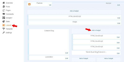
2.Pilih Layout--Add a gadget


3.HTML/Javascript


4.Masukkan kod dibawah ini:
<div style="position: fixed; top: 5px; right: 95px;"><a class="linkopacity" href="http://www.blogger.com/follow-blog.g?blogID=3112650486689767706" target="_blank" rel="nofollow" title="Follow !" imageanchor="1" style="margin-left: 2em; margin-right: 2em;"><img src="http://i219.photobucket.com/albums/cc282/garam63/FOLLOW.png" border="0" /></a><div style="display:scroll; position:fixed; top:5px; right:2px;"><a class="linkopacity" href="http://blogger.com/home" target="_blank" rel="nofollow" title="Dashboard !" imageanchor="1" style="margin-left: 2em; margin-right: 2em;"><img border="0" height="25" src="
http://i219.photobucket.com/albums/cc282/garam63/dash.png" /></a></div></div>

5.Tukarkan blog ID diatas  kepada id blog anda yang boleh didapati dibahagian atas semasa anda hendak memasukkan kod widget


http://i219.photobucket.com/albums/cc282/garam63/dashboardcopy.png

http://i219.photobucket.com/albums/cc282/garam63/follow.png


 http://i219.photobucket.com/albums/cc282/garam63/dashboard3copy.png


http://i219.photobucket.com/albums/cc282/garam63/follo3copy.png


 http://i219.photobucket.com/albums/cc282/garam63/dashboard4copy.png


http://i219.photobucket.com/albums/cc282/garam63/follo4copy.png

 http://i219.photobucket.com/albums/cc282/garam63/dashboard2copy.png


 http://i219.photobucket.com/albums/cc282/garam63/follo2copy.png

Tukarkan kod yang berwarna oren dengan url imej yang dikehendakki.
Kod oren yang pertama untuk butang follow dan kod kedua untuk butang dashboard 


6.Kemudian klik pada save
# letakkan kod dibahagian bawah ruangan add a gadget yang ada pada template anda supaya ia tidak terlindung dengan widget yang ada bila page discroll...:)
klik butang +1 jika suka artikel ini :) :)

update 8/5/2013

Thursday Tip # 8 - make it white

Coastal Living

There is something so soothing about a monochromatic colour scheme.  I have friends who would say boring not soothing. but to each his own.  It might seem easy to have a room is varying tones of one hue but not so.  It's even more difficult to design a white room to look interesting.  The trick is to emphasize shape and texture through repetition above all else. Don't forget that there are hundreds of whites with varying undertones and temperatures.

Why does this room work?
  •  white shows up all the textures and lines in the room;
  • the small mirrors arranged in a grid add a strong repetitive element and each looks like a small painting because of the reflections from outside (I'm assuming); that adds optical texture;
  • the walls are horizontal boards which play against the square mirrors;
  • apart from the texture of the white boards, the horizontal lines are soothing and are repeated in the cabinet below: 
  • the arrangement has various shapes( cones, spheres, stars) and surfaces (reflective, matt, rough, smooth);
  • shiny surfaces add an unknown quality because you never know what will be reflected;
  • the whites are on the warmer side and a little "dirty" which doesn't look stark.
Here are several other white rooms.  Do you think they are successful? What do they have in common with the room above?

Elle Decor


Marcelo Brito - Sao Paulo - Brazil contemporary dining room
Marcelo Brito


Which do you prefer? 

WANG KERTAS INDONESIA BELANDA LAMA ( SIRI WAYANG)


DE JAVASCHE BANK TAHUN 1938 - 10 GULDEN

Gambar Belangkas